
Over 80 percent of American businesses say that professionally designed signs improve their customer engagement. In a crowded market, the right signage can make the difference between standing out and blending into the background. This guide unpacks proven principles and practical strategies behind effective sign design so your business can capture attention, deliver clear messages, and build trust from the very first glance.
Table of Contents
- Defining Effective Sign Design Principles
- Types of Signs for Business Success
- Visual Elements That Drive Engagement
- Material Choices and Durability Factors
- Legal and ADA Compliance in U.S. Signage
- Common Mistakes to Avoid in Sign Design
Key Takeaways
| Point | Details |
|---|---|
| Effective Sign Design is Strategic | Sign design should combine artistic creativity with scientific research to enhance communication and engagement. |
| Accessibility and Compliance are Essential | Signs must adhere to ADA guidelines to ensure universal comprehension and accessibility for all individuals. |
| Materials Impact Longevity | Selecting durable materials is crucial for outdoor and indoor signage to maintain visual appeal and effectiveness over time. |
| Avoid Common Design Mistakes | Key mistakes include overcrowding elements and neglecting color contrast, which can compromise readability and message clarity. |
Defining Effective Sign Design Principles
Effective sign design is far more than aesthetic decoration – it represents a strategic communication tool that transforms visual information into compelling business messaging. Sign design principles combine artistic creativity with scientific research to create powerful visual communication strategies that drive engagement and comprehension.
The core principles of impactful sign design center on fundamental visual communication elements. Contrast emerges as a critical factor, enabling viewers to quickly process information by creating clear visual differentiation. Typography, color selection, and spatial arrangement work together to guide the viewer’s eye and communicate messages efficiently. Successful sign designs strategically balance these elements to ensure readability and immediate visual impact.
Accessibility and regulatory compliance represent another crucial dimension of effective sign design. Academic research demonstrates how design principles like alignment and repetition can significantly improve information accessibility, particularly for individuals with different visual capabilities. This approach goes beyond aesthetic considerations, incorporating standards such as Americans with Disabilities Act guidelines to ensure signs are universally comprehensible.
Practical sign design requires understanding both visual psychology and technical execution. Key considerations include:
- Maintaining high color contrast
- Using legible font styles
- Selecting appropriate text sizes
- Creating logical information hierarchies
- Ensuring visibility from expected viewing distances
By integrating these principles, businesses can transform signs from mere informational objects into powerful communication tools that engage audiences, communicate messages clearly, and reinforce brand identity.
Types of Signs for Business Success
Comprehensive sign research demonstrates that businesses can leverage multiple sign types to enhance communication and visibility. Each sign category serves a unique strategic purpose, from attracting potential customers to guiding them through physical spaces and reinforcing brand identity.
Exterior Signs represent the primary visual communication tool for businesses. These include storefront signs, monument signs, channel letters, and illuminated displays that capture attention and create crucial first impressions. Their design must balance visibility, readability, and aesthetic appeal to effectively communicate brand personality and draw potential customers.

Interior Signage plays an equally critical role in customer experience and navigation. Research into sign persuasion reveals how strategic sign design can influence customer behavior, making wayfinding signs, directional markers, and informational displays powerful communication tools. These signs help customers navigate spaces, understand service offerings, and feel more comfortable in unfamiliar environments.
Businesses can strategically utilize various sign types:
- Storefront Signs: Attract initial customer attention
- Directional Signs: Guide customers through physical spaces
- Promotional Signs: Highlight sales, events, or special offerings
- Informational Signs: Provide essential details about services or products
- Digital Display Signs: Offer dynamic, updatable communication platforms
By understanding and implementing these diverse sign types, businesses can create comprehensive visual communication strategies that enhance brand visibility, improve customer experience, and drive engagement.
Visual Elements That Drive Engagement
Color, typography, and visual hierarchy form the foundational elements that transform signs from mere information displays into powerful communication tools. Research on universal design demonstrates how precise visual elements can dramatically enhance audience engagement, revealing the scientific precision behind effective visual communication.
Color psychology plays a critical role in sign design, with specific hues triggering emotional and psychological responses. Warm colors like red and orange can generate excitement and urgency, while cool blues and greens communicate professionalism and calm. The strategic selection of color palettes goes beyond aesthetic preferences, functioning as a nuanced communication language that subconsciously influences viewer perception and behavior.
Typography represents another crucial visual element that directly impacts sign comprehension and engagement. Font selection involves careful considerations of readability, brand personality, and visual hierarchy. Serif fonts often convey traditional reliability, while sans-serif typefaces communicate modern simplicity. The interplay between font size, weight, and spacing determines how quickly and easily viewers can process information.
Key visual engagement strategies include:
- Maintaining high contrast between text and background
- Using legible font sizes
- Creating visual balance and symmetry
- Implementing white space strategically
- Ensuring consistent design language
By understanding and masterfully implementing these visual elements, businesses can create signs that do more than communicate information – they create memorable visual experiences that capture attention, convey messages efficiently, and reinforce brand identity.
Material Choices and Durability Factors
Comprehensive sign design research demonstrates that material selection is far more than a simple aesthetic decision. The right material can significantly impact a sign’s longevity, performance, and overall effectiveness in communicating business messages across various environmental conditions.
Outdoor Signs require materials with exceptional weather resistance and durability. Aluminum, high-density polyethylene, and marine-grade acrylic stand out as top choices, offering resistance to UV radiation, temperature fluctuations, and moisture. These materials maintain their structural integrity and visual appeal, ensuring that exterior signs continue to represent businesses professionally under challenging environmental conditions.
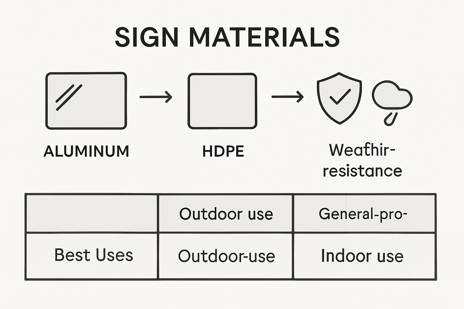
Interior signage demands a different approach to material selection. Academic studies on signage highlight the importance of materials that preserve visual clarity and maintain professional appearances. Materials like tempered glass, high-quality acrylics, and powder-coated metals provide sleek, modern finishes that withstand frequent interactions and maintain their aesthetic quality over extended periods.
Key considerations for material selection include:
- Resistance to environmental factors
- Maintenance requirements
- Cost-effectiveness
- Weight and installation complexity
- Aesthetic compatibility with brand identity
By carefully evaluating these factors, businesses can select sign materials that not only communicate their message effectively but also demonstrate a commitment to quality and professionalism through durable, long-lasting visual communication solutions.
Legal and ADA Compliance in U.S. Signage
Comprehensive sign design research highlights the critical importance of understanding legal requirements in signage design. The Americans with Disabilities Act (ADA) establishes mandatory standards that businesses must follow to ensure inclusive and accessible visual communication across public and commercial spaces.
Accessibility Standards represent the cornerstone of legal compliance in signage. These regulations mandate specific requirements for sign characteristics, including character height, contrast ratios, tactile lettering, and mounting height. Businesses must ensure that signs are readable for individuals with visual impairments, featuring high-contrast color schemes, raised characters, and placement at consistent, predictable locations that facilitate easy navigation.
Academic studies on signage design demonstrate that legal compliance extends beyond mere technical specifications. The intent is to create an inclusive environment that allows all individuals, regardless of physical abilities, to access information confidently and independently. This approach requires a holistic understanding of how design elements interact to support universal accessibility.
Key ADA compliance requirements include:
- Minimum character height based on viewing distance
- Non-glare finish for improved readability
- Consistent color contrast between text and background
- Tactile lettering for critical informational signs
- Braille translation for permanent room identification
- Consistent mounting height and location
By proactively integrating these legal standards, businesses demonstrate social responsibility while avoiding potential legal complications, creating signage that serves all customers effectively and equitably.
Common Mistakes to Avoid in Sign Design
Comprehensive sign design research exposes critical design pitfalls that can dramatically undermine a sign’s effectiveness. Understanding these common mistakes helps businesses create more impactful, professional visual communication tools that truly engage their target audience.
Visual Clutter represents one of the most prevalent design errors. Overcrowding signs with excessive text, graphics, or competing visual elements reduces readability and dilutes the core message. Professional sign design requires strategic editing, focusing on essential information and maintaining clear visual hierarchies that guide the viewer’s attention efficiently.
Academic studies on signage redesign highlight additional critical mistakes businesses frequently make. Poor color contrast, inconsistent typography, and non-standard design elements can significantly diminish a sign’s communication potential. These errors not only reduce visual appeal but can also create confusion and reduce the sign’s overall effectiveness.
Key mistakes to avoid include:
- Overcrowding design elements
- Using low contrast color schemes
- Selecting inappropriate or hard-to-read fonts
- Ignoring viewing distance and angle
- Failing to consider accessibility standards
- Using dated or inconsistent design language
By proactively identifying and addressing these common design pitfalls, businesses can create signs that communicate clearly, attract attention, and represent their brand with professionalism and precision.
Elevate Your Business Impact with Custom Sign Solutions
Designing effective signs that capture attention and communicate clearly is essential to boosting your business presence. This article highlights the importance of contrast, typography, and material durability to create signs that not only attract but engage customers. If you find yourself struggling with overcrowded designs, poor readability, or questions about material choices to ensure long-lasting signs, professional custom sign services can help solve these challenges.

Discover how Uncategorized – services offered at Custom Signs Today provide tailored solutions that address these exact pain points. From banners made with high-quality materials for outdoor durability to precise lettering and vehicle wraps that boost brand visibility, you can rely on expert craftsmanship to make your signs stand out. Take the next step—request a free quote today and transform your visual communication strategy with signs designed for maximum business impact.
Frequently Asked Questions
What are the key principles of effective sign design?
The key principles of effective sign design include contrast, typography, color selection, and spatial arrangement. These elements work together to ensure readability and visual impact, guiding the viewer’s eye to communicate messages efficiently.
How can accessibility affect sign design?
Accessibility affects sign design by requiring compliance with standards like the Americans with Disabilities Act (ADA). This includes ensuring signs are readable by individuals with visual impairments through elements like high-contrast colors, tactile lettering, and appropriate mounting heights.
What materials are best for outdoor signs?
Best materials for outdoor signs include aluminum, high-density polyethylene, and marine-grade acrylic. These materials offer durability and resistance to weather conditions like UV radiation and moisture, ensuring long-lasting performance.
What common mistakes should be avoided in sign design?
Common mistakes to avoid in sign design include overcrowding elements on the sign, using low-contrast color schemes, selecting inappropriate fonts, ignoring accessibility standards, and employing inconsistent design language.