
The most effective ways to boost curb appeal for a commercial property start with one thing: professional signage. Research by The Signage Foundation confirms that well-maintained storefronts with clear, attractive signs directly influence how customers perceive product and service quality, often before they ever step inside. Get the sign right, and everything else builds from there.
Here are the top curb appeal improvements that actually move the needle for businesses:
- Professional custom signage that clearly identifies your brand from the street
- Exterior lighting to highlight your sign and entrance after dark
- Landscaping and greenery to frame your storefront and soften hard surfaces
- Fresh paint and clean facades to project maintenance and professionalism
- Seasonal decor and window displays to keep the exterior feeling current
- Accessible walkways and driveways that welcome every customer safely
Table of Contents
- 1. Ways to boost curb appeal start with signage design
- 2. Run a visibility audit before you install anything
- 3. Choose materials built for outdoor conditions
- 4. Build a maintenance schedule and stick to it
- 5. Meet ADA standards for accessibility
- 6. Use exterior lighting to extend your sign’s working hours
- 7. Apply a focused color scheme to your facade
- 8. Add landscaping and greenery to frame your entrance
- 9. Refresh walkways, driveways, and the entrance zone
- 10. Rotate seasonal decor and window displays
- Customsignstoday gives your business a visible edge
- Key Takeaways
1. Ways to boost curb appeal start with signage design
Good signage design is not about looking impressive. It is about being read fast, from a distance, by someone who is moving. Design experts recommend four fundamentals: simplicity, size, location, and color contrast. A cluttered sign with three fonts and five colors fails all four.
Limit your sign to your business name and one clear descriptor. Two main colors with a strong contrast between text and background is the standard that works. Avoid decorative typefaces that look great on screen but become unreadable at 30 feet.
- Keep the message to one idea
- Use high contrast: dark text on light background, or the reverse
- Choose a font size large enough to read from the street
- Avoid more than two typefaces on a single sign
Pro Tip: Walk across the street and look at your sign from a driver’s perspective. If you cannot read it in three seconds, it needs a redesign.
The US Chamber of Commerce advises that legibility must always override style. A beautiful sign that nobody can read is a missed opportunity every single day.
2. Run a visibility audit before you install anything
Placement kills more signs than bad design. A sign that looks perfect head-on may be completely blocked by a tree, a parked truck, or an awning overhang when viewed from the actual traffic flow. Practitioners recommend checking your sign from multiple vantage points: both directions of vehicle traffic, the sidewalk, and across the street.
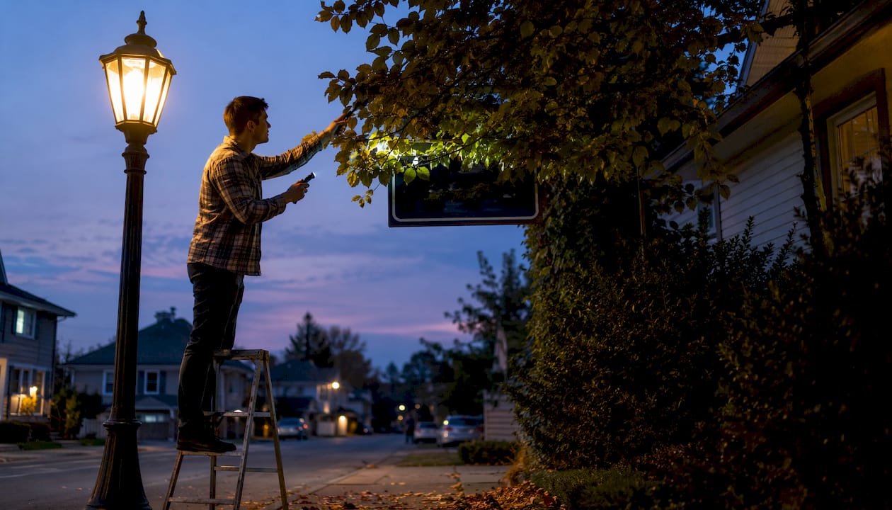
Walk the approach routes your customers actually use. Note any obstructions at different times of day, since shadows and parked vehicles shift. Fix placement before fabrication, not after.
3. Choose materials built for outdoor conditions
Outdoor signage takes a beating. UV exposure, rain, humidity, and temperature swings degrade cheap materials fast, and a faded or peeling sign does more damage to your brand than no sign at all. Durable options include aluminum, acrylic, and weather-resistant vinyl, each suited to different applications and budgets.
Aluminum holds up in direct sun without warping. Acrylic works well for illuminated cabinet signs. Vinyl wraps and decals offer flexibility for windows, vehicles, and temporary promotions. The right material depends on where the sign lives and how long you need it to last.
- Aluminum: corrosion-resistant, ideal for permanent exterior mounting
- Acrylic: clean, professional finish for lit or unlit face signs
- Weather-resistant vinyl: versatile for wraps, decals, and banners
4. Build a maintenance schedule and stick to it
A damaged or partially lit sign actively hurts your brand. Regular upkeep means quarterly cleaning, prompt bulb or LED replacement, and an annual inspection for cracks, fading, or mounting issues. Set a calendar reminder. Treat signage the same way you treat any other long-term marketing asset.
Clean signs with mild soap and water. Avoid abrasive cleaners on acrylic faces. Check mounting hardware after storms. Repaint or replace panels when color fades noticeably.
5. Meet ADA standards for accessibility
ADA-compliant signage uses high-contrast colors, clear fonts, and tactile lettering where required. Beyond the legal obligation, accessible signs read better for everyone, including customers with no visual impairment who are simply moving fast. Compliance and good design point in the same direction.
Position signs at eye level wherever possible, free from obstructions. For interior and directional signs, Braille and raised lettering may be required depending on your state and building type.
6. Use exterior lighting to extend your sign’s working hours
Your sign stops advertising the moment it goes dark. Illuminated signs extend advertising impact beyond business hours, reaching evening foot traffic and drivers who would otherwise pass without noticing. Spotlights aimed at your sign face, backlit channel letters, or LED cabinet signs all accomplish this at different price points.
Exterior lighting also sets mood. Warm tones work for restaurants and boutiques. Cooler, brighter light suits service businesses and medical offices. Soft lighting around the entrance signals that the space is welcoming and open.
7. Apply a focused color scheme to your facade
Limiting your exterior palette to two main colors and one accent creates a coherent storefront that reads clearly from a distance. Too many colors make a facade look busy and confused, especially when viewed from a moving vehicle. Your sign colors, trim, and door should work together, not compete.
Consider how your colors look in different light conditions: direct sun, overcast sky, and at night under artificial light. What reads as a warm cream in daylight can look dingy under sodium streetlights.
8. Add landscaping and greenery to frame your entrance
Cleanliness, safety, and landscaping are core dimensions of curb appeal that affect property values and customer patronage decisions. Planters flanking an entrance, trimmed hedges along a walkway, or a simple strip of mulch and seasonal flowers all signal that someone cares about the property. That inference transfers directly to how customers perceive your business.
Keep it simple and well-maintained. Overgrown or dying plants do the opposite of what you intend. If you cannot commit to regular watering and trimming, choose low-maintenance native plants or high-quality artificial greenery for planters.
9. Refresh walkways, driveways, and the entrance zone
Cracked concrete, faded parking lot lines, and a cluttered entrance all undercut an otherwise attractive storefront. Power-wash hard surfaces annually. Repaint parking lines and curbs when they fade. Keep the path from the street to your door clear, well-lit, and free of debris.
Architectural visualization tools can help you plan facade and entrance improvements before committing to physical changes, which is especially useful for larger renovation projects.
10. Rotate seasonal decor and window displays
Changing your exterior decor seasonally prevents customers from developing what retailers call marketing fatigue, the point where a familiar storefront stops registering at all. A window display updated for spring, a banner announcing a summer promotion, or simple holiday lighting in December each give repeat passersby a reason to look again.
Seasonal window displays work best with one strong focal point rather than a cluttered arrangement. One hero product or message, framed simply, stops more people than a window packed with everything you sell.
Customsignstoday gives your business a visible edge
Your exterior is working or it is not. There is no neutral. Customsignstoday produces custom signs, banners, vehicle wraps, decals, and lettering built for outdoor durability, so your storefront keeps performing through Florida heat, rain, and heavy traffic.
The product range covers everything from permanent site identification signs to face change signs that let you update your message without replacing the whole cabinet. Every order is customized to your brand colors, dimensions, and mounting requirements. Get a free quote at customsignstoday.us and see what the right sign does for your street presence.
Key Takeaways
Professional signage is the single highest-leverage curb appeal investment for any commercial property, directly influencing customer quality perception and foot traffic.
| Point | Details |
|---|---|
| Signage drives quality perception | The Signage Foundation confirms well-maintained signs influence conscious and unconscious quality judgments. |
| Legibility beats style | High contrast, simple fonts, and correct sizing matter more than visual complexity for street-readable signs. |
| Material choice determines longevity | Aluminum, acrylic, and weather-resistant vinyl each suit different outdoor applications and lifespans. |
| Seasonal updates prevent fatigue | Rotating decor and window displays keeps repeat passersby engaged and prevents your storefront from going invisible. |
| Customsignstoday covers the full range | From permanent site signs to face change signs and vehicle wraps, Customsignstoday delivers outdoor-ready custom signage. |