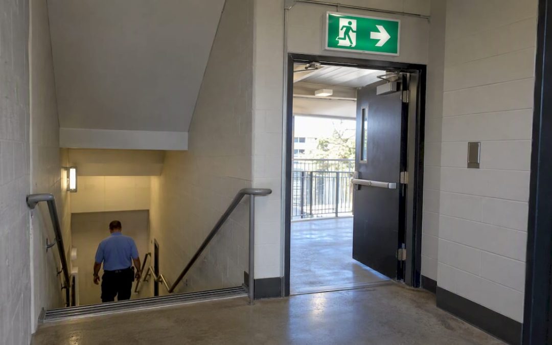
Safe condition signs are informational signs that mark the location of safety equipment, exits, and emergency procedures, and you can spot one immediately by its green background with a white pictogram or text. Common examples include exit signs, first aid markers, and assembly point signs. Each tells you where to go or what to use when something goes wrong, without needing a second glance to decode it.
TL;DR:
- OSHA requires visible, unobstructed exit routes; signs need 5 foot candles, or 54 lux, unless they use an approved source that glows without power.
- Repeat directional exit signs wherever the route is unclear, maintain line of sight, and label misleading doors Not an Exit.
- Pair indoor sign checks with scheduled fire drills or safety audits, and inspect outdoor assembly point and exterior exit signs every six months.
- Photoluminescent signs need adequate light to recharge, so inspect their glow and add supplemental lighting when dim placement prevents a full charge.
- Coordinate signs with alarms and other safety instructions so evacuation routes do not conflict, and pair unfamiliar symbols with short bilingual labels.
Table of Contents
- How colors, shapes, and symbols identify a safe condition sign
- Where you’ll actually see these signs in a building
- Standards and placement rules that shape every sign
- How to read a safe condition sign and act on it
- What professional signage providers consider when making these signs
- Keeping safe condition signs visible over time
- Making safe condition signs part of a bigger safety system
- What a confused evacuation taught me about signage
- Getting compliant safe condition signage made and installed
- FAQ
- Sources
How colors, shapes, and symbols identify a safe condition sign
Green and white is the giveaway. Under OSHA’s exit route standard, safe condition signs use a white image or lettering set inside a green square or rectangular background, and that pairing is reserved for this category alone. It is never used for warnings or instructions that carry risk.
That separation matters because color coding across the safety sign system is deliberate:
- Red marks prohibition or fire equipment, never a safe route or resource.
- Yellow or orange flags a hazard or caution area.
- Blue signals a mandatory action, like wearing eye protection.
- Green always points to something safe: an exit, a first aid kit, an assembly point.
Pictograms reinforce the color. A red cross means first aid, a running figure with an arrow means exit, a lightning bolt over a plug-and-heart shape marks an AED, and an eye under a faucet marks an eyewash station. NIOSH and CDC research found that simple, person-centered graphics like these are recognized more reliably under stress than abstract icons, though recognition for specialized symbols such as radiation or biohazard markers varies more widely. Legibility and contrast matter as much as color: panels need clean edges and sans-serif lettering, and many facilities add photoluminescent coating so the sign still reads during a power outage.
Where you’ll actually see these signs in a building
Safe condition signs show up anywhere someone might need to find help or an exit without stopping to think. Common placements follow a predictable pattern:
- Exit signs sit above doors and along corridors, with directional arrows repeated wherever the path to the exit is not obvious.
- First aid signs mark the location of supply kits, usually near break rooms, reception desks, or shop floors.
- AED signs point to defibrillator cabinets, often mounted at eye level in a hallway or lobby.
- Eyewash and emergency shower signs sit directly above or beside the equipment, especially where corrosive chemicals are handled, a requirement tied to OSHA’s first aid standard.
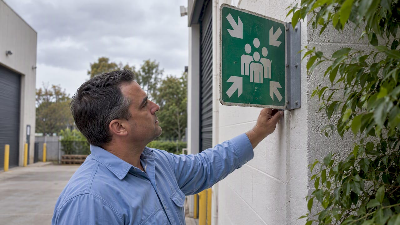
- Assembly point signs mark outdoor gathering locations, placed where evacuating staff can be accounted for safely after leaving the building.
The mix shifts by setting. Office buildings lean on exit and first aid signage along open floor plans. Warehouses add more directional repetition because sightlines get blocked by racking and equipment. Hospitals combine safe condition signs with patient wayfinding, so symbols often pair with short text for clarity. Construction sites favor durable, high-contrast panels that survive dust and weather, and schools tend to keep assembly point signage simple and highly visible for fast, calm evacuation.
Standards and placement rules that shape every sign
Two federal references do most of the work here. OSHA 29 CFR 1910.37 requires exit routes to stay visible and unobstructed, and the word “Exit” must appear in legible letters with size specified by OSHA regulations. Illumination has to reach at least 5 foot-candles, or 54 lux, unless the sign uses an approved self-luminous or photoluminescent source.
Color and layout come from a separate standard. OSHA 1910.145 specifies the white background and green panel with white lettering used on safety instruction signs, distinct from the yellow background and black lettering required on caution signs. ANSI’s Z535 series builds on this with a coordinated system: safe condition symbols stay white on green, while hazard, mandatory, and prohibition signs use different shapes and colors entirely, which cuts down on confusion for workers and visitors alike.
A few practical rules follow from these standards:
- Directional exit signs must repeat anywhere the route isn’t immediately obvious, and “Not an Exit” markings are required on doors that could be mistaken for one.
- Line-of-sight to an exit sign has to be maintained at all times, per OSHA’s evacuation eTool.
- Illumination needs a backup plan. A correctly colored sign that goes dark in a power failure still fails its job.
How to read a safe condition sign and act on it
Reading one of these signs is simple by design. Follow the next sentence below, step by step.
- Spot the green panel and follow its arrow or symbol toward the exit, first aid station, or assembly point it marks.
- Check for obstructions or missing repeats. If the next directional sign isn’t visible from where you’re standing, something is blocking the route or a sign is missing.
- Confirm illumination. A dim or dark sign during a drill is a maintenance flag, not a minor issue.
- If anything is unclear, move toward the nearest posted sign rather than guessing at a route.
For facility managers, a short checklist covers the basics: confirm symbol clarity from typical sightlines, verify illumination and backup power, and set a recurring inspection schedule rather than a one-time check.
Pro Tip: Walk your own evacuation route at night with the lights off once a year. It’s the fastest way to find a sign that looks fine on paper but fails in the dark.
What professional signage providers consider when making these signs
Material choice depends on environment: vinyl and aluminum composite hold up indoors, while anodized aluminum or photoluminescent panels handle outdoor exposure and power loss. Customization options include symbol-only designs for fast recognition or symbol-plus-text for bilingual and accessibility needs. Mounting height, anti-glare finish, and a regular inspection cadence all affect whether a sign still works years after installation.
Keeping safe condition signs visible over time
A sign that was compliant on installation day can fail years later if nobody checks it. Panels fade under UV exposure, mounting brackets loosen, and foliage or new shelving can block a line of sight that was clear during the original walkthrough. Routine inspection catches these problems before an emergency does.
A practical inspection covers a few repeatable items: check that the green and white color contrast hasn’t faded past legibility, confirm that illuminated or photoluminescent signs still charge and glow as expected, and verify that nothing new in the space, a stacked pallet, a parked cart, a closed door, has blocked the sign from its usual vantage point. Photoluminescent signs in particular need periodic exposure to adequate light to maintain their charge, so a sign tucked into a dim corner may need supplemental lighting to stay effective.
Facilities that already run scheduled fire drills or safety audits can fold sign inspection into that same cycle instead of treating it as a separate task. A quarterly walk-through, paired with a quick photo log of each sign’s condition, gives a paper trail if a safety inspector asks for it and catches fading or damage long before it becomes a liability. Mounting hardware deserves a look too: a sign that has shifted angle or loosened from its bracket may no longer be visible from the approach angle it was designed for.
Outdoor assembly point and exterior exit signage face the added stress of weather, so a six-month check is often more realistic than an annual one. Indoor signs in low-traffic areas can go longer between inspections, but the standard remains the same everywhere: a sign is only as good as its last confirmed check.
Making safe condition signs part of a bigger safety system
Safe condition signs rarely work alone. They’re most effective as one layer in a broader communication system that includes mandatory signs, hazard warnings, floor markings, and verbal briefings. A clear exit sign loses value if the mandatory sign requiring hard hats near the same doorway is missing, or if a hazard warning for a wet floor sits right where the evacuation route runs.
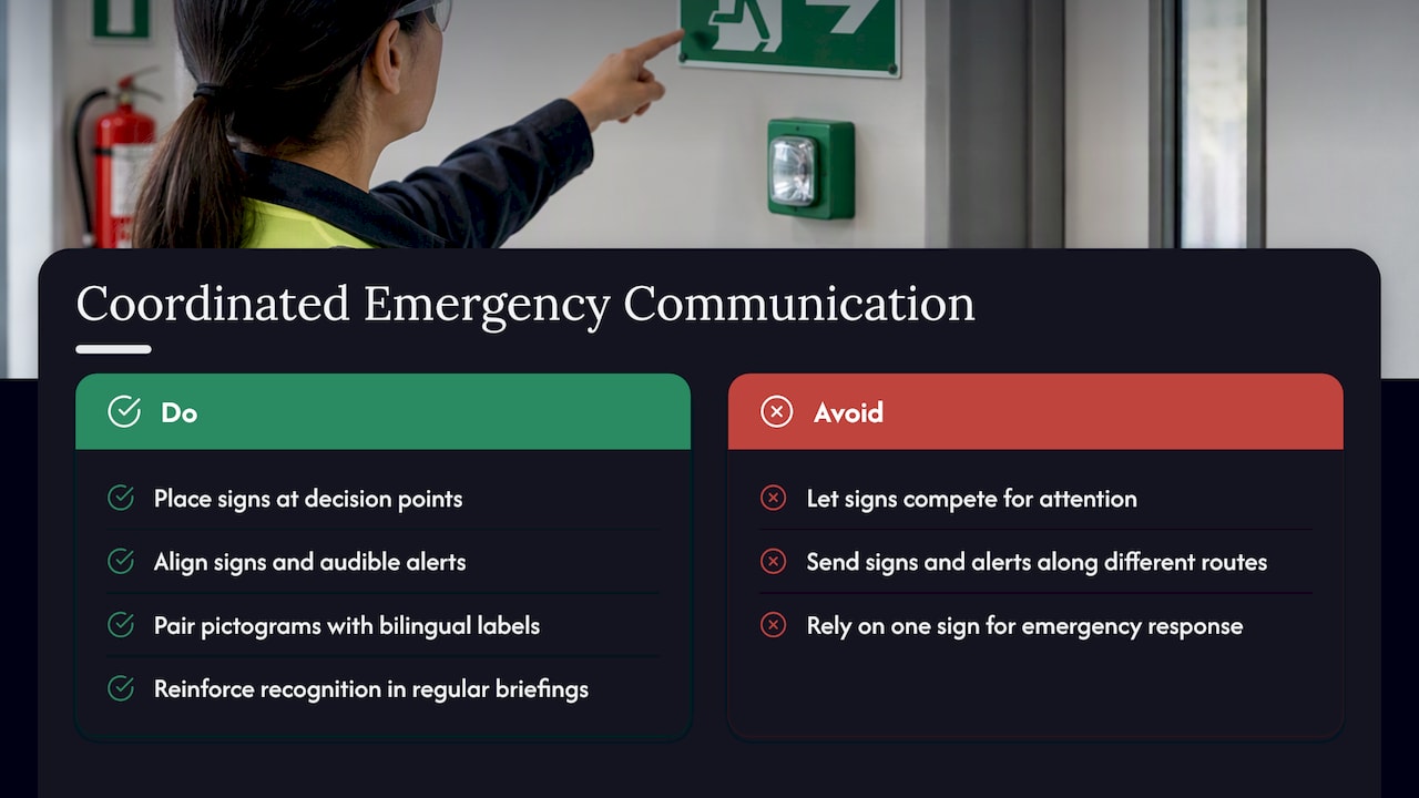
Coordinating these layers starts with consistent placement logic. Safe condition signage should appear at decision points, anywhere someone has to choose a direction, so it works in sequence with mandatory and warning signs rather than competing with them for attention. In facilities with alarm systems, signage and audible alerts should point toward the same route; a sign directing people one way while an intercom announcement sends them another creates the kind of confusion that slows an evacuation.
Training reinforces the system further. Short, regular briefings on what each sign color means and where key equipment is located help staff recognize signage instantly rather than puzzling over it mid-emergency. Site-level safety briefings, sometimes called toolbox talks, are a common way construction and trade crews cover this kind of signage recognition alongside other daily safety topics.
For multi-language workforces, pairing a universally recognized pictogram with a short bilingual label below it keeps the sign fast to read without sacrificing clarity for anyone unfamiliar with the symbol alone. The goal across all of this is the same: no single sign should carry the full weight of an emergency response. It works because it’s part of a system that was planned that way.
What a confused evacuation taught me about signage
I once watched a fire drill stall at a stairwell because the exit sign was accurate but the one before it had been removed during a renovation. Nobody was lost for long, but the hesitation was visible. Good signage removes hesitation entirely. If you’re not sure your site would hold up under the same test, it’s worth walking the route yourself.
— Yossi
Getting compliant safe condition signage made and installed
Safe condition signage should have correct green and white panels, legible symbol sizing, and photoluminescent or illuminated options where power loss is a real risk. Our custom signs services cover design, materials, and installation guidance in one process, so you’re not piecing together compliance on your own.

What we offer for this kind of project includes:
- Interior signage built for first aid, AED, and eyewash station locations using durable, code-aware materials.
- Exterior signage rated for weather exposure at assembly points and outdoor egress routes.
- Custom sizing and bilingual layouts that keep symbols clear while adding text where it’s needed.
If you need a compliance review or a quote on new safe condition signage, our custom signs team can walk through your site’s requirements and turn around a design fast.
FAQ
What are examples of safe condition signs?
Common examples include exit signs, first aid station markers, AED location signs, emergency eyewash and shower signs, and assembly point signs. Each uses the same green background with a white pictogram or text, as defined under OSHA’s exit route standard.
What is the meaning of safe condition?
A safe condition sign marks a location, piece of equipment, or route that supports safety, such as an exit or a first aid kit, rather than warning of a hazard. The green and white color combination specified in OSHA 1910.145 distinguishes it from caution, warning, or prohibition signs.
What are the 5 main safety signs?
The main categories under ANSI Z535.2 are hazard alerting, notice, safety instruction, safety equipment location, and fire equipment location signs. Safe condition signs fall under the safety equipment and safety instruction categories.
What are the 4 types of safety signs?
The four core types by function are prohibition (red), warning (yellow or orange), mandatory (blue), and safe condition or information signs (green and white). Each color and shape combination is standardized so the meaning is clear at a glance, as described in ANSI’s guidance on safety symbols.
Sources
- 1910.37 – Maintenance, safeguards, and operational features for exit routes. | Occupational Safety and Health Administration
- ANSI Z535.3-2022: Designing Effective Safety Symbols – ANSI Blog
- Safety messages and signs (NIOSH/CDC)