A good sign design starts with one job, one viewing distance and one short message. Pick the purpose (identify, direct, advertise or warn), size the letters for how far away people will be, keep the words few and the contrast high, and choose materials for where the sign will hang. Everything below shows how to do that, with the numbers to check your layout against.
This guide is for business owners, property managers, real estate agents and event organizers who are about to brief a sign maker and want the brief to be right the first time.
TL;DR
- Decide the sign’s job first: identification, direction, advertising or safety. One sign, one job.
- Size letters for distance: experts recommend at least 1 inch of letter height for every 25 feet of viewing distance.
- Use few words, no more than three colors, and leave 30% to 40% of the sign face empty.
- Choose materials for the site, indoor or outdoor, and check local sign rules and accessibility needs before production.
- Send your sign maker the location, the viewing distance and the logo files, and the quote will be far more accurate.
Table of Contents
- Start with the job the sign has to do
- Design for under a second of attention
- Size letters for the viewing distance
- Contrast, color and white space
- Match materials to where the sign will live
- Place the sign where decisions happen
- Check accessibility and local rules before production
- Prepare your artwork and brief
- Perspective: why we start with the viewer, not the artwork
- Start your sign project with us
- FAQ
- Sources
Start with the job the sign has to do
Before choosing fonts or colors, name the sign’s purpose. A county planning primer describes signage as identification, advertising and wayfinding aids, and notes that for small businesses it can make or break competitiveness. Those three jobs need different designs.
A university design resource lists seven sign types: identification, directional, orientation or operational, warning, regulatory or prohibitory, interpretive and honorific. Most small businesses work with four of them:
| Sign job | Typical example | What the design must do |
|---|---|---|
| Identify | Storefront sign, suite number, lobby wall logo | Show the name and what you do, readable from the approach |
| Direct | Parking arrows, A-frame at a corner, wayfinding inside a building | Give one clear instruction at the decision point |
| Advertise | Banners, vehicle graphics, window graphics, property signs | Win attention in under a second |
| Warn or regulate | Safety and compliance signs | Follow standard wording, symbols and placement |
The Model Sign Code makes the same point from the community side: signs should identify and advertise a facility, direct motorists from the road to it, and be sized and arranged to avoid unsafe conditions. If a sign tries to do all of those at once, it does none of them well.
Write the one-sentence brief
Finish this sentence before you open a design file: “Someone at [distance], moving at [speed], should understand [one thing] and then do [one action].” A banner on a fence might read: “Grand opening Saturday.” A directional sign might say: “Visitor parking, turn right.” If you cannot finish the sentence, the sign is not ready to design.
Design for under a second of attention
People rarely study a sign. University of Maryland Extension notes that viewers typically look at a sign for less than a second, which is why few words work best, supported by generous letter size and white space.
The International Sign Association says a sign needs to be detectable, conspicuous, legible and comprehensible. In practice that is a four-step test:
- Detectable: can the eye find it against the building, street and other signs?
- Conspicuous: does it stand out from what surrounds it?
- Legible: can the letters be told apart at the distance people will be?
- Comprehensible: do they understand it at once?
The same source adds that unfamiliar or numerous words take longer to read. Use the words your customers already use. “Dental Care” beats a clever brand phrase that needs explaining.
A workable word budget for a roadside or storefront sign is your business name, one line about what you do, and at most one contact detail such as a website or phone number. Hours, full service lists and taglines belong on a window graphic, a brochure or your site, where people stand still.
Size letters for the viewing distance
This is where most sign designs fail, and it is pure arithmetic. The International Sign Association gives a rule of thumb: experts recommend at least one inch of letter height for every 25 feet of viewing distance. Its worked example is a sign read from 410 feet, with 30 mph traffic and two lanes in each direction, where the smallest letters should be 16.4 inches tall.
University of Maryland Extension gives two reference points from the other direction: 2-inch letters can be read at 50 feet, while 3-foot letters are needed at 1,000 feet.
Here is the rule turned into a planning table. The figures use the 1 inch per 25 feet minimum, so treat them as the smallest acceptable size, not the target.
| Where people read it | Typical distance | Minimum letter height |
|---|---|---|
| Retail counter or lobby sign | 10 feet | 0.4 inch |
| Door or window graphic from the sidewalk | 25 feet | 1 inch |
| Storefront sign from the parking lot | 75 feet | 3 inches |
| Banner on a fence along a slow street | 100 feet | 4 inches |
| Roadside sign for passing traffic | 250 feet | 10 inches |
If your layout does not fit at these sizes, cut words rather than shrinking letters.
Watch the letter shape
The same ISA guidance says fancy or script lettering is not recommended, because the minimum letter size must increase significantly and readability can suffer. Research summarized in the Arts and Science of Sign Design also says that the larger the letters, the better, and that stroke thickness should be about one-fifth of letter height for prime readability.
If your logo uses a script, keep it for the logo itself and set the supporting text in a plain, familiar typeface. Familiar logos, words and fonts are processed faster, which is the same study’s finding on comprehension.
Contrast, color and white space
Contrast does more for readability than any other single choice. The Arts and Science of Sign Design summary separates two kinds: exterior contrast compares the sign’s edge with its surroundings, while interior contrast compares the copy with the sign background. You need both. A dark-blue sign with white letters can still vanish if it hangs on a dark-blue wall.
Practical rules:
- Limit the palette. University of Maryland Extension suggests no more than three colors and 30% to 40% of the sign face left as white space.
- Put light on dark or dark on light. Avoid mid-tones against mid-tones, such as red on green or gray on tan.
- Test in the real light. Glare, shade and sunset change how a color looks. For screens and digital displays, one design guide cites WCAG-based targets of 4.5:1 for body text and 3:1 for large text, and notes that ambient light can reduce apparent contrast indoors.
- Think about the surface behind the sign. Jobsite and construction signs have to be recognized quickly in changing outdoor conditions, and this overview of parking lot and jobsite sign design criteria is useful when you plan signage for a commercial property.
Images follow the same rule as words: one strong logo or one clear photo, not a collage. A photo that looks sharp on your monitor can turn to mush at 10 feet wide, so ask for a proof at actual size or a scaled mockup.
Match materials to where the sign will live
Indoor and outdoor signs face different problems. Outdoors you deal with sun, rain, wind and temperature swings. Indoors you deal with handling, cleaning and lighting.
The Bureau of Reclamation’s sign guide says materials should be chosen for appropriateness to the site, longevity, aesthetics, cost and maintenance. Its examples show the range: anodized aluminum is very expensive but long-lived, low maintenance and impervious to weather; foam board suits temporary interior displays; high impact styrene is extremely durable and attractive indoors.
A simple way to decide:
- Permanent outdoor identification: choose rigid, weather-rated substrates and fade-resistant inks. See our exterior signs page for what we produce.
- Lobby, reception and office signs: look for clean edges and finishes that suit the room. Our interior signs cover these needs.
- Temporary promotion: vinyl banners, feather banners and A-frames are built to be moved or replaced. Browse banners for the formats.
- Mobile branding and surfaces: vehicle lettering, magnets, window graphics and wall graphics all sit under vinyl and vehicle graphics.
For a side-by-side look at substrates, our sign materials comparison guide goes deeper.
Place the sign where decisions happen
A well-designed sign in the wrong spot is wasted. ISO 28564-3 says information signs should sit where users expect to find them, typically near entrances, where people gather, and where they need wayfinding help or reassurance. It also says height and angle should account for whether people are standing or seated and which way they approach.
Translate that into a walk-through:
- Walk the customer’s route from the street, or from the parking lot, to your door.
- Mark every point where they must choose: turn, enter, park, look for a suite.
- Put one sign at each decision point, with the same style throughout.
- Stand where a first-time visitor would stand, and check for obstructions such as trees, poles, parked vans and glare.
For more on this, read our tips for effective sign placement.
Build a system, not one-offs
An accessibility toolkit from South Australia recommends a hierarchy of identification, information, direction and emergency or safety signs, with concise content and a consistent style. The idea carries over to any site in the US. Use the same fonts, colors and icon style on every sign, and people learn your system after the first one.
The Signage Pyramid Method, described in the same university design resource mentioned earlier, splits a signage plan into information content, graphics and hardware: what the signs say and where, how they look, and what they are made of and how they mount. Planning in that order stops you from picking a beautiful frame before you know what has to go in it.
Check accessibility and local rules before production
Rules decide what you can put up, so check them before the design is final.
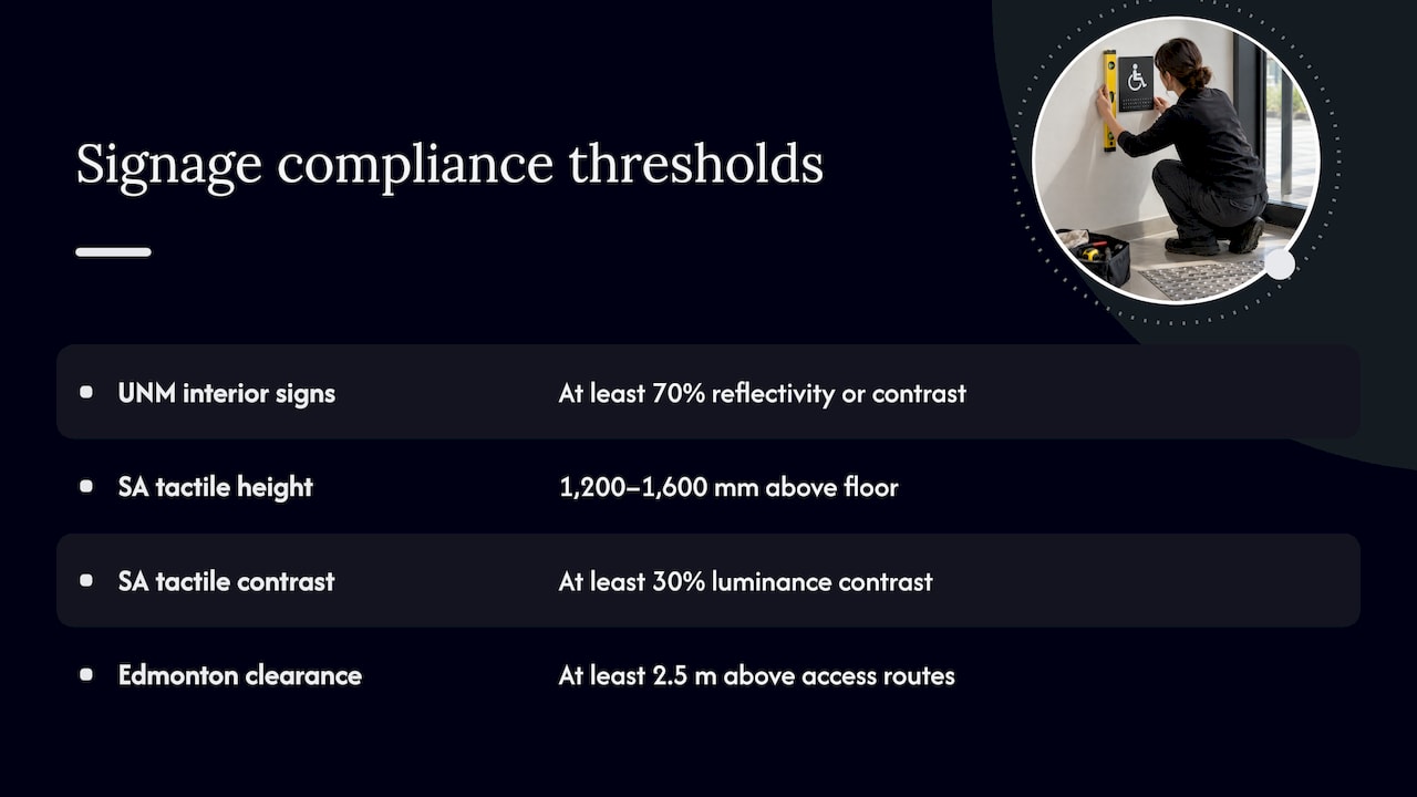
Accessibility. For interior signs, the University of New Mexico’s signage standards require at least 70% reflectivity or contrast between graphics and background, day and night, lit and unlit, and fonts that comply with ADA width-to-height and stroke-to-width ratios. That is one campus’s standard, not a universal law, but it shows the level of contrast and type control that accessible signage aims for. The ADA requirements that apply to your building depend on its use, so confirm them with your local building department or an accessibility specialist before ordering permanent room signs.
Mounting heights vary by country. South Australia’s guidance places raised tactile and Braille signs 1,200 to 1,600 mm above the floor and calls for at least 30% luminance contrast. Do not use that number for a US project. Use the ADA standards and your local code.
Local zoning. Cities regulate size, height, lighting and clearance. As one example from Canada, Edmonton’s zoning bylaw requires at least 2.5 m of vertical clearance for signs above vehicle access, driveways, drive aisles or pedestrian paths, with listed exceptions. Your city will have its own figures, so call the planning or permitting office before you finalize a permanent exterior sign. For listing signs, our real estate sign compliance guide covers what to check.
Prepare your artwork and brief
A complete brief shortens the quote and cuts revisions. Gather these before you ask:
- Location and mounting: wall, post, window, fence, vehicle panel or freestanding.
- Viewing distance and traffic speed, so letter size can be calculated.
- Final size, with the space the sign must fit.
- Logo files in vector format if you have them, plus brand colors.
- Exact wording, proofread, with phone numbers and web addresses checked.
- Indoor or outdoor use, and how long the sign must last.
- Any permit, landlord or HOA rules that apply.
The Bureau of Reclamation guide lists what a sign plan should settle: an overall design theme, the substrate, fabrication method, post style, and mounting and installation specifications. You can use the same checklist for a storefront or a property.
When you request pricing, our page on custom sign quotes explains what affects the number and what we need from you.
Perspective: why we start with the viewer, not the artwork
Most sign problems we see are not printing problems. They are planning problems. A logo that looks great on a laptop gets sent to a 10-foot banner with a paragraph of text under it, and nobody asks who will read it, from where, and for how long.
We begin every project with the location and the viewer. How far away will they be? Are they driving, walking or waiting? What is the one thing they must take away? Once that is settled, the size, materials and layout follow naturally, and the sign does its job instead of just decorating a wall.
That is why we handle the whole path: consultation, design, compliance guidance, fabrication and certified installation. A sign should match your brand and its surroundings, and it is easier to get that right when one team sees the project from the first conversation to the last bolt. Whether it is a storefront, a fleet of vehicles, a listing or an event, our aim is the same: a sign that gets read.
Yossi
Start your sign project with us
If you have worked through the steps above, you are ready for a quote. We design and produce custom signs for businesses, property managers, real estate agents and event organizers, from exterior and interior signs to banners, vehicle graphics, vinyl, window and wall graphics, and printed materials. Tell us where the sign will go, how far away people will see it and what it needs to say, and we will guide you on size, materials and installation.

See our custom signs offer, or request a quote and send your location details and logo files.
FAQ
How big should the letters on my sign be?
A common minimum is 1 inch of letter height for every 25 feet of viewing distance, according to the International Sign Association. A sign read from 100 feet needs letters of at least 4 inches. Go larger when the lettering is decorative or traffic is fast.
How many words and colors should a business sign use?
Keep the words to the essentials: name, what you do and one contact detail. University of Maryland Extension recommends no more than three colors and 30% to 40% white space. Fewer words let you use bigger letters, which is what makes a sign readable at a distance.
Can I use the same design for indoor and outdoor signs?
You can keep the same brand colors, fonts and logo, but the materials and sizes usually change. Outdoor signs need weather-resistant substrates and larger letters for distance, while indoor signs are read up close and may need accessibility features. We can adapt one brand system across both.
Do I need a permit for a sign?
Often yes for permanent exterior signs, because cities regulate size, height, lighting and placement. Rules differ by municipality, so check with your local planning or permitting office before production. We can walk you through what to ask and design to the limits you are given.
Sources
- Signs and Signage planning primer, Jefferson County, NY
- Design Resource 3.2 Signs, thisisud.com
- Model Sign Code, 2019 Edition
- What’s Your Sign? University of Maryland Extension
- Design & Placement of Signs, International Sign Association
- Arts and Science of Sign Design, executive summary
- Digital Signage Design: Rules and Best Practices
- Parking lot and jobsite sign installation overview
- Sign Guidelines for Planning, Designing, Fabricating, Bureau of Reclamation
- ISO 28564-3:2019 information index signs
- Accessible Wayfinding and Signage Toolkit, South Australia
- University of New Mexico interior signage standards
- 6.90 Signs, City of Edmonton Zoning Bylaw