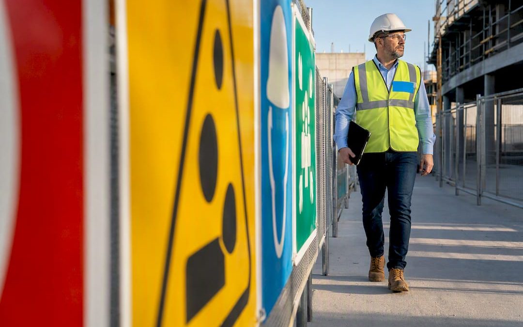
Every safety sign on the planet falls into one of four categories: Prohibition, Warning, Mandatory, and Safe Condition (which covers emergency and fire equipment signage). Each category has its own color, shape, and job to do, and international standards like ISO 7010, ANSI Z535, and OSHA’s sign regulations all agree on the basic framework, even if the fine print differs. The rest of this guide walks through what each category looks like, where to put it, and how to keep it legally sound.
TL;DR:
- Proper placement is crucial, with signs mounted at eye level, directly on hazards, and sized for visibility from a worker’s typical standing distance.
- Signage color and shape must match the hazard’s severity, with red for fire equipment, yellow for warnings, blue for instructions, and green for safety conditions, per ISO, OSHA, and ANSI standards.
- Regular inspections should catch fading, damage, or misplacement; signs older than their recommended lifespan or obscured by clutter must be replaced promptly.
- International businesses should use ISO 7010 symbols paired with local language text, ensuring clarity and compliance across diverse regulatory environments.
- Custom signage solutions built to standards offer durable, site-specific options, with guidance on design, materials, and placement to meet legal and safety requirements.
Table of Contents
- The Four Types of Safety Signs, Explained
- Prohibition Signs: What They Look Like and When to Use Them
- Warning Signs: Visual Cues and the Hazards They Flag
- Mandatory Signs: Required Actions, Not Just Restrictions
- Safe Condition and Emergency Signs: Exits, First Aid, and Fire Equipment
- Colors, Shapes, and Standards: ISO 7010, ANSI Z535, and OSHA Basics
- How to Display Safety Signs: Placement, Size, and Legibility
- Publisher Expertise: How Custom Signs Today Helps Organizations Meet Signage Needs
- History and Evolution of Safety Sign Categories
- Legal Requirements and Compliance Implications for Businesses
- Cultural Variations and International Differences in Safety Sign Interpretation
- Maintenance and Regular Inspection Procedures for Safety Signs
- A Practitioner’s Take on Where Signage Programs Go Wrong
- How Custom Signs Today Can Help: Request a Quote for Compliant Safety Signs
- Sources
The Four Types of Safety Signs, Explained
Safety professionals sort every hazard sign into one of these four buckets because doing so lets a worker recognize the message before they even read the words. A red circle means stop. A yellow triangle means look out. A blue circle means do this. A green square means safety is here. That visual shorthand is the entire point of standardized signage, and it’s why a warehouse worker in Ohio and a factory floor supervisor in Osaka can both glance at the same pictogram and understand it instantly.
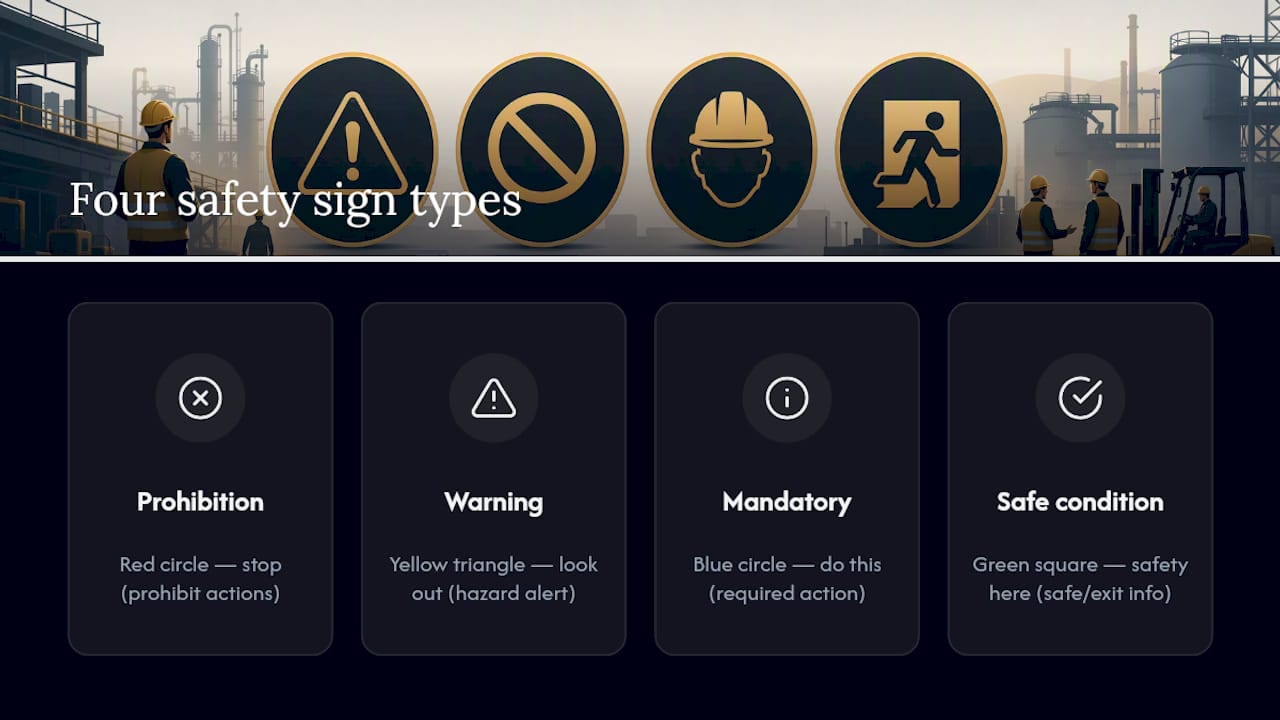
The system isn’t arbitrary. It grew out of decades of accident data, workplace fatalities, and a slow international push to make hazard communication less dependent on any single language. Below, each category gets its own breakdown, starting with the one most people picture first when they hear “safety sign.”
Prohibition Signs: What They Look Like and When to Use Them
A prohibition sign tells someone to stop doing something, or to never start. The format is instantly recognizable: a red circle with a diagonal bar running through a black pictogram, set against a white background. That red circle and slash combination reads as “do not” almost universally, which is exactly why regulators built the format around it rather than relying on text alone.
Common examples include:
- No smoking
- No open flame or ignition sources
- No entry for unauthorized personnel
- No use of mobile phones near flammable materials
- No pedestrian access in forklift zones
Place prohibition signs at entrances, on or near the equipment involved, and at any point where someone might be tempted to take a shortcut that creates risk. A “no entry” sign belongs at the doorway itself, not fifty feet down the hallway where it’s too late to matter. Custom Signs Today’s visual guide to prohibition signs breaks down the exact specs if you’re sourcing signage for a specific hazard.
Warning Signs: Visual Cues and the Hazards They Flag
Warning signs use a yellow triangle with a black border and black pictogram, and their job is to flag a hazard that requires caution rather than an outright ban. The shape matters as much as the color. A triangle reads differently than a circle, and that distinction is baked into both ISO and ANSI conventions on purpose.
Typical warning signs cover:
- Slippery or wet floor surfaces
- High voltage or electrical hazards
- Falling or overhead objects
- Hot surfaces or machinery
- Biological or chemical hazards
Not every hazard belongs on a plain warning sign, though. Under OSHA’s accident prevention sign specifications and the ANSI Z535 signal-word hierarchy, a hazard capable of causing serious injury or death gets escalated to a “Danger” sign with red and black panels, not just a yellow warning triangle. That escalation matters legally: mislabeling a lethal hazard as a routine “Caution” sign can become a liability issue if an incident occurs.
Mandatory Signs: Required Actions, Not Just Restrictions
Mandatory signs tell people what they must do, not what to avoid, and that distinction is what separates them from prohibition signs. The format is a blue circle or blue panel with a white pictogram, and the blue color code is consistent across ISO and most national standards precisely because it signals instruction rather than restriction.
Common mandatory signs include:
- Wear eye protection
- Wear hearing protection
- Wear a hard hat
- Use the designated walkway
- Wash hands before returning to work
Mandatory signage does more than remind workers of a rule. It reinforces training and gives supervisors a defensible paper trail if a compliance question ever comes up. A facility that pairs its PPE training program with clearly posted mandatory signs has a much easier time proving due diligence than one relying on verbal instructions alone. For examples specific to events and temporary job sites, Custom Signs Today’s guide to identifying mandatory signs covers scenarios beyond the standard factory floor.
Safe Condition and Emergency Signs: Exits, First Aid, and Fire Equipment
This fourth category splits into two color codes that people often confuse. Green signs mark safe conditions, including exits, first aid stations, and assembly points. Red signs mark fire equipment specifically, like extinguishers, hose reels, and fire alarm call points. Both use white pictograms, and both need to be recognizable in a split second because that’s exactly the condition under which someone reads them.
Standard examples include:
- Running man icon for emergency exits
- Green cross for first aid stations
- Fire extinguisher pictogram in red
- Fire alarm call point signage
- Assembly point markers for evacuation
Contrast and illumination aren’t optional extras here. A fire exit sign that’s readable in daylight but invisible during a smoke-filled evacuation isn’t doing its job, which is why photoluminescent and internally lit exit signs are standard in most commercial buildings. Egress routes should get priority placement over other emergency signage since evacuation speed is the metric that actually saves lives.
Colors, Shapes, and Standards: ISO 7010, ANSI Z535, and OSHA Basics
ISO 7010 is the international reference point for safety signs, and it’s larger than most people expect.
Statistic Callout: The ISO 7010 registry contains over 200 registered safety symbols spread across five categories, each with a fixed reference number used in procurement specs and facility plans. That number system means a “no smoking” symbol ordered in Germany matches the one ordered in Brazil, pixel for pixel.
In the United States, two frameworks work alongside each other rather than against one another. OSHA 1910.145 sets the legal floor, specifying sign and tag classifications like danger, caution, and safety instruction. ANSI Z535 goes further, defining the actual format, including signal-word headers, symbol placement, and legend structure. Many compliance consultants recommend following ANSI Z535’s formatting even where OSHA’s rule only sets a minimum legal specification, because the added visual hierarchy reduces ambiguity in high-risk settings.
The rule of thumb worth memorizing: red stops or marks fire equipment, yellow warns, blue instructs, green marks safety. Get that sequence right and you’ll correctly guess the function of nearly any sign you encounter, anywhere in the world.
How to Display Safety Signs: Placement, Size, and Legibility
A sign that’s technically correct but poorly placed does almost nothing. Effective display comes down to a short list of rules that inspectors check every time.
- Mount at eye level and keep the line of sight unobstructed by shelving, equipment, or foot traffic.
- Position signs directly on or beside the hazard, not in a general area nearby where the connection isn’t obvious.
- Size the lettering and pictograms so they’re readable from the distance a worker would realistically be standing, not just up close.
- Maximize contrast and lighting, especially for signs that need to work in emergencies or low-light conditions.
- Use permanent signs for permanent hazards, and reserve tags strictly for temporary or changing conditions.
That last point trips up more facilities than any other. OSHA draws a clear line between tags and signs: tags are meant for temporary situations, like a piece of equipment that’s out of service for repair, while signs are meant for permanent hazards. Leaving a tag hanging on a control panel for two years because nobody got around to ordering a proper sign is a common citation point during inspections.
Pro Tip: Walk your facility once a quarter specifically looking for tags that have quietly become permanent fixtures. If a tag has been in place longer than the repair it was meant to flag, it needs to be replaced with a real sign.
Publisher Expertise: How Custom Signs Today Helps Organizations Meet Signage Needs
Custom Signs Today designs and fabricates compliance signage built around the standards outlined above, using materials rated for both indoor and outdoor exposure so signs hold up under sun, moisture, and heavy foot traffic.
Every sign order can be customized for size, mounting type, and pictogram set, whether the job calls for a single mandatory PPE sign at a loading dock or a full site-wide package covering prohibition, warning, mandatory, and emergency categories together. For teams building a signage plan from scratch, Custom Signs Today’s guide to compliant signage walks through material choices and layout decisions in more depth.
History and Evolution of Safety Sign Categories
Safety signage as a formal system is younger than most people assume. Early industrial workplaces relied on written notices, which meant illiterate workers and non-native speakers were routinely left out of hazard communication entirely. That gap became impossible to ignore as factories, mines, and shipyards grew more mechanized through the early twentieth century, and injury rates climbed alongside them.
The shift toward symbol-based signage picked up momentum after World War II, as international trade and labor migration made single-language signs increasingly impractical. A pictogram doesn’t care what language a worker speaks, and that language independence became the organizing principle behind the modern four-category system. Standards bodies leaned into symbols specifically because they reduce dependence on text, which matters enormously on a construction site where crews might speak five different first languages.
ISO formalized its symbol registry over several revisions, consolidating national variations into a single international reference. The United States took a parallel but distinct path, with OSHA setting legal minimums starting in the 1970s and ANSI refining the visual format over subsequent decades. The two systems overlap heavily in colors and shapes, which is no accident. Harmonization between national and international standards was always the goal, even if full alignment took decades to reach.
What hasn’t changed is the underlying logic: color and shape carry the first layer of meaning, and text or pictogram detail carries the second. That two-layer design is what makes the system durable across a century of industrial change.
Legal Requirements and Compliance Implications for Businesses
Safety signage isn’t optional decoration. In the United States, OSHA 1910.145 sets binding requirements for how accident-prevention signs and tags must be designed and used in general industry workplaces, and OSHA’s construction standards under 1926.200 add specific requirements for job sites, including exit sign lettering and caution panel colors. Failing to meet these specifications isn’t just a paperwork problem. It’s the kind of gap that shows up during an OSHA inspection and can trigger citations, fines, or worse, a liability claim after an injury.
The compliance stakes go beyond the sign itself. Regulators and courts often look at whether a hazard was reasonably communicated, and a missing or incorrect sign can become evidence of negligence in a workplace injury case. That’s true whether the business is a manufacturing plant, a retail store, or a construction site with rotating subcontractors who’ve never seen the facility before.
Businesses operating internationally face an added layer of complexity, since ISO 7010 governs symbol design in most countries outside the U.S., and local regulators sometimes layer their own requirements on top of it. A multinational company running facilities in three countries can’t assume the signage that satisfies OSHA will automatically satisfy a European or Asian regulator. The safest approach is treating signage compliance as an ongoing responsibility tied to facility audits, not a one-time purchase made when a building opens. Signs age, hazards change, and regulations get updated. Any of those shifts can turn a compliant sign into a liability overnight.
Cultural Variations and International Differences in Safety Sign Interpretation
Color and shape conventions travel well across borders, but interpretation isn’t perfectly universal. Red reads as “danger” or “stop” in most cultures, largely because of its association with fire and blood, but the intensity of that association varies. Some research into cross-cultural sign perception has found that certain pictograms, particularly ones involving human figures or specific gestures, can carry different connotations depending on regional context, even when the underlying hazard is identical.
This is part of why ISO 7010’s registered symbol library matters so much for companies operating across multiple countries. Rather than each country inventing its own visual language for “wear eye protection” or “no smoking,” the registry gives every member country the same tested pictogram with a fixed reference number. That consistency reduces the risk of a symbol being misread by a worker who’s used to a different national convention.
Text still matters at the margins, even in a symbol-first system. Many countries require supplemental text in the local language beneath the pictogram, particularly for high-severity hazards where a misunderstanding could be fatal. A facility with a genuinely international workforce sometimes needs multilingual signage that pairs the standardized ISO pictogram with two or three language versions of the same instruction stacked underneath.
The practical lesson for any business managing multiple locations: don’t assume a sign that works perfectly in one country will land the same way somewhere else. Check local regulatory requirements, and lean on the ISO symbol as the visual anchor while adjusting text and supplemental language to match the workforce actually reading it.
Maintenance and Regular Inspection Procedures for Safety Signs
A sign that’s faded, cracked, or partially obscured is functionally the same as no sign at all, which is why maintenance deserves the same attention as initial installation. Faded red panels can drift toward pink or orange over years of UV exposure, at which point the color no longer reads correctly against the standard it’s supposed to represent.

Signs should be replaced when they’re faded, physically damaged, or when the underlying hazard or operation changes, not just when someone happens to notice the problem. Reflectivity and brightness matter just as much as color accuracy, particularly for exit signs and fire equipment markers that need to perform in smoke or low visibility. A photoluminescent exit sign that’s lost its charge capacity after a decade of service isn’t going to glow the way it did when it was installed, even if it still looks fine under normal lighting.
A practical inspection routine covers three things on a recurring schedule: visual condition (fading, cracking, peeling), physical placement (still unobstructed, still mounted securely), and relevance (does the sign still match the hazard actually present). Facilities that fold sign checks into their existing safety audit calendar, rather than treating signage as a separate task, tend to catch problems faster. A quarterly walkthrough paired with a more thorough annual review covers most of what regulators expect to see, and it catches the kind of slow degradation that’s easy to miss day to day but obvious the moment an inspector points it out.
A Practitioner’s Take on Where Signage Programs Go Wrong
The same three mistakes show up in facility after facility. Wrong color choice tops the list, usually a warning sign used where a mandatory blue sign belongs. Poor placement is second, signs mounted where they’re technically present but practically invisible behind equipment or clutter. Third is the tag-as-permanent-sign problem, where a temporary fix quietly becomes a fixture nobody revisits.
Fix them in that order: audit colors against ISO or ANSI categories first, walk the floor for visibility second, and replace any tag older than its original repair window third. A short compliance review now costs far less than an incident report later.
— Yossi
How Custom Signs Today Can Help: Request a Quote for Compliant Safety Signs
Custom Signs Today is the practical answer for businesses that need signage built to the standards covered above, not a generic template pulled off a shelf. Every order is designed around your specific hazards, using durable materials rated for indoor or outdoor exposure, with layouts that follow ISO, ANSI, and OSHA color and format conventions from the start.

Whether you need a single mandatory PPE sign for a new equipment install or a full site package covering prohibition, warning, mandatory, and emergency categories, the process starts with a straightforward custom sign consultation where materials, sizing, and installation guidance get worked out before anything goes into production. If you’re not sure what a project will cost, Custom Signs Today’s quote guide walks through what to expect before you request pricing. Reach out today to get a free quote and turn your compliance checklist into signage that’s actually installed and working.
Sources
- ISO 7010:2019 – Graphical symbols — Safety colours and safety signs — Registered safety signs
- 1910.145 – Specifications for accident prevention signs and tags. | Occupational Safety and Health Administration
- ANSI Z535 series overview (ANSI webstore summary)