Did you know that over 60 percent of shoppers say poor or confusing signage prevents them from entering a business? The right custom sign does much more than decorate a space. It shapes your first impression, communicates vital information, and guides visitors where they need to go. Choosing the right design and materials for your signs can mean the difference between attracting customers and losing them to competitors who invest in clear, intentional branding.
Quick Summary
| Key Point | Explanation |
|---|---|
| 1. Define your sign’s purpose clearly | Understanding your sign’s primary objective guides its design and effectiveness as a communication tool. |
| 2. Choose appropriate materials for context | Material selection should reflect the environment and brand image, ensuring durability and visual appeal. |
| 3. Employ impactful branding elements in design | Incorporating brand colors, fonts, and logos creates a recognizable and cohesive visual presence for your signage. |
| 4. Ensure print-ready file specifications | Preparing print files with correct formats, resolution, and bleed areas is vital for quality production outcomes. |
| 5. Conduct comprehensive proof reviews | A meticulous review of proofs can catch errors in text, color, and layout, preventing production mistakes. |
Table of Contents
- Step 1: Identify Sign Purposes And Key Requirements
- Step 2: Select Optimal Materials And Sizing Options
- Step 3: Create Impactful Designs Using Branding Elements
- Step 4: Prepare Print-Ready Files And Specifications
- Step 5: Review, Approve, And Quality-Check Final Proofs
Step 1: Identify sign purposes and key requirements
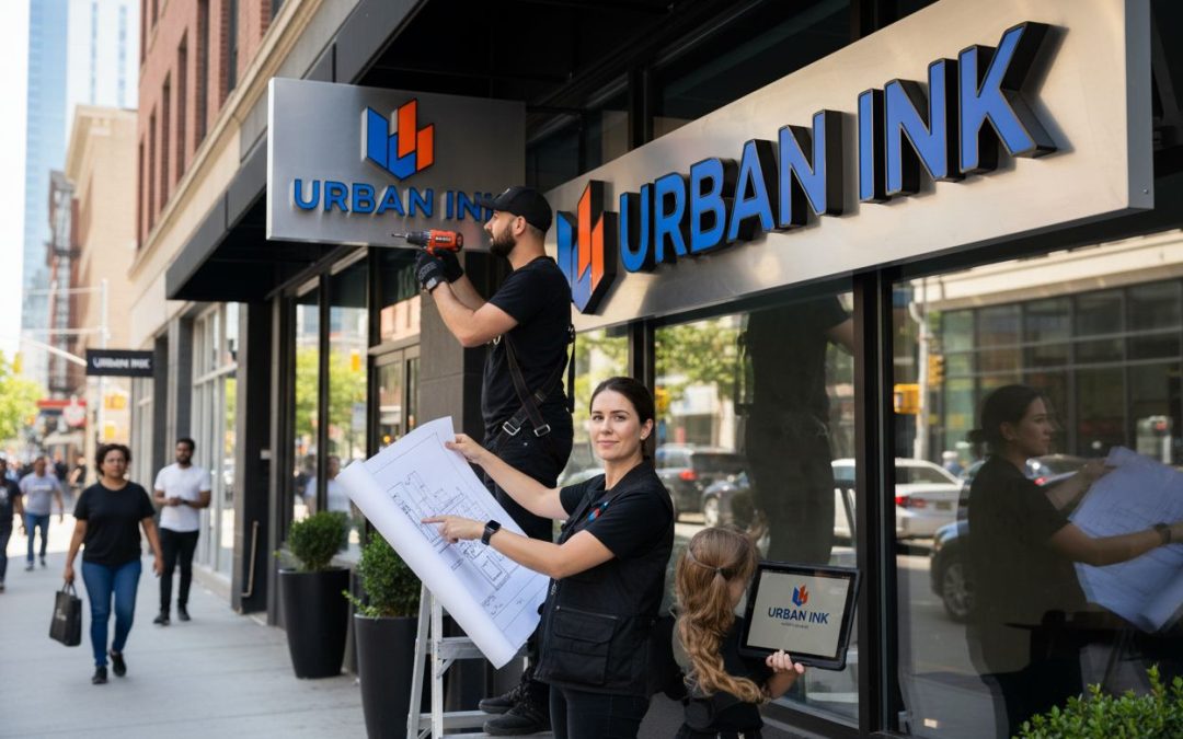
When designing custom signs for your business, the first critical step is understanding exactly why you need the sign and what specific goals it needs to achieve. Your sign isn’t just a piece of visual decoration it’s a strategic communication tool that represents your brand and communicates critical information to your audience.
Start by determining the primary purpose of your sign. According to research from The Loyal Brand, your signage typically falls into four core categories: branding and business identity, promotional messaging, wayfinding or informational communication, and regulatory or safety notifications.
For branding signs, focus on creating a visual representation that instantly communicates your company’s personality. This means selecting colors, fonts, and design elements that align closely with your existing brand guidelines. Promotional signs should grab attention and clearly communicate a specific message or offer. Wayfinding signs need to be exceptionally clear and readable from a distance, while regulatory signs must meet specific legal requirements.
A key consideration is understanding your audience and viewing context. Professionals recommend using font sizes that ensure readability based on expected viewing distance approximately 1 inch of letter height per 10 feet of viewing distance. This ensures your message remains legible and impactful.
Pro Tip: Always test your sign design by viewing it from the actual intended distance and angle to confirm its effectiveness.
As you move forward, remember that your sign’s purpose will directly influence its design strategy. A sign meant for close personal interactions will look very different from one designed to be seen from a passing vehicle or across a large space. Take time to truly understand your specific communication needs before diving into design details.
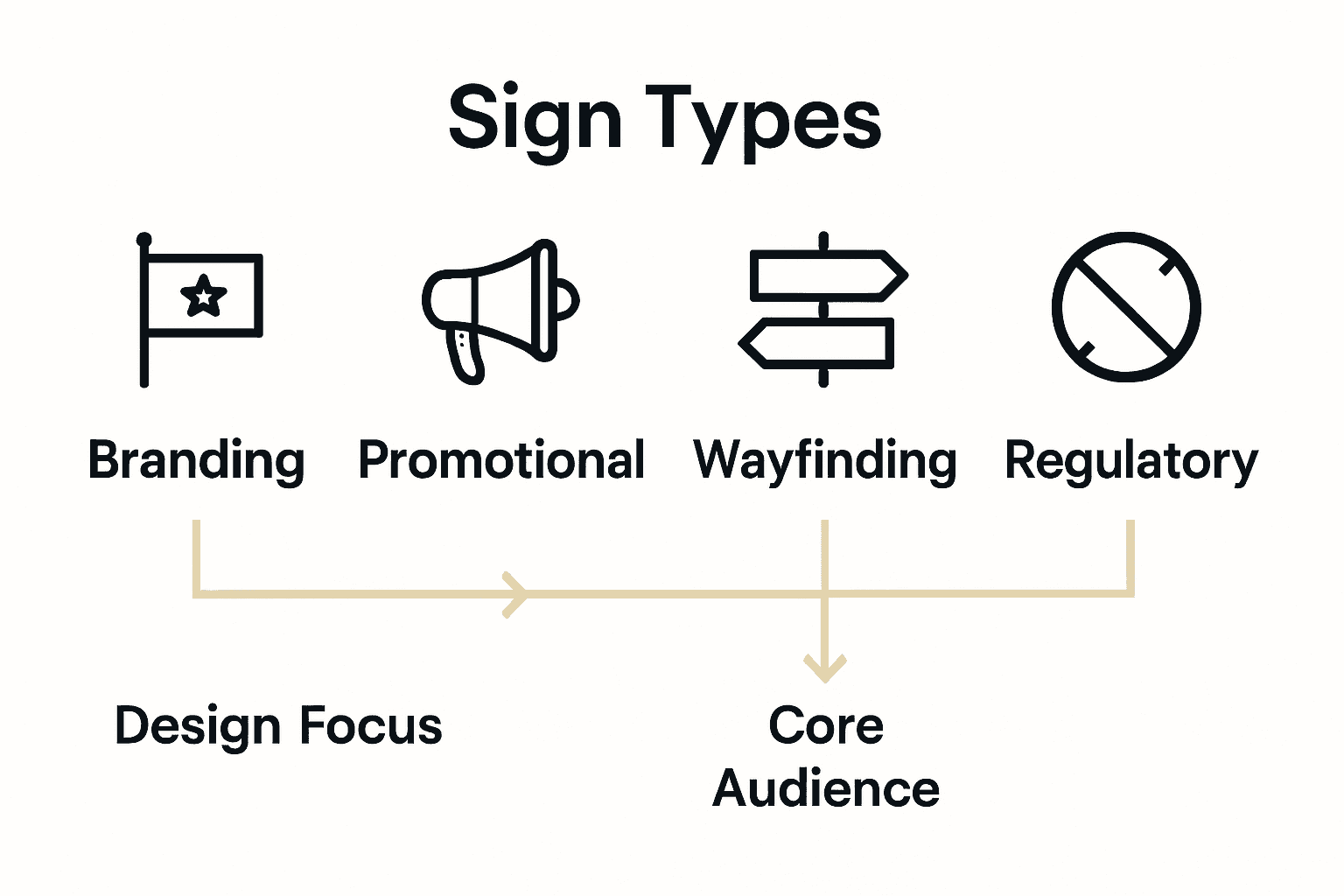
Here’s a comparison of sign types and their key design requirements:
| Sign Type | Main Purpose | Key Design Focus | Audience Consideration |
|---|---|---|---|
| Branding | Brand identity | Brand colors Logo use |
Consistent with brand image |
| Promotional | Highlight offer/message | Bold graphics Clear headlines |
Immediate attention Impulse |
| Wayfinding | Navigation Information |
Large text Clarity |
Readable from distance |
| Regulatory/Safety | Compliance Safety notices |
Legal symbols Contrast |
Meets regulations Fast insight |
In the next step, we will explore how to translate these purpose insights into a compelling visual design that captures attention and drives your desired outcome.
Step 2: Select optimal materials and sizing options
Once you’ve defined your sign’s purpose, the next crucial step is selecting materials and sizing that will maximize your sign’s visual impact and durability. This decision goes far beyond simple aesthetics and involves strategic considerations about your environment, brand perception, and long term performance.
According to research from Big Sign FX, material selection should be primarily driven by your specific usage context. For outdoor signs exposed to harsh weather conditions, aluminum offers exceptional durability and resistance. Indoor environments allow more flexibility with lighter materials like foam or vinyl that can be more cost effective.
Your material choice also communicates subtle brand messaging. As experts from Sarasota Sign Shop suggest, different materials evoke distinct brand perceptions. Wooden signs can suggest warmth and traditional craftsmanship while metallic finishes project a modern sleek professional image. Consider how the material itself tells a story about your business.

Size matters dramatically when it comes to sign effectiveness. You’ll want to calculate dimensions based on viewing distance and environmental context. A sign meant for highway visibility requires different sizing compared to one intended for a storefront window. Consider proportions that allow your text and graphics to be readable from the expected distance.
Pro Tip: Always mock up your sign design at actual size and view it from multiple perspectives to ensure optimal visual communication.
Additionally, explore lighting options that can dramatically enhance visibility. LED or backlit finishes can transform a standard sign into a powerful communication tool especially during evening hours or in low light environments.
As you finalize your material and size selections, remember that this choice is an investment in your brand’s visual communication strategy. In our next section we will dive into designing graphics and typography that make your carefully selected sign truly sing.
Step 3: Create impactful designs using branding elements
With your sign’s purpose and materials selected, it is time to transform your vision into a compelling visual design that truly represents your brand. Design is where strategy meets creativity turning your sign from a simple communication tool into a powerful marketing asset.
According to research from All Time Design, the key to creating impactful signage lies in consistent and strategic use of your brand elements. This means deliberately incorporating your brand colors, fonts, and logo in a way that feels authentic and immediately recognizable.
Visual hierarchy is crucial for capturing audience attention. As experts from AGC Signs suggest, people typically scan visual information using a Z pattern. Design your layout to guide the viewer’s eye naturally through the most important information first. Use sans serif fonts for maximum readability and ensure your text size allows for easy reading from the expected viewing distance.
Color plays a massive role in design effectiveness. Select a color palette that matches your brand identity but also provides strong contrast to ensure readability. Dark text on light backgrounds or vice versa works best for visibility. Remember that your color choices communicate subtle emotional messages about your brand.
Pro Tip: Always test your design in multiple lighting conditions to ensure consistent legibility and impact.
While maintaining brand consistency is important, avoid cluttering your design. Be concise with messaging and focus on communicating one clear primary message. Each element should serve a specific purpose and contribute to your overall communication goal.
In our next section we will explore how to fine tune your design and prepare it for professional production.
Step 4: Prepare print-ready files and specifications
Transitioning from design to production requires precision. Preparing print-ready files is a critical step that determines whether your sign will look exactly as you envisioned or fall short of your expectations.
According to Jukebox Print, professional print files must meet specific technical requirements. The most universally accepted file formats include PDF, Adobe Illustrator (AI), Photoshop (PSD), EPS, TIFF, and high resolution JPG. However PDF is typically the most reliable format for ensuring consistent reproduction.
Resolution is paramount. Your design should be created at a minimum of 300 dots per inch (dpi) to guarantee crisp and clear output. Color mode matters significantly too. Professional printers work in CMYK color space not RGB which means you’ll need to convert your design before submission.
As experts from Royal Printers recommend, include a 0.125 inch bleed area around your design. This extra space ensures that your sign graphics extend fully to the edges without any white borders or unexpected cutoffs. Additionally create a safe zone inside your design where critical text and logos remain protected from potential trimming.
Pro Tip: Always outline or embed your fonts to prevent unexpected typography issues during printing.
Font handling requires special attention. Converting text to outlines or embedding fonts guarantees that your original design remains intact regardless of the printer’s available typefaces. This step prevents potential last minute design shifts that could compromise your sign’s visual impact.
Before sending your files, confirm all material and finishing specifications with your sign production team. Each detail from color calibration to material texture can influence your final product.
In our final section we will explore how to select the right production partner to bring your sign design to life.
Step 5: Review, approve, and quality-check final proofs
You are now at the most critical moment of your sign design journey where careful review can prevent costly mistakes and ensure your vision becomes reality. This final proofing stage is your last opportunity to catch and correct any potential errors before production begins.
According to Jukebox Print, your proof review should be comprehensive and methodical. Start by checking every single text element for accuracy. Verify spelling, grammar, contact information, and ensure all text is correctly positioned and readable.
Color accuracy is another crucial consideration. As experts from Lawton Repro recommend, confirm that your colors match your original design exactly. This means carefully comparing the proof against your original digital files and checking that CMYK conversions have not altered your intended color palette.
Visual elements require equally meticulous examination. Check that images are sharp, logos are crisp, and graphic elements align perfectly. Pay special attention to resolution and how design elements interact across different areas of the sign. Look for any pixelation uneven color or unexpected shifts in visual quality.
Pro Tip: Print a small test version of your proof to see how colors and details translate in physical form.
Beyond visual inspection, confirm that technical specifications match your original requirements. Verify bleed areas, safe zones, and that crop marks are correctly positioned. Ensure font embeddings are correct and that transparency effects have been properly flattened.
Before giving final approval, request a physical or digital proof that exactly represents the final output. This allows you to catch any potential issues that might not be visible in digital previews.
Once you’ve thoroughly reviewed and approved your proof your sign is ready to move into production bringing your visual branding vision to life.
Turn Your Custom Sign Design Into Real-World Impact
You have read how crucial strategy, purpose, and technical precision are for creating effective custom signage. But translating your visual branding ideas into professional signs can be overwhelming. Many business owners struggle with choosing durable materials, the right sizing, and ensuring designs look flawless in print. The pressure to get every detail right for your brand image is real. That is where our expertise at Custom Signs Today bridges the gap.

Take the stress out of sign creation and bring your vision to life with our custom signage solutions. Partner with us for high-quality banners, decals, vehicle wraps, and more—all customizable to your exact needs. See all our service categories and options here. Let our team help you confidently move from design to finished product. Visit Custom Signs Today now and request your free quote to make your brand stand out. Do not miss the chance to turn your impactful design into a powerful reality.
Frequently Asked Questions
What are the key steps to design custom signs for impactful visual branding?
Start by identifying the purpose of your sign, such as branding, promotional messaging, or wayfinding. Once defined, choose optimal materials and sizes that align with your goals, and create a design using your brand’s elements for consistent recognition.
How do I ensure my sign’s message is clear and readable from a distance?
Use a font size that increases by 1 inch for every 10 feet of viewing distance. Test your design by viewing it from the intended distance and adjust as necessary to enhance readability.
What materials are best for different environments when designing signs?
Choose durable materials like aluminum for outdoor signs, while lighter materials such as foam or vinyl are ideal for indoor use. Consider the specific weather conditions and location to ensure longevity.
How can I effectively incorporate my brand colors and fonts into my sign design?
Use your brand colors and fonts consistently throughout the sign to maintain brand identity. Aim for strong contrast between text and background for visibility, ensuring core elements are easily recognizable.
What technical specifications should I follow to prepare print-ready files for my sign?
Ensure your design is at least 300 dpi and in CMYK color mode, with a 0.125 inch bleed area for edge coverage. Double-check that fonts are outlined or embedded to avoid unexpected changes.
How can I conduct a thorough proof review before sign production?
Examine every text element for accuracy, confirm color matching, and ensure all visual components are sharp and correctly positioned. Printing a small test version can help identify issues not visible on digital previews.