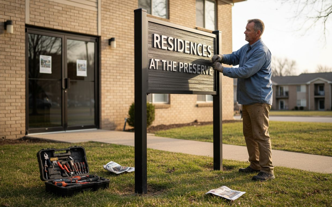
Over 60% of American property managers say that clear signage directly impacts both visitor experience and brand perception. The right sign design is more than just a formality. It determines how easy it is to find your location, understand directions, or make a lasting first impression. This practical guide walks you through every step of creating property signage that lasts, stands out, and truly serves its American audience.
Table of Contents
- Step 1: Identify Signage Goals And Requirements
- Step 2: Select Materials And Sizing For Longevity
- Step 3: Develop Layout And Visual Hierarchy
- Step 4: Choose Fonts, Colors, And Branding Elements
- Step 5: Review, Approve, And Test Final Design
Quick Summary
| Key Point | Explanation |
|---|---|
| 1. Define Clear Signage Goals | Establish specific objectives to guide the design process and ensure effective visual communication. |
| 2. Select Durable Materials | Choose appropriate materials based on environmental conditions to enhance longevity and visibility. |
| 3. Create a Strategic Layout | Implement an organized layout that directs the viewer’s attention and communicates the message effectively. |
| 4. Use Readable Fonts and Colors | Opt for clear fonts and high-contrast colors to maximize legibility and reinforce brand identity. |
| 5. Thoroughly Review Final Design | Conduct a detailed review to ensure compliance with objectives, regulations, and visual impact before production. |
Step 1: Identify Signage Goals and Requirements
Designing property signage starts with crystal clear goal definition. Your signage requirements will determine everything from design complexity to material selection, ensuring your visual communication strategy hits its intended target.
Begin by conducting a comprehensive assessment of your specific objectives. Are you aiming to increase property visibility, provide directional information, enhance branding, or comply with local regulations? Property signage design guidelines often emphasize the importance of creating signs that serve multiple strategic purposes while maintaining aesthetic standards. Evaluate key factors such as location visibility, target audience, environmental conditions, and regulatory constraints that might impact your sign design.
Your signage goals should align with broader business or property management objectives. Consider factors like target demographic, message clarity, readability from different distances, and potential impact on foot or vehicle traffic. A real estate property might require different signage approaches compared to a commercial office complex, so tailor your requirements precisely to your specific context.
Pro tip: Sketch preliminary design concepts before finalizing requirements. This helps visualize how different goals translate into actual signage and allows you to identify potential design challenges early in the planning process.
Step 2: Select Materials and Sizing for Longevity
Choosing the right materials and sizing for your property signage is crucial to ensuring durability, visibility, and long-term performance. Your selection will directly impact how effectively your sign communicates its message and withstands environmental challenges.
Material selection requires careful consideration of your specific property environment. For outdoor signage, prioritize weather-resistant materials like aluminum, acrylic, or high-grade PVC that can endure sunlight, rain, wind, and temperature fluctuations. Indoor signage offers more flexibility with materials such as wood, glass, or lightweight composites. Understanding types of promotional signage can help you navigate the best material choices for different contexts.
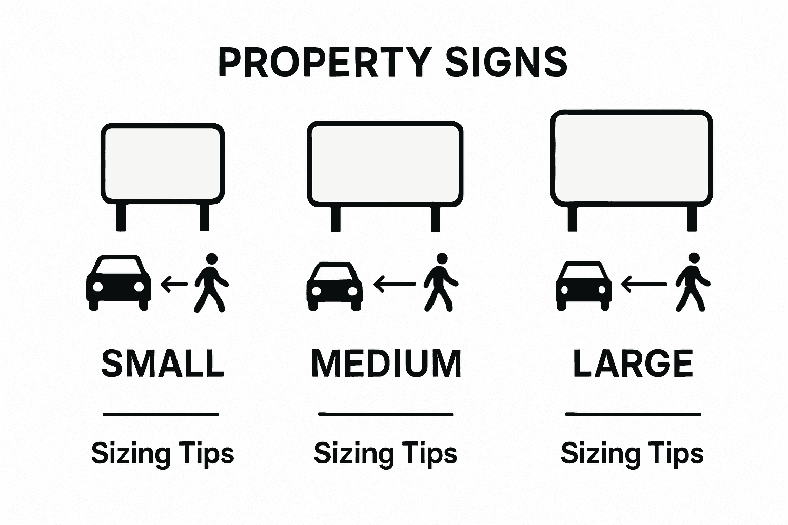
Sizing depends on several critical factors including viewing distance, location, traffic patterns, and local regulatory requirements. A sign placed near a highway needs different dimensions compared to one positioned at a building entrance. Measure potential viewing distances and consider how quickly people will pass by your sign. Ensure text remains readable and design elements remain clear even from different angles and speeds.
Pro tip: Request material samples before final production. This allows you to physically assess durability, color consistency, and how different materials interact with lighting conditions in your specific environment.
Here’s a summary of material options and their best-use scenarios for property signage:
| Material Type | Best Use Location | Durability Level | Typical Benefits |
|---|---|---|---|
| Aluminum | Outdoors | Very high | Rust-resistant, lightweight |
| Acrylic | Indoors & Outdoors | High | Modern look, weatherproof |
| High-Grade PVC | Outdoors | High | Affordable, versatile |
| Wood | Indoors | Medium | Warm aesthetics, custom shapes |
| Glass | Indoors | Medium | Premium finish, easy to clean |
| Lightweight Composites | Indoors | Moderate | Easy to install, cost-effective |
Step 3: Develop Layout and Visual Hierarchy
Designing an effective property sign requires strategic layout planning that guides the viewer’s eye and communicates your message with precision. Your visual hierarchy will determine how quickly and clearly people understand your sign’s purpose.

Sign design guidelines from municipal reviews emphasize creating layouts that define and enhance architectural elements without overwhelming visual space. When developing your sign layout, focus on creating a clear visual path that leads viewers through the most important information. Implement a strategic approach by using different font sizes, weights, and colors to create natural reading priorities. Larger, bolder text should highlight key messages, while secondary information can be presented in smaller, more subtle typography.
Adhere to professional design principles that maximize readability. Local design standards recommend maintaining 30% to 40% white space to ensure your sign remains clean and easy to comprehend. This approach prevents visual clutter and helps viewers quickly absorb your message. Consider the viewing distance and angle, ensuring that critical information stands out even when someone is passing by quickly.
Pro tip: Create multiple layout drafts and view them from different distances and perspectives. This helps you identify which design most effectively communicates your message and maintains visual clarity.
This table compares key visual hierarchy strategies for effective sign layouts:
| Visual Strategy | Purpose | Outcome for Viewer |
|---|---|---|
| Bold Headlines | Draw immediate attention | Instant understanding |
| Clear White Space | Reduce clutter | Easier message absorption |
| Contrasting Colors | Make text stand out | Enhanced readability |
| Hierarchical Fonts | Establish info priority | Quick content navigation |
Step 4: Choose Fonts, Colors, and Branding Elements
Selecting the right fonts, colors, and branding elements transforms your property signage from a simple communication tool into a powerful visual representation of your brand identity. This critical step requires careful consideration to ensure your sign speaks volumes about your property or business.
Local design guidelines recommend integrating signage that reflects architectural character, which means your font and color choices should harmonize with your property’s visual environment. Choose fonts that are clean, professional, and easily readable from a distance. Sans serif fonts often work best for signage, providing crisp legibility. Stick to two complementary fonts maximum one for headlines and another for supporting text to maintain a professional appearance.
Professional sign design requires strategic color selection that ensures maximum visibility and readability. Avoid color combinations that create visual strain, such as low contrast backgrounds and text. High contrast colors like dark text on light backgrounds or bright colors against neutral tones will make your sign pop. Incorporate your brand’s primary colors thoughtfully, using them to create visual interest while maintaining clarity. Ensure your color palette not only represents your brand but also remains legible in various lighting conditions.
Pro tip: Create a color mock-up of your sign design and view it under different lighting conditions and distances to verify readability and visual impact.
Step 5: Review, Approve, and Test Final Design
The final stage of property signage design requires meticulous review and validation to ensure your sign meets all functional and aesthetic requirements. This critical phase transforms your conceptual design into a professional, compliant visual communication tool.
Custom signage plan processes typically involve comprehensive review and approval steps, which include preparing detailed application materials and obtaining necessary regulatory permits. During your design review, carefully examine every aspect of the sign. Check for alignment with your original objectives, brand identity, and local regulatory standards. Verify text readability, color accuracy, material quality, and overall visual impact from multiple viewing angles and distances.
Property signage design guidelines recommend a systematic approach to finalizing your project, which includes requesting proposals from local sign companies, selecting the most suitable vendor, and conducting thorough design validation. Create multiple mockups and test them in different lighting conditions and environments. Seek feedback from colleagues or potential viewers to ensure your sign communicates its intended message effectively. Pay special attention to how the sign appears during different times of day and from various approach angles.
Pro tip: Request a full scale prototype or digital rendering before final production. This allows you to catch potential design issues and make precise adjustments without additional manufacturing costs.
Elevate Your Property Signage Design with CustomSignsToday.us
Designing property signage that truly stands out requires solving challenges like material durability, clear visual hierarchy, and brand consistency. This article highlights key goals such as ensuring maximum readability, selecting weather-resistant materials, and balancing aesthetic appeal with local regulations. If you want to avoid common pitfalls and make a lasting impact on your audience, professional guidance and high-quality custom solutions are essential.
At CustomSignsToday.us, we specialize in turning your signage vision into reality by offering a wide range of custom sign options tailored to your unique property needs. Whether you need banners, vehicle wraps, or directional signs, our expert team helps you create durable, visually striking signage that communicates your brand clearly and effectively. Explore our diverse services and discover how simple it is to bring your signage design to life. Start by visiting our Uncategorized category for inspiration and then head to our main site to request a free quote.

Ready to make your property signage work harder for you today Visit CustomSignsToday.us now to explore premium custom sign solutions designed for maximum impact and long-lasting results. Take the first step toward signage that truly represents your property’s identity and commands attention.
Frequently Asked Questions
What are the key goals to consider when designing property signage?
To effectively design property signage, identify specific objectives such as enhancing visibility, providing directional information, improving branding, or ensuring regulatory compliance. Begin by assessing what you want your signage to achieve and sketch preliminary design concepts to visualize these goals.
How do I select the best materials for outdoor signage?
Choose weather-resistant materials like aluminum, acrylic, or high-grade PVC for outdoor signage to ensure durability against environmental factors. Prioritize materials based on your property environment, testing samples in real conditions to ensure they meet your longevity requirements.
What factors should influence the sizing of my property signage?
Consider factors like viewing distance, location, and local regulations when determining the size of your property signage. Measure potential viewing distances and traffic patterns to ensure your sign remains readable and impactful from various angles and speeds.
How can I create a clear visual hierarchy in my sign layout?
Utilize different font sizes, weights, and colors to establish a visual hierarchy that guides the viewer’s eye. Focus on making bold headlines prominent, maintaining 30% to 40% white space, and implementing contrasting colors to enhance readability and emphasize key messages.
What steps should I take to ensure proper font and color selection?
Select professional, easily readable fonts and high-contrast colors to ensure visibility and brand alignment. Stick to a maximum of two complementary fonts for a polished look, and create mock-ups to test color combinations under various lighting conditions for optimal clarity.
How do I finalize my property signage design before production?
Conduct a thorough review of the design to ensure it aligns with your goals, brand identity, and legal standards. Create multiple mock-ups for testing and seek feedback, refining the design until you are confident it communicates effectively and meets all requirements.