A good sign is designed before it is fabricated. Decide what one message the sign must deliver, size the letters for the distance it will be read from, keep the words few, use strong contrast, and pick a material that suits where it will hang. Get those five things right and the sign does its job. Get one wrong and the best printing in the world won’t save it.
This guide walks through the decisions in the order you will face them, with the research behind each one. It is written for business owners, property managers, real estate agents and event organizers who are about to commission a sign and want to brief it well.
TL;DR
- Give the sign one job. On-premise signs should identify the business, mark its location, convey the right image and show what you sell.
- Size letters by distance: a common guideline is 1 inch of letter height for every 25 feet of viewing distance, and more if the lettering is fancy.
- Use few words, simple type and strong contrast. People glance at signs for less than a second.
- Match material and sign type to the location, then check accessibility and local sign rules before production.
- Send your brief with the viewing distance, location and message to get an accurate quote.
Table of Contents
- Start with what the sign has to do
- Write fewer words than you think you need
- Size the letters for the viewing distance
- Use contrast and white space on purpose
- Choose the sign type and material for the setting
- Place the sign where people can act on it
- Check accessibility and local rules before production
- How the design process works with us
- Our perspective
- Ready to brief a sign?
- Common mistakes to avoid
- FAQ
- Sources
Start with what the sign has to do
Before anyone opens a design file, write down the sign’s single purpose. The International Sign Association describes the job of an on-premise sign as identifying your business, marking where it is, conveying the right image and, most of all, telling customers what you are selling so they know what they will find inside.
That gives you a useful test. A storefront sign for a dental office should say the practice name and the word “dentist” clearly. It does not need the full service list, the phone number, the hours and a slogan. Those belong on the window, the website and the business card.
Different signs have different jobs, and the design follows:
| Sign type | Main job | What to put on it |
|---|---|---|
| Storefront or exterior sign | Identify and attract | Name, what you do, logo |
| Directional or wayfinding sign | Move people | Destination and arrow |
| A-frame or yard sign | Catch passing traffic | One offer or one name, one contact |
| Banner | Announce something temporary | Event or promotion, one call to action |
| Vehicle graphics | Advertise while moving | Name, service, phone or web address |
| Interior sign | Orient and reinforce brand | Room names, brand elements, rules |
If you are unsure which type fits your business, our guide to which types of outdoor signs fit your business best lays out the options.
Write fewer words than you think you need
The most common design mistake is too much copy. The University of Maryland Extension notes that the average person looks at a sign for less than a second, so fewer words and larger letters beat packing in information.
The U.S. Sign Council’s on-premise standards give a practical range. They report that four to eight words in simple typography can be read and understood in about four seconds. The same standards recommend short messages and simple typography over long messages and cursive or decorative type, because they take less time to process.
A quick editing routine:
- Write everything you want the sign to say.
- Circle the one thing a stranger must know.
- Cut anything the passing reader can find elsewhere: hours, long URLs, lists of services.
- Count what is left. If it is more than eight words, cut again.
A sign that says “Rivera Plumbing, 24-hour repairs” gets read. A sign with a paragraph about the company’s history does not, however good the history is.
Size the letters for the viewing distance
Letter height is the lever that matters most. The U.S. Access Board’s research on message signs found that letter height has the greatest impact on the distance at which a sign can be read, and that legibility keeps improving as letters get taller, up to practical limits.
Two rules of thumb help you brief a sign:
- The International Sign Association advises at least 1 inch of letter height for every 25 feet of viewing distance, and says difficult fancy lettering needs significantly larger letters.
- The University of Maryland Extension offers a few reference points: two-inch letters can be read at 50 feet, while three-foot letters are needed at 1,000 feet.
Work it out for your own site. If customers first see your storefront from a parking space 75 feet away, the ISA guideline points to letters of at least 3 inches. For a sign read from a road, measure the distance at which a driver first needs to decide, and size up from there. Treat these numbers as minimums, not targets.
Angle matters as much as size
A sign mounted flat against the front of a building is seen at a glancing angle by drivers. ISA research reports that a sign parallel to the roadway needs to be at least 70% larger than one mounted perpendicular to the road to be readable in time. If your storefront faces along a busy street, a projecting or blade sign can do work that a much larger wall sign cannot.
Use contrast and white space on purpose
Contrast is what lets a reader pick out the words before they have time to think. The Access Board’s research looks at both light letters on dark backgrounds and dark letters on light backgrounds and finds that the choice affects legibility. The practical lesson: pick a clear pairing, test it at distance, and do not let a brand color with weak contrast carry the message.
Some working guidelines:
- Limit the palette. Two or three colors is plenty. The University of Maryland Extension recommends limited color variety, larger letters and intentional white space.
- Leave room to breathe. The same source suggests white space of about 30% to 40% of the sign face for best readability. The U.S. Sign Council’s standards describe a similar idea as the relationship between the copy area and the negative space needed for legibility over distance.
- Keep type simple. Choose a clean, bold typeface for the main message. Save script and decorative fonts for a logo, if you use them at all.
- Check the real background. A sign mounted on brick, glass or a bright wall behaves differently from a mockup on white.
Contrast is not only a sign issue. Sports brands face the same problem when home and away colors need contrast so that a team stays readable at a glance. For our deeper take on signs, read the role of contrast in signage.
Choose the sign type and material for the setting
Material depends on where the sign lives and how long it needs to last. A banner for a weekend sale and a monument sign for a ten-year lease are different briefs.
Questions to answer before you pick:
- Indoors or outdoors? Outdoor signs face sun, rain and wind, so ask for durable materials rated for exposure. Indoor signs can prioritize finish and detail.
- Permanent or temporary? Events, grand openings and listings suit banners, feather banners, retractable banners and A-frames. Long-term identity suits fabricated exterior signs.
- Fixed or moving? Vehicles need graphics made for surfaces that flex, get washed and sit in sun. Vinyl lettering, magnets and full wraps cover different budgets and commitments.
- Wind and weather exposure? Large banners in open areas often use mesh so wind can pass through.
We compare common options in our sign materials comparison guide. When you request a quote, tell us where the sign will be, how long you need it, and how it will be mounted, so the material recommendation fits the real conditions.
Matching the sign to your business
- Retail and restaurants: an exterior sign for identity, window graphics for offers, an A-frame for foot traffic.
- Real estate agents: property signs and banners that show your name and number large enough to read from the street.
- Event organizers: banners, directional signs and retractable displays that go up and come down quickly.
- Property managers: wayfinding, unit and amenity signs, plus site signs for leasing. Our wayfinding sign examples show how these fit together.
- Service businesses with vehicles: lettering, magnets or wraps that turn every trip into advertising.
Place the sign where people can act on it
A perfect design in the wrong spot fails. Think about where a person is when they need the information, and how fast they are moving. Government sign guidelines from the Bureau of Reclamation put it plainly: location is critical, and signs should be in view of the feature, where traffic is sufficient, and accessible to people with disabilities.
For a business, that translates to a short walk-through:
- Stand where the customer first needs the sign: the road, the parking lot, the lobby door.
- Note what blocks the view: trees, parked vehicles, awnings, other signs.
- Measure the distance from that spot to the sign’s location.
- Use that distance to set the letter height, as above.
- Repeat at night if you are open in the evening, since lighting changes what people can read.
We cover more detail in our sign placement tips for business owners.
Check accessibility and local rules before production
Some signs are not optional design choices. Permanent room and space signs often need tactile characters and braille so people who are blind or have low vision can use them. The Braille Authority of North America’s signage guidelines call for domed, rounded braille dots free of sharp edges and rough spots. They also specify a dot base diameter of 0.059 to 0.063 inch, with dot spacing in a cell of 0.090 to 0.100 inch measured center to center.
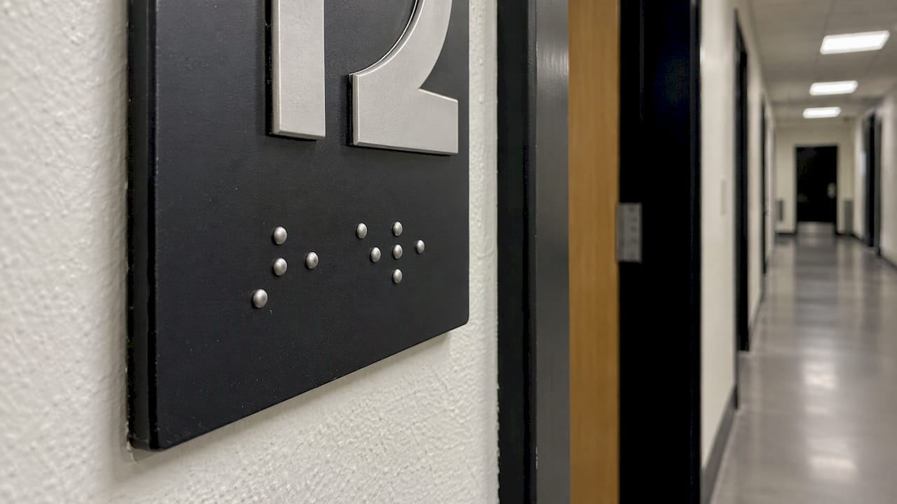
You do not need to memorize those numbers. You do need a fabricator who works to them. Our ADA signs page explains what we make for interior spaces.
Exterior signs add another layer: size, height, lighting and placement limits set by your city or county and, for leased space, by your landlord or property association. Rules differ a lot from one jurisdiction to the next, so check with your local planning or zoning office before you commit. We offer compliance consulting as part of the process, which helps you ask the right questions early rather than after a sign is built.
How the design process works with us
A clean brief saves time and money. Here is what to have ready:
- The location, with photos of the wall, window, lot or vehicle.
- The distance from which the sign will mainly be read.
- Your logo files and brand colors, if you have them.
- The one message the sign must carry.
- Whether it is permanent or temporary, indoor or outdoor.
- Your timeline.
From there we move through consultation, design, material selection, fabrication and installation guidance. For what a quote should include and how to compare them, see our guide to custom sign quotes.
Our perspective
Most sign problems we see started before the design. The owner had a lot to say, a small space, and no distance measured. So the sign tried to say everything and was read by no one.
Our approach is to slow down at the start. We ask what the sign is for, who is looking, from how far, and in what light. Then we design backward from those answers: the fewest words, the largest letters the space allows, contrast that holds up in real conditions, and materials that suit the location.
We build signs for business owners, real estate agents, event organizers and property managers, so we see the full range, from a weekend banner to permanent exterior and interior signage. We think a sign should match your brand and your environment, and we handle consultation, compliance questions, fabrication and installation guidance so you are not coordinating several vendors.
If you take one thing from this guide, make it this: put the measured viewing distance in your brief. It changes every other choice.
Yossi
Ready to brief a sign?
If you are planning signs for a storefront, property, event or fleet, we can design and produce them to your size, material and brand. Start with the page that matches your project: custom signs for A-frames, real estate and directional signs, exterior signs for building identity, or banners for events and promotions.
Send us your location, viewing distance and message through the quote request on our site, and we will come back with a design and fabrication plan that fits.
Common mistakes to avoid
- Designing on a screen only. A layout that looks bold on a monitor can shrink to nothing at 60 feet. Print a mockup at scale and look at it from the real distance.
- Treating the sign as an ad page. A sign is a quick identifier, not a brochure. Put details in brochures or business cards.
- Ignoring the neighbors. Look at the signs around yours. If everything nearby is red, a clean high-contrast alternative may stand out more than another red one.
- Skipping the install conditions. Mounting surface, wind, sun and access for installation affect both material and cost.
- Forgetting the update plan. If your offer changes often, consider a layout with changeable panels rather than reprinting a whole sign. Our face change signs are built around that idea.
For a longer checklist, see our signage design tips for business success.
FAQ
What does a good sign design include?
A good sign has one clear message, simple type, strong contrast, enough white space and letters sized for the viewing distance. It also uses a material suited to the location. Add your logo and brand colors only as far as they stay readable.
How big should the letters on my sign be?
A common guideline from the International Sign Association is at least 1 inch of letter height for every 25 feet of viewing distance, with larger letters for decorative fonts. Measure where viewers first need to read the sign and size up from there. Rules of thumb are minimums, so go larger when space allows.
How many words should a sign have?
As few as possible. U.S. Sign Council standards report that four to eight words in simple typography can be read and understood in about four seconds. If your draft runs longer, move the extra detail to your website, window or printed materials.
Do I need a permit for my sign?
Often yes for permanent exterior signs, but requirements vary by city, county and property owner. Contact your local planning or zoning office, and your landlord if you lease, before production. We can help you work through what to ask as part of our compliance consulting.
Can you design and install my sign?
We design and fabricate signs and banners, vehicle graphics and printed materials, and we provide installation guidance. Use the quote request on our site to tell us about your project.
Sources
- Signs for Marketing, International Sign Association
- Design & Placement of Signs, International Sign Association
- VMS Legibility Standards and Research, U.S. Access Board
- What’s Your Sign?, University of Maryland Extension
- USSC Guideline Standards for On-Premise Signs
- Sign Guidelines for Planning, Designing, Fabricating, U.S. Bureau of Reclamation
- Guidelines for the Creation of Braille Signage, BANA