A good store sign is designed around one fact: people give it about a second. Everything else follows from that. Keep the message short, size the letters for the distance, give the text strong contrast, light it so it works after dark, and mount it where the traffic can see it. At Custom Signs Today we design, fabricate and help install exterior signs and interior signs built around these rules, matched to your brand and your building.
This guide gives you the working numbers and the decisions behind them, so you can brief a sign project with confidence.
TL;DR
- Few words win. University of Maryland Extension reports that the average person looks at a sign for less than a second.
- Size letters for distance: the International Sign Association recommends at least one inch of letter height for every 25 feet of viewing distance for drivers.
- Use no more than three colors, strong contrast and plenty of empty space so the message does not get lost.
- Plan illumination, mounting angle and materials at the design stage, not after the artwork is approved.
- Check accessibility and local sign rules before you finalize the design. We offer compliance consulting as part of the process.
Table of Contents
- Know which signs your store actually needs
- Design for the one-second read
- Size your letters for the distance
- Use color and contrast to carry the message
- Lay out graphics so shoppers decode them fast
- Plan lighting before the artwork is final
- Place the sign where the traffic can read it
- Choose materials and construction for where the sign lives
- Check accessibility and local rules first
- From design brief to installed sign
- Get a store sign designed around your storefront
- FAQ
- Sources
Know which signs your store actually needs
Before you design anything, decide which job each sign does. A store usually needs a mix:
- Exterior signs (wall signs, channel letters, blade signs, window graphics) make people notice and identify the store.
- Interior signs (department, aisle and wayfinding signs) orient shoppers once they are inside.
- Promotional signs (banners, A-frames, feather banners, point-of-purchase displays) push a specific offer.
- Informational and safety signs (policies, hours, exits, accessibility signs) keep the store running smoothly and compliant.
The Signage Foundation notes in its retail wayfinding best practices that signs were long treated as the most disposable part of a store, and that they are now seen as an investment to be considered with the same care as other fixtures. That is the right way to budget: one well-designed storefront sign works every hour you are open and every hour you are not.
If you are opening a new location, start with the exterior. It is the sign that decides whether a passerby becomes a customer, and it sets the colors, fonts and tone that every other sign should repeat. Our guide to storefront signs and brand visibility covers that first impression in more detail.
Design for the one-second read
University of Maryland Extension describes a sign as your handshake with the buying public: first impressions last, so the sign has to project the image you want customers to have of you. The same page reports that sign experts favor few words, because the average person looks at a sign for less than a second.
In practice that means:
- Name plus one descriptor. “Rivera’s Hardware” with “Tools, Paint, Keys” beats a sentence about your history.
- One message per sign. A sign that tries to announce the name, the sale, the hours and the website says none of them.
- Cut the phone number and URL from signs read from a moving car. Put them on the window or the vehicle graphics where people are standing still.
- Say it before you decorate it. Write the shortest version of the message first, then design around it.
The same Extension guidance warns that when a sign gets too busy, its message is lost on readers. When we review a draft with a client, the first edit is almost always subtraction.
Size your letters for the distance
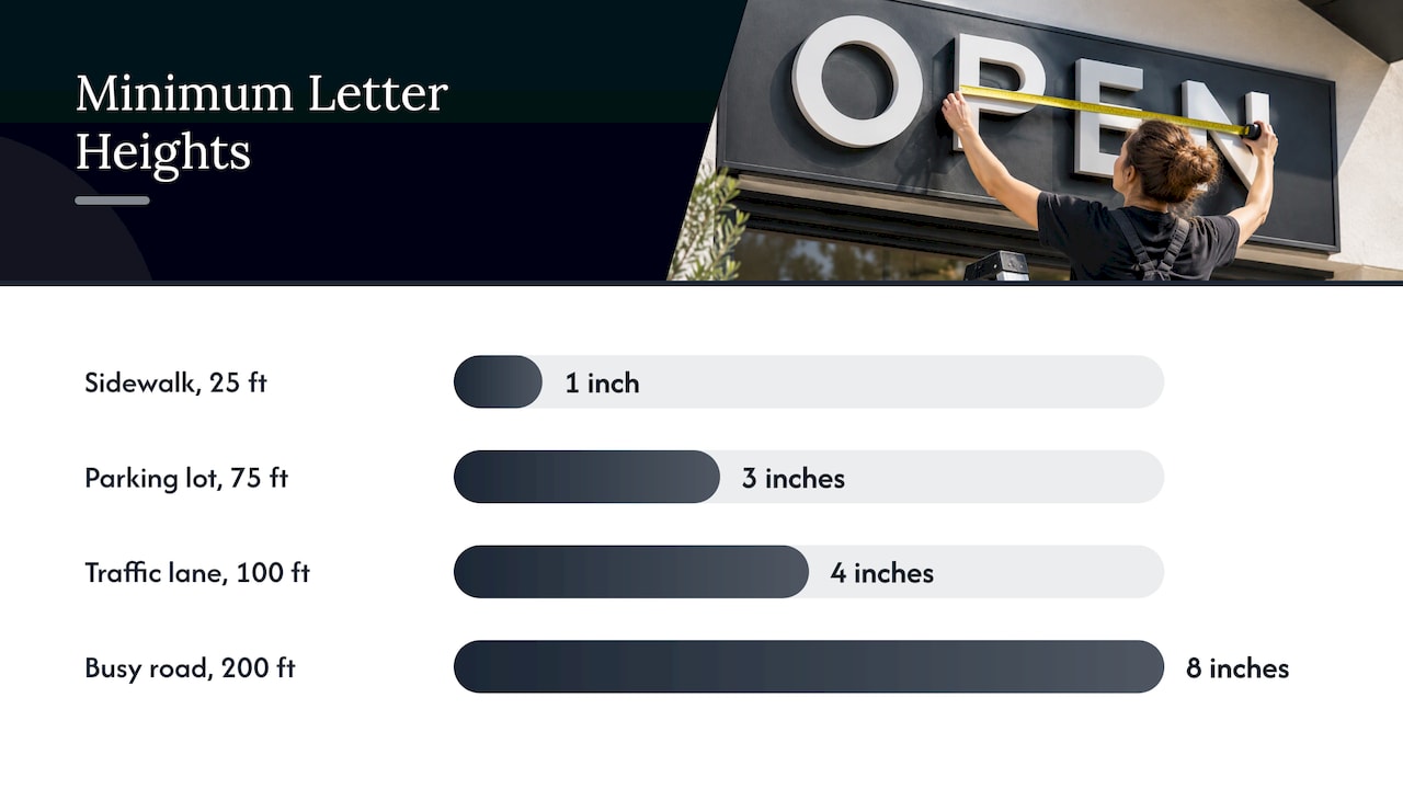
Letter height is the single most common reason a handsome sign fails. The International Sign Association recommends letters at least one inch tall for every 25 feet of distance so the sign is readable for all legal drivers. It adds that fancy lettering that is harder to read requires a significantly larger minimum letter size.
Here is what that rule means for common situations. The figures are simple arithmetic from the one-inch-per-25-feet rule:
| Where the sign is read from | Distance | Minimum letter height |
|---|---|---|
| Sidewalk, pedestrians close to the window | 25 feet | 1 inch |
| Across a parking lot | 75 feet | 3 inches |
| From a lane of passing traffic | 100 feet | 4 inches |
| From a busy road, approaching at speed | 200 feet | 8 inches |
Treat these as floors, not targets. University of Maryland Extension gives a useful real-world reference point: two-inch letters can be read at 50 feet, while three-foot letters are needed at 1,000 feet. If your storefront sits behind a setback or faces a fast road, go larger than the table.
The Extension page also notes that short, thick letters are easier to read than thin, tightly spaced ones. Pick a clean, bold typeface for the business name and save decorative fonts for a logo mark, where legibility is less critical.
Use color and contrast to carry the message
Color choices do more for legibility than most owners expect, and the evidence points to contrast above all.
- Limit the palette. The Extension guidance says simple color schemes help accentuate the important words, and that no more than three colors are necessary.
- Prioritize light against dark. The Sign Research Foundation’s study of illuminated sign conspicuity reports that luminance contrast is substantially more important to legibility than color contrast. It cites research finding legibility is best supported at a luminance ratio of 12:1 between the sign face and its characters.
- Know your high-visibility colors. The Extension page identifies red and yellow as the most visible colors. Use them for the element you most want read, not for every surface.
- Leave empty space. The same source recommends keeping 30% to 40% of the sign face as white space for best readability.
A practical test: print the design in grayscale. If the name is still easy to read, the contrast is working. If the text and background turn to similar grays, changing the hue will not fix it; change the lightness.
We go deeper on this in our article on contrast in signage, readability and compliance.
Lay out graphics so shoppers decode them fast
Shoppers process pictures faster than words, so a logo or simple image does a lot of the work. Retail design practitioners suggest five words or fewer for the key message once a visual has set the scene. The same source explains that the first 10 to 20 feet inside a store is a “decompression zone” where shoppers orient themselves and look up for cues, which is where your first interior sign belongs.
A clean layout follows a few habits:
- One focal point. Usually the business name or logo, placed at the top or center of the sign face.
- Consistent alignment. Left-aligned or centered, not both on the same sign.
- Icons for repeated information. Restrooms, fitting rooms and exits read faster as symbols plus words.
- Eye-level placement indoors. The same Medallion source says shoppers’ primary field of vision runs about 45 degrees above and below eye level to roughly five feet out, and that shelf signage under two feet from the floor can be difficult or impossible to read.
For a look at how this plays out in real navigation systems, see our wayfinding sign examples and directional door signs.
Plan lighting before the artwork is final
A sign that reads well at noon can disappear at 7 p.m. in winter. The International Sign Association describes three basic illumination methods: external lamps shining on the sign face, internal illumination shining through the face, and illuminated elements such as exposed bulbs, LEDs or neon-style tubing.
Choosing among them shapes the design:
- Externally lit signs suit a textured or dimensional face, such as routed letters on a wood-look panel, and need a place to mount the fixtures.
- Internally lit signs and cabinets give an even glow and suit a bold, simple face.
- Individually lit letters such as illuminated channel letters give a clean nighttime silhouette with the building wall as the background, which makes the wall color part of your contrast decision.
Inside the store, The Signage Foundation reports that a leading trend is cove and soffit lighting to illuminate signs while highlighting entire departments. Tell your sign provider early whether the interior has that kind of lighting, because glare on a glossy face can ruin an otherwise legible sign.
Place the sign where the traffic can read it
Placement is design. The International Sign Association states that for maximum readability a sign must be detectable, conspicuous, legible and comprehensible. It also cites research (Schwab, 1998) showing that a sign mounted parallel to the roadway needs to be at least 70% larger than one mounted perpendicular to be read in time.
That is why a flat wall sign on a street-facing facade often needs a companion blade sign or projecting sign. A blade sign faces oncoming pedestrians and drivers head-on, so it can be smaller and still be read earlier.
Walk the approach before you finalize the position:
- Stand where a driver or pedestrian first has a clear line of sight to the building.
- Note what blocks it: trees, awnings, a neighboring sign, a parked truck lane.
- Measure that distance and use it in the letter-height table above.
- Repeat from the opposite direction.
Our retail sign placement guide and effective sign placement tips walk through this in more depth. If you are working on the building side, an overview of storefront architecture helps you see how the facade itself frames the sign.
Choose materials and construction for where the sign lives
Materials should follow location, not the other way round.
- Outdoor, permanent: aluminum, dimensional letters, channel letters and durable vinyl graphics that handle sun, rain and temperature swings.
- Outdoor, temporary: banners, feather banners and A-frames for sales, openings and seasonal offers. Mesh banners suit windy locations.
- Indoor, permanent: wall graphics, department signs and wayfinding panels that match your fixtures.
- Windows: perforated or cut vinyl window graphics that carry hours, offers and branding.
The Signage Foundation notes that stores are beginning to use channel letters, projecting signs and awnings in in-store wayfinding programs, and that modular sign systems are being linked more closely to merchandise fixtures, which raises sign quality by matching the same material standards. The lesson for a small store: pick one finish family, say brushed metal with matte black, and repeat it inside and out.
We produce banners, vinyl graphics, vehicle lettering and wraps, and rigid signs with durable materials made for indoor and outdoor use. You can choose size, materials and design, so the sign suits your building rather than a stock template.
Check accessibility and local rules first
Sign rules in the US vary by city and county, and some of them cover size, height, illumination and the type of sign allowed. Accessibility is a separate layer. Before you approve artwork, confirm with your local permitting office what is allowed on your property, and ask your landlord or property manager about lease restrictions.
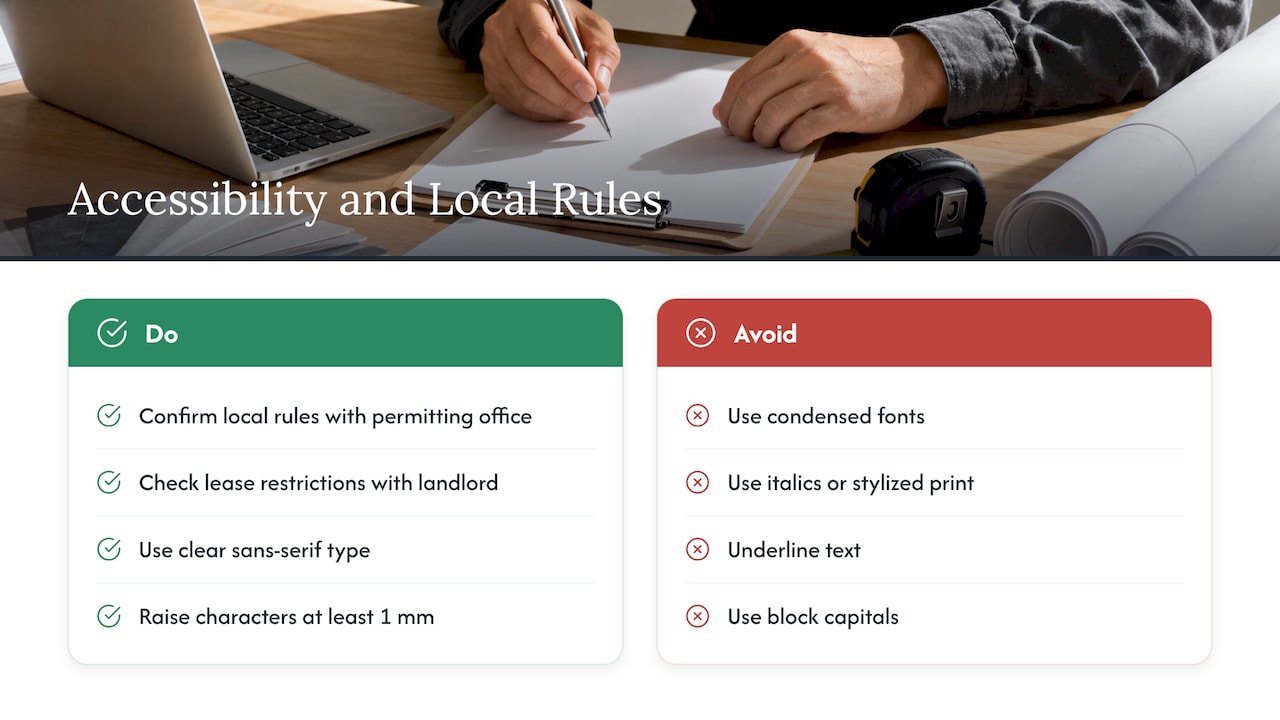
On legibility for people with low vision, published accessibility guidance gives concrete direction. The Braille Literacy Canada guidelines (a Canadian standard, useful as a design reference) recommend a clear sans-serif typeface with uniform stroke width, and advise against condensed fonts, italics, stylized print, underlining and block capitals. Raised characters should stand at least 1 mm from the surface, according to the same document. For US requirements on interior room and permanent signage, confirm the current ADA standards with your local authority or your design team.
We handle compliance consulting as part of the sign process, from the first consultation through installation, and you can see our approach on our ADA signs page. That includes certified installation, so the mounting height and location are right the first time.
What we think about store sign design
Most store owners come to us with a logo and a hunch. The sign that works is rarely the one with the most going on. It is the one that matches the building, the street and the brand, and that someone planned from the first conversation through installation.
That is why we start with a consultation, not a catalog. We look at where the sign will hang, who will read it and from how far away, then design and fabricate to fit. Our range covers exterior and interior signs, banners, vehicle lettering, wraps and decals, so your storefront, your window, your sidewalk sign and your van can all say the same thing in the same colors.
Consistency is the cheapest marketing a small store has. When every sign repeats the same name, color and typeface, customers learn you faster and trust you sooner. We build for that, for local businesses and for clients nationwide.
Yossi
From design brief to installed sign
Here is how a store sign project runs when it is done well, and what we take off your hands at each stage.
- Define the job. Name the sign types you need and who must read them from where. We discuss this in the consultation, so you do not have to guess at sizes.
- Gather the site facts. Photos of the facade, the viewing distance, lighting conditions and any lease or permit limits. We cover the compliance side so the design is checked against the rules for your location.
- Design to your brand. Colors, fonts and layout that follow the rules above, with size, materials and design customized to the building.
- Approve the proof. Check the text letter by letter, and view the proof at the scale it will be read, from across the room or the street.
- Fabricate and install. Our installation is certified, and we offer fast turnaround for local and nationwide clients.
If you want to see the thinking behind good results first, our storefront sign examples show how different businesses applied it.
Get a store sign designed around your storefront
If you would rather have an expert handle the measuring, design, compliance questions and installation, send us your project. We make custom signs of any size and type for businesses, including exterior signs, interior signs, banners, window graphics and vehicle graphics. Tell us what the sign has to do and where it will hang, and we will take it from there.
Start with a free quote request on our custom signs page, or read what to expect from a custom sign quote first.
FAQ
How big should my store sign letters be?
The International Sign Association recommends at least one inch of letter height for every 25 feet of viewing distance for drivers. A sign read from 100 feet needs letters of at least 4 inches. Go larger if the lettering is decorative or the road is fast.
How many colors should a store sign use?
University of Maryland Extension says no more than three colors are necessary. Strong contrast between text and background matters more than the specific hues. Use your brightest color for the one element you most want noticed.
What should a store sign say?
Use your business name and one short descriptor of what you sell. Research summarized by University of Maryland Extension says people look at a sign for less than a second, so leave out sentences, phone numbers and long URLs on signs read from the road. Put detailed information on windows or at the entrance.
Do I need a sign for the inside of my store too?
If customers need to find departments, services or restrooms, yes. Interior signs orient shoppers, and the first ones belong in the entry area where people look up for cues. Repeat your exterior colors and typeface so the store feels like one brand.
Do I need a permit for a new storefront sign?
Many US cities and counties regulate sign size, placement and lighting, and a landlord may add limits in your lease. Check with your local permitting office before you order. We include compliance consulting as part of our sign process.
Sources
- What’s Your Sign? | University of Maryland Extension
- Design & Placement of Signs, International Sign Association
- Illuminated Sign Conspicuity, Sign Research Foundation
- Retail Wayfinding Best Practices, The Signage Foundation
- The Five Unbreakable Rules of In-Store Signage
- Accessible Signage Guidelines 2024, Braille Literacy Canada
- What is storefront architecture: a 2026 guide