
Did you know that color consistency can increase brand recognition by 80 percent? The right business sign does more than mark your location. It shapes first impressions and tells your story at a glance. Whether you want to stand out on a busy street or guide visitors inside, understanding the key steps in sign design ensures your brand looks sharp, feels memorable, and connects with every passerby.
Quick Summary
| Key Point | Explanation |
|---|---|
| 1. Define Branding Goals for Signage | Create guidelines that align your sign’s design with your brand identity to enhance recognition and customer attraction. |
| 2. Choose Durable Materials | Select materials like aluminum or acrylic that withstand environmental conditions and maintain a professional appearance. |
| 3. Use a Clear Layout | Implement a visual hierarchy using the Z pattern to guide viewer attention toward the most essential message effectively. |
| 4. Strategically Select Colors and Fonts | Prioritize legibility and emotional response through the use of high-contrast colors and readable fonts in your design. |
| 5. Confirm Legal and Approval Standards | Review design details and comply with local regulations to avoid complications and ensure successful installation. |
Table of Contents
- Step 1: Define Your Branding And Sign Goals
- Step 2: Choose Materials And Sizing For Your Space
- Step 3: Create A Visually Impactful Layout
- Step 4: Select Colors, Fonts, And Graphics Strategically
- Step 5: Review, Approve, And Plan Installation
Step 1: Define Your Branding and Sign Goals
Your business sign is more than just text and colors. It is your silent ambassador that communicates your brand’s personality and attracts potential customers before they even walk through your door. Understanding how to align your signage with your brand identity is crucial for creating a memorable visual experience.
Start by examining your brand’s core visual elements. What colors represent your company? What typography reflects your professional personality? According to research from Zigo Sign, color consistency can boost brand recognition by an impressive 80%. This means selecting a color palette that matches your existing marketing materials and maintaining that consistency across all signage.
Consider your brand’s personality. Are you a tech startup wanting to appear innovative? A law firm seeking to project professionalism? A creative agency aiming to look dynamic? Your sign should visually communicate these attributes through strategic design choices. As experts note, your sign is often the first impression potential customers will have of your business.
Create a clear branding guideline specifically for your signage. Document your preferred color codes, logo placement rules, acceptable typography variations, and overall design philosophy. This ensures that whether you create a storefront sign, vehicle wrap, or indoor directional marker, you maintain a uniform visual identity.
Pro Tip: Aim for simplicity. Complex designs might look impressive but can reduce readability and memorability.
By thoughtfully defining your branding goals for signage, you transform a simple sign into a powerful marketing tool that speaks volumes about your business before a single word is read. In the next step, we will explore how to translate these branding goals into actual sign design elements.
Read our guide on creating custom signs for visual branding to dive deeper into this process.
Step 2: Choose Materials and Sizing for Your Space
Selecting the right materials and sizing for your business sign is like picking the perfect outfit. It needs to look great, withstand environmental challenges, and communicate your brand’s personality. Your sign must be both visually appealing and practically designed to survive the elements and catch potential customers’ attention.
Start by assessing your physical location and environmental conditions. According to research from Federal Heath, exterior signs require durable materials that can handle weather exposure. Aluminum and acrylic emerge as top choices for their resilience and professional appearance. These materials resist corrosion, maintain color integrity, and provide a sleek look that communicates quality.
Consider your specific placement requirements. Are you designing a storefront sign? A window display? A roadside marker? Each location demands different sizing considerations. Measure your available space carefully and check local zoning regulations. Some municipalities have strict rules about sign dimensions and placement, so understanding these guidelines prevents potential legal complications.
Material selection goes beyond durability. Sign Signs highlights emerging trends in sustainable signage materials. Recycled plastics and sustainably sourced wood offer environmentally conscious businesses an opportunity to demonstrate their commitment to green practices while maintaining professional aesthetics.
Pro Tip: Always request material samples before final production. Viewing physical samples helps you assess color accuracy and texture.
Vinyl graphics provide another flexible option, allowing vibrant colors and easy updates. They work exceptionally well for temporary signage or spaces requiring frequent visual refreshes. By thoughtfully combining materials like aluminum frames with vinyl graphics, you create signs that are both durable and dynamically designed.
Here’s a comparison of common signage materials and their features:
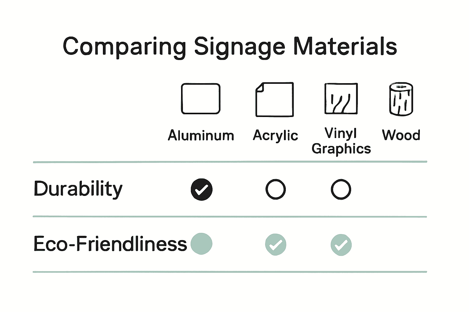
| Material | Durability | Appearance | Eco-Friendly Options |
|---|---|---|---|
| Aluminum | High | Sleek/Modern | Recyclable |
| Acrylic | Moderate-High | Glossy/Clean | Limited |
| Vinyl Graphics | Moderate | Vibrant/Flexible | Some Recycled Vinyl |
| Wood | Variable | Natural/Warm | Sustainable Sourcing |
| Recycled Plastics | High | Varies | Yes |
In our next step, we will explore how to optimize your sign’s visual design to maximize its impact and readability.
Read our guide on understanding promotional signage types to explore more material and design strategies.
Step 3: Create a Visually Impactful Layout
Your sign’s layout is the visual storyteller that communicates your message in milliseconds. It’s not just about what you say but how you say it visually. Effective signage design transforms information into an instant communication experience that captures attention and drives action.
According to AGC Signs, the key to an outstanding layout lies in establishing a clear visual hierarchy. Think of your sign like a visual pyramid where the most critical information sits at the top. Your primary message or call to action should be the largest element that immediately catches the eye. Secondary details receive smaller fonts and less prominent placement.
Adopt the Z pattern layout when designing your sign. This natural reading pattern starts at the top left corner where viewers first look, moves across the top, then diagonally down to the bottom right. Position your most important information along this visual path to maximize comprehension and retention. Imagine guiding your viewer’s eyes exactly where you want them to look.
Research from Big Sign FX emphasizes keeping text concise. Limit your primary message to 7 to 10 words. Brevity is not just about saving space its about ensuring instant understanding. Every word should earn its place on your sign.
Pro Tip: Use white space strategically. Empty space is not wasted space it helps your critical information breathe and stand out.
Balance is crucial. Combine text and graphics thoughtfully so neither overwhelms the other.
 Your graphic elements should complement your message not compete with it. A well designed sign feels harmonious and intentional.
In our next step, we will explore color selection and typography techniques that further enhance your sign’s visual impact.
Learn more about indoor signage solutions to refine your design approach.
Step 4: Select Colors, Fonts, and Graphics Strategically
Think of your sign’s color scheme and typography as the personality of your visual communication. These elements do far more than just look pretty they tell a story about your brand and determine how quickly and effectively viewers understand your message.
According to AGC Signs, legibility is your top priority. High contrast is key. Aim for combinations like light text on dark backgrounds or dark text on light backgrounds. This ensures your message pops out even from a distance. When selecting fonts, stick to sans serif styles which offer clean readability. Limit yourself to no more than two font types to maintain a professional appearance.
Color psychology plays a massive role in perception. Sign Signs reveals three strategic color palette approaches. Monochromatic palettes create a polished cohesive look. Analogous color schemes provide harmonious warmth. Complementary colors deliver bold attention grabbing contrast. Choose your palette based on the emotional response you want to evoke from potential customers.
Graphics should complement not compete with your text. Select imagery that instantly communicates your brand’s essence. A tech company might use sleek geometric icons while a wellness center could incorporate soft natural graphics. The goal is visual storytelling that happens in milliseconds.
Pro Tip: Always consider how your color choices and graphics will appear under different lighting conditions.
Remember that consistency is crucial. Your sign’s design should feel like a natural extension of your existing brand materials. This creates a seamless visual experience that reinforces brand recognition.
In our final step, we will discuss how to validate and refine your sign design before production.
Explore our exterior signage basics guide for additional design insights.
Step 5: Review, Approve, and Plan Installation
You are in the final stretch of creating a stunning business sign that will transform your visual brand presence. The review and approval process is your last opportunity to catch potential issues and ensure your sign meets all professional and legal requirements before installation.
According to Federal Heath, the approval process involves more than just aesthetic review. You will need to verify that your sign design meets manufacturing standards, installation requirements, and critical local signage codes. This is especially important for illuminated signs which require specific attention to permits, brightness limitations, and energy efficiency standards.
Start by requesting a comprehensive proof from your sign manufacturer. This should be a detailed mockup that precisely represents the final product. Examine every element carefully. Check color accuracy, font clarity, graphic placement, and overall visual balance. Do not hesitate to request revisions if something does not look exactly as you envisioned.
Contact your local municipal office to confirm zoning regulations and signage permits. Different jurisdictions have unique requirements regarding sign size, placement, illumination, and visibility. Some areas restrict sign heights or require specific mounting techniques. Getting these details confirmed early prevents potential legal complications or mandatory modifications later.
Pro Tip: Schedule a site survey with your installation team to evaluate mounting surfaces and determine the most effective placement strategy.
For illuminated signs, pay special attention to energy efficiency.
Modern LED technologies offer bright visibility while consuming minimal power. Confirm that your sign meets local energy conservation guidelines and choose lighting solutions that balance visibility with sustainability.
Once you have completed all reviews and secured necessary approvals, schedule your professional installation. A skilled installation team will ensure your sign is securely mounted, perfectly aligned, and positioned for maximum visibility.
Check out our comprehensive guide to exterior signage basics for additional installation insights.
Turn Your Signage Vision Into Reality with Custom Signs Today
Do you want business signs that do more than just get noticed? If you are struggling with unclear branding, unsure about which materials will last, or feeling overwhelmed by complex layout and design choices, you are not alone. Creating impactful signage that truly boosts visibility can be stressful when every detail matters to your brand’s first impression. The article you just read covered everything from consistent color use to selecting durable materials and perfecting visual layouts. Now, you need a signage partner who understands these challenges and can translate your goals into attention-grabbing solutions.

Let our team at Custom Signs Today bring your vision to life. We specialize in producing custom business signs that match your brand identity and attract the right customers. Whether you need storefront signs, banners, vehicle wraps, or decals, we help you choose the right materials and designs for your unique needs. Ready to see the difference a well-crafted sign can make? Visit our home page, explore our service categories, and request a free quote today. Take action now so your business stands out and gets the visibility it deserves.
Frequently Asked Questions
How can I define my branding goals for business signs?
Start by identifying the core visual elements of your brand, including colors and typography that align with your identity. Document these elements in a branding guideline to ensure consistency across all signage types.
What materials should I consider for business signs that withstand the elements?
Choose durable materials like aluminum or acrylic, which resist corrosion and maintain their appearance over time. Always evaluate the environmental conditions of your location to select materials that will endure.
How do I create a visually impactful layout for my sign?
Establish a clear visual hierarchy by placing the most important information at the top and using a Z-pattern layout for readability. Keep your primary message brief, ideally between 7 to 10 words, to grab attention immediately.
What color schemes and fonts enhance the visibility of business signs?
Use high-contrast color combinations, such as light text on dark backgrounds, to ensure legibility. Limit yourself to two font types and opt for sans serif styles to maintain professionalism and enhance readability from a distance.
What steps should I take during the review and approval process of my sign design?
Request a detailed mockup from your sign manufacturer and check every element for accuracy. Confirm compliance with local signage regulations and secure necessary permits before scheduling installation to avoid legal complications.
How can I ensure my sign is installed for maximum visibility?
Schedule a site survey with your installation team to evaluate the best placement strategy for your sign. Aim to secure your sign in a location that aligns with high foot or vehicle traffic areas to boost visibility effectively.