
TL;DR:
- Business signage evolved from ancient symbols used by civilizations to modern digital, 3D, and LED displays shaping branding today. It has historically served functions of identification, wayfinding, and advertising, guiding behavior and reinforcing identity. Digital tools now enable precise, customizable signs that enhance brand perception and operational efficiency.
The evolution of business signage is defined as the progression from primitive symbolic markers used by ancient civilizations to the advanced digital, 3D, and LED-driven branding tools shaping customer experiences today. This transformation spans thousands of years and touches every aspect of how businesses communicate identity, attract customers, and build trust. From hand-carved stone plaques in ancient Rome to programmable LED displays in modern retail, signage has always been the most visible expression of a brand. Tools like CAD software, 3D modeling platforms, and digital printing have made today’s signs more precise, more customizable, and more strategically powerful than at any point in history.
How did the evolution of business signage begin?
Ancient Greeks and Romans used imagery for businesses specifically to overcome mass illiteracy. A carved boot outside a shop meant cobbler. A painted bunch of grapes meant wine merchant. These symbols were not decorative choices. They were functional communication tools in a world where most customers could not read a word.
Early signs were built from hand-carved wood, stone plaques, and painted boards. Gold engraving appeared on higher-status establishments to signal prestige. The materials were durable by necessity, since a sign had to survive weather, foot traffic, and years of use without replacement.
The types of business signs used in ancient commerce served three core functions:
- Identification: Telling passersby what a business sold or offered
- Wayfinding: Guiding customers through markets, ports, and urban centers
- Advertising: Differentiating one merchant from competitors on the same street
Public spaces in ancient Rome featured painted election notices and commercial announcements on building walls, making signage one of the earliest forms of mass communication. Government buildings used carved stone inscriptions to project authority and permanence. Trade guilds adopted shared symbols so customers could recognize member businesses across different cities.
Pro Tip: Study ancient signage symbols when developing a new brand icon. The most enduring logos, like the barber’s pole or the pawnbroker’s three gold balls, trace directly to pre-literacy pictograms that still communicate instantly today.
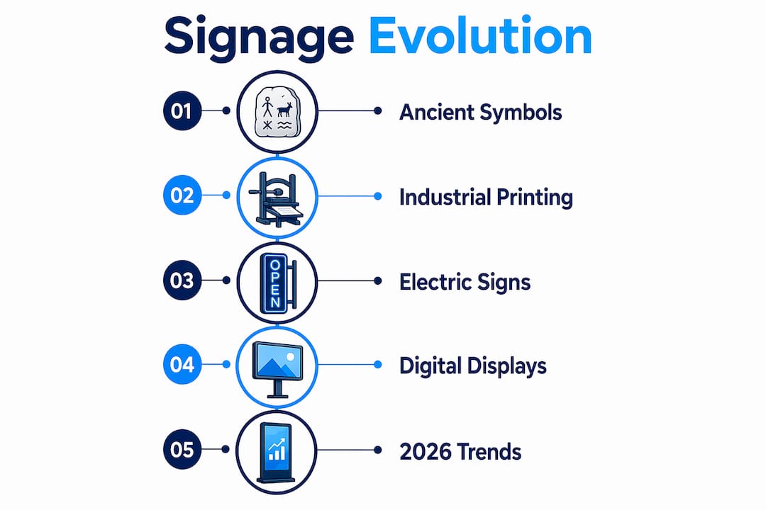
This foundation matters because it proves that signage as operational infrastructure is not a modern invention. The core job of a sign has never changed: guide behavior and reinforce identity.
What innovations transformed signage from the industrial revolution to the 20th century?
The Industrial Revolution brought commercial printing and electric signage that allowed brands to project identity boldly and at scale. Neon lighting from the early 20th century became a hallmark of vibrant commercial signage, turning city streets into competitive visual arenas where visibility after dark became a real business advantage.
Before and after this era, the contrast in signage capability is striking:
| Era | Materials and Methods | Brand Impact |
|---|---|---|
| Pre-Industrial (pre-1800s) | Hand-carved wood, painted boards, stone | Basic identification, limited reach |
| Industrial Revolution (1800s) | Commercial printing, elaborate typefaces, color lithography | Consistent brand messaging at scale |
| Early 20th Century | Electric signs, neon lighting, large-format displays | 24/7 visibility, emotional brand appeal |
| Mid-20th Century | Pylon signs, monument signs, backlit cabinets | Roadside dominance, franchise identity |
Commercial printing enabled businesses to produce elaborate typefaces and colorful signs that were previously impossible to replicate by hand. A bakery could now display the same visual identity across multiple locations. A department store could run coordinated window and exterior signage that told a single brand story.
The growth of branding as a discipline accelerated this shift. Logos, custom color palettes, and cohesive visual identity systems became competitive tools. Coca-Cola’s red, Ford’s oval badge, and the golden arches of McDonald’s all emerged from this era’s understanding that consistent signage builds recognition faster than any other marketing channel.
Large-format signs like pylons and monument signs reshaped urban commercial environments. A pylon sign visible from a highway gave a business a physical presence that no newspaper ad could match. These exterior signage formats became the primary way businesses competed for attention in suburban retail corridors.
Pro Tip: When evaluating your current signage, ask whether it would still communicate your brand identity if all the text were removed. The strongest signs from this era worked on color and shape alone. Yours should too.
How have digital technologies reshaped signage in the 21st century?
Modern signage integrates CAD, 3D modeling, and digital printing to create cohesive brand environments that blend exterior and interior signage into a single visual system. This is not just a production upgrade. It changes what is possible at every stage of the design and fabrication process.
Here is how the shift to digital tools has changed signage production and strategy:
- CAD and 3D modeling allow clients to visualize complex sign designs before fabrication begins. Errors are caught digitally, not after expensive materials have been cut and assembled.
- Digital printing enables photographic-quality graphics on virtually any substrate, from aluminum composite panels to fabric banners, at sizes that were previously cost-prohibitive.
- LED lighting replaced fluorescent and neon in most commercial applications. LED signs consume significantly less energy and last far longer, reducing operating costs over a sign’s lifespan.
- Programmable digital displays allow businesses to update messaging in real time. A restaurant can change its lunch special at 11 a.m. without printing a single sheet of paper.
- Interactive signage using touchscreens and QR code integration connects physical signs to digital experiences, turning a static display into a two-way communication channel.
High-quality signage can increase foot traffic by up to 20%. That number represents real revenue, not just impressions. For a retail business operating on thin margins, a 20% lift in walk-in customers can be the difference between a profitable quarter and a struggling one.
Current signage design trends emphasize minimalism, high-contrast typography, and energy-efficient LED integration. The reasoning is functional, not aesthetic. A cluttered sign forces the viewer’s eye to work harder. A clean sign with one dominant message communicates in under two seconds, which is roughly the time a driver has to read a roadside sign at 35 miles per hour.

Poorly planned digital signage appears as clutter, increasing user stress rather than improving navigation or branding. A screen cycling through 12 different messages at a retail entrance does not inform customers. It overwhelms them. Integration with physical environments and wayfinding systems is what separates effective digital signage from expensive noise. For businesses exploring this format, a digital displays guide is a practical starting point.
What are the critical design principles for effective signage today?
Legibility is a functional requirement, not a stylistic preference. Poor kerning, inadequate line spacing, and low contrast between text and background all reduce a sign’s effectiveness and slow recognition. These are not minor details. They determine whether a customer reads your sign or walks past it.
The most common design mistakes in modern signage include:
- Overcrowding: Fitting too much information onto one sign forces the viewer to prioritize, and they usually choose not to
- Inconsistent fonts: Mixing three or more typefaces on a single sign destroys visual hierarchy and signals unprofessionalism
- Poor contrast: Light gray text on a white background may look elegant in a design file and become invisible in direct sunlight
- Ignoring scale: A design that looks balanced at thumbnail size often falls apart when fabricated at 4 feet by 8 feet
- Rushed digital content: Scrolling text that moves too fast, or slides that change before they can be read, defeats the purpose of the display
Accessibility in signage is a strategic design principle, not just a compliance checkbox. High contrast and readable fonts serve aging populations, visually impaired users, and anyone reading in poor lighting conditions. ADA-compliant signs address this directly, but the underlying principle applies to every sign you produce.
Visual hierarchy requires discipline. Not everything can be bold or bright. Selective emphasis is what makes the most important information stand out. A sign that treats every element as equally important communicates nothing clearly.
Pro Tip: Before approving any sign design, print it at full scale and view it from the distance and angle your customers will actually use. A sign that looks perfect on a monitor can fail completely in a real-world environment.
How can businesses use signage history to strengthen their brand today?
The history of business signage offers a direct playbook for modern brand strategy. Every era’s most effective signs shared one quality: they communicated a single clear message to a specific audience without requiring effort from the viewer.
Here is how to apply that principle in practice:
- Treat signage as a 24/7 brand ambassador. Your exterior sign works when your staff does not. Exterior signage that is well-lit, well-maintained, and visually consistent with your other brand materials builds recognition passively over time.
- Use modern materials to create immersive environments. Edge-lit acrylic panels, 3D dimensional letters, and backlit fabric graphics create depth and texture that flat printed signs cannot match. These formats signal investment and quality to customers before they walk through the door.
- Place signs where behavior happens. A wayfinding sign placed after the decision point is useless. Study your customer’s physical path and place signs where they need information, not where it is convenient to install them. A wayfinding signage guide covers this in detail.
- Prioritize accessibility from the start. Signs that work for the widest possible audience reduce friction for every customer, not just those with specific needs.
- Invest in professional design and fabrication. Over 60% of consumers report that unclear or poorly executed signage negatively impacts their perception of a business. That perception damage happens in seconds and takes months of consistent quality to repair.
The Beverly Hills sign demonstrates what happens when signage transcends function and becomes identity. It does not direct traffic or advertise a product. It communicates an entire set of values through typography, placement, and maintenance. That is the standard every business sign should aspire to, at whatever scale fits the budget.
Key takeaways
Effective signage has always been the most direct expression of brand identity, and the businesses that treat it as core infrastructure consistently outperform those that treat it as an afterthought.
| Point | Details |
|---|---|
| Signage origins are functional | Ancient signs used symbols over text to communicate across language and literacy barriers. |
| Industrial era set brand standards | Commercial printing and neon lighting made consistent, scalable brand identity possible for the first time. |
| Digital tools changed production | CAD, 3D modeling, and LED integration allow precise, customizable signs that reduce errors and operating costs. |
| Legibility is non-negotiable | Poor kerning, low contrast, and overcrowding reduce sign effectiveness regardless of design quality. |
| Signage is operational infrastructure | Signs that guide behavior and reinforce identity reduce customer friction and build measurable brand trust. |
Signage history taught me to stop treating signs as decoration
I have worked with enough businesses to recognize a pattern. The ones that struggle with signage almost always share one misconception: they think a sign is decoration. They treat it like a finishing touch, something to order after the real branding work is done. That is exactly backwards.
The history of business signage proves that signs were never decoration. They were the primary communication channel between a business and its customers for most of human history. The cobbler’s carved boot was not art. It was a sales tool. The neon sign above a 1940s diner was not atmosphere. It was the reason customers stopped instead of driving past.
What I find most overlooked today is the gap between digital capability and digital execution. Businesses invest in programmable displays and then fill them with too much content, cycling too fast, in fonts that are hard to read from a moving car. The technology is not the problem. The discipline to use it well is.
The businesses I have seen get signage right treat every sign as part of a system. Exterior signs set expectations. Interior signs confirm them. Wayfinding signs reduce friction. Digital displays add timely information without creating noise. When those elements work together, the signage disappears into ease. Customers find what they need without thinking about it. That is the goal.
My honest recommendation: audit your current signage the way you would audit a sales funnel. Identify where customers get confused, where they miss information, and where your brand identity breaks down. Then fix those points systematically, starting with the highest-traffic locations.
— Yossi
Bring your signage strategy to life with Customsignstoday
Customsignstoday specializes in custom visual communication solutions that apply every principle covered in this article, from historically grounded brand clarity to the latest in digital display integration and accessible design.
Whether you need face change signs that let you update messaging without replacing the entire structure, ADA-compliant interior signs that serve every customer, or large-format exterior signs built for maximum visibility, Customsignstoday produces them with professional-grade materials and precision fabrication. The team works with businesses across West Palm Beach and South Florida to translate brand strategy into physical signage that performs. Request a free quote and see what the right sign can do for your business.
FAQ
What is the history of business signage in brief?
Business signage originated with ancient Greeks and Romans who used pictorial symbols to identify shops for largely illiterate populations. Signs evolved through hand-carved wood and stone to commercial printing, neon lighting, and now digital displays and 3D fabrication.
How does signage affect branding and customer perception?
Over 60% of consumers report that poorly executed signage negatively impacts their perception of a business. Consistent, professional signage builds recognition and trust before a customer ever interacts with staff.
What are the main types of business signs used today?
The main types include exterior monument and pylon signs, interior wayfinding and identification signs, digital displays, ADA-compliant signs, vehicle wraps, and dimensional letter signs. Each type serves a specific function within a broader brand communication system.
What signage design trends are most important in 2026?
Current trends favor minimalism, high-contrast typography, energy-efficient LED integration, and 3D dimensional elements like edge-lit acrylic and raised lettering. Accessibility and legibility remain the foundational requirements beneath all aesthetic choices.
Why is legibility treated as a functional requirement, not a style choice?
Poor kerning, inadequate line spacing, and low contrast reduce sign effectiveness and slow recognition regardless of how visually appealing the design appears on screen. A sign that cannot be read quickly from the relevant distance has failed its primary purpose.