
Every workplace safety sign falls into one of five categories: Prohibition, Warning, Mandatory, Safe Condition (or Information), and Fire/Emergency. Color and shape are the fastest cues a worker gets, red circles for “don’t,” yellow triangles for “watch out,” blue circles for “you must,” green for “safe route.” Two frameworks govern how these signs are built: OSHA 29 CFR 1910.145 sets the legal floor, while ANSI Z535 offers the more detailed, symbol driven approach most facilities now use.
TL;DR:
- Prohibition signs use red circles with diagonal bars to instantly indicate actions that are not allowed, leveraging quick color recognition.
- Warning signs employ yellow triangles with black borders to highlight environmental hazards, with severity distinctions clarified by ANSI’s detailed signal-word levels.
- Mandatory signs are blue circles that specify actions such as wearing protective gear, often prioritized during OSHA inspections for missing signs at hazards.
- OSHA’s standard offers a minimum, legal framework, while ANSI Z535 provides a more detailed, pictogram-based system that is voluntary but widely adopted for clarity.
- Proper sign placement, legibility, and consistency are crucial, with signs mounted at eye level, materials tested for weather resistance, and signage systems kept uniform across the site.
Table of Contents
- The Main Health and Safety Sign Types, Defined
- OSHA vs. ANSI: What’s Legally Required vs. Best Practice
- Reading Signs Fast: Color, Shape, and Legibility Rules
- Placement, Selection, and Maintenance Checklist
- Specialist Signals: Illuminated Signs, Alarms, Hand Signals, and Tags
- Common Symbols and Pictograms Explained
- Global Sign Standards Beyond OSHA and ANSI
- Case Studies in Sign Type Selection
- A Signage Supplier’s View on Getting Compliance Right
- Get a Quote for Compliant Custom Signs
- Sources
- FAQ
The Main Health and Safety Sign Types, Defined
Knowing the five categories cold is the difference between a compliant facility and a citation waiting to happen. Each type carries its own visual grammar, and mixing them up confuses workers fast.
Prohibition signs tell people what not to do. They use a red circle with a diagonal bar over a black pictogram on white, the universal “no” symbol seen on No Smoking and No Entry postings. These signs work because the eye recognizes the red slash faster than it reads text, which matters when someone is walking toward a hazard without looking down at a label.
Warning signs flag a hazard that exists in the environment, not an action someone is about to take. They use a yellow (or amber) triangle with a black border and black pictogram. This is where OSHA’s older three-tier system and the newer ANSI signal-word ladder diverge: OSHA historically leaned on generic “Caution” language, while ANSI’s structure separates DANGER, WARNING, and CAUTION into distinct severity levels so a live electrical panel doesn’t get the same visual weight as a wet floor.
Mandatory signs specify a required action, most often personal protective equipment. Blue circles with white pictograms cover things like “Hard Hats Required” or “Eye Protection Must Be Worn.” These are the signs OSHA inspectors check first on a walkthrough, because a missing mandatory sign next to an active hazard is one of the easiest citations to write.
Safe condition (information) signs point toward safety, not away from danger. Green rectangles or squares mark exits, first aid stations, emergency assembly points, and eyewash stations. Notice signs, a related but separate category, usually appear as blue or black-on-white postings for general information that isn’t strictly a hazard warning.
Fire and emergency signs use red panels to mark firefighting equipment: extinguisher locations, fire alarm pull stations, hose reels, and fire exit routes. The red background here does double duty as both a Prohibition-adjacent color and an equipment-location marker, which is part of why the five-type framework treats fire signage as its own category rather than folding it into Warning or Mandatory.
- Prohibition: red circle, diagonal bar, “no” pictograms
- Warning: yellow/amber triangle, black border and symbol
- Mandatory: blue circle, white pictogram, required action
- Safe condition: green rectangle, exits and first aid
- Fire/Emergency: red panel, equipment and alarm locations
For a closer look at how prohibition and mandatory pictograms are actually rendered on a physical sign, our visual guide to prohibition sign design breaks down the layout choices that keep these signs readable at a glance.
OSHA vs. ANSI: What’s Legally Required vs. Best Practice
OSHA 29 CFR 1910.145 is the law. It’s the floor every US employer must clear, and it’s narrower than most people assume.
The standard defines just three legacy sign classes: Danger, Caution, and Safety Instruction. It sets baseline color and construction rules and, critically, spells out tag requirements: a tag must carry a signal word and a major message readable from at least five feet, and it has to stay attached by a positive means until the hazard is gone. It also requires signs to be free of sharp edges, with fasteners positioned so they don’t create a new hazard, a detail that trips up a surprising number of DIY sign installations.
ANSI Z535, by contrast, is voluntary but far more granular. The Z535 series covers six sub-standards addressing safety colors, facility sign design, symbol criteria, product labels, tags, and manual-based safety information. Its signal-word ladder (DANGER, WARNING, CAUTION, NOTICE) gives clearer severity separation than OSHA’s three-class system, and its symbol panels reduce reliance on English-only text.
Here’s the part that confuses a lot of facility managers: in 2013, OSHA issued a direct-final rule accepting named editions of ANSI Z535 as an alternative to its own legacy sign formats. That means a facility can run either an OSHA-legacy sign system or an ANSI-format system and be compliant, as long as the choice is documented.
- OSHA 1910.145: legal minimum, three sign classes, mandatory tag rules
- ANSI Z535: voluntary, six-part series, signal words plus symbol panels
- 2013 rule: named ANSI editions accepted as an OSHA-compliant alternative
- Mixing both formats on one site is legal but not advisable
The practical rule: pick one system for the entire site and document that choice in your safety file. A mixed environment, some signs OSHA-legacy, some ANSI, undermines color as a severity cue because workers lose the consistent association between a color and a risk level. Multilingual or high-turnover workforces generally do better with ANSI’s pictogram-led format, since symbols carry meaning without needing translation.
Reading Signs Fast: Color, Shape, and Legibility Rules
A worker glancing at a sign for half a second needs the shape and color to do the talking before the text ever gets read.
- Red circle + diagonal bar = Prohibition (stop this action)
- Yellow/amber triangle = Warning (hazard present)
- Blue circle = Mandatory (action required)
- Green rectangle = Safe condition (exit, first aid, safety equipment)
- Red rectangle = Fire/emergency equipment
Shape matters almost as much as color for colorblind workers: circles, triangles, and squares stay distinguishable even when red and green blur together. A pictogram should appear on any sign meant to be understood in under two seconds, and a short consequence or action statement (“Contact may cause burns”) sharpens a Warning sign considerably compared to the symbol alone.
Legibility comes down to viewing distance. Text height needs to scale with how far away someone reads it, and outdoor signs need weather-rated materials rather than the laminated stock that works fine indoors. Our sign materials comparison guide covers which substrates hold up outdoors versus in a climate-controlled warehouse.
Pro Tip: Stand where the sign will actually be viewed from, not where it’s easiest to install, before finalizing text size. A sign that’s perfectly legible from three feet away is useless if forklift traffic only ever sees it from fifteen.
Placement, Selection, and Maintenance Checklist
A sign is a control of last resort. HSE guidance is explicit that signs should only be used once a significant residual risk remains after engineering controls, procedural changes, and PPE have already been applied. Don’t reach for a sign as a substitute for fixing the hazard.
- Confirm the hazard can’t be engineered out or procedurally eliminated before defaulting to signage.
- Mount signs at eye level along the primary line of sight, not buried behind equipment or doorframes.
- Inspect signage on a set schedule, quarterly is common, and replace anything faded, cracked, or peeling.
- For temporary hazards, use an OSHA-compliant tag with a signal word and five-foot readability, secured until the hazard clears.
- Check fasteners for sharp edges or protrusions that could themselves become a hazard.
Our mandatory signs checklist walks through the specific citation triggers OSHA inspectors flag most often during walkthroughs.
Specialist Signals: Illuminated Signs, Alarms, Hand Signals, and Tags
Not every hazard gets communicated with a printed panel. Illuminated or photoluminescent exit signs are required where power loss is a realistic scenario, stairwells, windowless corridors, large assembly spaces. In high-noise environments like stamping plants or loading docks, acoustic alarms and standardized hand signals replace text signs entirely because nobody’s reading a sign over machinery at 95 decibels.

Tags differ from fixed signs in one key way: they’re for temporary conditions. A tag on a locked-out breaker or a wet floor cone comes down once the hazard clears; a fixed sign stays permanently. Confined spaces, active labs, and fire doors often combine several signal types at once, a fixed Warning sign plus a temporary tag plus a verbal briefing before entry.
Common Symbols and Pictograms Explained
Pictograms exist because reading is slower than recognizing. A black flame, a skull and crossbones, an exclamation mark inside a triangle, these transmit hazard type before a worker processes a single word.
OSHA’s Hazard Communication pictogram set standardizes nine symbols for chemical hazards: flame, exploding bomb, corrosion, skull and crossbones, gas cylinder, flame over circle (oxidizers), health hazard, environmental hazard, and exclamation mark. These originated in chemical labeling but show up constantly on facility signage wherever hazardous materials are stored or handled.
Beyond chemical pictograms, facility signs commonly use a hard hat icon for Mandatory PPE zones, a running figure toward a door for exits, a cross for first aid, and a lightning bolt for electrical hazards. The strength of a pictogram system is consistency: once a worker learns that a black exclamation point inside a yellow triangle means “general caution,” that association transfers across every building on a multi-site campus, even one using a different primary language on the floor.
Symbol quality matters more than most people assume. A poorly rendered pictogram, too small, too detailed, low contrast, defeats the entire purpose. ANSI Z535’s testing criteria for symbol comprehension exist specifically because a hazard symbol that workers can’t decode instantly isn’t actually functioning as a safety control.
Global Sign Standards Beyond OSHA and ANSI
OSHA and ANSI dominate US facility compliance, but they’re not the only frameworks in play, especially for companies with international operations or imported equipment.
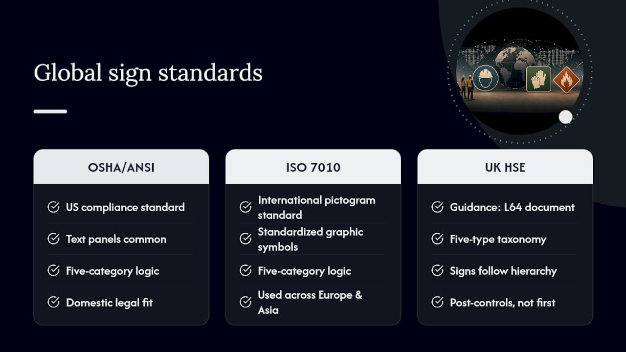
ISO 7010 is the international pictogram standard, widely adopted across Europe, Asia, and dozens of other markets. It uses the same five-category logic, Prohibition, Warning, Mandatory, Safe Condition, Fire Equipment, but standardizes the exact graphic symbols so a “No Smoking” pictogram looks identical whether it’s posted in Germany or Singapore. Multinational facilities often run ISO 7010 pictograms alongside ANSI text panels to satisfy both audiences.
The UK’s HSE framework, built around the Health and Safety (Safety Signs and Signals) Regulations and detailed in guidance document L64, closely mirrors the five-type taxonomy but ties sign use explicitly to a hierarchy of controls. Signs come after elimination, substitution, and engineering fixes, never before them.
For US facilities sourcing equipment internationally or hosting overseas visitors, the practical move is layering: keep the ANSI or OSHA format that satisfies domestic compliance, and add ISO 7010 pictograms where the symbol differs meaningfully from the American convention. Electrical hazard and biohazard symbols are usually consistent across frameworks. Chemical hazard and PPE pictograms sometimes aren’t, and that’s where a second layer of symbols earns its keep.
Case Studies in Sign Type Selection
A distribution warehouse running mixed forklift and pedestrian traffic is a textbook case for layering sign types rather than picking one. Prohibition signs mark pedestrian-only walkways, Mandatory signs post PPE requirements at loading dock entries, and Safe Condition signage marks assembly points near dock doors, all color-coded so a new hire recognizes the hierarchy within a shift.
A chemical processing facility leans harder on Warning and Fire signage. HazCom pictograms appear on drum labels and are echoed on nearby wall-mounted Warning signs, so the visual language stays consistent between container and room. Fire equipment signage in these facilities typically sits at a fixed, memorized height near every exit, because in an actual emergency nobody has time to search.
A multilingual construction site is where ANSI’s pictogram-first approach earns its reputation. A site with workers speaking five different first languages can’t rely on text-heavy Caution signs. Swapping to ANSI Z535 panels, symbol plus brief consequence statement, cut the guesswork that text-only signs create, since the pictogram carries the primary meaning and the words function as backup. Site safety platforms like EntryWatch that manage sign-in compliance for construction crews often reinforce this same layered approach, tracking who’s been briefed on which hazard signage before they’re allowed on site.
A Signage Supplier’s View on Getting Compliance Right
Most sign compliance failures aren’t about ignorance of the standards, they’re about execution: wrong color formula, indoor material used outdoors, fasteners that create a new snag hazard. Working with a signage specialist catches these before installation rather than during an OSHA walkthrough.
When requesting a compliance-focused quote, bring the standard you’re citing (OSHA legacy or a specific ANSI edition), site photos of mounting locations, and a hazard list. Signage providers can build sign sets against those specs and help confirm placement and material choices before production starts.
— Yossi
Get a Quote for Compliant Custom Signs
Once you know which sign types your facility needs, ordering them shouldn’t be the hard part. Custom signs can be designed and fabricated to meet OSHA and ANSI-format standards as required for compliance, rather than using generic stock designs.

To speed up a compliance-focused quote, send over site photos of where each sign will mount, the standard you’re targeting (OSHA legacy or a named ANSI Z535 edition), sign quantities, and your preferred material for indoor versus outdoor placement. Construction sites and large facilities needing higher sign volumes can start with the site signage page, while general facility orders fit best through the custom sign services page. If you’re unsure what the quoting process involves, the custom sign quote guide walks through timelines and what to prepare. Request a quote today and get compliant signage produced to spec, not guesswork.
Sources
- 1910.145 – Specifications for accident prevention signs and tags. | Occupational Safety and Health Administration
- ANSI/NEMA Z535 set (overview) | ANSI Webstore
- Health and safety signs – UCL
FAQ
What are the OSHA standards for safety signs?
OSHA 29 CFR 1910.145 sets three legacy sign classes, Danger, Caution, and Safety Instruction, along with color, construction, and tag requirements including tag readability appropriate for workplace visibility.
What are the five types of safety signs?
The five recognized categories are Prohibition, Warning, Mandatory, Safe Condition (Information), and Fire/Emergency, each defined by a distinct color and shape combination.
How many different types of safety notices are there?
Beyond the five main sign categories, workplaces also use supplementary notices and temporary tags, but the core classification system used across OSHA, ANSI, and HSE guidance sticks to five main types.
Is ANSI Z535 legally required, or just OSHA 1910.145?
OSHA 1910.145 is the legal requirement; ANSI Z535 is voluntary, though OSHA’s 2013 rule accepts named ANSI editions as an equally compliant alternative format.
Can I mix OSHA-legacy and ANSI-format signs on one site?
It’s legally permitted, but not advisable, since mixing formats makes color and signal words unreliable as consistent severity cues across the facility.