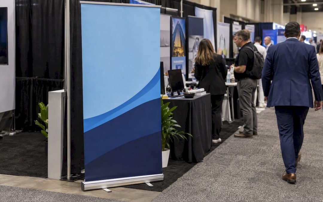
The best trade show banners do one thing: they tell a passing attendee what you do for them in about the time it takes to walk past. Below are eight banner formats and layouts that earn that glance, what makes each one work, and the file and booth-rule details that trip up first-time exhibitors.
TL;DR
- Pick one benefit per banner and write it as a short headline, not a feature list.
- Match the format to the job: a retractable banner for a table or inline booth, a hanging sign for island booths, floor graphics for aisles.
- Use two fonts at most, strong contrast, and one dominant image or pictogram.
- Send vector or properly scaled art. Large banners do not need 300 ppi.
- Read the exhibitor manual before you order anything that hangs, stands tall or goes on the floor.
Table of Contents
- What the strongest banners have in common
- Eight trade show banner examples and why they work
- Quick comparison: which format for which booth
- Design rules that make examples work
- Before you order: a pre-show checklist
- Our perspective: what we see when banners fail
- Get your banner made
- FAQ
- Sources
What the strongest banners have in common
Look at enough booths and the pattern is plain. The banners that work are not the prettiest. They are the ones a stranger understands from across the aisle.
Practitioners writing for the exhibition industry’s CEIR put it bluntly: backwalls often become bulletin boards of features, and if a booth staffer has to point at the sign and explain it, the sign has failed. The graphic should communicate in a split second and focus on benefits that match what attendees came to find.
That gives you a simple filter for every example below:
- Can someone get the message in three seconds at ten or fifteen feet?
- Does it say what the visitor gets, not what you make?
- Is there a clear reason to walk in?
Eight trade show banner examples and why they work
1. The single-benefit retractable
The workhorse. A tall retractable banner with a full-bleed photo, a headline of six words or fewer, and a logo at the top where it clears a crowd. Think of a commercial roofing company whose banner shows a dry, finished building and one line about leak-free warranties, rather than a list of shingle brands.
Why it works: one idea, one image, one logo. It fits in a case, sets up in a minute, and pairs well with a table or a narrow inline booth. See our banner stands and what a banner stand actually is if you are choosing hardware.
2. The pictogram banner
Replace a paragraph with an icon. A security installer shows a lock, a camera and a check mark, and nothing else but the company name. A food-packaging supplier shows a sealed tray.
Event strategists covering Pack Expo 2025 note that the most impactful signage uses pictograms and simplified imagery to communicate meaning instantly, which also removes language barriers in a crowded hall. That matters at international shows.
3. The question banner
A headline that names the visitor’s problem: “Still re-keying invoices by hand?” It invites a yes, and a yes starts a conversation. Keep the question about the attendee’s pain, not about you. Put the answer, your product or service, in a smaller line underneath.
Test it by reading it aloud to someone who has never heard of your company. If they can guess your industry from the question, it is working.
4. The hero-product banner
For physical products, show the product large, lit well and in use. A single oversized photo of a finished custom countertop or a piece of equipment beats a collage of twelve small ones. Reserve the bottom third for a short line and a web address or QR code.
The same logic applies to your tabletop: research from CEIR advises keeping literature in acrylic or collapsible racks instead of letting stacks of paper crowd the space and hide your branding.
5. The hanging sign
In big halls, the first thing an attendee sees is what is above the aisle. Event Marketer’s IMEX America 2025 takeaways describe the most effective exhibits using “aerial real estate”: suspended fabric, thematic icons or projected imagery that set a mood and define the booth from far away, rather than a simple name beacon.
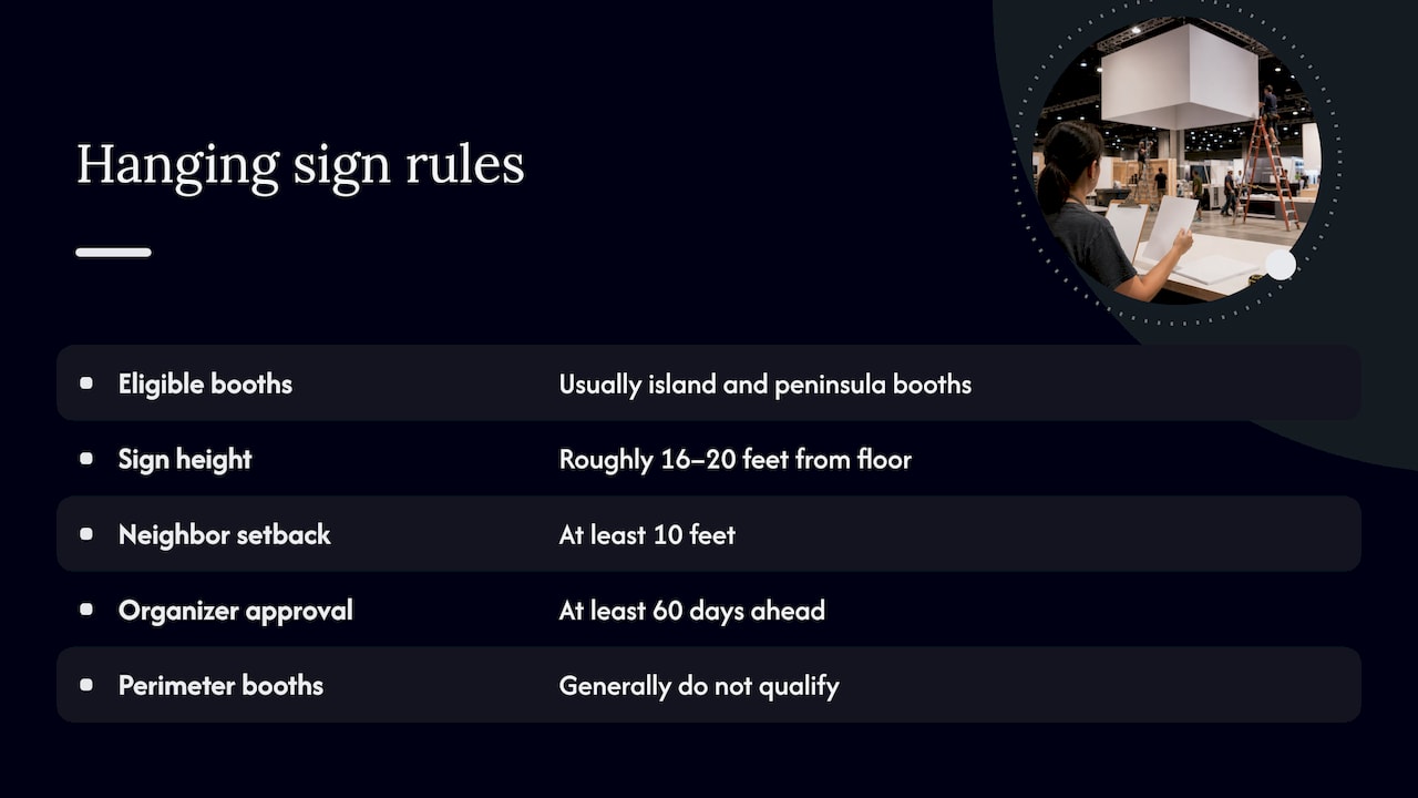
Hanging signs come with rules. Under IAEE’s display guidelines (2023), hanging signs are typically allowed in island and peninsula booths, usually up to roughly 16 to 20 feet from the floor to the top of the sign, set back at least 10 feet from neighboring booths, with organizer approval needed at least 60 days ahead. Perimeter booths generally do not qualify, and limits vary by show. Your exhibitor manual has the final word.
6. The booth-ID upgrade
Many organizers hand out a plain cardboard ID sign. The same IAEE guidance calls it a sign of inexperience and suggests replacing it with custom, well-built hanging or floor-standing signs, labeled and cased separately so they are easy to find during onsite setup. Your name should be the most professional thing on the aisle side of your space.
7. The floor graphic and aisle sign
When rigging is expensive or hanging is not allowed, look down. An IAEE piece on exhibition floor design points to floor clings and aisle signs supported by floor structures as ways to cut costs compared with high rigging. For an exhibitor, a floor decal with an arrow and a short line (“Free site assessment, this way”) pulls foot traffic into a small booth.
Check whether your show allows adhesive on the carpet or hall floor before you print.
8. The experience-led banner
Sometimes the banner should not carry the whole story. Event Marketer reports that 74 percent of attendees form a more positive opinion of a company after a positive event experience, and 61 percent describe immersive experiences as hands-on product interaction rather than passive, flashy displays.
In practice: the banner promises one thing (“Try it for 60 seconds”), and the booth delivers it. The sign sets the hook, the activity closes it.
Quick comparison: which format for which booth
| Format | Best for | Watch out for |
|---|---|---|
| Retractable banner | Table-top and 10-foot inline booths, tight budgets, frequent travel | Keep the key message above waist height so tables do not hide it |
| Wide vinyl or mesh banner | Backwalls, outdoor expos, windy venues (mesh) | Needs grommets or hardware plan and a wall or frame to hang from |
| Feather banner | Outdoor events, entrances, parking areas | Check show rules on outdoor flags |
| Hanging sign | Island and peninsula booths | Height, setback and approval deadlines |
| Floor graphic | Any booth where floors can be marked | Surface rules, slip safety |
| Wall or window graphic | Permanent showrooms, pop-up spaces | Surface prep and removal |
For more on choosing between these, our guides on effective trade show signs and trade show signage ideas go deeper on booth layouts.
Design rules that make examples work
Words: fewer than you think
CEIR’s guidance is to use large, bold imagery and limit text to benefits rather than feature lists. Too much copy tires the eye, and attendees keep walking. A workable structure is a headline of three to seven words, a one-line support statement, and your logo and web address.
Type and contrast
Two fonts is a safe ceiling. Adobe’s typography guidance recommends two to three typefaces at most, enough contrast between text and background, minimal decorative or cursive styling, and text sized for the viewing distance. Dark text on a busy photo fails; put the headline on a solid or darkened area.
Hierarchy
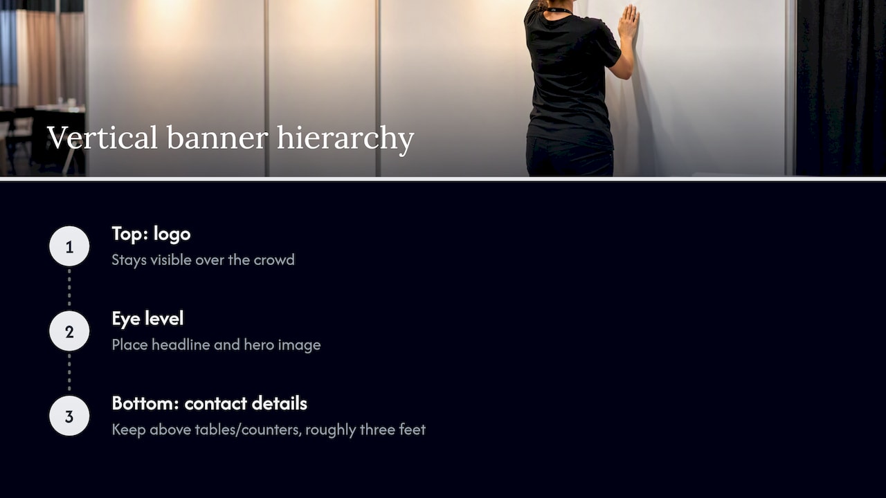
People read a vertical banner top to bottom, but the eye sits at the middle. Put the logo at the top for visibility over a crowd, the headline and hero image at eye level, and contact details at the bottom, where the table or counter will not hide them if you keep them above roughly three feet.
Files: why 300 ppi is the wrong target
This surprises many first-time buyers. Adobe community practitioners explain that 300 ppi is meant for print held at close range, and that for large banners about 30 ppi at final size is standard for viewing at a distance. It is also common to build the file at reduced scale, such as 10 percent, with proportionate imagery and let the print shop handle final scaling. Use vector logos and type wherever possible so edges stay crisp at any size.
Send your printer exact dimensions, bleed and safe-area requirements, and ask for a proof. A stand’s visible area is often smaller than the printed graphic, so never guess.
Before you order: a pre-show checklist
- Read the exhibitor manual. Hanging limits, floor rules and outdoor signage can differ by venue and booth type.
- Count your lead time. Hanging-sign approval can be due about 60 days before install, and you need print and production time before that.
- Walk your booth footprint. Where will tables, screens and people stand? Banners behind a crowd of staff lose their impact.
- Pick a single message. Ask your sales team what attendees ask most often, and answer that.
- Plan for travel. Pick a case or tube that fits the airline or van you are using, and a spare for the banner stand base.
- Bring repair tape and a backup file. Both have saved a morning more than once.
If your booth has a lounge or meeting corner, a bit of printed decor can soften the space. Some exhibitors use custom canvas wall art to dress a private meeting area, as long as the main branding stays on proper display graphics.
Our perspective: what we see when banners fail
Most banner problems we are asked to fix are decisions made before the design started. A company tries to make one banner serve three audiences, so it says nothing to any of them. Or the team approves artwork on a laptop screen and never checks what it looks like at fifteen feet.
Our advice is to treat the banner as a short sentence, not a brochure. Decide who you want to stop, write one line that speaks to them, then choose the format that fits the hall, the booth type and the show rules. We handle the consultation, design, fabrication and installation guidance, and we ask about the venue and its sign rules early because that is where timelines slip.
Durable material matters too. A banner that curls at the edges or fades after two shows undermines the first impression you paid for. If you plan to reuse graphics, tell us, and we will recommend the material and hardware to match.
— Yossi
Get your banner made
If you know the show, the booth size and the message, we can turn it into retractable, vinyl, mesh or feather banners, plus the vehicle graphics, wall graphics and printed collateral that go with them. Browse our banner options or request a quote and tell us the show date so we can plan around your deadline.
FAQ
What should a trade show banner include?
A short benefit-led headline, one strong image or icon, your logo and a way to follow up, such as a web address or QR code. Leave out feature lists and paragraphs. If a staff member has to explain the banner, the message needs work.
How do I make a trade show banner catchy?
Focus on the attendee’s problem or result, not your product name. Use a bold image, high contrast and two fonts at most. Then check it from a distance: if you cannot read it at the far side of a room, simplify it.
What resolution do I need for a large banner?
Far less than for a flyer. Around 30 ppi at the final printed size is common practice for large banners seen from a distance, according to Adobe community guidance. Use vector logos and text, and confirm requirements with your print provider.
Can I hang a banner above my booth?
Only if the show allows it for your booth type. IAEE guidelines say hanging signs are typically limited to island and peninsula booths, with height limits and organizer approval needed well in advance. Your exhibitor manual sets the actual limits.
Sources
- IMEX America 2025: Five Takeaways for Trade Show Marketers, Event Marketer
- Big Machines, Big Ideas: How Exhibitors Engineered Engagement at Pack Expo 2025, Event Marketer
- Guidelines for Display Rules and Regulations, IAEE
- The Art of Exhibition Floor Design, IAEE
- CEIR, Center for Exhibition Industry Research
- Typography basics, Adobe
- Best practice for scaling images for large banners, Adobe Community