
TL;DR:
- Luminance contrast is the key factor in sign readability, surpassing font choice, size, or color. Measuring brightness differences with tools ensures signs are accessible for low vision and color-blind viewers, meeting WCAG and industry standards. Effective design uses high contrast, redundancy, and appropriate materials to maintain legibility across environments.
Contrast is the single most important factor in whether a sign gets read. Not font choice, not size, not color palette. Luminance contrast — the difference in brightness between text and its background — determines whether a viewer can decode your sign in under two seconds from a moving car, a crowded hallway, or dim emergency lighting. The rule is simple: maximize brightness difference first, then worry about color.
The short version:
- Target a minimum contrast ratio of 4.5:1 for standard text and 3:1 for large text, per WCAG 1.4.3 (W3C)
- The International Sign Association (ISA) recommends a strong luminance contrast target between characters and their field for physical signage
- ADA and ICC A117.1 guidance requires light-on-dark or dark-on-light contrast with a non-glare finish for tactile and visual characters
- Test with a luminance meter or photometer — not just your eyes — because hue alone misleads
- Account for lighting conditions, viewing distance, material finish, and sign aging before finalizing any color spec
- Customsignstoday produces ADA-compliant signs and custom signage with material and finish options that support these standards.
Table of Contents
- 1. Why luminance matters more than color in signage contrast
- 2. What standards require: WCAG, ADA/ICC, and ISA benchmarks
- 3. Which color combinations actually work for signage
- 4. How environment and materials change what you see
- 5. Designing for color-vision deficiencies and low vision
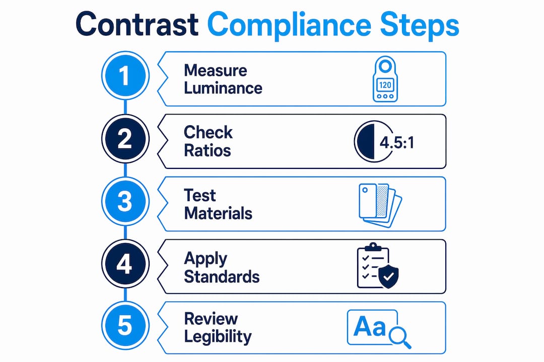
- 6. How to measure and test contrast for physical signs
- 7. Best-practices checklist for readable, accessible, compliant signs
- Key Takeaways
- Why brand identity and legibility are not actually in conflict
- Get high-contrast, compliant custom signs from Customsignstoday
- Useful sources and tools
1. Why luminance matters more than color in signage contrast
Luminance is perceived brightness, and it is the primary visual cue the human eye uses to separate foreground from background. Hue (the red/blue/green quality of a color) is secondary. That distinction matters enormously in practice because two colors can look dramatically different to a person with normal color vision yet appear nearly identical in brightness, making text unreadable for someone with a color-vision deficiency or low vision.
Consider a deep red on a dark green background. To a trichromat viewer, those look like distinct colors. To someone with red-green color blindness, the brightness values may be almost identical, and the text disappears. Luminance contrast solves this because brightness perception is largely preserved across most forms of color blindness.
Luminance contrast also drives visual hierarchy. The element with the highest contrast against its background draws the eye first. Designers should reserve the highest contrast for the primary message — an exit sign, a room number, a warning — and use lower contrast for secondary information. Applying maximum contrast to everything creates visual noise that slows recognition rather than speeding it up.
Type weight, x-height, and letter spacing interact with contrast. A thin-weight typeface at 4.5:1 contrast ratio reads worse than a medium-weight face at the same ratio because stroke width affects perceived luminance at a distance. Contrast multiplies good type choices and exposes weak ones.
Research published in MDPI’s Buildings journal found that contrast impact on legibility depends heavily on sign size: for very small signs (around 1% of reading distance), even large increases in brightness contrast have limited effect. Contrast utility peaks as sign size approaches roughly 5% of reading distance, with a recommendation of at least 7% for low-vision users.
2. What standards require: WCAG, ADA/ICC, and ISA benchmarks
Three frameworks define the measurable targets you need to know.
WCAG (W3C) sets the most widely cited numeric thresholds. Success Criterion 1.4.3 requires at least 4.5:1 contrast for normal-sized text and 3:1 for large text (18pt or 14pt bold). Criterion 1.4.11 extends the 3:1 minimum to non-text elements such as icons, form borders, and graphical objects. WCAG expresses contrast as a ratio from 1:1 (no contrast) to 21:1 (black on white). The math uses relative luminance values, not RGB numbers directly.
4.5:1 minimum contrast ratio for standard text (WCAG 1.4.3); 3:1 for large text and non-text graphical elements (WCAG 1.4.11)
ADA / ICC A117.1 governs physical signage in U.S. buildings. The U.S. Access Board’s ADA guide requires characters to contrast with their background using either light-on-dark or dark-on-light, with a non-glare finish. No minimum numeric contrast level is specified in the ADA Standards themselves, but the guidance states clearly: the higher the contrast, the better, especially for people with low vision. Tactile characters must also meet finish and contrast requirements; braille is exempt.
ISA guidance fills the numeric gap for physical signs. The International Sign Association recommends at least 70% luminance contrast between characters and their field. This is a percentage-based metric derived from Light Reflectance Values (LRV), not the ratio format WCAG uses.

Converting LRV to a contrast ratio — a quick example:
Suppose your background substrate has a high light reflectance value and your text color has a low value. The luminance contrast percentage calculated from these shows a high contrast, exceeding the commonly recommended threshold for physical signage. To express this as a WCAG-style ratio, convert each LRV to relative luminance (divide by 100, apply the sRGB gamma formula), then divide the lighter value by the darker. For most practical sign-specification work, LRV-based percentage checks align well with the 4.5:1 WCAG threshold when the percentage exceeds roughly 70%.
Use LRV percentages when specifying paint, substrate, and vinyl colors in production. Switch to photometer luminance readings when verifying an installed sign under actual site lighting.
3. Which color combinations actually work for signage
Some pairings are reliable across nearly every environment. Others look fine on a monitor and fail in the field.
High-contrast pairs that perform consistently:
- Black on white / white on black — the gold standard for directional and informational signs; works in sun, shade, and artificial light
- Dark navy on white — slightly softer than pure black, still exceeds 4.5:1 easily, and suits professional or wayfinding contexts
- Yellow on black — exceptional for warning and safety signs; high luminance contrast and strong visibility in low light
- White on deep red or dark burgundy — works for regulatory and emergency signage when the red is dark enough (LRV below 20)
- White on dark green — standard for exit and safety signs in the U.S.; the dark green provides sufficient luminance difference
Pairs to avoid:
- Pastel on pastel (light yellow on cream, light blue on white) — luminance values are too close
- Red on green — hue-reliant; fails completely for red-green color-blind viewers
- Medium gray on white — looks clean on screen, often falls below 3:1 in print
- Gold or metallic on white — reflective finishes shift apparent luminance depending on viewing angle
Adapting brand palettes is where most designers run into trouble. A brand’s signature mid-tone blue may look great on a business card but fall below 4.5:1 on a sign background. Three practical fixes: darken the brand color until it meets the LRV threshold, add a dark outline or drop shadow around lighter text, or place text on a solid contrasting field (a dark band or panel) rather than directly on a patterned or mid-tone background.
Dos and don’ts for brand palette adaptation:
- Do: test every brand color pair with a luminance tool before approving production files
- Do: use a dark outline (at least 2px equivalent at final print scale) when text must sit on a variable background
- Don’t: assume a color that passes on-screen will pass in print — monitor gamma and substrate reflectance differ
- Don’t: rely on color alone to convey critical information; pair color with shape, text, or position
4. How environment and materials change what you see
A sign that passes contrast testing in a studio can fail in the field. Lighting is the biggest variable. Direct sunlight washing over a glossy sign can reduce apparent contrast by creating specular reflections that obscure text. Low-light conditions at dusk or in underground parking require higher inherent contrast because the eye’s sensitivity to luminance differences drops as overall illuminance falls. Standards note that lower illuminance typically requires greater contrast to maintain readability.
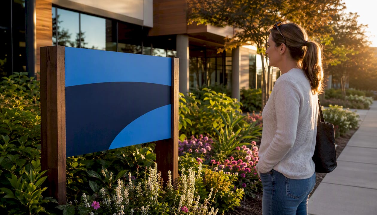
Reflective vinyl outdoors performs very differently from matte interior substrates. A matte white background with dark text reads consistently across lighting angles. A glossy white background with the same dark text can look washed out at certain sun angles, effectively reducing perceived contrast even though the material specs haven’t changed. For construction-site signage where lighting varies dramatically, safety-focused mounting and material choices directly affect whether workers can read critical warnings.
Retroreflective materials increase nighttime visibility but introduce a specific risk: hot spots and glare at certain angles that reduce legibility. Specification should include target reflectance behavior and angle-dependent testing wherever retroreflection is needed.
Aging degrades contrast over time. UV exposure fades ink, yellows laminates, and oxidizes vinyl. A sign that starts at 80% luminance contrast may drop below the 70% ISA threshold within a few years without UV-stable inks and protective overlaminates. Build a re-inspection schedule into any long-term signage program.
Pro Tip: Prefer matte or low-glare finishes for informational and directional signage. The ADA sign guidance explicitly requires non-glare finishes for tactile and visual characters, and matte substrates preserve contrast consistency across the widest range of lighting angles.
5. Designing for color-vision deficiencies and low vision
About 8% of men and 0.5% of women have some form of color-vision deficiency. Designing for them is not a niche concern — it affects a meaningful share of every sign’s audience.
The core principle: never use color as the only way to convey information. An exit sign that uses green text on a white background without the word “EXIT” or an arrow fails for anyone who cannot distinguish that particular green. Add shape, text labels, position, or pictograms as redundant cues.
Practical checks and tools:
- Run your design through a color-blindness simulator such as Coblis or the Colour Contrast Analyser’s built-in simulation modes before sending to production
- Check the design in grayscale — if the text and background look similar in grayscale, luminance contrast is insufficient
- Verify that any information conveyed by color alone is also conveyed by shape, pattern, or text
- For wayfinding signs, use directional door signs with both color coding and text labels so no single cue carries the full message
Dos and don’ts for color-blind accessibility:
- Do: use strong luminance contrast (aim for 4.5:1 or higher) as the primary legibility tool
- Do: pair color with shape redundancy (red octagon for stop, yellow triangle for caution)
- Don’t: use red and green together for critical information — the most common deficiency (deuteranopia) makes these nearly indistinguishable
- Don’t: rely on subtle tonal differences between adjacent colors to separate zones or categories
Accessibility experts stress that luminance contrast is the primary tool for people with low vision and many forms of color blindness, not hue selection.
6. How to measure and test contrast for physical signs
Visual inspection is not a measurement. Here is a repeatable workflow.
Tools you need:
- A luminance meter or photometer for installed sign verification under site lighting
- LRV charts or a spectrophotometer for production-stage substrate and ink specification
- The Colour Contrast Analyser (free, from TPGi) for preflight proofs — it accepts RGB/Hex values or an eyedropper and computes WCAG ratios; automated web checkers miss text embedded in images, so this tool matters for print proofs too
- A color-blindness simulation app for design review
Step-by-step measurement workflow:
- Identify measurement points: the lightest area of the background and the darkest area of the text (or vice versa for light-on-dark)
- Measure luminance (cd/m²) at each point with a photometer, or obtain LRV values from substrate and ink data sheets
- Compute the contrast ratio: divide the higher luminance value by the lower (add 0.05 to each per WCAG relative luminance formula for digital proofs)
- Compare against thresholds: 4.5:1 (WCAG normal text), 3:1 (large text / non-text), 70% LRV difference (ISA physical sign guidance)
- Document conditions: date, time, ambient light level, sun angle, and artificial lighting type
- Remediate if below threshold: darken text color, lighten background, increase text size, or change finish
| Sample | Meets 70% ISA? |
|---|---|
| Dark navy on white | Yes |
| Medium gray on white | No |
| Yellow on black | Yes |
| Light blue on white | No |
Pro Tip: When testing an installed sign, measure at two representative times: bright midday and dusk or low-light conditions. Document the ambient illuminance at each reading. A sign that passes at noon may fall below threshold at 6 PM under parking-lot sodium lighting.
7. Best-practices checklist for readable, accessible, compliant signs
Use this before approving any proof or inspecting an installed sign.
- Choose a high-luminance pair: black/white, dark navy/white, or yellow/black as the baseline
- Verify numeric thresholds: 4.5:1 minimum for standard text, 3:1 for large text and icons, 70% LRV difference for physical signage fields
- Test with a luminance tool, not just visual inspection or on-screen preview
- Specify matte or low-glare finishes for all informational and directional signs
- Size text for the anticipated reading distance: at least 7% of reading distance for low-vision users, per MDPI research
- Add redundant cues (shape, text label, position) for any information conveyed by color
- Simulate color-blindness before production approval
- Check aging plan: specify UV-stable inks and overlaminates; schedule re-inspection at regular intervals
- For outdoor property signage, test contrast under direct sun and overcast conditions before final approval
- Document all measurements: substrate LRV, ink LRV, computed ratio, lighting conditions, and date
Key Takeaways
Luminance contrast is the primary driver of sign legibility — measure it with a photometer or LRV data, not by eye, and verify against WCAG and ISA thresholds before production.
| Point | Details |
|---|---|
| Luminance beats hue | Brightness difference determines legibility for low-vision and color-blind viewers; hue alone is unreliable. |
| Know your thresholds | WCAG requires 4.5:1 for standard text; ISA recommends 70% LRV difference for physical signage fields. |
| Environment changes everything | Test at multiple lighting conditions; lower illuminance requires higher inherent contrast to maintain readability. |
| Redundancy protects everyone | Never rely on color alone; pair it with shape, text labels, or position for critical messages. |
| Customsignstoday delivers compliant signs | Customsignstoday produces custom signs with material and finish options aligned to ADA, ISA, and WCAG contrast requirements. |
Why brand identity and legibility are not actually in conflict
The conventional framing treats accessibility as a constraint that forces designers to compromise their brand. That framing is wrong, and it leads to bad decisions.
Brand palettes almost always contain at least one color dark enough to meet a 4.5:1 ratio against white, and at least one light enough to work as a background against dark text. The problem is that designers default to mid-tone brand colors because they look balanced on a screen, then resist darkening them because it “changes the brand.” What actually changes the brand is a sign nobody can read.
The practical fix is straightforward: identify the two or three brand colors with the most extreme LRV values and build your sign contrast system around those. Use mid-tone brand colors for decorative elements, borders, and backgrounds where no text sits. Reserve the high-contrast pairs for every character, symbol, and critical graphic. This approach preserves brand recognition — viewers still see the palette — while meeting every numeric threshold.
The effective sign design principles that actually work in the field are not about choosing between looking good and being readable. They are about understanding that a sign’s job is to communicate, and contrast is the mechanism that makes communication possible at speed and distance.
Get high-contrast, compliant custom signs from Customsignstoday
Knowing the standards is one thing. Getting a sign produced to those standards is another. Customsignstoday works with clients to specify material finishes, substrate LRV values, and ink combinations that meet ADA, ISA, and WCAG contrast requirements from the first proof, not after a costly reprint.
Whether you need custom signs for a commercial building, site signs for a construction project, or face-change displays that need to stay legible across frequent content updates, the production team at Customsignstoday can advise on matte finishes, retroreflective materials, and color proofing before anything goes to press. Request a quote and include your contrast requirements — LRV targets, ADA compliance needs, or viewing distance specs — and get a production plan built around them.
Useful sources and tools
Standards and regulatory guidance:
- WCAG 2.2 Success Criterion 1.4.3 (W3C) — primary reference for contrast ratio math and thresholds
- WebAIM: Contrast and Color Accessibility — plain-language explanation of WCAG ratio calculations and extensions to non-text elements
- U.S. Access Board: ADA Guide, Chapter 7 Signs — governing U.S. standard for physical sign contrast, finish, and character requirements
- ISA Sign Contrast Guidance — industry guidance on 70% luminance contrast for physical signage
- ADA.gov — primary resource for U.S. ADA law and enforcement
Measurement and testing tools:
- Section508.gov: Color Contrast in Non-Web Documents and Images — guidance on using luminance tools for print and physical sign proofs; covers Colour Contrast Analyser and Accessibility Insights
- Colour Contrast Analyser (TPGi, free download) — accepts RGB/Hex or eyedropper input; computes WCAG ratios for preflight proofs
Research:
- MDPI Buildings: Experimental Study on Signage Size and Brightness Contrast for Low Vision — empirical data on size-contrast interaction and low-vision reading distance recommendations