TL;DR:
- Proper sign placement is crucial for visibility and effectiveness, often outweighing design quality.
- Position signs in high-traffic areas with clear sight lines and appropriate height based on viewer type.
Sign placement is the single most important factor determining whether your signage gets noticed or ignored. A beautifully designed sign mounted in the wrong spot, blocked by a tree, or installed at the wrong height will fail every time. These tips for effective sign placement cover location, height, message length, and environmental factors so your signs work as hard as your business does.
1. Why sign placement matters more than design
Sign placement can matter more than the design itself. An obstructed or poorly located sign fails even when the graphics are excellent. This is the core principle behind professional sign positioning: the best location unlocks the full value of your investment.
Business owners often spend heavily on design and materials, then make placement decisions as an afterthought. That sequence is backwards. Placement planning belongs at the start of the project, not the end.
2. How does location influence sign effectiveness?
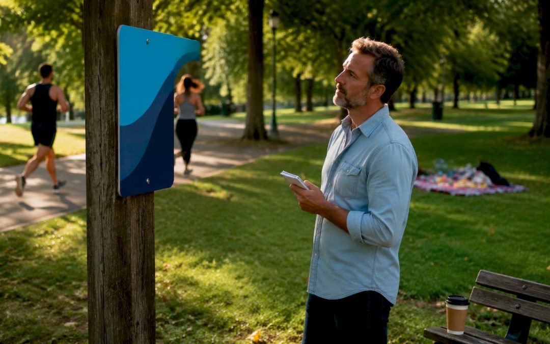
The right location puts your sign in front of the right people at the right moment. Placement follows the viewer’s path, considering approach angles and natural lines of sight rather than just property boundaries. A sign facing the wrong direction misses every driver approaching from the main road.
Start by identifying your highest-traffic approach routes, both pedestrian and vehicle. Walk or drive those routes yourself at peak times and note exactly where your eye naturally lands. That spot is your prime placement zone.
Key location factors to check before installation:
- Clear sight lines. Remove or avoid obstructions like utility poles, parked vehicles, and dense shrubs.
- Approach direction. Face the sign toward the dominant direction of incoming traffic, not toward your building.
- Dwell time. Place signs where people slow down, stop, or wait, such as intersections, parking lot entrances, and crosswalks.
- Competing visual noise. Avoid walls or fences already covered with other signs. Multiple signs competing for attention dilute message clarity.
Pro Tip: Walk your placement route at the same time of day your customers typically arrive. Morning sun glare and afternoon shadows can make a perfectly positioned sign invisible at peak hours.
3. What is the optimal height for sign placement?
Height is the most underestimated variable in sign positioning. Pedestrians naturally scan at eye level and slightly below, so signs mounted too high reduce readability even when the font is large. The fix is not a bigger font. It is a lower mounting point.
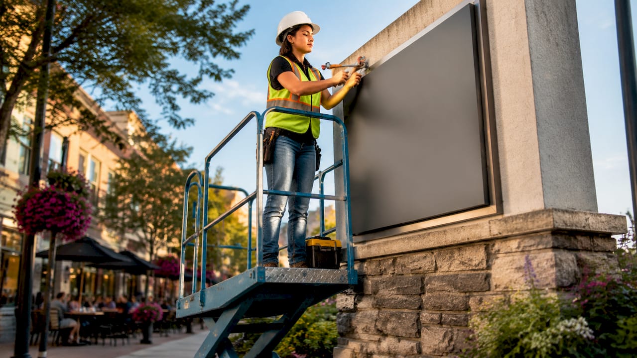
Installation height must align with natural human gaze behavior to capture attention and improve readability. For pedestrian signs, the professional standard is 1.6–2.2 meters from ground level. Driver-facing signs need higher placement, but the message must also be shorter and the lettering larger to compensate for increased viewing distance and speed.
| Viewer type | Recommended height | Key adjustment |
|---|---|---|
| Pedestrian | 1.6–2.2 meters | Center message at eye level |
| Seated driver | 2.0–3.0 meters | Increase font size, reduce word count |
| Parking lot visitor | 1.8–2.5 meters | Add directional arrow for clarity |
| Event attendee | 1.5–2.0 meters | Use bold contrast colors |
Angle matters as much as height. Tilt the sign face slightly toward the viewer’s natural line of sight rather than mounting it perfectly vertical. A 5–10 degree forward tilt on a wall-mounted sign can dramatically improve readability from a distance.
Pro Tip: Stand at the exact spot where your viewer will first see the sign. Hold a piece of cardboard at different heights until it feels natural to read. That is your mounting height.
4. Why message simplicity is essential for fast-moving viewers
Short messages get read. Long messages get skipped. When traffic speed is higher, sign messages should be limited to 3–7 words for effective communication. A driver passing at 35 mph has roughly 2–3 seconds to register your sign. Seven words is already pushing the limit.
Placement directly shapes how much text you can use. A sign near a bus stop or crosswalk earns more reading time than one beside a highway on-ramp. Match your word count to the viewing time your location actually provides.
Rules for message simplicity by location type:
- High-speed roadway: 3–5 words maximum, one strong visual element.
- Parking lot or entrance: 5–7 words, include a directional cue.
- Storefront window or door: Up to 10 words, since viewers are already slowing down.
- Event venue interior: Full sentences work here because attendees are stationary.
High-contrast lettering is non-negotiable. Dark text on a light background, or white text on a dark background, reads faster than any other combination. Avoid decorative fonts for primary messages. Cramped messages drastically reduce sign effectiveness, so leave generous white space around your text.
5. How do environmental factors affect sign visibility?
Environment changes daily, seasonally, and over years. Lighting conditions, glare, shadows, and background contrast all affect sign visibility across different times of day. A sign that reads perfectly at noon may disappear into a shadowed wall by 4 p.m.
Plan for visibility in changing light conditions before you commit to a location. Check the spot at dawn, midday, and dusk. Note where shadows fall and where direct sunlight creates glare on glossy sign faces. Matte finishes reduce glare outdoors. Backlit or illuminated signs solve the low-light problem entirely.
Environmental factors to assess before installation:
- Background contrast. A white sign against a white building is invisible. Choose mounting surfaces that contrast with your sign color.
- Seasonal obstructions. Trees that are bare in winter may fully block your sign by july. Placement should anticipate growing trees and seasonal decorations that may obstruct visibility over time.
- Glare and backlighting. Avoid placing signs where the sun sits directly behind them during peak viewing hours.
- Maintenance access. Signs that are hard to reach get neglected. Faded or damaged signs hurt your brand more than no sign at all.
| Factor | Risk | Solution |
|---|---|---|
| Direct sun glare | Sign face unreadable | Use matte laminate or reposition |
| Tree growth | Gradual obstruction | Choose open wall or pole mount |
| Low-light hours | Poor visibility at night | Add illumination or reflective material |
| Regulatory limits | Fines or forced removal | Check local zoning before installation |
Local regulations influence sign setbacks, height restrictions, and brightness, affecting feasible placement options. Check your city or county zoning code before ordering. Permits are often required for permanent outdoor signs, and violations can result in forced removal. For property managers, the relationship between placement and compliance is especially critical because safety signs must meet specific positioning standards to be legally valid.
6. Test your placement before committing
Testing sign visibility from multiple approaches and at actual traffic speeds is the step most business owners skip. Print a full-size mock-up, tape it to the proposed location, and drive or walk past it at normal speed. You will immediately see whether the height, angle, and message length work together.
Signs only work when seen at the right moment and place. Small adjustments in placement improve both safety and communication significantly. Moving a sign 18 inches lower or rotating it 15 degrees can be the difference between a sign that converts and one that blends into the background.
Test from every realistic approach angle, not just the front. Customers arriving from a side street or parking lot see a completely different view than those coming from the main road. A retail sign placement guide can help you map those angles systematically before installation day.
7. Coordinate signage with on-site elements
Signs do not exist in isolation. They compete with architecture, landscaping, other signs, and ambient visual noise. Effective sign positioning accounts for the full visual environment, not just the sign itself.
Align your sign with natural decision points on your property. Place directional signs where people must choose a path, not after they have already passed the turn. For events, position entry signs at the first point of confusion, which is usually the parking lot, not the front door.
Coordinating your sign system with on-site elements also means matching sign styles across locations. Consistent colors, fonts, and mounting heights create a visual hierarchy that guides viewers naturally. Understanding site sign types and best practices helps you build that hierarchy from the ground up.
Key takeaways
Effective sign placement requires matching location, height, message length, and environmental conditions to the viewer’s actual behavior and approach path.
| Point | Details |
|---|---|
| Location beats design | A well-placed simple sign outperforms a beautiful sign in the wrong spot. |
| Match height to viewer type | Pedestrian signs work best at 1.6–2.2 meters; driver signs need higher placement and shorter text. |
| Limit words by traffic speed | Fast-moving traffic requires 3–7 words maximum for the message to register. |
| Plan for environmental changes | Seasonal tree growth, glare, and low-light hours can make a good location fail over time. |
| Test before you install | A full-size mock-up test at real traffic speeds reveals placement problems before they cost you money. |
What I have learned from watching signs fail in the field
I have reviewed hundreds of sign installations over the years, and the pattern is always the same. The sign looks great in the design file. Then it goes up, and nobody notices it. The culprit is almost never the design. It is a placement decision made by someone who never stood at the viewer’s position.
The most common mistake I see is mounting signs at a height that feels logical from a ladder but is completely wrong from the sidewalk. Installers naturally work at their own eye level, which is fine for the person hanging the sign but wrong for the person reading it. The second most common mistake is ignoring the background. A dark blue sign against a dark brick wall disappears, regardless of font size or quality.
What actually works is treating placement as a separate discipline from design. Walk the site before you order anything. Photograph the proposed location from every approach angle. Then design the sign to fit that specific environment, not the other way around. The outdoor signage installation process should always start with a site assessment, not a design brief.
One more thing: revisit your signs every six months. Trees grow. Neighboring businesses add new signs. Seasonal banners appear. A placement that worked perfectly in january may be blocked by a food truck canopy every summer. Placement is not a one-time decision. It is an ongoing responsibility.
— Yossi
Get signs built for the location, not just the wall

Customsignstoday designs and produces custom signs built around your specific site conditions, viewer distances, and compliance requirements. Whether you need face change signs for flexible outdoor messaging or site signs for construction and property management, every order starts with understanding where and how the sign will be seen. The team at Customsignstoday works with business owners, event planners, and property managers across West Palm Beach and Florida to match materials, sizing, and mounting options to real-world placement needs. Get a free quote and bring your placement plan to life.
FAQ
Why does sign placement matter more than design?
Placement determines whether a sign is seen at all. An obstructed or poorly located sign fails even when the design is excellent, so location is the foundation of any effective signage strategy.
What height should outdoor signs be mounted at?
Pedestrian signs should be mounted at 1.6–2.2 meters from ground level to align with natural eye level. Driver-facing signs need higher placement combined with larger fonts and shorter messages.
How many words should a roadside sign have?
Limit roadside sign messages to 3–7 words. Faster traffic gives viewers less time to read, so fewer words deliver the message more reliably.
Do I need a permit for an outdoor sign?
Most permanent outdoor signs require a permit. Local zoning codes regulate setbacks, height, and brightness, so check with your city or county before installation to avoid fines or forced removal.
How do I test sign placement before installing?
Print a full-size mock-up and tape it to the proposed location. Walk and drive past it at normal speed from every approach angle to confirm the height, angle, and message length work together in real conditions.