TL;DR:
- A prohibition sign features a red-bordered circle, white background, black pictogram, and a red diagonal slash at roughly 45°, governed by ISO 7010, ANSI Z535.3, or MUTCD standards depending on location.
- Correct color, shape, and contrast are essential for compliance and effective recognition across various environments and jurisdictions.
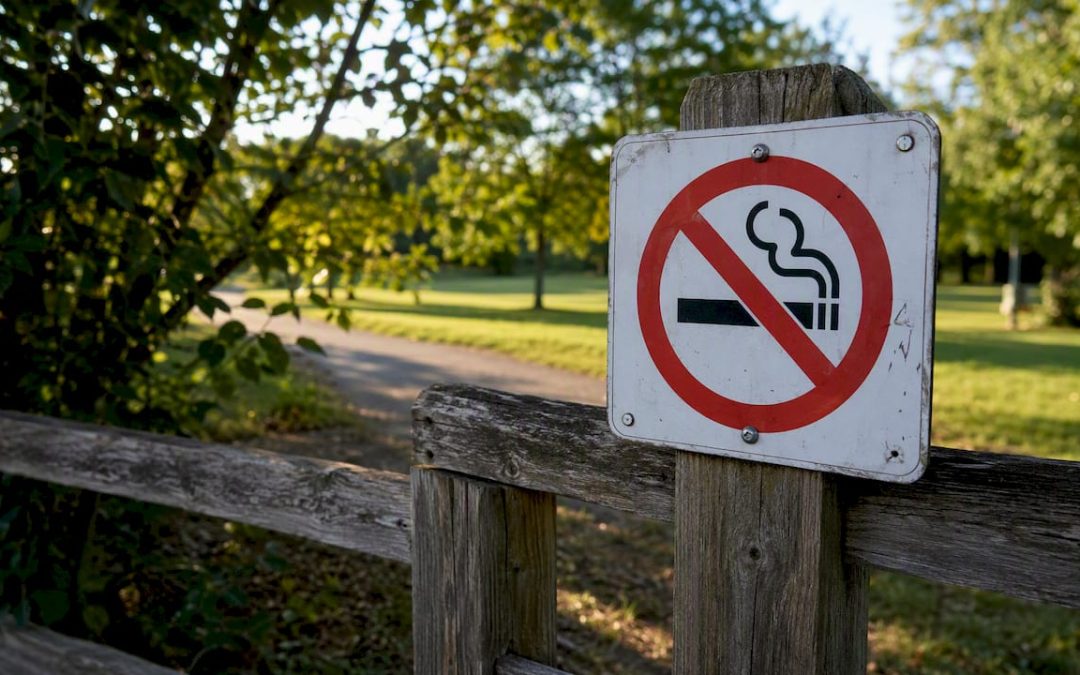
A prohibition sign is a circle with a red ring border, a white interior field, a black pictogram centered in the middle, and a red diagonal slash running from upper-left to lower-right at roughly 45°. That combination is the universal “do not” signal, codified in ISO 7010 for international workplace and public safety use, in ANSI Z535.3 for U.S. workplace signs, and in the MUTCD for regulatory traffic signs on American public roads.
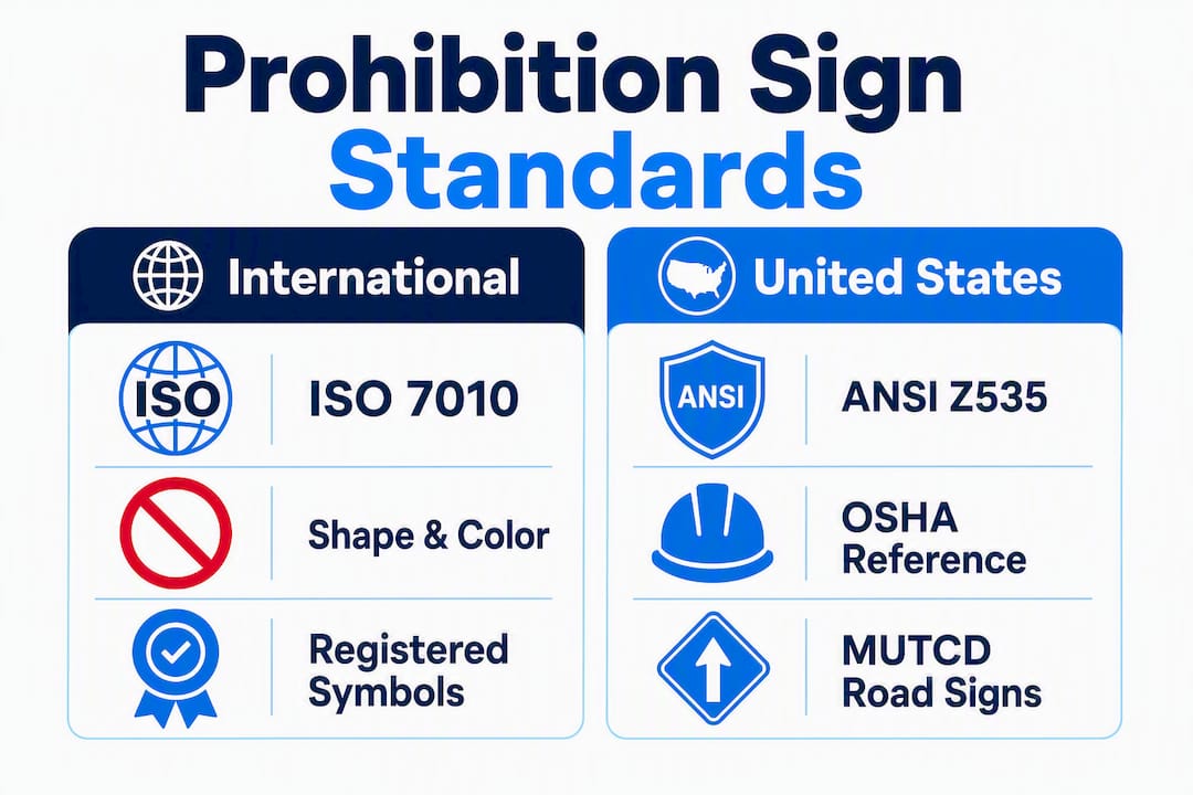
Three standards govern this symbol in the United States. ISO 7010 defines the registered pictograms and ties shape and color to ISO 3864-1 and ISO 3864-3. The ANSI Z535 family, referenced by OSHA under 29 CFR 1926.200, sets the format for workplace safety signs. The MUTCD 11th Edition controls every regulatory sign on a public road. Knowing which standard applies to your situation is the first decision, not the last.
Table of Contents
- What does a prohibition sign look like, exactly?
- How ISO 7010, ANSI Z535, and MUTCD compare on prohibition signs
- Where you will actually encounter prohibition signs
- Variations and non-compliant designs to watch for
- How to design and place a prohibition sign correctly
- Common prohibition pictograms and what they mean
- Key Takeaways
- Why standard compliance is more than a checkbox
- Customsignstoday can produce your prohibition signs to spec
- Useful sources for official specifications
What does a prohibition sign look like, exactly?
The basic composition never changes across compliant designs: a circle, a red border ring, a white background inside the ring, a black pictogram, and a red diagonal slash crossing the pictogram. That slash runs from the upper-left to the lower-right at approximately 45°, which is the conventional orientation specified in ISO 7010 and referenced in ANSI guidance. The slash does not obscure the pictogram completely; it overlays it so the viewer can still read what action is prohibited.
Color is where most non-compliant signs fail. The red must be a true safety red, not orange-red or burgundy. The interior field must be white, not off-white or gray, because contrast between the black pictogram and the background is a functional requirement, not just an aesthetic one. The pictogram itself is black on that white field, with the red slash crossing both.
Visual element specifications at a glance:
| Element | Specification | Standard Reference |
|---|---|---|
| Overall shape | Circle | ISO 7010 / ISO 3864-1 |
| Border/ring color | Safety red | ISO 3864-1, ANSI Z535.3 |
| Interior field color | White | ISO 7010, ANSI Z535.3 |
| Diagonal slash color | Safety red | ISO 7010 |
| Slash angle | ~45°, upper-left to lower-right | ISO 7010 convention |
| Pictogram color | Black | ISO 7010 |
| Minimum size | Context-dependent; MUTCD tables for road signs | MUTCD Part 2B |
Quick visual checklist — a compliant prohibition sign has all of these:
- Circular shape (not square, not rectangular)
- Continuous red ring forming the border
- White interior background
- Black pictogram centered inside the circle
- Red diagonal slash crossing the pictogram at roughly 45°
- High contrast between all elements (no faded or mismatched colors)
If any element is missing or the colors are wrong, the sign does not meet the standard.
How ISO 7010, ANSI Z535, and MUTCD compare on prohibition signs
These three standards cover overlapping territory but serve different jurisdictions and contexts. Choosing the wrong one for your application is a compliance error, not just a paperwork problem.
ISO 7010 is the international reference. It prescribes registered safety symbols and relies on ISO 3864-1 for safety colors and shapes and ISO 3864-3 for design principles. Every registered prohibition symbol in ISO 7010 uses the red circle-and-slash format described above. ISO 7010 is the right standard for multinational facilities, exported products, and any context where international recognition matters.
ANSI Z535.3, referenced by OSHA under 29 CFR 1926.200, governs U.S. workplace safety signs. OSHA specifies that danger signs use red predominance, and the ANSI Z535 figures provide the layout templates inspectors check against. Mixing nonstandard colors or improvised artwork in a workplace sign can trigger an OSHA inspection failure. For construction sites, factories, and commercial buildings, ANSI Z535 is the controlling document.
MUTCD (11th Edition) is the law for public roads. It contains a dedicated R3-series for movement prohibition signs, covering R3-1 through R3-4, R3-18, and R3-27. These signs have tighter geometric and color requirements than their workplace counterparts, and retroreflective sheeting type is regulated. A noncompliant material on a road sign can reduce its legal enforceability. For LED changeable-message signs, MUTCD requires that the red circle and diagonal be approximated as closely as possible, with the action legend displayed in white on a black background.
| Standard | Scope | Mandatory or Recommended | Key Color/Layout Rule | When It Takes Precedence |
|---|---|---|---|---|
| ISO 7010 | International workplace and public safety | Mandatory where adopted | Red ring, white field, black pictogram, red slash | Multinational sites, exported goods |
| ANSI Z535.3 | U.S. workplace safety signs | Mandatory via OSHA reference | Red predominance for danger; ANSI figure layouts | U.S. construction, factories, commercial buildings |
| MUTCD 11th Ed. | U.S. public roads | Mandatory for public roads | R3-series geometry, retroreflective sheeting | Any sign on a public right-of-way |
Where you will actually encounter prohibition signs
Prohibition signs appear in more contexts than most people realize, and the standard that applies shifts with the location.
-
Traffic control on public roads. Stop signs, No U-Turn signs, Do Not Enter signs, and No Parking signs are all prohibition signs under MUTCD. The R3-series covers movement prohibitions specifically. These are the signs you see at intersections, highway on-ramps, and parking lots on public property.
-
Workplace safety. Construction sites, manufacturing floors, chemical storage areas, and server rooms all use prohibition signs to communicate firm restrictions: No Smoking, No Open Flames, No Unauthorized Entry. ANSI Z535 and OSHA’s accident prevention sign rules govern these.
-
Public buildings and facilities. Airports, hospitals, schools, and government buildings post prohibition signs for fire safety, security, and public health. These often follow ISO 7010 pictograms, especially in facilities that serve international visitors.
-
Consumer packaging and product labels. A No Flame symbol on a spray can or a No Microwave symbol on a food container uses the same red-circle-and-slash format. ISO 7010 registered symbols appear frequently on product packaging sold in global markets.
-
Temporary site restrictions. Construction fences, event perimeters, and film sets use prohibition signs for short-term access control. These are often vinyl decals or printed panels rather than permanent aluminum signs, but the visual format should still follow the relevant standard.
-
Digital and LED displays. Changeable-message signs on highways and parking structures display prohibition messages electronically. MUTCD requires the red circle and diagonal to be approximated as closely as the display technology allows.
The message level matters too. A prohibition sign communicates a firm “must not” — not a suggestion, not a warning. That distinction separates prohibition signs (red circle and slash) from warning signs (yellow or black triangle or rectangle), which alert to a hazard rather than forbidding an action.
Variations and non-compliant designs to watch for
Not every sign that looks like a prohibition sign actually is one, and some legitimate variants can confuse people who are not familiar with the standards.
Legitimate variations:
- No pictogram, red ring only. Some older or simplified signs use the red circle and slash without a pictogram, relying on text alone. This is less effective for international audiences and does not meet ISO 7010 registration requirements, but it appears in legacy installations.
- Full red background traffic signs. The Do Not Enter sign (R5-1 in MUTCD) uses a white horizontal bar on a full red background, not the standard circle-and-slash format. It is a prohibition sign by function but differs visually from the ISO format.
- Different slash angles. Some regional or older designs use a slash closer to 30° or 60°. These are non-standard and reduce immediate recognition.
Common errors in non-compliant signs:
- Incorrect red (too orange, too dark, or faded from UV exposure)
- Missing contrast between the pictogram and the white field
- Slash too thin to read at distance
- Pictogram color reversed (white symbol on red background instead of black on white)
- Text-only signs with no pictogram, which fail ISO 7010 and reduce comprehension speed
- Wrong shape (square or rectangular signs with a circle printed on them rather than a true circular sign)
Regional differences exist even within the U.S. Some state DOTs have historically used slightly different proportions or supplemental text panels. MUTCD sets the floor, but local amendments can add requirements on top of it.
Pro Tip: Remove or cover any prohibition sign that no longer applies. Safety professionals warn that outdated signs cause sign blindness, where workers or visitors start ignoring all signs because some are clearly irrelevant. One stale “No Entry” sign on an open door trains people to tune out the signs around it.
How to design and place a prohibition sign correctly
Follow these steps whether you are commissioning a sign or checking a vendor’s proof.
-
Pick the correct standard first. Public road? MUTCD R3-series. U.S. workplace? ANSI Z535.3 and OSHA 29 CFR 1926.200. International or multi-site? ISO 7010. The standard determines everything downstream, from pictogram art to material specs. For compliant safety signage, this is the non-negotiable starting point.
-
Select a registered pictogram. ISO 7010 maintains a library of registered symbols. Using a registered symbol means the image has been tested for comprehension across cultures. Do not improvise artwork for a prohibition sign if a registered symbol exists for your message.
-
Set the minimum size for your viewing distance. MUTCD provides size tables for road signs based on speed limit and road type. For workplace signs, ANSI Z535 guidance ties minimum letter and symbol height to the maximum viewing distance. A sign too small to read from the relevant distance is a compliance failure.
-
Specify materials for the environment. Outdoor road signs require retroreflective sheeting per MUTCD. Long-term outdoor workplace signs need UV-stable substrates. Indoor signs can use lighter materials, but color accuracy still matters. Reviewing a sign materials comparison before ordering saves costly reprints.
-
Mount at the correct height and angle. MUTCD specifies mounting heights for road signs. For workplace and building signs, the general guidance is eye level (roughly 60 inches to the center of the sign) with no obstructions in the sightline. ADA considerations apply in public accommodations; ADA sign placement rules govern mounting height and location relative to the door or hazard.
-
Use pictogram-only or pictogram-plus-text based on your audience. Pictogram-only signs work well in multilingual environments and at high-speed viewing distances. Adding text below the pictogram helps in lower-traffic areas where viewers have time to read and where the audience may be unfamiliar with the symbol.
-
Build in a maintenance schedule. Faded colors, cracked substrates, and peeling decals all reduce compliance and credibility. Schedule annual inspections and replace any sign that no longer meets color or legibility standards. Remove signs immediately when the restriction no longer applies.
Pro Tip: For road signs or any long-term outdoor prohibition sign, professional fabrication is not optional. Retroreflectivity, color accuracy, and sheeting type are regulated, and a sign that looks correct to the eye may still fail a DOT inspection. Get a quote from a sign provider who understands the material specs before you order.
Common prohibition pictograms and what they mean
These are the signs you will encounter most often, each using the red circle-and-slash format over a specific black pictogram.
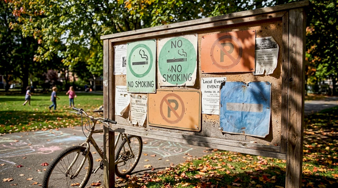
- No Smoking (ISO 7010 P002). A lit cigarette crossed by the red slash. Posted in hospitals, restaurants, fuel stations, and most public buildings. Often accompanied by text in the U.S.
- No Parking. The letter “P” crossed by the red slash, or a vehicle icon. Governed by MUTCD R7-series on public roads; appears in parking lots and private property as well.
- No U-Turn (MUTCD R3-4). A curved arrow representing a U-turn, crossed by the red slash. Standard at intersections where the turning radius or traffic flow makes U-turns unsafe.
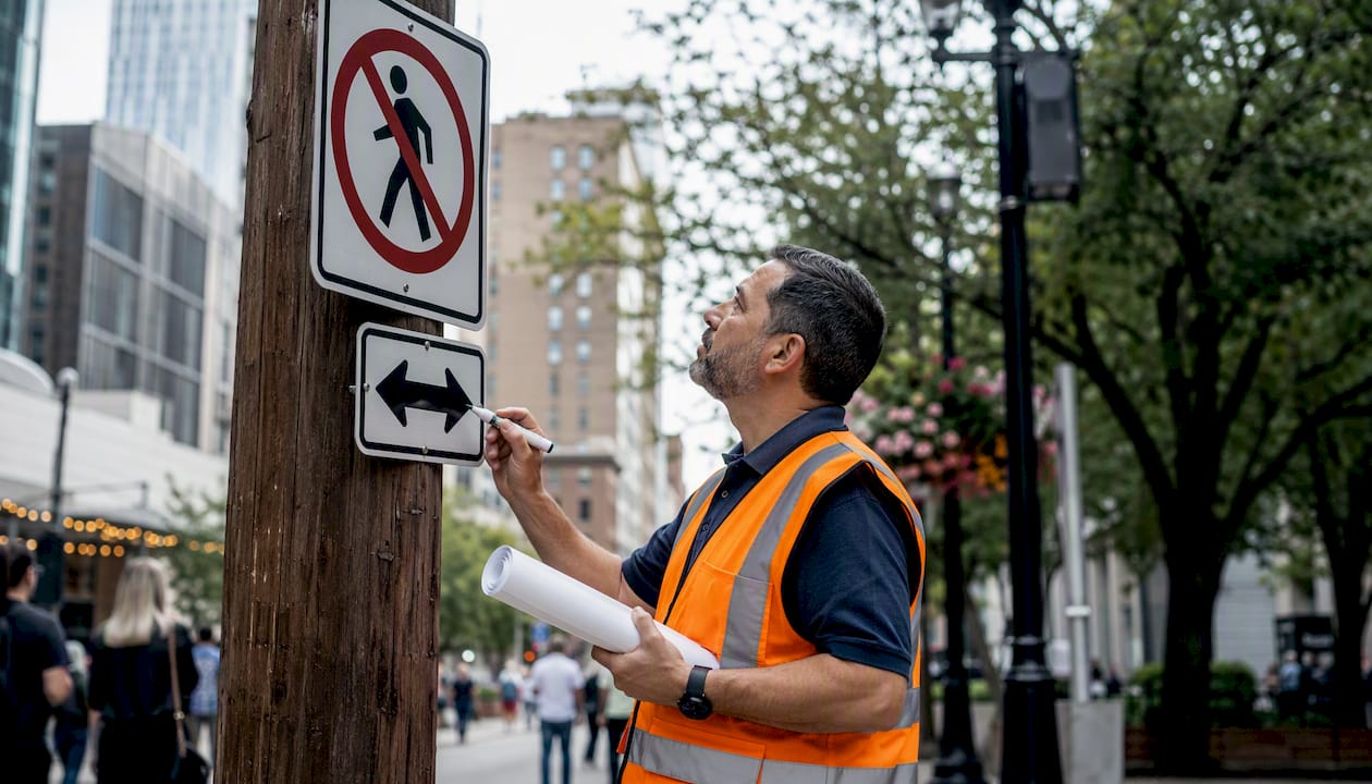
- No Pedestrians. A walking figure crossed by the red slash. Used at highway on-ramps, construction zones, and restricted-access areas.
- No Mobile Phones. A phone handset or smartphone icon crossed by the red slash. Common in hospitals, secure facilities, and fuel stations.
- No Open Flames. A flame icon crossed by the red slash. Required near flammable storage, chemical handling areas, and fuel dispensing points.
- No Entry / Do Not Enter (MUTCD R5-1). On U.S. roads, this uses the distinctive white bar on red background rather than the standard circle-and-slash, but it functions as a prohibition sign. In non-traffic contexts, a figure walking toward a barrier with the red slash is the ISO 7010 equivalent.
Most of these common prohibition signs appear with a short text line below the pictogram in U.S. installations, particularly in workplaces where OSHA compliance requires the message to be unambiguous to all employees. In international or high-traffic settings, the pictogram alone is often sufficient.
Key Takeaways
A prohibition sign is always a red-bordered circle with a white field, a black pictogram, and a red diagonal slash at roughly 45°, and the correct governing standard depends entirely on where the sign will be installed.
| Point | Details |
|---|---|
| Core visual formula | Red ring, white field, black pictogram, red diagonal slash at ~45° — all four elements must be present. |
| Standard by context | Use MUTCD for public roads, ANSI Z535.3/OSHA for U.S. workplaces, and ISO 7010 for international or multi-site use. |
| Color accuracy matters | Faded, off-hue, or low-contrast colors make a sign non-compliant and reduce recognition speed at distance. |
| Remove outdated signs | Leaving irrelevant prohibition signs posted causes sign blindness and undermines compliance across the whole site. |
| Customsignstoday | Produces custom prohibition signs in outdoor-rated materials with accurate color matching for workplace, construction, and property use. |
Why standard compliance is more than a checkbox
The prohibition sign format has survived decades of international standardization for a reason: it works across language barriers, literacy levels, and viewing distances. What I see repeatedly in the field is that clients underestimate how much the details matter. A slash that is slightly too thin, a red that has shifted toward orange after two summers outdoors, a pictogram that is technically correct but printed at 60% of the required size — these are not cosmetic issues. They are the difference between a sign that stops behavior and one that gets ignored.
The other thing clients consistently underestimate is the cost of getting it wrong twice. A non-compliant road sign may need to be replaced at the jurisdiction’s expense. A workplace sign that fails an OSHA inspection creates paperwork and liability exposure that dwarfs the cost of the sign itself. Spending a little more on correct materials and verified color matching upfront is almost always cheaper than the alternative.
The standards exist not to create bureaucracy but because someone, somewhere, was hurt because a sign was unclear. That context is worth keeping in mind every time you order one.
Customsignstoday can produce your prohibition signs to spec
Getting the red right, the slash angle right, and the substrate right for your specific environment is exactly what professional fabrication is for. Customsignstoday produces custom prohibition and safety signs in outdoor-rated materials, with color-accurate printing that holds up against UV exposure, moisture, and daily handling.

For construction sites, parking lots, storefronts, and facilities that need to update messages over time, face-change signs let you swap the prohibition panel without replacing the frame, which cuts long-term costs significantly. Vinyl decals work well for indoor prohibition signs or temporary restrictions where a rigid substrate is not needed. Request a quote at Customsignstoday and specify which standard applies to your installation — the team will match the material and color specs to your context.
Useful sources for official specifications
Consult these primary sources for full technical requirements before fabricating or ordering any prohibition sign.
- ISO 7010:2019 — The international standard for registered safety signs, including all prohibition pictograms. Use this for workplace and international safety signage. Ties to ISO 3864-1 (safety colors and shapes) and ISO 3864-3 (design principles).
- MUTCD 11th Edition (FHWA, 2023) — The controlling document for all regulatory signs on U.S. public roads. Consult Part 2B for the R3-series movement prohibition signs and LED/changeable-message requirements.
- OSHA 29 CFR 1926.200 — OSHA’s accident prevention sign and tag requirements for construction. References ANSI Z535 figures for sign format and color.
- 29 CFR 1926.200 via e-CFR (Cornell LII) — Searchable regulatory text for the same OSHA standard; useful for verifying current code language.
- OSHA 1910.145 — Specifications for accident prevention signs and tags in general industry (not just construction). Covers signal words, major message requirements, and tag specifications.
| Source | Best For | Format |
|---|---|---|
| ISO 7010:2019 | International and workplace pictograms | Purchasable standard (ISO.org) |
| MUTCD 11th Edition | U.S. public road regulatory signs | Free PDF (FHWA) |
| OSHA 29 CFR 1926.200 | U.S. construction workplace signs | Free (OSHA.gov, Cornell LII) |
| OSHA 1910.145 | U.S. general industry signs and tags | Free (OSHA.gov) |