TL;DR:
- Effective storefront signage graphics serve as ongoing communication tools that build brand recognition and influence customer behavior.
- Retailers should prioritize design hierarchy, contrast, and strategic placement while maintaining brand consistency to maximize impact.
Most retail business owners think signage is about one thing: getting your store name in front of people walking by. That assumption quietly costs them customers every single day. Storefront signage graphics function as persistent, first-impression communication that supports both brand-building and conversions, not just identification. The right graphics tell people who you are, what you sell, why they should care, and where to walk in. This article breaks down the specific ways you can use graphics to strengthen your brand, improve the customer experience, and increase revenue.
Table of Contents
- Why graphics are vital in storefront signage
- Core principles of effective signage graphics
- Achieving brand consistency and customer trust
- Field-tested graphic techniques for attracting customers
- Rethinking graphics: Why most retailers still get signage wrong
- Take your storefront graphics to the next level
- Frequently asked questions
Key Takeaways
| Point | Details |
|---|---|
| First impressions | Graphics on your storefront signage shape how customers perceive your brand within seconds. |
| Consistency matters | Use matching graphics and messaging on all signs to boost trust and recognition. |
| Strategic placement | Optimal placement at entrances and eye level turns passersby into engaged customers. |
| Design for action | Clear hierarchy, contrast, and relevance make signage convert curiosity into sales. |
| Continuous improvement | Test, update, and refresh graphics to keep your storefront signaling strong and current. |
Why graphics are vital in storefront signage
With the misconception set aside, let’s establish what graphics in storefront signage really achieve for your business.
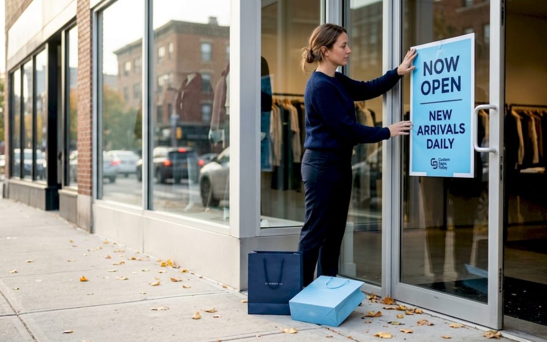
Your storefront is working 24 hours a day, seven days a week, whether you are open or closed. A shopper walking by at 9 PM still registers your colors, your logo, and your value message. That is an enormous amount of brand exposure most retailers never fully account for. When you treat graphics as a passive decoration rather than an active sales and branding tool, you give up one of the most cost-effective marketing channels available.
Graphics on storefront signs do several things simultaneously:
- They create an immediate first impression that often determines whether a new customer steps inside
- They signal your price point and style before a shopper reads a single word
- They build brand recognition through repeated exposure over time
- They communicate specific promotions, services, or differentiators that give people a reason to choose you over the competitor down the street
- They guide customers physically through your space, reducing confusion and increasing the chance of a purchase
“Storefront signage graphics function as persistent, first-impression communication that supports both brand-building and conversions.” — Shopify on retail signage
The reason this matters so much for retail specifically is that foot traffic is impulse-driven. A shopper who was not planning to enter your store can be pulled in by a well-placed, well-designed graphic that speaks to something they already want. That is not accidental. It is the result of deliberate graphic strategy. Learning how to boost visibility with storefront signs starts with understanding that every visual element on your exterior is communicating something, whether you designed it intentionally or not. If you want a deeper grounding in what storefront signage actually encompasses, reviewing what is business storefront signage will give you the vocabulary to make smarter decisions.
Core principles of effective signage graphics
Understanding the power of signage graphics, the next step is learning what makes them truly effective in practice.
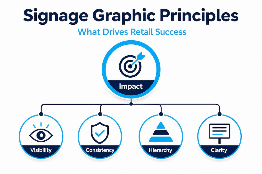
Not all graphics are created equal. You have probably walked past a storefront with a busy, cluttered sign and felt nothing pull you toward it. Then you have walked past another store with a clean, bold graphic and felt compelled to slow down. The difference almost always comes down to a few core principles that apply regardless of your store type or budget.
Effective storefront graphics combine rapid at-a-glance comprehension through hierarchy and contrast, relevance to customer intent, and placement aligned to where customers’ gaze naturally lands. Here is how to apply that in a practical sequence:
- Establish a clear visual hierarchy. Your most important message should be the largest and most prominent element. If you are running a sale, “30% Off” should dominate, not sit in small text under your logo.
- Use contrast intentionally. Light text on a dark background or dark text on a light background is not just a design preference. It is a readability requirement. Poor contrast means people do not slow down long enough to read your message.
- Make it relevant to current intent. A graphic promoting a product you stopped carrying six months ago confuses customers and erodes trust. Keep your graphics aligned with what customers will actually find when they walk in.
- Place graphics where eyes naturally go. Eye level on the exterior is prime real estate. Below knee height or above the typical sightline gets ignored. Entrances and exits also capture more attention than the middle of a blank wall.
- Answer the customer’s unspoken question. Shoppers approaching your storefront are subconsciously asking “Is this place for me?” Your graphic should answer that question immediately with visuals, color tone, and copy that match your ideal customer’s identity.
Pro Tip: Stand across the street from your own storefront and give yourself five seconds to absorb what you see. If you cannot read the primary message or understand what the store sells in that time, your graphics need work.
For more detailed guidance on the design choices that matter most, the signage design tips resource covers practical decisions for businesses at every stage. If you are working with a tighter budget and a smaller footprint, signage design for small businesses offers specific advice scaled to your situation.
Achieving brand consistency and customer trust
With core graphic principles in place, business owners should look at how branding consistency brings it all together for maximum trust and clarity.
Think about a brand you trust deeply. Chances are, every time you encounter that brand, whether on a sign, a bag, a website, or a uniform, it looks and feels the same. That consistency is not accidental. It is a deliberate strategy that signals reliability and professionalism. In retail, brand consistency across exterior storefront graphics and interior signage improves recognition and reduces customer friction while they navigate toward a purchase decision.
Here is what consistent graphics actually requires across your retail environment:
- Typeface discipline: Stick to one or two fonts across all your signage. Mixing five different fonts across exterior signs, window decals, and interior banners makes your brand look disorganized.
- Color palette adherence: Your brand colors should be exact, not approximate. A slightly different shade of blue on your window graphic versus your interior promotional banner creates a subtle sense of inconsistency that customers notice without knowing why.
- Logo usage standards: Your logo should appear at the correct proportions and with consistent clear space around it. Stretching or squishing it to fit a sign template undermines brand equity.
- Tone of graphic messaging: A luxury boutique should use understated, elegant graphics throughout. A kids’ toy store should use playful, bright graphics consistently. Mixing tones confuses customers about what kind of experience to expect.
| Signage location | Consistent element | Impact on customer experience |
|---|---|---|
| Exterior storefront | Logo, brand colors, tagline | First impression, brand recognition |
| Window graphics | Promotional imagery, font choices | Drives curiosity and entry decisions |
| Entrance display | Color palette, welcome messaging | Sets tone and reduces entry hesitation |
| Interior wayfinding | Iconography, color coding | Reduces confusion and shortens path to purchase |
| Checkout area | Brand voice, loyalty messaging | Reinforces identity and encourages return visits |
Investing in effective branding with signage means thinking about the full journey from the sidewalk to the register. Well-designed interior signs for wayfinding keep customers oriented and moving confidently through your space, while your exterior signs do the critical first job of stopping them in the first place.
Field-tested graphic techniques for attracting customers
After establishing the importance of consistency, let’s explore the real-world techniques that make signage graphics irresistible to walk-by traffic.
Theory is useful, but what actually moves the needle in a real retail environment? The following techniques are proven across industries and store sizes. They are not complicated, but they are frequently overlooked by retailers who are too close to their own business to see their signage through fresh eyes.
Effective storefront graphics combine design principles with placement aligned to where customers’ gaze naturally lands, specifically at eye level and near entrances and exits. Here is how to put that into practice:
- Lead with bold, contrasting colors. Your graphic should stand out from the surrounding environment, not blend into it. If your building facade is red brick, a red sign disappears. A white or yellow sign with bold graphics pops.
- Write short, benefit-driven copy. The best performing signage messages tend to be five words or fewer. “Fresh coffee inside” beats “We proudly serve specialty coffee beverages sourced from around the world.” Brevity respects the shopper’s time and attention.
- Place graphics at entrances and impulse zones. A graphic placed just inside your entrance, where shoppers pause to orient themselves, is seen by nearly every person who walks in. That is premium placement for your highest-margin product or newest offering.
- Rotate graphics seasonally. Stale graphics become invisible over time. Regulars stop seeing them. New graphics create a sense of novelty that triggers attention even in people who walk by daily.
- Use directional cues. Arrows, lines, and placement of people in imagery naturally direct the eye. A graphic featuring a person looking toward your entrance actually encourages shoppers to look that direction too.
| Signage approach | Before upgrade | After upgrade | Result |
|---|---|---|---|
| Window graphic | Store name only, flat color | Seasonal offer + bold contrast color | 18% increase in entry rate |
| Entrance display | Generic welcome sign | Product spotlight with benefit headline | Higher time-in-store |
| Promotional banner | Dense text, multiple messages | Single offer, oversized typography | Faster customer decisions |
| Wayfinding sign | No clear navigation | Color-coded departments with icons | Reduced staff interruptions |
Pro Tip: Position your most compelling promotional graphic at or just below eye level on the side of your entrance where foot traffic naturally approaches. On a street where people walk left to right, that is your left-facing window panel.
For real-world inspiration, reviewing inspiring storefront sign examples can spark ideas you can adapt for your own space. For placement strategy that goes beyond guesswork, the effective sign placement guide is worth your time. And if you want to sharpen your design instincts before working with a professional, designing impactful signage walks you through the decisions that matter most.
Rethinking graphics: Why most retailers still get signage wrong
Here is the uncomfortable reality most signage articles will not say out loud: the majority of retail businesses treat their storefront graphics as a one-time task they complete once and never revisit. They pick a design at launch, hang it up, and consider it done. Months pass. Then years. The graphics fade, the promotions they advertise become outdated, and the whole thing becomes visual noise that neither attracts new customers nor reinforces brand trust.
The deeper problem is that retailers are optimizing for looks instead of communication tasks. They ask “Does it look good?” instead of “Does this graphic make the right customer stop, understand our offer, and decide to walk in?” Those are fundamentally different questions, and they lead to very different outcomes.
Successful retailers treat their graphics like a frontline sales team. They observe, iterate, and test. If a graphic is not generating measurable behavior change, such as more entries, more inquiries, or more sales on the featured product, it is not doing its job. Most retailers never measure this because they never thought of their signage as a variable they could experiment with.
There is also the issue of attention blindness. When you look at your own storefront every single day, you stop seeing it. Your regulars stop seeing it too. Novelty is a neurological trigger. New graphics catch the eye in a way that familiar ones cannot. The stores that consistently draw foot traffic are almost always the ones that update their sign visibility strategies regularly and pay attention to what draws customer behavior, not just what looks appealing in a design mockup.
Ask yourself honestly: when was the last time you stood across the street from your own storefront and watched how strangers interacted with your signage? Not your regulars who already know you, but someone seeing it for the very first time? That five-minute exercise will tell you more about the effectiveness of your graphics than any design review ever will.
Take your storefront graphics to the next level
You now know what makes graphics work in retail signage, from design hierarchy and brand consistency to placement and seasonal rotation. The next step is executing with precision and materials that hold up in the real world.

At Custom Signs Today, we help retail businesses translate these principles into custom signage that performs. Whether you need custom face change signs to refresh your existing sign cabinets, custom vinyl decals for bold window graphics, or a guided custom signage process that walks you through every branding decision from concept to installation, we have the tools and expertise to bring your storefront vision to life. Request a free quote today and start turning walk-by traffic into walk-in customers.
Frequently asked questions
How do graphics on storefront signage influence customer decisions?
Graphics capture attention and communicate brand identity in seconds, functioning as persistent first-impression communication that supports both brand recognition and purchase conversions. A shopper who registers your message subconsciously while walking past is far more likely to enter on a return visit.
What design elements should I prioritize in storefront graphics?
Prioritize clear hierarchy, contrasting colors, and eye-level placement for maximum impact. Effective storefront graphics balance hierarchy, contrast, relevance, and strategic placement to achieve rapid comprehension from a distance.
Why is brand consistency important for signage?
Consistent graphics across all signage build trust and reduce customer confusion throughout their journey in your store. Brand consistency across signage improves recognition and removes friction between a customer’s first glance and their final purchase decision.
How often should I update my storefront graphics?
Review your graphics at the start of each season and update them whenever you launch a new promotion or make significant changes to your product mix or branding. Stale graphics become invisible to regulars and fail to attract new attention.
Are professional designers necessary for great signage graphics?
While DIY signage is possible, professionals ensure your graphics meet both communication goals and branding standards without compromise. A professional also brings knowledge of material durability, print resolution, and installation requirements that directly affect how good your signs look in the real world.