
TL;DR:
- Proper file preparation ensures signage prints and displays correctly the first time.
- Use the correct color modes, resolution, bleed, and formats specific to print or digital signage.
- Working with experienced signage professionals helps prevent costly errors and maintains brand quality.
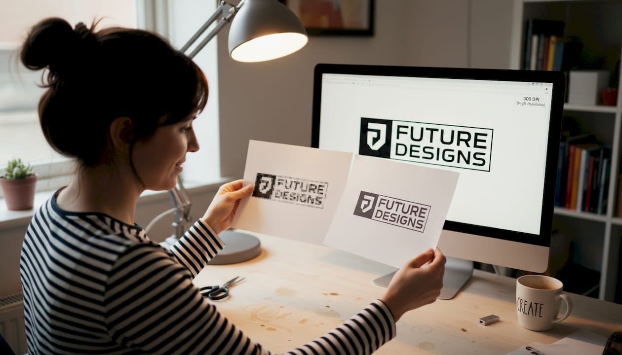
You spend real money on signage, and then it comes back blurry, off-color, or with text that got cut off at the edges. That kind of outcome wastes your budget and quietly damages your brand every time someone sees it. The good news is that almost every production failure traces back to a handful of fixable file preparation mistakes. This guide walks you through exactly what to do before you send files to a print shop or deploy them on a digital screen, covering color modes, resolution, bleed settings, and format choices so your signs come out right the first time.
Table of Contents
- Key requirements before you start
- How to set up print signage files for flawless results
- How to prepare digital signage files for maximum impact
- Troubleshooting common signage file mistakes
- Why professional signage file prep is a branding superpower
- Bring your signage to life with professional support
- Frequently asked questions
Key Takeaways
| Point | Details |
|---|---|
| Always match specifications | Set up your files for print or digital using the correct color, resolution, and dimensions from the start. |
| Proof and test | Print proofs and check digital files on target hardware to catch costly errors before production. |
| Avoid common mistakes | Prevent issues by using CMYK for print, sRGB for digital, and always including bleed and safe zones. |
| Leverage expert help | Professional support or templates can save time, money, and ensure your brand looks its best. |
Key requirements before you start
Before you open a design program, you need the right tools and information ready. Skipping this setup step is where most projects go sideways.
Start by choosing professional design software. Adobe Illustrator and InDesign are the industry standard for print signage. Canva works for basic projects but limits your control over bleed, color profiles, and export settings. For digital signage, tools like Adobe Photoshop or even Figma work well, as long as you understand the output requirements.
Next, request a file template or spec sheet from your signage provider. These documents tell you the exact canvas size, required bleed, color profile, and accepted file formats. Never guess at dimensions.
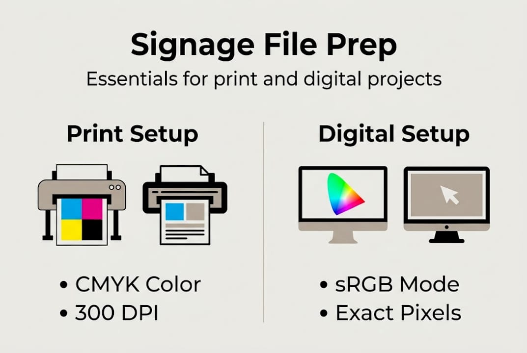
For printed signage, you need CMYK at 300 DPI with a bleed of 0.125 to 0.25 inches on all sides. Digital files follow a completely different set of rules, which we cover later.
Also check whether your sign needs to meet ADA sign requirements for accessibility. Directional and identification signs in public spaces often have legal specifications for font size, contrast, and Braille.
Print vs. digital: quick comparison
| Requirement | Print signage | Digital signage |
|---|---|---|
| Color mode | CMYK | sRGB |
| Resolution | 300 DPI minimum | Match screen resolution |
| File format | PDF/X-1a | PNG, JPEG, MP4 |
| Bleed needed | Yes (0.125 to 0.25 in.) | No |
Key things to assemble before designing:
- Final sign dimensions from your provider
- Brand color values in both CMYK and sRGB
- Logo files in vector format (.ai or .eps)
- Font files for any custom typefaces
- Spec sheet or template file from your printer
Pro Tip: Review the print-ready file guidelines published by your printing partner before starting. Most shops post these online and they save you from a costly reprint.
How to set up print signage files for flawless results
Once you have your essentials ready, you’re ready to begin building your print file step by step. Follow this sequence carefully, and you’ll hand off a file that requires zero corrections.
- Set the document size to the final print dimensions. If the sign is 24 by 36 inches, build the file at exactly 24 by 36 inches. Never scale files after the fact.
- Switch your color mode to CMYK immediately. RGB looks great on screen but shifts unpredictably when printed. Always start in CMYK before placing any images or adding colors.
- Set image resolution to at least 300 DPI. Low-resolution photos may look sharp on screen but will print soft or pixelated. Check every placed image individually.
- Add bleed and a safe zone. Bleed extends your background 0.125 inch beyond the trim edge so no white borders appear after cutting. The safe zone keeps critical content 0.125 to 0.25 inch inside the trim line.
- Outline all fonts or embed them. If your printer does not have your font installed, text reflows or disappears. Outlining converts text to shapes that print exactly as designed.
- Export as PDF/X-1a or Press Quality PDF. These formats flatten transparency, embed color profiles, and lock in your settings. Embed fonts, use CMYK, and include bleed in every export.
For help making your files visually compelling beyond the technical side, the guidance on designing impactful signage covers layout and brand hierarchy in detail.
Standard print file specs at a glance
| Setting | Recommended value |
|---|---|
| Color mode | CMYK |
| Resolution | 300 DPI |
| Bleed | 0.125 to 0.25 inch |
| Safe zone | 0.125 inch inside trim |
| Export format | PDF/X-1a or Press Quality |
Working with Adobe InDesign? The official printing with Adobe InDesign documentation walks through exact export dialogs so nothing gets missed.
Pro Tip: Place a low-resolution placeholder image and compare it to your 300 DPI original at actual print size. If you can see a difference on screen, the printer definitely will.
How to prepare digital signage files for maximum impact
With the essentials of print signage covered, let’s shift focus to preparing impactful digital signage files. The rules are different, and confusing the two is one of the most common production mistakes.
- Match your file resolution to the screen. Most digital displays run at 1080p (1920 by 1080 pixels). High-end installs use 4K (3840 by 2160). Get the spec from the hardware before designing.
- Use sRGB color mode. Unlike print, screens render sRGB natively. Designing in CMYK for a digital display causes washed-out colors that look nothing like your mockup.
- Choose the right file formats. For static graphics, use PNG or high-quality JPEG. For motion content, use MP4 with H.264 encoding. These formats play back reliably across most commercial display systems.
- Prioritize high contrast and large fonts. Digital signage is usually viewed from 10 to 30 feet away. A font that looks readable at your desk becomes unreadable at distance. Stick to sans-serif typefaces at 40 points or larger.
- Apply the 3×5 rule. Limit slides to 3 lines of text and 5 words per line. Viewers have a short dwell time, often under 8 seconds, and they cannot absorb dense content while walking.
- Test files on the actual display hardware. Colors, contrast, and font rendering all look different on a physical screen than on your design workstation.
Digital signage files should match screen resolution, use sRGB color, and prioritize contrast for maximum readability.
For thoughtful choices about effective text for digital signs, font weight and spacing make a measurable difference in how quickly your message lands.
Digital format comparison
| Content type | Best format | Notes |
|---|---|---|
| Static image | PNG | Lossless, sharp edges |
| Photo-heavy graphic | JPEG | Compress to under 2 MB |
| Video or animation | MP4 (H.264) | Widest playback support |
Pro Tip: Review digital design best practices before finalizing layouts. Many businesses overlook safe zones on digital displays, and content near the edges often gets cropped by bezel frames.
Troubleshooting common signage file mistakes
Even careful prep can go wrong. Here’s how to catch and fix the most common mistakes before they cost you time and money.
The biggest print errors fall into three categories: wrong color mode, low-resolution images, and missing fonts. A file built in RGB that gets sent to a CMYK printer will shift in unpredictable ways, especially in skin tones and brand colors. Images sourced from websites are typically 72 DPI, which looks fine on screen but prints with visible softness.
Most common file mistakes to check:
- RGB images placed in a CMYK document without conversion
- Photos sourced from the web at 72 DPI instead of 300 DPI
- Fonts not outlined or embedded before export
- Missing bleed, causing white borders after cutting
- Logos saved as JPEG (with compression artifacts) instead of vector format
- Digital files built at wrong pixel dimensions for the target screen
For print, the preflight function in Adobe Acrobat or InDesign scans your file and flags problems automatically. Run it on every file before sending. It catches missing fonts, low-resolution images, and color profile mismatches in seconds.
Print proofs and hardware testing are essential steps to avoid color shifts or playback issues on the final product.
For digital signage, test playback on the actual hardware at the installation site. A video that plays smoothly on your laptop may stutter on an older display controller. Also check font rendering since some display systems substitute fonts when the original file is missing typeface data.
After installation, run an accessibility check to confirm contrast ratios and text sizes meet compliance standards where required.
Pro Tip: Build a preflight checklist document and save it as a template. Before any file goes to production, run through every item. This single habit eliminates most reprints. Review sign installation tips to understand how file quality connects to the physical installation outcome.
Why professional signage file prep is a branding superpower
Most business owners treat file preparation as a technical chore they hand off to whoever is cheapest or fastest. That thinking has a real cost.
Poor file prep does not just cause one bad sign. It creates a pattern of reprints, delays, and brand inconsistency across every touchpoint. A logo that prints in the wrong shade of blue on your storefront, your event banner, and your vehicle wrap does invisible damage over months and years. Customers may not consciously notice, but they register that something feels off about your brand.
The other myth worth challenging: digital signage prep is easier than print, so it matters less. That is completely wrong. Digital screens amplify problems. A low-contrast font that is hard to read on paper becomes impossible to read on a bright LED screen in a sunlit lobby.
The brands that get consistent, professional signage results are not the ones with bigger budgets. They are the ones with better systems. Setting up a reusable file template, a preflight checklist, and documented brand color values in both CMYK and sRGB is a one-time investment that pays off on every future project. Pairing that internal system with a strategy from signage visibility strategies makes the output even stronger.
Bring your signage to life with professional support
Knowing how to prep files correctly puts you miles ahead of most businesses. But even with the best preparation, working with an experienced signage team means your files get checked before production and problems get caught before they cost you anything.

At Custom Signs Today, we review every submitted file for resolution, color mode, bleed, and format compatibility before a single print runs. Whether you need face change signs for a seasonal refresh or custom vinyl decals for a vehicle or storefront, our team guides you through every step. Explore the full range of professional sign services and get a free quote so your next project goes from file to finished sign without a single surprise.
Frequently asked questions
What is the best file format for print signage?
A print-ready PDF in PDF/X-1a or Press Quality format is the industry standard because it locks in color profiles, embeds fonts, and preserves bleed settings reliably.
What resolution should I use for signage files?
Use 300 DPI for close-up prints like retail signs and trade show displays. For large-format banners viewed from 10 feet or more, 150 to 200 DPI is sufficient and keeps file sizes manageable.
How do I prepare digital signage files for best results?
Match the exact screen resolution, use sRGB color mode, and export static graphics as PNG or JPEG. For motion content, MP4 with H.264 encoding gives you the widest playback compatibility across commercial display systems.
What common mistakes should I avoid when prepping signage files?
The most damaging mistakes are using RGB for print, forgetting to add bleed, failing to outline fonts, and placing low-resolution images pulled from websites. Each one can cause a reprint or a failed display.