
TL;DR:
- Choosing the correct sign size depends on viewing distance, traffic speed, and environment to ensure readability and compliance.
- Measuring distance and applying established rules like one inch of letter height per 10 feet of viewing distance helps determine appropriate dimensions.
Sign size selection is the process of matching letter height and overall dimensions to viewing distance, location type, and message purpose. Get it wrong and your sign either disappears into the background or overwhelms the space around it. The stakes are real: a storefront sign that is too small loses customers before they ever walk in, and an oversized yard sign can violate local zoning codes. Knowing how to select sign size correctly means applying established legibility rules, accounting for traffic speed, and understanding the environment where your sign will live.
What factors determine the appropriate sign size?
Viewing distance is the single most important factor in sign size selection. The industry standard legibility rule states that one inch of letter height is required for every 10 feet of viewing distance. A sign read from 60 feet needs 6-inch letters. A sign read from 100 feet needs 10-inch letters. That single formula drives most professional sizing decisions.
Traffic speed changes the equation significantly for outdoor signs. Drivers moving at higher speeds have less time to read, so letters must be larger to compensate. Drivers need at least 3 seconds of uninterrupted visibility to detect, read, and understand a sign message. At 45 MPH, primary text heights must often reach 20 inches or larger to meet that standard. That is a number most business owners never consider when ordering a roadside sign.
Location context shapes sizing just as much as distance. An indoor office corridor sign operates in a controlled, low-speed environment where 6-inch letters may be perfectly adequate. A sign on a busy commercial strip competes with visual clutter, vehicle movement, and changing light conditions. The purpose of the sign also matters: a directional sign needs fewer words and can be smaller, while a branding sign needs enough size to register a logo and company name clearly.
Key factors to evaluate before choosing sign dimensions:
- Viewing distance: Apply the 1-inch-per-10-feet rule as your baseline.
- Traffic speed: Higher speeds demand larger letter heights for driver readability.
- Location type: Indoor, outdoor, roadside, and retail each have different size norms.
- Message complexity: More words require either a larger sign or fewer words.
- Environmental clutter: Busy visual environments require larger, bolder signs to stand out.
- Lighting conditions: Low-light settings affect how well a given size reads at a distance.
Pro Tip: Before ordering, stand at the exact spot where your audience will first see the sign and measure the distance. That number is your starting point for every sizing decision.
How do you calculate letter height and sign dimensions?
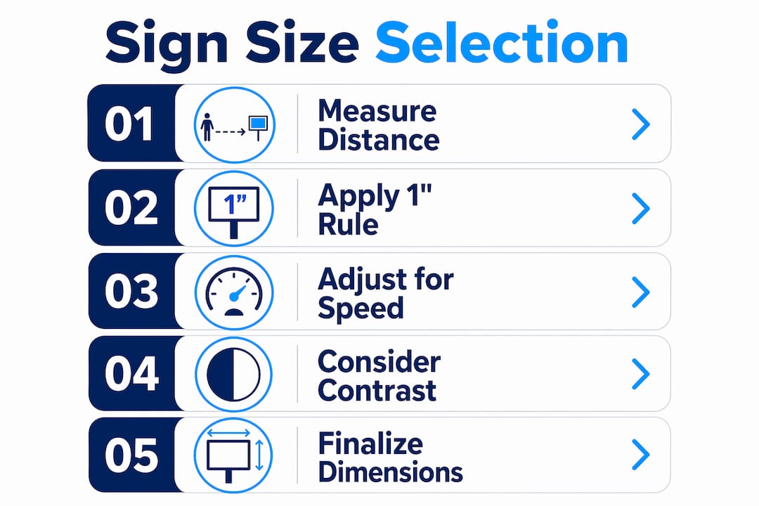
Calculating the right sign dimensions follows a clear sequence. Start with the viewing distance, apply the legibility formula, then build the overall sign size around the text you need to display.
- Measure the viewing distance. Stand where your audience will first see the sign and measure the distance in feet.
- Calculate minimum letter height. Divide the viewing distance by 10. A sign at 80 feet needs 8-inch letters at minimum.
- Account for traffic speed. If viewers are in moving vehicles, increase letter height by 25–50% beyond the baseline calculation.
- Estimate total sign area. Letters typically occupy 30–40% of a sign’s total area. Use that ratio to calculate the overall width and height needed.
- Check for message fit. Write out your full message and count characters. Longer messages require either a wider sign or a second line of text, which adds height.
The table below shows how traffic speed directly affects the minimum letter height required for a driver to read a sign within the 3-second visibility window:
| Traffic speed | Minimum letter height |
|---|---|
| 25 MPH | 6–8 inches |
| 35 MPH | 10–12 inches |
| 45 MPH | 16–20 inches |
| 55 MPH | 24–30 inches |
| 65 MPH | 30–36 inches |

These figures assume clear sightlines and good lighting. Adverse conditions push the numbers higher. A sign on a curved road or in a shaded area needs even larger text than the table suggests.
Pro Tip: Create a paper or digital mockup at the calculated size and photograph it from the actual viewing distance. What looks large on a design screen often looks small in the real world.
What sign sizes work best by type and location?
Standard sign sizes exist for common sign types, and knowing them saves time and money. Common interior sign sizes follow functional norms: door signs run 6 inches by 9 inches, nameplates range from 8 by 2 inches to 12 by 3 inches, and storefront signs typically start at 36 by 48 inches and scale up from there. These are starting points, not fixed rules.
Exterior signs follow different logic than interior ones. Outdoor signs face weather, variable lighting, and longer viewing distances, so they run larger across every category. A yard sign for a residential listing typically measures 18 by 24 inches, which works well at sidewalk viewing distances of 20–30 feet. A construction site sign or building identification sign may need to be 4 by 8 feet or larger to be readable from the street.
ADA compliance adds another layer to interior sign sizing. The Americans with Disabilities Act sets specific requirements for door and room identification signs, including character height, finish, and mounting position. Non-compliance carries legal risk, so ADA-regulated signs should always be sized according to the current ADA Standards for Accessible Design, not just visual preference.
Illuminated signs change the sizing calculus in a useful way. LED-based illuminated formats retain clarity under adverse lighting such as dusk or rain, which means an illuminated sign can perform effectively at a smaller size than a non-lit equivalent. A backlit channel letter sign at 12 inches tall may outperform a 20-inch painted sign in low-light conditions. That trade-off is worth factoring into your budget and size decision.
Interior vs. exterior sign sizing at a glance:
| Sign type | Typical size range | Key sizing driver |
|---|---|---|
| Door / room sign | 6" x 9" | ADA compliance, close viewing |
| Nameplate | 8" x 2" to 12" x 3" | Desktop or wall proximity |
| Retail storefront | 36" x 48" and up | Brand visibility, foot traffic |
| Yard sign | 18" x 24" | Sidewalk viewing distance |
| Building ID sign | 48" x 96" and up | Street-level viewing distance |
| Illuminated cabinet | Varies | Lighting compensates for size |
How does color contrast affect sign size decisions?
Color contrast and sign size work together. A sign with poor contrast needs to be larger to achieve the same readability as a well-contrasted sign of smaller dimensions. Effective signage requires a minimum 65% contrast ratio between text and background for maximum visibility. That standard comes from traffic engineering research and applies equally to commercial and retail signage.
Black text on a yellow background is the highest-rated combination for visual impact and legibility. White on dark blue and white on dark green also perform well. Low-contrast combinations like gray on white or red on green force viewers to get closer before they can read the message, which effectively shrinks the functional size of your sign.
Mounting height interacts with size in ways that most buyers overlook. The MUTCD recommends minimum mounting heights of 7 feet in urban areas and 5 feet in rural areas. A sign mounted too low gets blocked by parked vehicles, pedestrians, and landscaping. A sign mounted at the correct height with the correct size reaches its intended audience without obstruction.
Best practices for maximizing visibility through color and placement:
- Use high-contrast color pairs. Black on yellow or white on dark blue are proven combinations.
- Avoid placing a sign against a background of similar color. A white sign on a white building disappears.
- Match mounting height to the environment. Urban settings need higher placement to clear street-level obstructions.
- Limit your message to key words or phrases. Short messages perform better within the 3–5 second glance window most viewers give a sign.
- Test illuminated options in low-light conditions before finalizing size.
Pro Tip: If your sign will be viewed at dusk or in shaded areas, choose an illuminated format before increasing the physical size. Illumination often solves a readability problem more cost-effectively than going larger.
What are the most common sign sizing mistakes?
The most common mistake is sizing by gut feeling rather than by viewing distance. Business owners frequently order signs that look right on a computer screen but are unreadable from the sidewalk or road. Oversized signage clutters visual space and can violate zoning codes. Undersized signs simply fail to attract attention. Both errors cost money and time to correct.
Common sizing mistakes to avoid:
- Skipping the viewing distance calculation. Every sizing decision should start with a measured distance, not a guess.
- Ignoring traffic speed. A sign designed for pedestrians will fail completely if it is placed on a 45 MPH road.
- Overloading the message. Too much text forces smaller font sizes, which defeats the purpose of a larger sign.
- Neglecting local regulations. Zoning codes and permitted signage rules cap sign dimensions in many commercial zones. Check before you order.
- Skipping a mockup. A physical or digital mockup at scale, photographed from the viewing distance, catches sizing errors before production.
Professional consultation solves most of these problems before they happen. A signage provider with experience in your sign type and location can flag regulatory limits, recommend sizes based on real-world performance data, and produce mockups that show exactly how the finished sign will look in context.
Key Takeaways
Sign size selection works best when viewing distance, traffic speed, and message purpose drive every dimension decision rather than visual preference alone.
| Point | Details |
|---|---|
| Use the 1-inch-per-10-feet rule | Calculate minimum letter height by dividing viewing distance in feet by 10. |
| Traffic speed raises the bar | At 45 MPH, primary text must reach 20 inches or more for driver readability. |
| Match size to sign type | Door signs start at 6" x 9"; storefront signs start at 36" x 48" and scale up. |
| Contrast reduces size requirements | A 65% contrast ratio improves legibility and lets smaller signs perform better. |
| Check regulations before ordering | Zoning codes and ADA standards set hard limits on sign dimensions and placement. |
Why “bigger is always better” is the wrong approach
The instinct to go as large as possible is understandable. Bigger feels safer. But choosing sign size should start from understanding the viewer’s environment and reading speed, not from maximizing square footage. I have seen businesses install massive signs that technically violated local zoning, required expensive removal, and left them with no sign at all during the replacement process. That is a painful and avoidable outcome.
What actually works is matching size to context. A well-sized illuminated sign on a busy street outperforms an oversized painted sign every time, especially after dark. The businesses that get signage right treat it as a communication problem, not a visibility arms race. They measure the viewing distance, account for how fast people are moving, and choose a size that fits the architecture and the regulations.
My honest advice: use a mockup every single time. Print the design at scale, tape it to the wall or the building face, and photograph it from the actual viewing distance. That five-minute test has saved more clients from expensive mistakes than any formula I can give you. Pair that with a conversation about effective sign placement and you will get a sign that works from day one.
— Yossi
Custom signs sized right for your location and audience
Getting sign dimensions right from the start saves you from reprints, compliance issues, and lost visibility.

Customsignstoday specializes in custom exterior lightbox signs and a full range of custom signs built to the exact dimensions your location and viewing distance require. The team works with businesses and individuals across West Palm Beach to match sign size to real-world conditions, not guesswork. Whether you need a storefront sign, a yard sign, or a large-format building identification sign, Customsignstoday can produce a mockup, confirm local compliance, and deliver a finished product that performs exactly as planned. Reach out for a free quote and get sizing guidance from people who do this every day.
FAQ
What is the standard rule for sign letter height?
The standard rule is one inch of letter height per 10 feet of viewing distance. A sign at 50 feet needs 5-inch letters; a sign at 100 feet needs 10-inch letters.
How does traffic speed affect sign size?
Faster traffic requires larger text because drivers have less time to read. At 45 MPH, primary text must be 20 inches or taller to meet the 3-second readability standard.
What is the minimum contrast ratio for readable signage?
Effective signs require a minimum 65% contrast ratio between text and background. Black on yellow is the highest-rated combination for legibility and visual impact.
Do illuminated signs need to be as large as non-lit signs?
No. Illuminated signs improve legibility by creating internal contrast, which allows them to perform effectively at smaller sizes, especially in low-light or adverse weather conditions.
What is the recommended mounting height for outdoor signs?
The MUTCD recommends mounting heights of 7 feet in urban areas and 5 feet in rural areas to maintain visibility and meet safety standards.