
TL;DR:
- Effective logo display relies on responsive systems, proper placement, and consistency across digital and physical environments.
- Brands often overlook the importance of scaling, contrast, and systemic management, leading to trust erosion and reduced recognition.
Your logo is working constantly, across every touchpoint your audience encounters. The wrong logo display examples cost you recognition. The right ones build trust before a single word is read. Whether you’re rethinking your website header, commissioning outdoor signage, or briefing a vehicle wrap, the decisions you make about format, placement, and context shape how customers perceive your brand at first glance. This article walks through the most effective approaches, compares them directly, and gives you the frameworks to choose what actually fits your business.
Table of Contents
- Key takeaways
- 1. Understanding what makes logo display examples worth copying
- 2. Digital logo display examples on websites
- 3. Favicon and avatar logo display examples
- 4. Physical signage logo display examples
- 5. Vehicle wrap logo display examples
- 6. Animated and digital signage logo display examples
- 7. Comparison of logo display methods
- 8. Choosing the right display approach for your business
- My take on what most brands get wrong with logo displays
- Get your logo in front of more customers with Customsignstoday
- FAQ
Key takeaways
| Point | Details |
|---|---|
| Context determines format | No single logo version works everywhere. Tailor your display to each environment. |
| Responsive systems beat static logos | A tiered logo system (full, horizontal, icon-only) keeps your brand legible at every size. |
| Physical signage drives real traffic | Animated and well-placed physical signs demonstrably increase foot traffic and sales. |
| Logo bars need social proof | A logo wall alone underperforms. Pair it with testimonials to convert visitors. |
| Consistency builds recognition | The same logo, used correctly across every asset, compounds trust over time. |
1. Understanding what makes logo display examples worth copying
Before you study any specific logo display examples, you need a framework for judging them. Not every creative logo design that looks great in a portfolio will perform well in your context.
Here are the core criteria that separate effective logo examples from ones that just look good in screenshots:
- Visibility: Does the logo hold contrast against its background in both light and dark environments? A logo that disappears on mobile is a missed brand impression.
- Scalability: Responsive logo systems use a tiered structure: full logo for headers, horizontal version for narrow spaces, simplified icon for small contexts. Favicons need to work at 16px. Website headers can run 100 to 300px wide. One file cannot serve both.
- Contextual adaptability: A law firm’s logo should feel authoritative on a site sign and approachable on a social profile photo. Neither version should look like an afterthought.
- User experience: Logo placement is a UX decision that combines aesthetics with user behavior. Misplace it and you confuse navigation. Get it right and it anchors trust.
- Technical execution: SVG files scale infinitely without blurring. Raster PNG and JPG logos often blur on retina displays and increase page load times, hurting both user experience and SEO rankings.
Pro Tip: Always maintain a clear safe zone around your logo in every display context. Crowding it with other elements is the fastest way to destroy legibility and brand authority.
2. Digital logo display examples on websites
Your website header is the highest-frequency logo display location you own. Most users load dozens of pages per session, which means your header logo gets seen more than almost any other branded asset.
Eye-tracking studies confirm that users instinctively look at the top-left corner of websites first, making it the standard placement for strong UX and brand recall. Placing anything other than your logo there trains users to distrust their own instincts.
Here are the formats that actually work across different website contexts:
- Full wordmark plus icon for desktop headers where horizontal space allows both the symbol and company name to breathe
- Horizontal simplified version for narrow headers on tablets and smaller laptop screens, stripping back taglines and secondary elements
- Icon-only version for sticky headers that shrink on scroll, keeping the brand present without dominating the viewport
- Animated logos on homepage hero sections or loading screens, used sparingly to communicate personality without sacrificing speed
One of the most overlooked logo showcase ideas in digital settings is the logo bar. Adding a logo row featuring press mentions or client brands can increase cold-traffic conversion by 18% over six weeks, with some SaaS implementations generating over 22,000 unique clicks annually from logo-linked case studies. That is not a passive design choice. That is a conversion asset.
Be careful with plain logo walls, though. A passive logo display without testimonials or case studies performs poorly. Pair logos with a customer quote or a click-through to a case study and the same real estate starts earning its place.
3. Favicon and avatar logo display examples
Favicons are where most brands quietly lose consistency. A logo that looks strong at 300px can become an unrecognizable blob in a browser tab.
Modern favicon design requires multi-size bundles and context-aware variants including dark mode and mask icons. Your favicon needs to work in light browser themes, dark themes, bookmarks, PWA home screen icons, and OS tiles. That is not one file. That is a system.
The same logic applies to social media avatars. Your profile photo across LinkedIn, Instagram, and Google Business Profile will be cropped into circles, displayed against white or gray backgrounds, and shrunk to 32px in notification feeds. The focal point of your logo needs to be centered, readable, and high-contrast before you finalize any of these.
Pro Tip: Build a comprehensive favicon system with at least five size variants and a dedicated dark-mode version. It takes two hours and pays dividends across every digital surface your brand touches.
4. Physical signage logo display examples
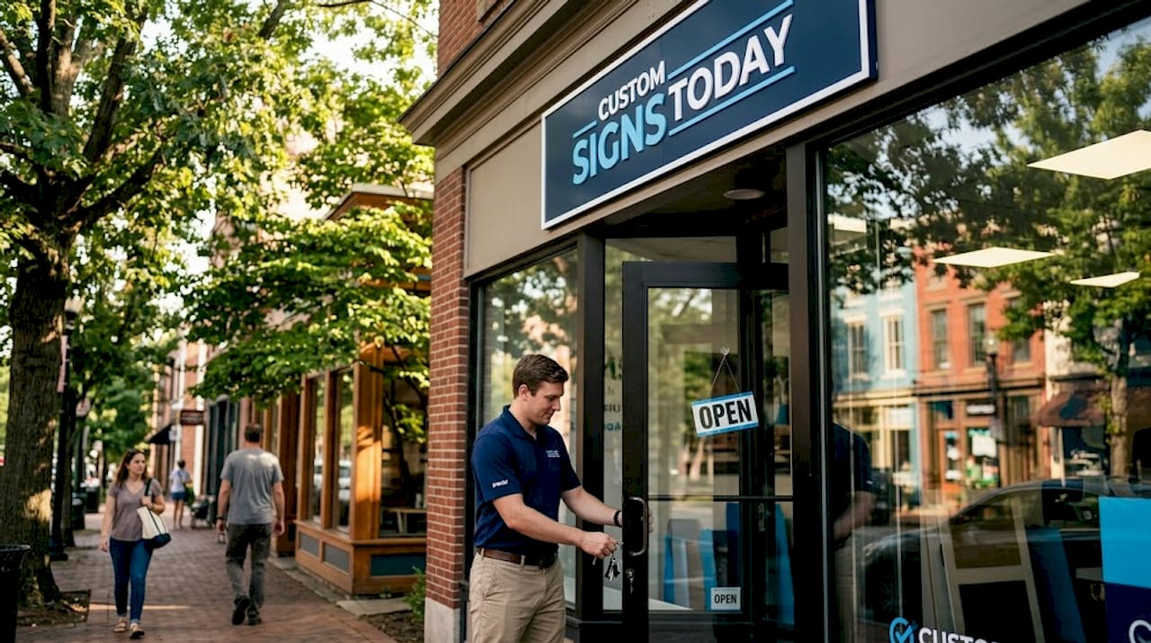
Digital is only half the picture. For most local businesses, physical logo displays generate more daily impressions than any website or social channel. A storefront sign seen by 2,000 commuters per day is a media channel in its own right.
The strongest examples of logo displays in physical environments share a few characteristics:
- High contrast with background: White logos on dark backgrounds or vice versa maintain legibility from distance and in varying light conditions
- Clear safe zones: No text, imagery, or competing elements within a defined margin around the logo
- Appropriate scale: The logo should be readable from the furthest point a customer would reasonably view the sign
- Material durability: Outdoor applications require UV-resistant inks and materials that hold color fidelity through sun and weather exposure
Outdoor signage solutions for storefronts and construction sites let you bring the same discipline to physical displays that you apply to digital ones. Office signage creates internal brand consistency that influences how employees and visiting clients perceive your company culture.
Pro Tip: Treat every physical logo placement as a media buy. Calculate daily impressions based on foot or vehicle traffic, and match the production quality of the sign to that audience size.
5. Vehicle wrap logo display examples
Vehicle wraps are among the most cost-efficient examples of logo displays in terms of cost per impression. A single wrapped vehicle traveling urban routes can generate thousands of brand exposures daily. Vehicle wraps and lettering function as mobile brand ambassadors that expand your reach in local markets without recurring media spend.
The best vehicle wrap logo applications treat the vehicle as a canvas with specific zones. The rear panel gets the most dwell time in traffic. The driver-side door panel gets the most foot-traffic views. Your logo needs to be legible at speed, which means clean forms, high contrast, and a design that works without taglines or secondary details that blur at 45 mph.
6. Animated and digital signage logo display examples
Static signage does its job. Animated signage does more. In-store digital signage featuring animated logos can increase sales by an average of 33% on featured items. One UK bakery campaign using animated logo displays achieved a 42% increase in walk-ins and a 320% increase in local search impressions over eight weeks.
Animated logos in digital signage capture attention and reinforce brand personality in ways static images cannot. The motion does not need to be complex. A subtle reveal, a color pulse, or a looping icon animation draws the eye while the brand name registers in memory.
The key is restraint. Animation should support the logo’s identity, not distract from it.
7. Comparison of logo display methods
This table gives you a direct side-by-side view of the most common logo display methods so you can match the right tool to your context.
| Display method | Scalability | Visibility | Cost | Best use case |
|---|---|---|---|---|
| Website header logo | High (SVG) | High on desktop | Low | Primary digital brand touchpoint |
| Favicon/avatar | Requires system | Medium | Low | Browser tabs, social profiles, PWAs |
| Physical storefront sign | Fixed | Very high | Medium to high | Local brand presence and foot traffic |
| Vehicle wrap | Fixed to vehicle | Very high in urban areas | Medium | Mobile local marketing |
| Animated digital signage | High | Very high indoors | Medium to high | Retail, hospitality, event environments |
| Logo bar (website) | High | Medium | Low | Social proof and conversion support |
Each method has a distinct role. The businesses that get the most from their logo are the ones using several of these methods together with consistent visual identity across all of them.
8. Choosing the right display approach for your business
Not every logo display strategy fits every business. Here is how to match your situation to the right approach.
- Startups and small businesses should prioritize a responsive digital logo system first. Get your website header, favicon, and social avatar right before spending on physical signage. These are low-cost, high-frequency touchpoints.
- Retail and restaurant businesses benefit most from in-store digital displays and exterior signage. The site sign outside your location is your highest-impression physical asset. Invest in quality materials and a clean logo presentation.
- Service businesses with fleets (contractors, delivery companies, cleaning services) should treat vehicle wraps as a primary marketing channel. The return on a wrapped vehicle compounds every mile driven.
- Enterprise brands need to treat logo display as a system problem. When you have dozens of locations, digital properties, and physical assets, inconsistency becomes a brand liability. A logo usage guide paired with a centralized asset library solves this.
- Event-driven businesses should invest in portable display solutions: retractable banners, signage kits, and branded materials that travel with your team and reinforce the same identity at every event.
Pro Tip: Before expanding your logo display footprint, audit what you already have. Inconsistent colors, outdated logo versions, and poor-quality print files on existing assets undermine the effectiveness of anything new you add.
My take on what most brands get wrong with logo displays
I’ve reviewed hundreds of branding projects over the years, and the same pattern shows up repeatedly. Brands spend significant resources designing a logo and then treat the display question as an afterthought. The logo gets handed off as a single PNG file, and whoever builds the website, orders the sign, or sets up the social profile makes their own judgment call about how to use it.
The result is a brand that looks slightly different everywhere it appears. Not dramatically different. Just slightly off. And that slight inconsistency quietly erodes trust with every customer who sees it.
What I’ve found actually works is treating your logo as a distributed system from day one. That means having a tiered asset library (full, horizontal, icon, inverted, favicon), a one-page usage guide that any vendor can follow, and a regular audit of every place the logo currently lives. Effective logos communicate trust through restraint and consistency, not complexity. The brands people trust most are the ones whose logos feel exactly the same everywhere you encounter them.
My honest advice: spend less time refining the logo and more time building the system that deploys it correctly. A good logo displayed consistently beats a great logo displayed carelessly, every single time.
— Yossi
Get your logo in front of more customers with Customsignstoday
When your logo display strategy calls for professional physical execution, Customsignstoday delivers. From face change signs that make brand refreshes effortless to vehicle lettering that turns your fleet into a rolling brand presence, every product is built for visibility and durability.
Customsignstoday works with local businesses, real estate professionals, and event organizers across South Florida to produce signage that makes logos work harder. Fast turnaround, quality materials, and a team that understands how branding decisions translate into physical production. Request a free quote and find out what the right signage can do for your brand visibility.
FAQ
What are the most effective logo display examples for websites?
The most effective website logo displays use a full wordmark in the top-left desktop header, a simplified horizontal version for mobile, and an icon-only variant for sticky scroll headers. Eye-tracking research confirms the top-left placement as the strongest position for brand recognition and user trust.
How should logos be displayed on physical signs?
Physical logo displays should prioritize high contrast, adequate scale for viewing distance, and a clear safe zone around the logo. Durable, UV-resistant materials are necessary for outdoor applications to preserve color fidelity over time.
What file format works best for logo display on websites?
SVG is the preferred format for web logo display because it scales infinitely without quality loss and keeps file sizes small. Raster formats like PNG and JPG can blur on retina screens and slow page load times.
Do logo bars on websites actually improve conversions?
Yes, when done correctly. A logo row featuring press mentions or client brands can increase cold-traffic conversion rates by 18% or more, but only when paired with testimonials or case studies rather than displayed as a plain wall of logos.
How often should I audit my logo display assets?
Audit your logo displays at least once per year, and any time you refresh your brand identity. Check for outdated logo versions, inconsistent colors, and low-quality files across every digital and physical touchpoint where your logo currently appears.