
A sign with good design is one the right person can spot, read and understand in the time they have. That depends on four decisions made before any artwork: where the sign is viewed from, how far away, how long the viewer has, and what single action you want next. If you are a business owner, property manager, real estate agent or event organizer, you can make those decisions yourself. At Custom Signs Today we take your answers and turn them into a sign that is sized, built and installed for the spot it hangs in.
TL;DR
- Design a sign from the viewing distance backward. The International Sign Association recommends at least 1 inch of letter height for every 25 feet of viewing distance.
- Leave breathing room. One city design guide recommends that 30% to 40% of a sign be empty space.
- Match the sign type to the job: exterior, interior, banner, vehicle or A-frame each solve a different problem.
- Interior signs for rooms and exits can fall under ADA character rules, so check size, font and Braille before you approve a proof.
- Send a quote request with the location, distance and purpose, and we handle the design, fabrication and installation guidance.
Table of Contents
- What “design” means for a sign
- Step 1: Define the job and the viewer
- Step 2: Choose the sign type for the purpose
- Step 3: Size the letters from the viewing distance
- Step 4: Arrange the layout
- Step 5: Use color and your logo to be recognized
- Step 6: Check accessibility rules for interior signs
- Step 7: Plan for light and weather
- Step 8: Prepare your design for production
- Where we come in
- Our view on designing signs
- Common design mistakes and the fix
- FAQ
- Sources
What “design” means for a sign
Most people hear “design” and think of looks: logo, colors, a nice font. The International Sign Association (ISA), the trade body for the sign industry, says sign design is about much more than appearance. Size, placement and lighting all have to fit the building and the location.
The same page gives a practical test. A sign has to be detectable (the viewer notices it), conspicuous (it stands out from its surroundings), legible (the letters can be read) and comprehensible (the message makes sense). A sign can pass the first and fail the last. A beautiful storefront panel with a thin script font fails at legibility. A crowded banner with six messages fails at comprehension.
Treat those four words as your checklist. Every choice below serves one of them.
Step 1: Define the job and the viewer
Before choosing a material or a color, write down four facts.
- Who is looking? A driver at 35 mph, a pedestrian on a sidewalk, a visitor in a lobby and a buyer driving past a listing all need different signs.
- From how far? Measure from where the viewer first needs to read it, not from where you stand.
- For how long? The Sign Research Foundation notes that at 55 miles per hour a viewer travels 80 feet per second, a quarter-mile in 16.5 seconds. At that speed there is room for a name and one short line, not a paragraph.
- What should they do next? Walk in, call, turn left, find suite 204. One sign, one action.
These four answers are also exactly what we ask for in a quote request, because they decide size, material and mounting. Our guide on how to plan a sign people read walks through the same questions in more detail.
Step 2: Choose the sign type for the purpose
Sign type is a design decision, not a catalog pick. The sign has to fit where and how it is seen.
| Need | Sign type that fits | Why |
|---|---|---|
| Permanent brand presence on a building | Exterior signs | Built for weather and fixed viewing positions |
| Wayfinding, room names, directories | Interior signs | Read at close range, often covered by accessibility rules |
| Grand opening, sale, event, construction | Banners (vinyl, mesh, feather, retractable) | Fast to deploy, large message area |
| Moving advertising | Vehicle lettering and car magnets | Your message travels the neighborhood |
| Sidewalk traffic | A-frame signs | Sits at pedestrian eye level |
| Listings and open houses | Real estate signs | Short message, large type, readable from the street |
| Windows and walls | Window graphics, wall graphics and decals | Turns a surface into a branded display |
Two outside references show how much function drives form. The U.S. Federal Highway Administration describes three classes of road sign defined by function under the national traffic sign manual: regulatory, warning and guide signs, each with its own color logic. Your business sign is not a road sign, but the lesson carries over: viewers read color and shape before words. For interiors, the ISA lists directional or wayfinding signs, directory signs, point-of-purchase signs and regulatory signs as separate types, and it notes that the ADA requires clearly marked accessible entrances and Braille on certain signage.
If you are a real estate agent or property manager, our guide on designing property signage applies these ideas to listings and buildings.
Step 3: Size the letters from the viewing distance
Letter height is where most weak signs fail. Use the ISA’s rule: experts recommend letters at least 1 inch tall for every 25 feet of viewing distance.
Worked example. A storefront faces a parking lot, and customers first need to read the name from 150 feet away. 150 divided by 25 is 6, so the letters should be at least 6 inches tall. If the name must read from a road 250 feet away, the minimum is 10 inches. That is a minimum for maximum readability, so going a little larger is usually safer than going smaller.
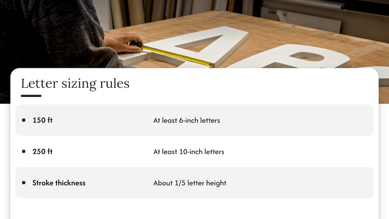
The Sign Research Foundation adds a second rule on stroke weight: letter thickness of about one-fifth the letter height gives prime readability. Hairline fonts disappear at a distance, which is why thin script lettering looks elegant on a business card and vanishes on a fascia.
Before you commit to dimensions, check the available wall or frontage, any landlord or local sign rules, and where the sign will sit relative to trees, awnings and traffic. Our guide to selecting sign size for maximum visibility covers this in depth. Local sign permits and size limits vary by city, and compliance consulting is part of what we do, so tell us the address when you request a quote.
Step 4: Arrange the layout
Leave space around the message
Crowding is the most common design error. The City of Walnut Creek, California, in its sign design guidelines, recommends that 30% to 40% of a sign be white space, meaning no text or graphics, so the sign stays easy to read. The same guide notes that a light letter on a dark background looks larger.
That is a city planning department’s guidance, not a national rule, but it is a good working target anywhere. If your draft looks full, remove words before you shrink letters.
Give each word room
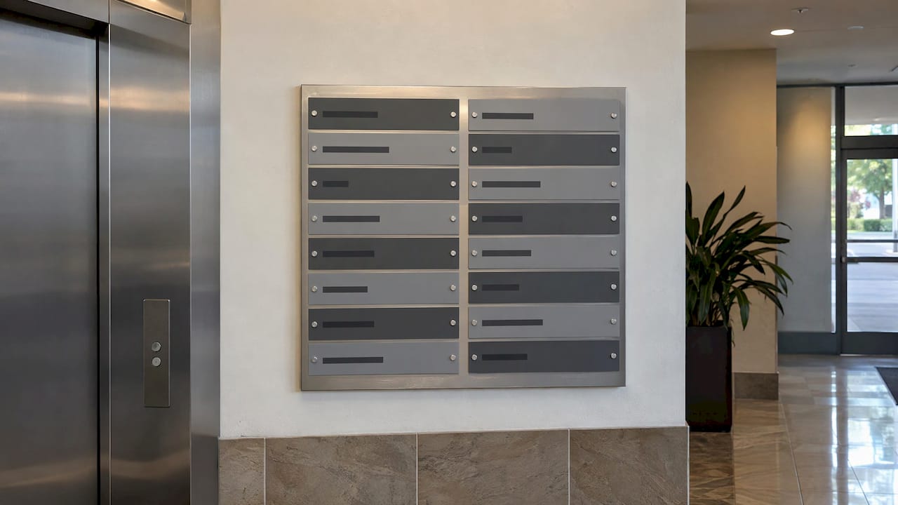
A 2026 SignCraft Magazine design clinic on a retail center directory makes a point that applies to any multi-name sign. Reducing letter height on tenant panels improved readability because the eye needs space around a word to recognize it quickly. The designer also aligned the names to the left margin and used a medium gray background on every other panel to separate them. Property managers with a multi-tenant monument or lobby directory can use both ideas.
Keep the message short
A useful working limit for a roadside sign is a business name, what you do and one contact element. For a banner at an event, it is the event name and one date or action. Phone numbers and web addresses work only if the viewer has time to read and remember them. At driving speed they usually do not.
Step 5: Use color and your logo to be recognized
The Sign Research Foundation reports that familiar logos, words and fonts can be processed more quickly by the viewer, and that viewers recognize signs partly by color, which is why color is an essential part of a corporate logo.
For your business, that means:
- Reuse your brand colors and typeface on the sign, the vehicle, the banner and the window. Repetition builds recognition faster than any single clever design.
- Prioritize contrast over matching. If your brand color sits on a similar-toned background, the sign will look washed out from a distance. Pair it with a much lighter or darker field.
- Limit the palette. Two or three colors read faster than five.
Our article on effective sign design principles and our business sign design tips give more examples of contrast pairings and layout.
Step 6: Check accessibility rules for interior signs
This step is a legal one, so treat it as required rather than optional. Under the ADA and ABA accessibility standards, signs that identify permanent rooms and spaces, such as restrooms and numbered rooms, must meet character rules. Two figures from the 2016 standard matter most when you design:
- Character height. For characters mounted 40 to 70 inches above the floor, the minimum height is 5/8 inch for viewing distances under 72 inches, plus 1/8 inch for each additional foot of viewing distance.
- Font proportions. The standard requires fonts where the uppercase O is 55% to 110% of the height of the uppercase I, and where the stroke of the uppercase I is 10% to 30% of the character height.
Worked example. A suite number is read from 10 feet, which is 120 inches. That is 48 inches beyond 72, or 4 feet. Four times 1/8 inch is 1/2 inch, so the minimum height is 5/8 + 1/2 = 1 1/8 inches. Condensed or ornamental fonts can fail the proportion test even when the height is right, so choose the font before you approve a proof.
The rules also cover tactile characters and Braille on certain signs, and which doors need them depends on the space. Our guide to ADA exit sign requirements explains which doors are affected, and our compliance consulting covers the rest. If your building is in a regulated setting, such as a public accommodation or a workplace, confirm the requirement with your local building department or an accessibility specialist before final production.
Step 7: Plan for light and weather
The ISA notes that an effectively lit sign can be visible and readable day and night, in all kinds of weather, and that drivers read an illuminated sign more quickly. If customers arrive after dark, whether you run a restaurant, a clinic or an evening event, lighting is part of the design, not an add-on.
Material choice follows the same logic: where will the sign live, and for how long? A few practical rules of thumb:
- A sign inside a lobby or office faces no weather, so lightweight boards or printed panels work.
- A permanent exterior sign faces sun, rain and temperature swings, so it needs rigid, weather-resistant material and fade-resistant finishes.
- A banner for a weekend event needs a fabric or vinyl that survives wind. Mesh banners let wind pass through, which suits fences and scaffolding.
- A vehicle needs vinyl made for curves and washing.
We offer full customization of size, materials and design, with durable materials for indoor and outdoor use, so you can tell us how long the sign has to last and we recommend the build.
Step 8: Prepare your design for production
You can bring a finished design or start from a rough idea. Either way, a few preparation habits save revision rounds.
- Gather the logo in its best format. Vector files (such as AI, EPS or a vector PDF) scale to any size without blurring. A small web image stretched to a banner will look soft.
- Write the final text first. Check the spelling, the phone number and the web address. Changes after a proof are the biggest cause of delay.
- State the real size and the viewing distance. A design that looks fine on a laptop screen can be unreadable at 40 feet.
- List brand colors. Screen colors and printed colors differ, so give your brand color values if you have them and tell us where the sign will be seen.
- Photograph the site. A picture of the wall, window, vehicle or fence with a rough measurement tells us more than a description.
- Say what is allowed. Landlord rules, homeowner association rules and city permits can limit size, lighting or placement.
Online design tools can help you sketch a layout, but a screen mockup does not account for mounting, materials, permits or how a sign reads from across a lot. That gap is where a consultation pays for itself.
Where we come in
We design and fabricate custom signage for businesses, real estate agents, event organizers and property managers: banners, storefront and exterior signs, interior signs, vehicle wraps and lettering, window and wall graphics, decals, property signs and event signs. We handle the consultation, compliance guidance, design, fabrication and installation guidance, with certified installation and fast turnaround for local and nationwide clients.
If you have your viewing distance, location and purpose, the quickest route is a quote request on the page for your sign type: custom signs, exterior signs, interior signs or banners. Our guide to custom sign quotes explains what to include.
Want a second pair of eyes before you commit? Send us the photo and the measurements through the Custom Signs Today quote page and we will start from your real wall, window or vehicle.
Our view on designing signs
A sign is a small piece of communication with a very hard job. It has a few seconds, a moving audience and a lot of competing noise. The most common thing we see in a design brief is too many ideas on one surface.
Our approach is to start with the viewer, not the logo. Where do they stand, how far away are they, and what do they need to do? Once that is answered, letter height, contrast, material and mounting follow almost automatically.
We build custom signs because standard sizes rarely fit a real building, a real fence or a real vehicle. Full customization of size, materials and design, plus compliance consulting and certified installation, means the sign you approve is the sign that goes up, and it matches your brand and your environment.
If you take one rule away: cut words before you cut letter size. A short sign that people read beats a complete sign that people ignore.
Yossi
Common design mistakes and the fix
| Mistake | What goes wrong | Fix |
|---|---|---|
| Letters sized to the wall, not the distance | Name unreadable from the street | Start at 1 inch of height per 25 feet of distance |
| Thin script or condensed fonts | Strokes vanish; ADA proportions fail indoors | Use a clear font with strong strokes |
| Light logo on a mid-tone background | Low contrast, washed out | Pair with a much darker or lighter field |
| Full phone number and web address on a roadside sign | Nobody can read or remember it at speed | Name, one line, one action |
| Different colors on each item | No recognition across sign, van and banner | Reuse brand colors and typeface everywhere |
| Same sign for indoors and outdoors | Fading, warping or poor lighting | Choose material and finish for where it hangs |
FAQ
How big should the letters on my sign be?
The ISA’s guidance is at least 1 inch of letter height for every 25 feet of viewing distance, so a sign read from 100 feet needs letters of about 4 inches at minimum. Tell us the distance and mounting position in your quote request and we size it for the spot.
How much text should a business sign have?
Keep it to what the viewer can absorb in the time they have. For a roadside sign that is usually your name, what you do and one contact element. A city design guide recommends that 30% to 40% of the sign stay empty, which is a useful check on any draft.
Do my interior signs need to follow ADA rules?
Signs that identify permanent rooms and spaces generally need to meet ADA character height, font and Braille rules, while temporary or decorative signs may not. Which signs are covered depends on your building and use, so confirm with your local building department, and share the details with us so we can build to the requirement.
Can I send my own design?
Yes. Send the logo in a vector format if you have one, the final text, the real size and a photo of the location. We review it for readability at the intended distance and tell you what to adjust before production.
What is the difference between a banner, a vinyl sign and a rigid sign?
Banners are flexible and quick to deploy, which suits events, promotions and construction sites. Vinyl graphics apply to windows, walls and vehicles. Rigid exterior signs are for permanent use on a building or post, and the right choice depends on how long the sign needs to last and where it is mounted.
Sources
- Design & Placement of Signs, International Sign Association
- Identification of Sign Types, International Sign Association
- Sign Principles and Types, Federal Highway Administration
- Sign design tips and guidelines, City of Walnut Creek
- Design Clinic: Directory for a Retail Center, SignCraft Magazine
- Arts and Science of Sign Design, Sign Research Foundation
- 703.5 Visual Characters, ADA/ABA standard (character height)
- 703.5 Visual Characters, ABA guidelines (font proportions)