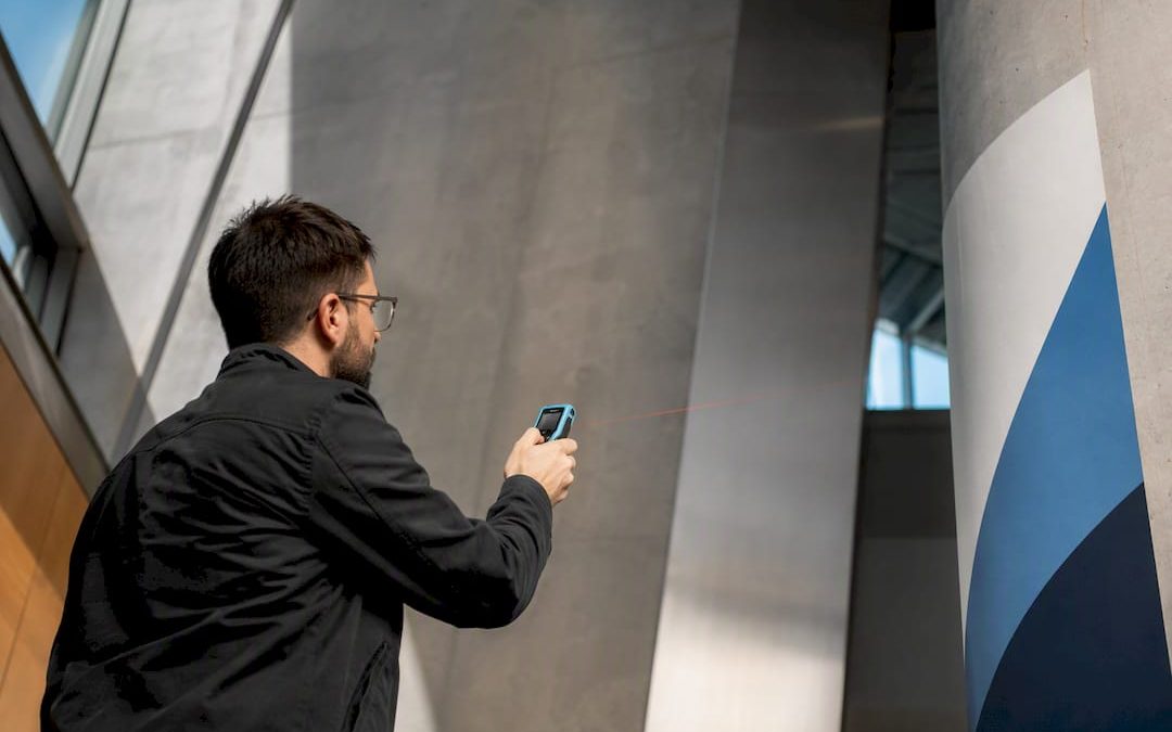
Environmental graphic design (EGD) is the practice of applying graphic design principles to physical, three-dimensional spaces to guide movement, tell stories, and shape how a place feels. SEGD, the field’s leading professional organization, frames it around wayfinding, placemaking, and experience design. The result is buildings and public spaces that people can navigate intuitively while absorbing a clear sense of identity.
TL;DR:
- Conduct thorough site research and user-journey mapping to ensure signage placement and messaging are tailored to actual movement patterns and environmental conditions.
- Choose durable, weather-appropriate materials like anodized metal or UV-stable vinyl, and ensure ADA compliance for legibility and accessibility.
- Prototype signs at full scale outdoors to test for glare, contrast, and integration with the environment before fabrication.
- In complex or environmentally stressed sites, partner with signage specialists to guarantee long-term performance and maintenance efficiency.
- Recognize that environmental graphic design relies heavily on technical analysis to ensure creative elements function effectively in real-world conditions.
Table of Contents
- What Is Environmental Graphic Design, Exactly?
- Where You See Environmental Graphic Design in Action
- How the Design Process Actually Works
- Materials, Durability, and Accessibility Basics
- Case Studies: What Real Projects Reveal
- When to Bring in a Signage Partner
- The Perspective Worth Considering
- Sources
What Is Environmental Graphic Design, Exactly?
EGD lives in three dimensions, not two. A poster or a website lives flat, on a page or a screen. Environmental graphics wrap around columns, hang from ceilings, get etched into concrete, and stretch across building facades. That distinction changes everything about how the work gets made.
It overlaps with graphic design, interior design, and architecture but isn’t fully any of them. A graphic designer thinks in layouts and typefaces. An interior designer thinks in furniture and flow. An environmental graphic designer thinks in both, plus sightlines, sun angles, and how a message reads at 30 miles per hour versus standing still. AND Academy’s overview of the field describes this as requiring designers to work at human scale, factoring in material performance and accessibility from the start rather than as an afterthought.
Common program areas include wayfinding systems, branded environments (think a hospital lobby that feels distinctly “that hospital” rather than generic), museum and exhibition design, and interpretive signage at parks or historic sites. Because the work spans disciplines, teams typically pull in architects, landscape designers, fabricators, and increasingly, creative technologists who handle digital or interactive elements. No single firm does it all alone.
Where You See Environmental Graphic Design in Action
The clearest way to understand environmental graphic design is to spot it in places you’ve already visited.
- Wayfinding and signage systems: directional signs, regulatory notices, and building directories that answer “where am I” and “where do I go next.” Airports are the textbook case, but hospitals, universities, and office campuses rely on the same logic. Our guide to wayfinding design breaks down how these systems get built from the ground up.
- Branded and identity-driven environments: retail stores, corporate headquarters, and hotel lobbies where color, typography, and materials reinforce a brand the moment someone walks in.
- Murals and public art: large-scale graphics or sculptural elements that turn a blank wall or plaza into a landmark, often anchoring a neighborhood’s identity.
- Exhibition and interpretive design: museum panels, park trail markers, and historic site signage that layer storytelling onto physical space.
- Interactive and media-based installations: digital kiosks, projection mapping, and responsive displays that blend static graphics with real-time content.
Each category solves a different problem, but they share a starting question: how does a person experience this space, and what does the graphic layer need to do about it?
How the Design Process Actually Works
EGD projects rarely start with a sketch. They start with research. Designers map user journeys and touchpoints to figure out where people get lost, where they pause, and what decisions they’re making at each turn. Site studies follow: sun angle analysis for outdoor signage, sightline checks for tall installations, and mounting constraints tied to existing structural systems.
None of this happens in isolation. Architects, landscape designers, fabricators, and structural engineers all weigh in before a single sign gets fabricated, and environmental graphic designers routinely coordinate with material specialists to account for building codes, accessibility requirements, and long-term maintenance before finalizing typography or mounting systems.
A typical commissioning sequence looks like this:
- Define goals and audience (visitors, employees, patients, residents).
- Conduct site research and user-journey mapping.
- Develop concepts and a visual hierarchy.
- Prototype and test materials in real conditions.
- Secure approvals from stakeholders and code officials.
- Fabricate and install.
- Review performance and plan maintenance.
Pro Tip: Ask your design partner to prototype at full scale outdoors, even briefly, before committing to fabrication. A sign that reads perfectly on a laptop screen can vanish against glare or clash with a building’s actual color at noon.
Materials, Durability, and Accessibility Basics
Material choice makes or breaks an EGD project long before anyone notices the design itself. Interior signs often use acrylic, aluminum composite, or dimensional letters, while exterior work leans on anodized metal, UV-stable vinyl, or powder-coated steel to survive weather and sunlight. Our breakdown of durable signage materials covers how these choices hold up over years, not just at installation.
Coastal projects face salt spray and humidity that eat through cheaper finishes within a season. Urban installations deal with vandalism and constant touch. Every site presents a different stress test, and material selection has to respond to those specific conditions rather than defaulting to whatever worked on the last job. A side-by-side look at common sign substrates helps clarify which option fits which environment.
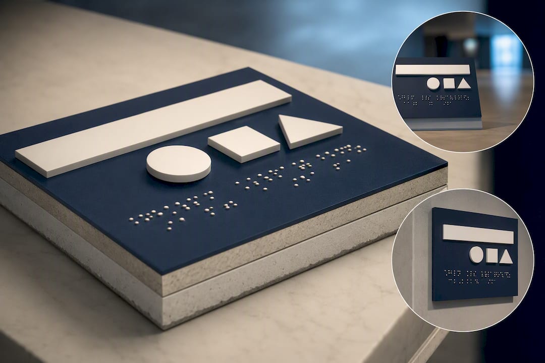
Legibility matters just as much as toughness. Typography, contrast, and scale determine whether a sign works from 3 feet or 30. ADA-compliant wayfinding, meaning raised characters, Braille, and adequate contrast ratios, isn’t optional in most public buildings. Maintenance planning belongs in the budget from day one, since a sign that looks great at installation but fades within two years costs more in replacements than a slightly pricier material would have upfront.
Case Studies: What Real Projects Reveal
Sourced project data shows how these decisions play out on the ground.
- Scarborough Foreshore: designers ran sun studies to determine exactly where signs should sit so shadow patterns aligned with peak beach hours, and they built the palette around local beach culture, moving from sky blues to warm yellows and deep purples for visibility across changing light. Coastal durability drove material choices from the outset.
- Postbyen: this mixed-use Copenhagen district needed one wayfinding system to serve parking, offices, and public space without visual chaos. The team built a layered graphic vocabulary, primary totems, secondary directional blades, and tertiary ground-plane cues, so information hierarchy stayed clear without cluttering the streetscape.
- Gatton Park: interpretive graphics tied local history to the site through etched ground-plane text and donor signage, connecting visitors to place-specific stories while balancing durability against aesthetic intent.
The common thread: projects that start with genuine user research and site-specific testing produce measurable results. Case studies across the field consistently link mapped user journeys to improved navigation and stronger place identity, not just prettier signs.
When to Bring in a Signage Partner
Standard signage works fine for a simple storefront. Once a project involves multiple buildings, mixed audiences, or a site with real environmental stress (coastal exposure, heavy foot traffic, ADA requirements), it’s worth bringing in a partner who understands fabrication and materials at that scale.
Some signage providers work with businesses navigating exactly that gap, producing custom signage built for durability and legibility across indoor and outdoor conditions. If you’re planning wayfinding for a growing facility, check our custom sign services or request a quote to talk through materials and site conditions before you commit to a design.
The Perspective Worth Considering
Most explanations of environmental graphic design treat it as a design specialty. That undersells it. EGD is closer to applied psychology with a fabrication budget attached. The Postbyen project didn’t succeed because someone picked a nice typeface. It succeeded because the team mapped how people actually move through a mixed-use district and built a hierarchy that matched real behavior instead of an idealized floor plan.
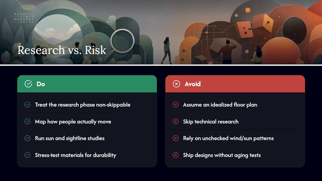
Here’s the part that gets overlooked: the technical research, sun studies, material stress testing, sightline analysis, isn’t a nice add-on to the creative work. It’s the thing that determines whether the creative work survives contact with reality. A gorgeous sign that fades in eighteen months or becomes illegible in afternoon glare has failed at its actual job, regardless of how it looked in the design deck.
The businesses that get the most out of EGD are the ones who treat the research phase as non-skippable, not as a formality before “the real design starts.” Skip it, and you’re gambling on a coastal wind pattern or a sun angle you never tested.
— Yossi
Sources
- About SEGD — Society for Experiential Graphic Design
- Scarborough Foreshore — SEGD project writeup
- Postbyen — SEGD project writeup
- What is Environmental Graphic Design (EGD)? | AND Academy