TL;DR:
- Most consumers notice business signs before anything else, significantly influencing foot traffic and sales. Effective signage combines proper size, contrast, font choice, and strategic placement to capture attention and communicate clearly. Business owners should treat signage as an evolving tool, constantly tested and optimized for maximum return on investment.
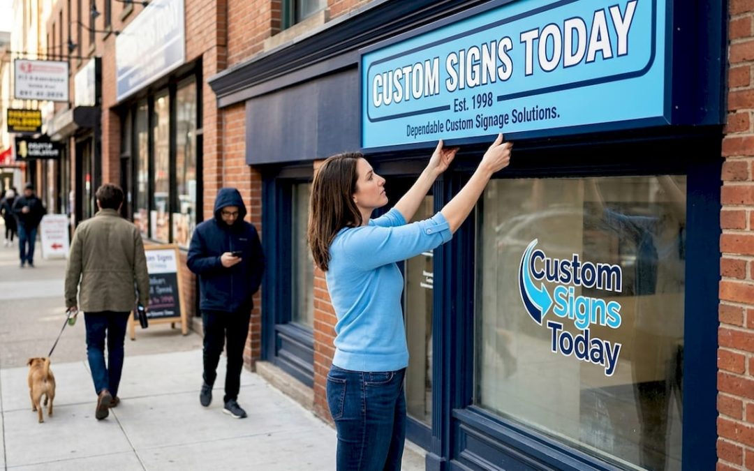
Before your staff says a word, before a customer reads your menu, before anyone even opens your door, your sign has already made a first impression. 75% of consumers notice a business sign before anything else when approaching a location, and 36% have walked into a store purely because a sign caught their eye. Yet most business owners spend far more time thinking about their social media profile than their storefront signage. This guide breaks down the psychology, design principles, and real-world strategy behind signage that consistently pulls in customers and converts them into buyers.
Table of Contents
- Why signs capture attention and drive foot traffic
- Key elements of signage that influence customer action
- Types of signage and matching them to your business goals
- Avoiding signage mistakes and unlocking full ROI
- Our take: Why conventional signage strategies miss the mark
- Looking to attract more customers? Let’s create signage that works
- Frequently asked questions
Key Takeaways
| Point | Details |
|---|---|
| First impressions matter | Three out of four customers will notice your sign before anything else at your business. |
| Signage drives real results | Upgrading signs can lead to sales increases of 10% or more for most businesses. |
| Design impacts effectiveness | Readability, size, color, and placement determine whether customers act on your signage. |
| Right type for right goal | Choose static or digital signs based on whether you want lasting impact or dynamic engagement. |
Why signs capture attention and drive foot traffic
Humans process visual information roughly 60,000 times faster than text. That biological fact is the foundation of why signage works. When someone drives or walks past your location, their brain is scanning the environment for something meaningful before they consciously decide to pay attention. A clear, bright, well-placed sign triggers that recognition and creates a split-second invitation.
The numbers behind this are striking. Research from the Sign Research Foundation confirms that 75% of consumers notice a sign before anything else when they approach a business, and 36% will walk in specifically because the sign’s quality impressed them. That means your sign is quietly doing sales work around the clock, without you paying commission.
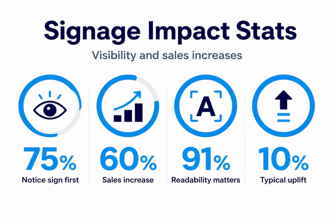
The revenue impact is just as clear. 60% of businesses reported a measurable sales increase after upgrading their signage, often without changing anything else. That single investment shifted how customers perceived and interacted with their location. Understanding how signs attract customers at this deeper level helps you stop treating signage as decoration and start treating it as infrastructure.
Here’s a quick look at the data:
| Signage metric | Statistic |
|---|---|
| Consumers who notice sign first | 75% |
| Customers who visit due to sign quality | 36% |
| Businesses reporting sales lift after sign upgrade | 60% |
| Shoppers who share information about a business from its sign | 68% |
Signs also shape customer behavior in multiple ways:
- They validate a business as legitimate and professional
- They set expectations about price, quality, and brand personality
- They direct foot traffic to the right entrance or department
- They highlight promotions and time-sensitive offers
- They reinforce brand recognition for repeat visits
- They communicate hours, services, and identity at a glance
Learning the basics of retail signage makes it clear that a sign is not just an identifier. It is a persuasion tool operating on a visual and emotional level before any direct conversation happens.
Key elements of signage that influence customer action
Attention is only half the battle. A sign that catches the eye but fails to communicate clearly is a missed opportunity. The difference between a sign that drives action and one that gets ignored often comes down to a few specific design variables.
Size and visual weight matter more than most people realize. A sign that is too small in context, like a 12-inch placard in front of a 60-foot building, will register as background noise. Your sign needs to feel proportional to the environment. Overcrowding a sign with too many words or images creates the same problem in reverse: visual clutter that the brain dismisses.
Readability at a glance is not optional. 91% of consumers expect to understand a sign without stopping to study it, and 61% have failed to find a business because its signs were too small or unclear. That is a direct loss of potential customers that better design would have prevented.

Font and letter case choices have a measurable effect on legibility. Here is how common options compare:
| Design choice | Legibility at distance | Best use case |
|---|---|---|
| Sans-serif font | High | Outdoor, roadside, fast-read signs |
| Serif font | Moderate | Indoor displays, premium branding |
| Mixed case (Title or Sentence case) | High | All sign types |
| All-caps | Low | Short words, accent labels only |
The evidence is clear: sans-serif and mixed-case text consistently outperforms serif and all-caps text for distance readability. A font like Helvetica or Arial on a roadside sign will outperform a decorative script even if the script looks more stylish at close range.
Color contrast and lighting play an equally critical role. High contrast combinations, such as dark text on a light background or white lettering on a bold solid color, improve readability across lighting conditions. Low contrast signs become nearly invisible on overcast days or in direct sun. Strategic sign design principles factor in the ambient light at your specific location, not just how the sign looks in a design file.
Follow these steps to optimize any sign for its actual environment:
- Visit the sign location at multiple times of day and assess light direction and intensity
- Check for glare sources like glass, metal surfaces, or direct sun angles
- Assess visual competition like nearby signs, competing colors, or busy architectural features
- Test font size by standing at the distance your target customer would view the sign from
- Review contrast ratios under overcast conditions, not just bright sunlight
Pro Tip: Print a physical mock-up of your sign at scale and hold it at the intended installation spot before committing to production. This step alone catches most readability and sizing errors before they cost you money.
“Unclear or illegible signage is not just a design flaw. It is a revenue leak. Every potential customer who cannot read or find your sign is a customer who chose a competitor by default.” — Sign Research Foundation data summary
Explore proven signage design tips and study the fundamentals of a solid sign placement guide to put these elements into action at your specific location.
Types of signage and matching them to your business goals
Not every sign serves the same purpose, and matching the format to your goal is what separates strategic signage from random visual noise. The International Sign Association benchmarks from ISA and the Sign Research Foundation consistently emphasize that visibility, readability, and alignment with retail strategy determine whether a sign investment pays off.
Static signs are the workhorses of brand identity and wayfinding. A well-designed monument sign, dimensional letter display, or painted window graphic tells customers who you are and where to go without requiring any interaction. These signs earn their cost through longevity and consistency. A quality exterior sign can function for five to ten years with minimal maintenance.
Digital signs create a different type of engagement. They are particularly effective for impulse-driven purchases, time-sensitive promotions, and locations with high evening or weekend traffic. Their ability to rotate messages means a single display can carry multiple campaigns. The tradeoff is higher upfront cost and reliance on power and screen maintenance.
Here is a practical breakdown of sign types and their best applications:
- Storefront/fascia signs: Brand identity, visibility from the street, open/closed status
- Window graphics and lettering: Promotions, hours, secondary brand messaging, product showcases
- Banners: Short-term campaigns, grand openings, seasonal offers, event announcements
- Lightbox signs: 24-hour visibility, restaurant menus, cinema and entertainment venues
- Directional and wayfinding signs: Multi-entrance buildings, parking, large retail spaces
- Digital displays: Real-time promotions, queuing systems, high-traffic entertainment venues
Lightbox signs deserve special mention. Their backlit format dramatically extends visibility into evening hours and creates a premium brand perception that unlit signs simply cannot match.
Pro Tip: If you run regular events, change your menu seasonally, or stay open late, a digital display near your entrance earns its cost back faster than any static sign. It lets you update messaging without reprinting, and it draws attention in low-light conditions when many of your competitors have gone visually silent.
For businesses with real estate, property management, or development purposes, learning how to design property signage for different lot types and viewer distances adds another layer of strategic thinking to your investment.
Avoiding signage mistakes and unlocking full ROI
Most signage underperformance is avoidable. The issues are predictable, well-documented, and often the result of prioritizing aesthetics over function, or cutting corners on placement decisions.
Research shows that signs consistently underperform in cluttered visual environments, under conditions of glare or low contrast, and in poorly chosen physical locations. These are not fringe cases. They are common situations that businesses step into without realizing it.
“A sign in the wrong location, with the wrong contrast, in a visually noisy environment might as well not exist. The investment goes to zero the moment visibility drops.” — Sign Research Foundation
Here are the top five signage mistakes that drain your return on investment:
- Low contrast color choices: Light text on a light background, or dark on dark, creates visual invisibility in outdoor conditions
- Overcrowded layout: Too many words, images, or messages dilutes the core message and overwhelms the viewer
- Undersized lettering: Characters that are readable at three feet fail entirely at thirty feet
- Ignoring glare and obstruction: Trees, neighboring signage, parked vehicles, and building overhangs can all block or wash out your display
- No placement testing: Installing without standing at the customer’s actual viewpoint leads to misalignment with real-world visibility
A smart signage installation guide accounts for all of these variables before a single screw goes into a wall. Using a detailed signage checklist during planning prevents expensive corrections after the sign is already up.
Pro Tip: Before finalizing any sign design or placement, test it under three conditions: midday sun, overcast sky, and at night with available ambient light. If it reads clearly in all three scenarios, you have a winning sign. If it fails in any one of them, that failure is exactly what your customers experience on that type of day.
Beyond avoiding mistakes, ROI on signage compounds when you treat it as a living system rather than a one-time install. Signs that get updated seasonally, refreshed with new campaigns, or repositioned to account for changing traffic patterns consistently outperform signs that sit unchanged for years.
Our take: Why conventional signage strategies miss the mark
After working with businesses across retail, food service, real estate, and events, one pattern stands out clearly. Most business owners treat signage as a box to check rather than a tool to use. They buy a sign, put it up, and assume the job is done. The most successful brands we see do the opposite.
They treat every sign as a hypothesis. They install it, observe how customers respond, gather feedback, and iterate. Did foot traffic improve on weekdays but not weekends? That signals a lighting issue after business hours. Did a new banner drive inquiries for one promotion but not another? That is data about messaging, not just design.
The conventional advice is to match your competitor’s signage style and stay consistent with your brand colors. That is not wrong, but it is incomplete. What works brilliantly for a competitor in a low-clutter suburban strip mall may completely fail for you in a dense urban block where ten other signs compete for the same eyeline. Context shapes performance, and custom solutions built around your specific environment consistently outperform generic templates borrowed from industry peers.
We also see businesses invest heavily in interior signage while neglecting the exterior entirely, or do the reverse. The most effective retail signage strategy treats indoor and outdoor as connected parts of a single customer journey. Each sign hands the customer off to the next one, from the street to the door to the product.
The businesses that maximize their signage ROI are not necessarily the ones with the biggest budgets. They are the ones that test, measure, and adapt with intention.
Looking to attract more customers? Let’s create signage that works
You now have the framework: how signs influence behavior, what design choices drive readability, which formats match specific business goals, and what mistakes kill your return on investment. The next step is applying those principles to your actual location.

At Custom Signs Today, we specialize in building signage solutions tailored to your business environment, your brand, and your customer’s viewing context. Whether you need storefront lettering, promotional banners, or illuminated face change signs that maximize nighttime visibility, we handle it from concept to installation. Curious about the investment? Start with a free consultation through our custom sign quotes page, or explore the full range of our custom signage services to find the right fit for your goals.
Frequently asked questions
What percentage of customers notice business signage first?
Research shows 75% of customers notice a business sign before anything else when approaching a location, making it the single most viewed marketing element for physical businesses.
Does upgrading my signage increase sales?
Yes. 60% of businesses experienced a sales increase of 10% or more after updating or adding signs, often without making any other operational change.
What are common mistakes that reduce signage effectiveness?
Unreadable fonts, low contrast colors, poor placement relative to glare and environmental clutter, and all-caps text that reduces legibility at distance are the most common errors that cause potential customers to walk past.
Is digital signage always better than static signs?
Digital signage excels for impulse-driven promotions, late-hour visibility, and emotional content, while static signs remain the stronger choice for consistent brand identity, wayfinding, and long-term cost efficiency.
Recommended
- Why Signage Boosts Sales for Local Businesses –
- Retail Signage Explained: Boosting Business Visibility –
- Storefront signs: boost visibility and build your brand –
- Why professional sign design boosts business visibility – Custom Signs Today
- Effective Business Logo Signs That Increase Sales – The Logo Light Store
- Retail signage integration with POS: 34% sales lift