
{
“@type”: “Article”,
“image”: {
“url”: “https://csuxjmfbwmkxiegfpljm.supabase.co/storage/v1/object/public/blog-images/organization-6408/1778509206874_Facility-manager-reviewing-clear-wayfinding-signage.jpeg”,
“@type”: “ImageObject”,
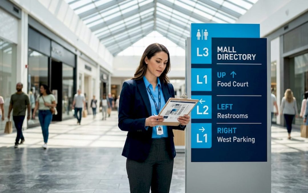
“caption”: “Facility manager reviewing clear wayfinding signage”
},
“author”: {
“url”: “https://customsignstoday.us”,
“name”: “Customsignstoday”,
“@type”: “Organization”
},
“@context”: “https://schema.org”,
“headline”: “How signage drives wayfinding success in any space”,
“publisher”: {
“url”: “https://customsignstoday.us”,
“name”: “Customsignstoday”,
“@type”: “Organization”
},
“inLanguage”: “en-US”,
“description”: “Discover the vital role of signage in wayfinding success! Learn how strategic signage can enhance navigation and boost visitor satisfaction.”,
“datePublished”: “2026-05-11T14:52:42.778Z”
}
TL;DR:
- Effective signage reduces confusion and speeds navigation by 35%, with directional signs as core components.
- Balancing clear hierarchy, consistency, and accessibility ensures signs serve both wayfinding and branding purposes effectively.
Well-designed signage can cut directional inquiries by 60% and navigation time by 35%, yet most business owners treat signs as an afterthought rather than a core operational tool. That gap between “putting up a few signs” and building a real wayfinding system costs businesses real money in staff time answering repeated questions, frustrated visitors who leave early, and missed branding opportunities. This guide unpacks the difference between generic signage and strategic wayfinding, shows you exactly how each sign type influences behavior, and gives you practical design and branding strategies you can apply to your space or next event.
Table of Contents
- Understanding the difference: Signage vs. wayfinding
- Key functions of signage in navigation
- Design strategies for effective wayfinding signage
- Integrating branding with wayfinding: Balancing promotion and clarity
- What most people miss about signage and wayfinding success
- Custom signage solutions for your business or event
- Frequently asked questions
Key Takeaways
| Point | Details |
|---|---|
| Signage boosts navigation | Strategic signs cut confusion and speed up wayfinding for everyone in your space. |
| Design for inclusivity | Accessible colors, icons, and languages ensure users of all abilities can navigate easily. |
| Branding should guide, not distract | Smart branding uses colors and zones but never overrides primary directional signage. |
| Prototype and test | Iteratively test signage to discover hidden user challenges before full rollout. |
| Measure for continuous improvement | Track navigation and inquiry data to optimize your wayfinding system over time. |
Understanding the difference: Signage vs. wayfinding
Most people use the words “signage” and “wayfinding” as if they mean the same thing. They don’t, and confusing the two leads to costly design mistakes.
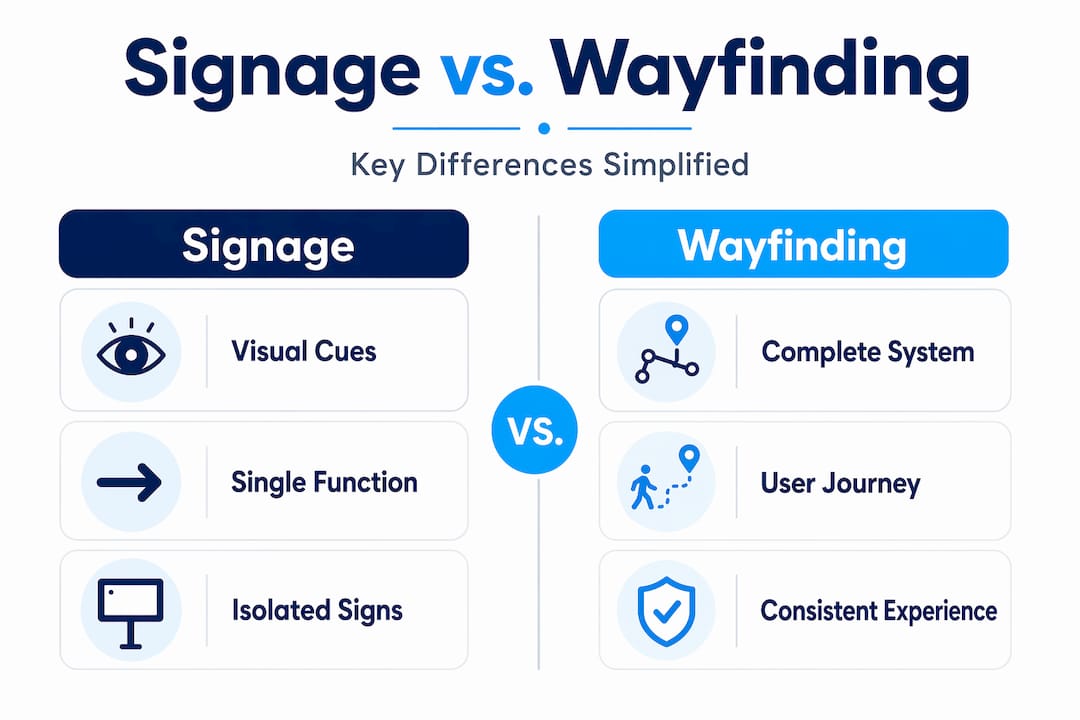
Signage is the broader category. It covers any visual communication tool, from a traffic stop sign to a branded banner outside your storefront. As contrasting views on the subject point out, signage is fundamentally universal and often regulatory: it’s designed so that any person in any context can understand its core message quickly. Think exit signs, restroom markers, or safety warnings. These signs don’t need your logo. They need clarity.
Wayfinding, on the other hand, is the full system a user experiences when navigating a space. It blends physical signs with digital tools, spatial design, lighting, color coding, and even floor patterns into one cohesive experience. Environmental graphic design (EGD) sits at the center of this, and as those same contrasting views note, EGD can either enhance or actively compete with wayfinding clarity if the elements aren’t arranged in a proper visual hierarchy.
Here’s a quick comparison to make this concrete:
| Feature | Signage | Wayfinding system |
|---|---|---|
| Scope | Individual signs | Entire navigation experience |
| Purpose | Communicate one message | Guide users through a full journey |
| Tools used | Physical signs | Signs, digital displays, maps, apps, lighting |
| Audience | Universal | Context-specific (venue, event, campus) |
| Branding role | Optional | Integrated but secondary to clarity |
| Success metric | Legibility | Reduced confusion, faster navigation |
For event organizers, this distinction is especially critical. A conference center might install beautiful branded banners that look stunning but fail to tell attendees where to check in, where the breakout rooms are, or where to find accessible exits. The branding succeeded; the wayfinding failed.
Common misconceptions business owners hold include:
- “More signs means better navigation.” Actually, sign overload creates visual noise and slows people down.
- “Our logo on every sign reinforces the brand.” It can, but only if placed strategically on secondary cues, not primary navigation markers.
- “Digital signs replace physical ones.” The research consistently shows hybrid systems outperform either approach alone.
Explore real-world wayfinding sign examples to see how businesses and events apply these principles in practice. SEGD and AIGA have developed universal symbol libraries precisely because consistent iconography, rather than brand-specific graphics, is what keeps directional signs legible across all audience types.
Key functions of signage in navigation
With both concepts defined, let’s explore exactly how signage fulfills the practical needs of wayfinding. There are four core sign types, and each one drives a different user behavior.

1. Directional signs are the backbone of any wayfinding system. Arrows, maps, “you are here” panels, and overhead hanging signs all tell people where to go next. When placed correctly, they cut confusion and keep foot traffic moving efficiently. A VR study of subway evacuations found that hanging signage reduces evacuation time by 17.62% compared to ground placement and by 5.46% compared to wall-mounted signs. That’s not a minor efficiency gain; in high-stakes situations, it’s the difference between a smooth exit and a dangerous bottleneck.
2. Identification signs tell people where they are. Room numbers, department names, floor directories, and branded entrance signs all confirm location. These signs do double duty: they serve navigation AND reinforce brand recognition when designed thoughtfully. A hotel lobby sign that matches the brand’s typeface and color palette communicates professionalism without sacrificing function.
3. Informational signs answer the “what’s here?” question. Think hours of operation, event schedules, maps, service descriptions, or QR codes linking to digital content. In event spaces, informational signs reduce staff interruptions dramatically because visitors self-serve the answers they need.
4. Regulatory signs communicate rules and safety requirements. These must meet legal standards, including ADA compliance for accessible parking and egress, and they leave almost no room for creative branding. Attempting to customize them too heavily is a compliance risk.
Here’s how each sign type maps to user behavior:
| Sign type | Primary function | Behavioral impact |
|---|---|---|
| Directional | Guide movement | Reduces stops, speeds up flow |
| Identification | Confirm location | Lowers anxiety, builds confidence |
| Informational | Answer questions | Reduces staff burden, increases dwell time |
| Regulatory | Enforce rules | Ensures safety and legal compliance |
For practical guidance on where to position each type, review this retail sign placement resource, which covers decision points, sightlines, and mounting heights that actually work in commercial environments. Similar principles apply to office signage design, where the balance between branding and function is especially delicate.
Pro Tip: Before committing to a full installation, print prototype signs at full scale and tape them in position for a day. Walk the space yourself, then ask someone unfamiliar with your layout to navigate using only the signs. The feedback you get in that one session will save you far more in redesign costs and downtime than the hour you spent testing.
Design strategies for effective wayfinding signage
To translate these proven functions into results, businesses and event planners need tactical design strategies. Good intentions aren’t enough; the execution of each sign determines whether users follow it or ignore it.
Hierarchy is everything. The most important information must be visually dominant. That means larger type, higher contrast, and more prominent placement than secondary information. If a visitor has to scan a sign for more than two seconds to find the main message, the hierarchy has failed. Use font size, bold weight, and whitespace to build a clear reading order from top to bottom.
Consistency builds confidence. When signs look the same throughout a space, users learn the visual language quickly and stop second-guessing themselves. SEGD and AIGA have established universal symbol sets for transportation and public spaces for this exact reason: consistent iconography transcends language barriers and reduces cognitive load for all users.
Accessibility is non-negotiable. Effective wayfinding design accounts for:
- Height: Signs placed too high or too low exclude users in wheelchairs or those of shorter stature.
- Color contrast: A minimum 4.5:1 contrast ratio between text and background is the recognized standard for readability.
- Font choice: Sans-serif typefaces like Helvetica or Arial read faster at a distance than decorative fonts.
- Multiple languages: Events drawing international audiences need text in the dominant local languages plus clear iconography.
- Tactile elements: Braille and raised lettering are legally required in many contexts and ethically essential in all of them.
For events like large conferences or outdoor festivals, the multilingual Brisbane City wayfinding project is a strong model. It combined consistent icons with multiple language overlays to serve a diverse visitor base without cluttering the visual hierarchy. Edge cases such as color-blind palettes and neurodiverse users who benefit from repetitive, predictable icon systems were central to that design process, not added as an afterthought.
“The Legible London project underwent 293 iterations before finalizing its sign system. That’s not excessive: that’s what it actually takes to build wayfinding that works under real-world conditions.” Expert perspective
Pro Tip: Use your brand colors freely for zoning (color-coding sections of a venue or event floor plan), but never apply them to primary navigation cues like directional arrows or exit markers. When brand color and navigation color are the same, users stop trusting both.
For deeper guidance on visual communication principles, the signage design tips resource covers hierarchy, typeface selection, and material choices in detail. And if you’re working on outdoor or property signage, this guide on designing property signage addresses weatherproofing, visibility, and local code compliance.
When considering accessibility at the parking or entry level, reviewing accessible parking signage standards provides a solid baseline for regulatory compliance before you begin customizing.
Integrating branding with wayfinding: Balancing promotion and clarity
With sound design strategies, the next challenge is integrating your unique branding without compromising efficient navigation. This is where many organizations get into trouble.
Branding matters deeply in commercial and event spaces. A cohesive visual identity builds trust, reinforces professionalism, and creates the kind of memorable experience that brings visitors back. But branding applied without discipline actively harms wayfinding. When logos crowd directional arrows, or when brand fonts are too decorative to read at a glance, the sign fails its primary job.
SEGD and AIGA guidance is clear on this: universal symbols should govern primary navigation, and brand elements should support rather than override that hierarchy. Signage as a category is fundamentally universal, which means the moment you make a directional sign too brand-specific, you risk excluding or confusing users who don’t share your visual context.
Here’s how to integrate branding effectively:
- Apply brand colors to zone markers, not to directional arrows. “The blue zone” can be a branded color. The arrow pointing to the blue zone should be white or black for maximum legibility.
- Use your logo on entry and identification signs, not on every panel in a corridor. Repetition dilutes impact.
- Match brand typefaces on informational signs, but switch to a high-legibility font for directional and regulatory signs where reading speed matters most.
- Co-brand sponsor signs thoughtfully. At events, sponsor logos belong on banners and informational panels, not on emergency exit signs.
- Review local regulations before customizing any sign with safety implications. ADA compliance and fire code requirements override brand preferences every time.
Pro Tip: Apply branding to secondary zoning cues, maintaining clear universal navigation symbols as your primary wayfinding layer. Think of branding as the personality of your space and wayfinding as its skeleton. The skeleton has to be structurally sound before the personality adds value.
A smart signage strategy integrates these two layers from the planning stage, not as a retrofit. When you design both simultaneously, the brand elements naturally support the navigation hierarchy rather than fighting it.
What most people miss about signage and wayfinding success
Here’s the uncomfortable truth that theory rarely covers: most wayfinding failures have nothing to do with poor design software or a weak brand. They happen because the sign system was never tested under real conditions with real people.
We see this consistently in commercial and event environments. An organization spends months on visual identity, selects premium materials, and installs a beautiful sign system, then discovers on opening day that half the visitors still can’t find the entrance because no one walked the space as an unfamiliar visitor before installation.
The Legible London project is the most cited example for good reason: 293 iterations before launch. That level of iteration isn’t a failure of design; it’s a recognition that human navigation behavior is complex and context-dependent. What looks logical on a floor plan doesn’t always translate to what feels intuitive when you’re standing in a crowded lobby.
Hybrid physical-digital systems consistently outperform either approach alone. Physical signs anchor the space and work without internet connectivity or device batteries. Digital displays allow real-time updates, which is invaluable at events where schedules shift and room assignments change. Together, they deliver the 60% reduction in inquiries and 35% faster navigation that well-designed systems achieve.
The other thing most people miss is that aesthetics and branding must serve the hierarchy, not the other way around. We’ve worked with clients who redesigned their entire sign system to look more modern, only to introduce problems because the new design prioritized visual impact over legibility at a distance. Beautiful signs that confuse people are failed signs.
For practical examples of how this plays out in office environments, explore these effective office signage solutions that balance professional aesthetics with genuine navigational clarity. The best systems are ones users don’t consciously notice because they just work.
Custom signage solutions for your business or event
If you’re ready to put these wayfinding strategies into practice, the next step is working with a signage partner who understands both the design principles and the production realities.

At Custom Signs Today, we produce custom signage for commercial spaces, retail environments, corporate offices, and live events of every scale. From face change signs that let you refresh messaging without replacing the full structure, to our full range of custom sign services covering directional, identification, informational, and regulatory needs, we build solutions that serve both navigation and brand goals. Need flexible, surface-level branding to complement your wayfinding installation? Our custom vinyl decals are a cost-effective way to add zoning color or branded accents without permanent commitment. Contact us for a free quote and let’s design a system that actually works for the people moving through your space.
Frequently asked questions
Why is signage essential in wayfinding systems?
Signage provides clear visual cues that reduce confusion and speed up navigation, especially in complex spaces. Well-designed systems reduce directional inquiries by 60% and cut navigation time by 35%.
How does sign placement impact effectiveness?
Signs placed at eye level or hung above high-traffic areas are significantly more visible and reduce wayfinding errors. Research shows hanging signage reduces evacuation time by 17.62% versus ground placement.
How should signage accommodate diverse users?
Incorporate multilingual text, universal icons, accessible color contrast, and tactile elements, then test with users of different abilities. Projects like the Brisbane City wayfinding system demonstrate how icon consistency and language layering serve diverse audiences effectively.
Can branding and wayfinding signage work together?
Yes, but branding elements should never obscure navigation cues. SEGD and AIGA guidance recommends using brand colors for zoning and secondary cues, while keeping primary directional signs in universally legible formats.
What is the ROI of upgrading signage for wayfinding?
Upgraded signage can lower directional inquiries by 60% and speed up navigation by 35%, directly reducing staff burden and improving visitor satisfaction. These measurable outcomes make wayfinding investment one of the clearest returns in facility management.