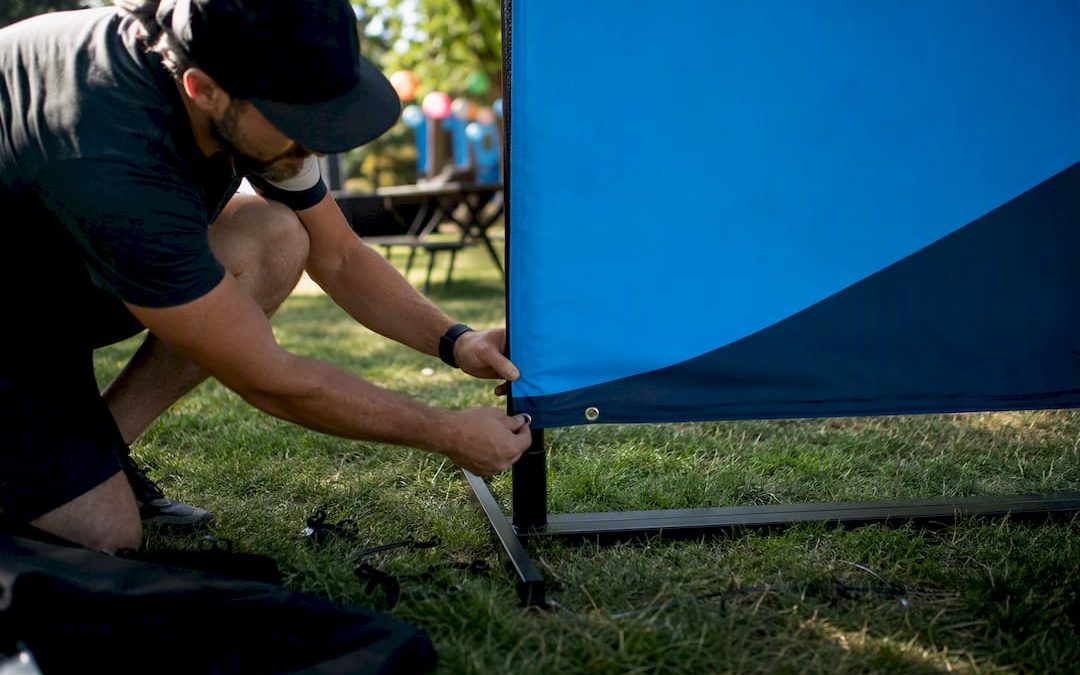
Order a step-and-repeat backdrop, one retractable banner, a branded table cover, directional signs for the room, printed handouts, and a QR-enabled photo station. Design everything around a single rule: a candidate-focused headline that reads clearly in 3 seconds from 10 feet away, in high-contrast, ADA-compliant type. Place your order 10 to 14 business days out so proofs, production, and a lighting check don’t get rushed.
TL;DR:
- Use high-contrast, legible signage with clear candidate-focused headlines that convey benefits or roles within three seconds from ten feet away.
- Prioritize portability by selecting retractable banners and fabric backdrops that can set up quickly and travel flat for multiple venues.
- Ensure signage placement at decision points and match type size to the reading distance to improve wayfinding and message visibility.
- Track engagement using QR codes linked to specific landing pages, and analyze data post-event to refine messaging and optimize future signage.
- Meet all ADA standards for contrast, font, and height, and conduct a final mockup test from ten feet away to verify readability before approval.
Table of Contents
- Essentials: Which Printed Items to Order for an Employer Branding Workshop
- Design and Messaging Rules for Candidate-Focused Signage
- Sizing, Materials, and Placement That Actually Work
- Getting Your Order Right: Files, Lead Times, and the Pre-Event Checklist
- Turning Signage Into Measurable Recruiting Data
- Setting Objectives Before You Design a Single Sign
- Building an Agenda That Keeps the Room Moving
- Who Needs to Be in the Room and What They’re Responsible For
- Getting Attendees to Actually Participate, Not Just Wander
- Feeding Workshop Insights Back Into Your Recruitment Strategy
- The Recurring Problems That Sink These Events, and Fixes
- What Actually Moves the Needle: An Editorial Take
- How Customsignstoday Helps You Get Event-Ready Fast
- Sources
Essentials: Which Printed Items to Order for an Employer Branding Workshop
Every item on your list should do one of three jobs: get you photographed, get candidates oriented, or get information into their hands. Skip any piece that doesn’t clear that bar.
A backdrop (fabric or step-and-repeat) is your photo engine. It’s what candidates stand in front of, what recruiters tag on LinkedIn, and what shows up in every group shot from the event. A retractable banner does the opposite job: it’s the first thing someone sees walking toward your booth, built for quick recognition rather than photo ops. Table covers turn a folding table into branded real estate the moment attendees approach to ask questions. Directional signs solve the unglamorous but critical problem of people not knowing where registration, breakout rooms, or the exit are. Handouts (one-pagers, QR-linked job sheets, culture cards) are what candidates actually take home, since nobody remembers a banner headline three days later.
Portability matters more than people plan for. If you’re running the same employer branding workshop at three different venues this quarter, a retractable banner kit sets up in under a minute and travels flat. Fabric backdrops fold into a bag. Permanent vinyl or rigid-substrate signage makes more sense for a fixed hiring center or a recurring monthly info session at the same address, where you’re not breaking down and rebuilding the same wayfinding setup every time.
For a standard workshop or a single career-fair booth, a workable minimum looks like this:
- One backdrop or step-and-repeat (8 to 10 feet wide)
- One to two retractable banners for booth-front visibility
- Two to three table covers if you’re staffing multiple stations
- Three to five directional signs (entrance, registration, restrooms, breakout rooms)
- A moderate amount of printed handouts depending on expected turnout
Directional signage gets skipped constantly, which is a mistake. It’s one of the few signage categories that builds brand goodwill just by solving a real problem instead of just displaying a logo.
Design and Messaging Rules for Candidate-Focused Signage
Skip the logo-first headline. “Now Hiring: Software Engineers” beats a company logo with a tagline underneath, because it tells a candidate in half a second whether they should stop walking. That’s not opinion. A candidate-focused headline built around a benefit or a role consistently outperforms brand-first messaging for pulling the right applicants toward your table.
Everything you print should pass the 3-second, 10-foot rule: a passerby ten feet away should absorb your core message in three seconds. Structure the layout in a Z-pattern, headline top-left, supporting detail moving right and down, logo or CTA in the bottom corner, so the eye travels the way it naturally scans a page.
Accessibility isn’t optional polish. ADA guidance from the U.S. Access Board calls for high contrast between text and background and legible sans-serif fonts on directional signage, and that standard is worth applying to every printed piece at your event, not just wayfinding. Dark navy on white, or white on deep charcoal, reads clearly under both daylight and fluorescent lobby lighting. Our contrast and readability guide breaks down ratios that hold up in both bright atrium lighting and dim conference rooms.
For anything going behind a photo station: keep logos 5 to 6 feet off the ground so they land inside a standard portrait photo, and choose matte fabric over glossy vinyl to kill flash glare.
- Headline: candidate benefit or role, not company name
- Body copy: one supporting line, max
- Finish: matte for anything behind cameras
- Logo height: 5 to 6 feet from the floor
Pro Tip: Before you approve a proof, take a photo of the mockup on your phone from 10 feet away and squint. If the headline blurs into noise, the font’s too small or the contrast is too low.
Sizing, Materials, and Placement That Actually Work
- Booth backdrops: for a standard 10×10 booth, size your backdrop 8 feet wide and 6 to 8 feet tall, leaving margin so it doesn’t crowd table displays or block sightlines from the aisle.
- Lobby and stage banners: retractable banners run roughly 31.5 by 81.8 inches, the trade-show standard, and set up in under a minute. For a stage backdrop or large lobby wall, go bigger with a fabric or vinyl panel sized to the space, not a scaled-up trade-show banner.
- Material choice: matte fabric indoors for anything near cameras; 13 oz scrim-reinforced vinyl or wind-perforated mesh for anything mounted outside where wind and weather are factors.
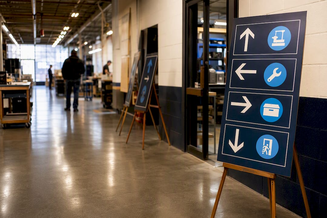
- Wayfinding placement: put directional signs at decision points, hallway junctions, elevator lobbies, room splits, not just at the entrance. A single sign at the front door does nothing for the candidate standing confused at a T-intersection two turns later.
- Headline sizing by distance: match type size to how far people will be standing when they read it. Booth-front banners read from 10 feet need larger type than a table tent read from 2 feet away.
- Mounting: confirm venue rules before you order hardware. Some conference centers ban adhesive mounting on walls entirely and require freestanding stands or pole pockets with weighted bases.
Getting Your Order Right: Files, Lead Times, and the Pre-Event Checklist
Production delays almost always trace back to file problems, not printer problems. Send vector logos (AI, EPS, or PDF), images at 300 DPI minimum, and artwork built in CMYK color mode with bleed extended past the trim line and text kept inside a safe margin. A logo that looks crisp on a laptop screen can turn pixelated at banner scale if it wasn’t built as a vector file.
Standard production runs 5 to 7 business days after proof approval. Rush service can compress that, but build in a buffer of at least 3 extra days for shipping and an on-site test setup. Ten to fourteen business days out from your event is the safe window for a full signage order.
When you place the order, specify your hardware and finish needs up front:
- Grommets for hanging banners on existing hardware
- Pole pockets for step-and-repeat frames
- Weighted bases for freestanding retractable stands
- Matte lamination for anything near a camera or bright window light
Pro Tip: Do a full dry run the night before or morning of: set up the backdrop under the actual room lighting, take a test photo, and scan your QR codes with a phone that’s on cellular data, not the venue Wi-Fi, since some conference networks block outside links.
Turning Signage Into Measurable Recruiting Data
A backdrop that just gets photographed is decoration. A backdrop with a unique QR code linking to a mobile-optimized landing page is a lead source. Assign a distinct code or short link to each major asset, backdrop, banner, handout, so you know which one actually drove clicks.
- Give each printed asset its own QR code and landing page
- Track branded hashtag usage and photo shares from the backdrop specifically
- Keep the photo-delivery email field separate from the marketing opt-in checkbox to stay compliant with privacy rules
- Walk the space after the event ends and note where lines formed or signage went unnoticed
That post-event walkthrough matters more than most teams give it credit for. It’s the fastest way to catch a wayfinding sign nobody could see from the main aisle.
Setting Objectives Before You Design a Single Sign
Signage decisions get easier once you know what the workshop is actually for. Are you trying to fill five open engineering roles by name, or building longer-term awareness so your company shows up on more candidates’ shortlists? Those two goals produce different signage.
A role-specific hiring push calls for headlines naming the position directly, “Now Hiring: Registered Nurses,” “3 Openings: Data Analysts,” because specificity filters the crowd fast. A broader employer brand strategy push calls for messaging built around culture, mission, or growth (“Where Your Next Five Years Actually Go Somewhere”), with signage doing more scene-setting than direct pitching.
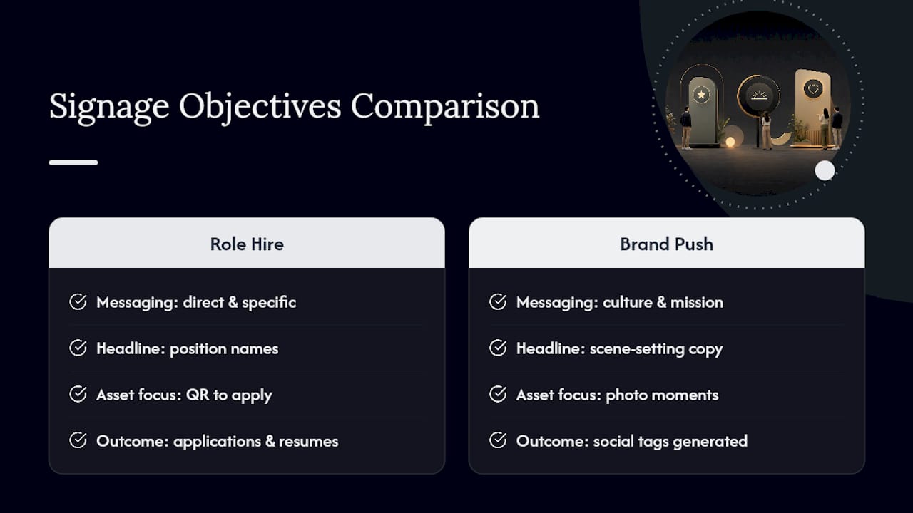
Write your objective down as a single sentence before you touch a design template: “Generate 40 qualified applications for warehouse roles” reads differently on paper than “Improve how job seekers perceive our culture.” The first objective wants a QR code tied to an application form on every asset. The second wants social-shareable photo moments and less hard-sell copy.
Desired outcomes should be measurable within a week of the event, not vague. Applications submitted, QR scans, resumes collected, social tags generated, these are countable. “Raised awareness” is not, and it’s the kind of goal that makes it impossible to tell whether the signage spend actually worked. Set the number before the event, not after.
Building an Agenda That Keeps the Room Moving
A workshop without a written agenda drifts, and drift shows up in signage as much as in programming, since nobody knows what sign goes where if nobody’s confirmed the room flow. Start with a 15-minute welcome and orientation block, this is where your backdrop and entrance signage earn their keep, setting tone before a single word is spoken.
Move into a 30 to 45 minute core session: panel discussion, culture presentation, or hiring manager Q&A, depending on your objective. This is the segment your directional signs need to support most heavily, since latecomers and room-switchers rely on clear wayfinding to find their seat without disrupting the room.
Build in a structured networking or booth-browsing block, 20 to 30 minutes, where your table covers and backdrop photo station do the heavy lifting. This is also the natural point to deploy handouts, since attendees are actively talking to recruiters and more likely to take something home.
Close with a clear next-step segment: how to apply, who to contact, what happens next. Print that information on a handout, don’t rely on attendees remembering it from a slide. End with 10 to 15 minutes for informal conversation and photos at the backdrop, the highest-traffic moment for your QR-enabled photo station all day.
Who Needs to Be in the Room and What They’re Responsible For
Employer branding workshops fail when one department tries to run the whole thing alone. HR typically owns the candidate experience and messaging accuracy, making sure job titles, requirements, and application steps printed on signage match what’s actually posted. Marketing owns visual consistency, logo usage, color palette, photography standards, so the backdrop doesn’t clash with what candidates see on your careers page later that night.
Hiring managers need a seat at the planning table too, not just the event itself. They know which roles are genuinely urgent and which messaging will actually resonate with the specific skill set you’re recruiting for. A generic “Join Our Team” banner means less to a specialized candidate than a headline naming the actual team or project they’d join.
Facilities or the event organizer role, whether that’s an internal coordinator or an external planner, owns the physical logistics: confirming mounting rules with the venue, checking lighting conditions in advance, and making sure signage arrives with enough buffer to fix anything wrong with an order.
Assign one person as the final sign-off on all proofs before they go to print. Committees don’t approve artwork efficiently, and a design bouncing between five reviewers is how typos survive to the printed banner. One decision-maker, informed by input from HR, marketing, and hiring managers, moves faster and catches more.
Getting Attendees to Actually Participate, Not Just Wander
Passive attendees don’t convert into applicants. The signage itself can nudge participation if it’s built with an action in mind rather than just information. A QR code that says “Scan to see what a day in this role looks like” pulls more engagement than “Scan for more info,” because it promises something specific.
Interactive stations work better than static displays. A photo backdrop paired with a printed prompt, “Tag us and tell us why you’re job hunting”, turns a passive photo op into content generation. Short surveys or “vote for your favorite project” boards near table displays give people something to do with their hands while they wait to talk to a recruiter.
Table cover design matters here too. A cover that lists three quick conversation starters (“Ask us about remote flexibility,” “Ask us about our training program”) gives shy attendees an easy opening line, lowering the barrier to actually approaching your table instead of walking past it.
Break up long panel sessions with short, structured Q&A blocks rather than saving all questions for the end. People engage more when they know a chance to speak is coming soon, not forty-five minutes from now. Print your Q&A format on a small table tent so attendees know when and how to jump in, removing the guesswork that keeps people quiet.
Feeding Workshop Insights Back Into Your Recruitment Strategy
The data an employer branding workshop generates, QR scan counts, which headlines drew crowds, which roles got the most questions, is wasted if it stays in an event debrief and never reaches the recruitment team planning next quarter’s job postings. Treat the workshop as a testing ground, not a one-off event.
If a “Now Hiring: Data Analysts” banner outperformed a generic “Join Our Team” banner in scans and conversations, that’s a signal for how job postings themselves should be worded, not just how the next event’s signage should look. Share scan and engagement data with whoever owns your careers page and job board listings.
Culture messaging that resonated at the booth, phrases attendees responded to, questions they asked most, belongs in onboarding materials and internal recruiting talk tracks too. An office signage design built around the same language you tested at the workshop keeps messaging consistent from the recruitment event all the way through a new hire’s first week.
Build a short debrief into your standard HR process: what messaging drove foot traffic, what signage got ignored, what candidates asked about that wasn’t addressed anywhere in your printed materials. That gap often reveals what your next job posting or careers page section is missing.
The Recurring Problems That Sink These Events, and Fixes
Budget fights are the most common obstacle. Marketing wants glossy, on-brand everything; HR wants function over polish. Solve it by agreeing on the non-negotiables early, backdrop and one banner, then treat everything else as flexible based on what’s left in the budget.
Messaging drift is the second big one. Signage says one thing, the actual job posting says another, and candidates notice the mismatch fast. Fix this by having one person cross-check every printed headline against the live job listing before anything goes to print.
Poor turnout planning causes waste or shortage. Running out of printed material mid-event looks worse than having a small stack left over.
Last-minute venue surprises, mounting restrictions, unexpected lighting, no available wall space, derail setups constantly. A venue site visit or a detailed floor plan request before you finalize sizing avoids most of this.
What Actually Moves the Needle: An Editorial Take
Most signage mistakes I see trace back to prioritizing polish over legibility. A glossy laminate backdrop looks premium in a mockup and photographs terribly under fluorescent lighting. A tiny, elegant headline reads beautifully up close and vanishes from ten feet back. Overpacked copy tries to say everything and communicates nothing in three seconds.
The small investments pay off disproportionately: a matte backdrop, one banner with a single clear QR-driven call to action, and a $30 portable light kit outperform an expensive but poorly lit setup every time. Choose portability if you’re running multiple events a year; choose permanent vinyl only for a fixed, high-traffic location you’ll use for months.
— Yossi
How Customsignstoday Helps You Get Event-Ready Fast
Customsignstoday is the alternative to piecing together signage from three different vendors under a tight deadline. Instead of chasing a print shop for banners, a separate supplier for table covers, and a sign shop for directional pieces, you order the whole employer branding workshop kit, backdrops, retractable banners, table covers, directional signs, and QR-enabled photo stations, from one shop that already builds to trade-show and ADA-compliant specs.
Standard production runs 5 to 7 business days after you approve a proof, so placing your order 10 to 14 business days ahead of the event gives you room for a rush fix if something needs adjusting. Browse the custom banners and backdrops page for sizing examples, or start with a free quote request and describe your venue, headcount, and timeline. If you’re unsure what to order first, request a quote and mention your event date. That’s the fastest way to get a real turnaround estimate instead of guessing.
Sources
For accessibility requirements on any printed signage, the ADA guidance from the U.S. Access Board covers contrast and font standards directly. Global Brands Magazine’s breakdown of event signage explains the 3-second rule and photo-backdrop logo placement in more detail. For sizing and material specs on your actual order, Customsignstoday’s banner production page and wayfinding signage guide cover the practical side.
- ADA guidance — U.S. Access Board
- How to Plan Event Signage That Builds Brand Recall – Global Brands Magazine
- Custom Banners Guide for Events, Business, and Every Display in Between – Custom Ink Blog