
TL;DR:
- Mandatory signs are blue circles with white icons, requiring specific safety actions.
- They differ from prohibition and warning signs by color, shape, and meaning.
- Regular audits ensure signage remains compliant and effective across workplaces and events.
Walk into any busy construction site or large event venue and you’ll likely see a wall of safety signs, each one a different color, shape, or symbol. The problem is that most business owners and event planners can’t tell a mandatory sign from a prohibition sign without a second look. That confusion isn’t just an inconvenience. Misidentifying required safety signage can lead to real compliance failures, workplace injuries, and costly fines. This guide breaks down exactly what mandatory signs look like, how they differ from other safety signs, and how to apply that knowledge in your workplace or event space.
Table of Contents
- What defines a mandatory sign?
- Key features of a mandatory sign: Color, shape, and icon
- Mandatory signs vs. other safety signs: Key differences
- Common examples of mandatory signs in the workplace and events
- What most businesses miss about mandatory signage
- Get expert guidance on compliant signage solutions
- Frequently asked questions
Key Takeaways
| Point | Details |
|---|---|
| Universal blue circle | All mandatory signs feature a blue circle with a white pictogram by international law. |
| Action-based icons | Mandatory signs show exactly what you must do, such as wearing PPE, with clear icons. |
| Not to be confused | Mandatory signs are not the same as warning or prohibition signs, which use other colors and shapes. |
| Compliance is critical | Using correct mandatory signage helps you stay compliant and avoid safety fines. |
What defines a mandatory sign?
A mandatory sign is a safety sign that requires people to take a specific action. It doesn’t suggest or warn. It tells you what you must do to stay safe in that area. This is the core distinction that sets mandatory signs apart from every other category of safety signage.
These signs are mandated by HSE and ISO 7010, which means they follow strict design and placement rules that apply across workplaces, construction sites, and event venues. The goal is simple: anyone entering a space should immediately understand what actions are required, regardless of language or background.
Here’s where mandatory signs typically appear:
- Construction sites requiring personal protective equipment (PPE)
- Food preparation areas requiring handwashing
- Industrial facilities requiring hearing protection
- Event venues with restricted access zones
- Laboratories requiring eye or respiratory protection
The reason visual recognition matters so much is that safety signs must communicate instantly. A worker entering a hazardous zone doesn’t have time to read a paragraph. The sign must trigger the right behavior in under two seconds. That’s why mandatory sign compliance is tied directly to consistent design standards, not just to having a sign on the wall.
“Mandatory signs prescribe specific behavior that must be followed for safety, per HSE and ISO 7010 standards.”
Think of mandatory signs as the safety equivalent of a traffic light turning red. There’s no ambiguity. You stop. In the same way, a mandatory sign tells your team or event guests exactly what they must do before proceeding. When signs are poorly designed or incorrectly placed, that clarity disappears, and so does your compliance.
Key features of a mandatory sign: Color, shape, and icon
With the definition in mind, here’s how you can spot a mandatory sign at a glance. The visual design of a mandatory sign is not arbitrary. Every element follows a formula that makes these signs instantly recognizable across industries and countries.
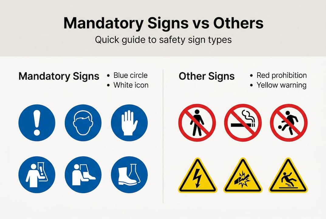
Shape: Mandatory signs are always circular. Not square, not triangular. A circle.
Color: The background must be blue, and blue must cover at least 50% of the sign area. The pictogram, which is the image or symbol on the sign, is always white on that blue background.
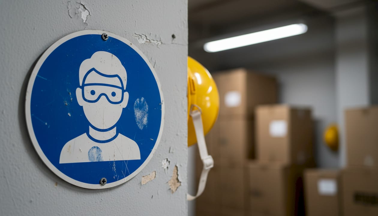
Pictogram: This is the visual cue that tells you what action is required. A helmet icon means head protection is required. Goggles mean eye protection. The pictogram does the heavy lifting, especially in multilingual environments.
Here’s a quick reference table:
| Feature | Mandatory sign specification |
|---|---|
| Shape | Circle |
| Background color | Blue (minimum 50% of area) |
| Symbol color | White |
| Text | Optional but must not replace the pictogram |
| Standard | ISO 7010 / HSE |
Supporting text is sometimes added below the pictogram, such as “Eye protection must be worn,” but it is not required by the ISO 7010 standard. The pictogram alone is sufficient for compliance. Text helps reinforce the message for diverse teams or event crowds who may need additional clarity.
The strict consistency in design exists for one reason: immediate recognition. When every mandatory sign looks the same, your brain learns to respond automatically. That’s the entire point.
Pro Tip: Don’t confuse mandatory signs with red prohibition signs or yellow warning signs. Red circles with a slash mean “do not do this.” Yellow triangles mean “caution, hazard ahead.” Blue circles mean “you must do this.” The colors alone tell the story.
For businesses managing multiple locations, it’s worth reviewing mandatory color standards to make sure every sign across your properties meets the same specifications. Inconsistency between locations is one of the most common compliance gaps we see. You can also explore property signage design principles to understand how visual hierarchy applies beyond safety signs.
Mandatory signs vs. other safety signs: Key differences
Knowing what a mandatory sign looks like is easier when you compare it directly to other common safety signs. Each category has a distinct visual identity, and once you know the code, you’ll never mix them up again.
Here’s how the three main categories break down:
| Sign type | Shape | Color | Meaning |
|---|---|---|---|
| Mandatory | Circle | Blue background, white icon | Must do this action |
| Prohibition | Circle with slash | Red border/slash, white background, black icon | Must not do this action |
| Warning | Triangle | Yellow background, black icon | Caution, hazard present |
The distinction from prohibition and warning signs is critical because mandatory signs communicate an affirmative requirement. You are being told to act, not to avoid. A prohibition sign with a red slash through a flame icon means “no open flames.” A mandatory sign with a flame-resistant suit icon means “you must wear flame-resistant clothing.” Both signs might appear in the same area, but they carry completely different instructions.
Here’s a numbered checklist to identify a mandatory sign on the spot:
- Look at the shape. Is it a circle with no slash? Good start.
- Check the background color. Is it predominantly blue?
- Look at the symbol. Is it white on the blue background?
- Ask yourself: does this sign tell me to do something? If yes, it’s mandatory.
- Verify placement. Is it positioned where the action is required, not 20 feet away?
Typical pitfalls include using the wrong icon for a required action, printing signs with off-brand blue shades that don’t meet standards, and placing signs after the point where the action should begin. Following solid sign installation best practices helps you avoid all three of these errors before an inspection catches them.
Common examples of mandatory signs in the workplace and events
With the differences clear, it’s helpful to recognize the mandatory signs most commonly seen in your environment. These are the signs you’re most likely to need, whether you’re managing a warehouse, a construction project, or a large-scale public event.
The most frequently used mandatory signs include:
- “Eye protection must be worn” (white goggles icon on blue circle): required in labs, workshops, and chemical handling areas
- “Safety helmet must be worn” (white helmet icon on blue circle): standard on all construction sites
- “Wear ear protection” (white earmuff icon on blue circle, ISO 7010 code M003): required in high-noise industrial environments
- “Wear high-visibility clothing” (vest icon on blue circle): common in logistics, traffic management, and outdoor events
- “Wash your hands” (hands under water icon on blue circle): mandatory in food service and healthcare settings
According to HSE safety sign guidance, examples like “Eye protection must be worn” and “Safety helmet must be worn” are among the most cited signs in workplace compliance audits. Getting these right matters.
For event planners specifically, mandatory signs serve a different but equally important function. A large crowd doesn’t know your venue’s layout or hazards. Clear, correctly designed mandatory signs at property entrance safety signs and transition points guide behavior before incidents happen. Explore site signs to see how these requirements translate into real-world applications for outdoor and temporary event setups.
A critical stat worth noting: the majority of business compliance fines related to signage stem not from a total absence of signs, but from misplacement or incorrect style. Having a sign that looks almost right is not the same as being compliant.
What most businesses miss about mandatory signage
Here’s the uncomfortable truth: most organizations treat mandatory signage as a one-time setup task. They buy the signs, stick them on the wall, and consider the job done. That approach works fine until something changes, and something always changes.
Staff turnover means new workers who haven’t internalized the layout. Renovations shift traffic flow and render old sign placements irrelevant. Event venues reconfigure spaces between bookings, moving hazard zones without updating signage to match. These are not edge cases. They are the norm.
The most common errors we see are using the wrong icon for a required action, printing signs with blue shades that fall outside the 50% coverage rule, and placing signs too late in the approach path to trigger the right behavior in time. Each of these errors looks minor on paper but carries real risk during an inspection or, worse, an incident.
Pro Tip: Build a quarterly signage audit into your safety management routine. Walk the space as if you’ve never seen it before and ask whether every mandatory sign is visible, correctly placed, and still relevant to current operations.
The sign compliance guide we’ve put together reinforces this point: compliance is not a destination. It’s an ongoing process that requires the same attention as any other risk management activity in your business.
Get expert guidance on compliant signage solutions
Compliant mandatory signage reduces your liability, protects your team, and signals to inspectors that your operation takes safety seriously. But getting every detail right, from the correct shade of blue to proper icon sizing and placement height, takes more than good intentions.

At Custom Signs Today, we help business owners and event planners design and install signage that meets current standards without the guesswork. Whether you need face change signs for rotating safety messages, exterior lightbox signs for high-visibility compliance displays, or a full review of your current setup, we’re ready to help. Check out our business and event signage guide for a broader look at how signage strategy supports your operations from day one.
Frequently asked questions
What is the required color and shape of a mandatory sign?
A mandatory sign must be a blue circle with a white pictogram, with blue covering at least 50% of the sign area per ISO and HSE standards. No other color or shape qualifies as a mandatory sign under these regulations.
How can you tell a mandatory sign from other safety signs?
Mandatory signs are blue circles with white action icons, while prohibition signs use red circles with slashes and warning signs use yellow triangles. The blue circle is always an affirmative requirement, meaning you must take that action.
Are mandatory signs standardized across countries?
ISO 7010 standardizes mandatory signs globally as blue circles with white action icons, making them recognizable across borders. This consistency is especially valuable for multinational businesses and international event venues.
What are common examples of mandatory signs?
Common examples include “Eye protection must be worn” and “Safety helmet must be worn,” each displayed with a specific white icon on a blue circular background. Ear protection and handwashing signs are also widely required in industrial and food service settings.