

TL;DR:
- Proper wayfinding signage reduces confusion, builds trust, and enhances the visitor experience in any space.
- Effective signage requires thorough space assessment, strategic placement, clear design, and ongoing maintenance.
- Investing in modular, durable materials and following universal design principles ensures signs remain functional and branding cohesive over time.
Guests who can’t find the bathroom. Attendees wandering the wrong wing. Customers leaving without buying because they couldn’t figure out where to go. Poor directional signage costs you real money and real goodwill. Knowing how to plan directional signs before you order a single panel is the difference between a space that works and one that frustrates. This guide walks you through every stage: assessing your space, applying design principles, placing signs strategically, choosing materials, and maintaining your system over time.
Table of Contents
- Key takeaways
- How to plan directional signs: start with a space assessment
- Design principles for effective directional signage
- Step-by-step sign placement for maximum clarity
- Material choices, installation, and maintenance
- What I’ve learned from real wayfinding projects
- Get professional directional signage that works
- FAQ
Key takeaways
| Point | Details |
|---|---|
| Walk the space first | Map every decision point on foot before committing to any sign design or placement. |
| Design for distance | Text size must match viewing distance using a calculated formula, not guesswork. |
| Place signs before decision points | Signs should be visible at least 5 meters ahead so visitors can process and act on them. |
| Match materials to environment | Outdoor and high-traffic spaces require weather-resistant and vandalism-resistant materials for longevity. |
| Plan for updates | Modular or magnetic insert systems let you update destinations without replacing entire sign structures. |
How to plan directional signs: start with a space assessment
Before you sketch a layout or pick a font, you need to understand how people actually move through your space. On-site evaluation and client feedback are the foundation of any effective wayfinding plan. No floor plan substitutes for walking the space yourself.
Start by physically tracing the routes a first-time visitor would take from every entry point. Note where you pause, hesitate, or feel uncertain about which direction to take. Those hesitation moments are your primary sign locations.
As you walk, document the following:
- Entry points: Every door, gate, parking lot exit, and lobby where visitors first orient themselves.
- Key destinations: Restrooms, exits, elevators, registration desks, service counters, and conference rooms.
- Decision points: Any intersection, fork, or open area where a visitor must choose a direction.
- Obstructions: Columns, walls, and fixtures that could block sightlines to a mounted sign.
- Accessibility needs: Paths used by wheelchair users, visitors with low vision, and anyone requiring ADA-compliant signage heights.
Gather input from staff who interact with visitors daily. They know exactly which questions get asked most. Front desk teams and security personnel are often your best source of directional sign planning tips that no blueprint will show you.
Pro Tip: Document your walk with photos and a simple hand-drawn map. Mark the exact spots where you felt uncertain. That map becomes your sign placement blueprint before you ever open design software.
Once you have your documentation, list every destination that needs a sign. Rank them by frequency of use. High-traffic destinations like restrooms and exits get priority placement at every relevant decision point. Lower-traffic destinations may only need one or two signs near the entry area.

Design principles for effective directional signage
Designing directional signage is not about making something beautiful. It is about making something that works the moment someone glances at it under pressure. Beauty is a bonus.
Typography and text sizing
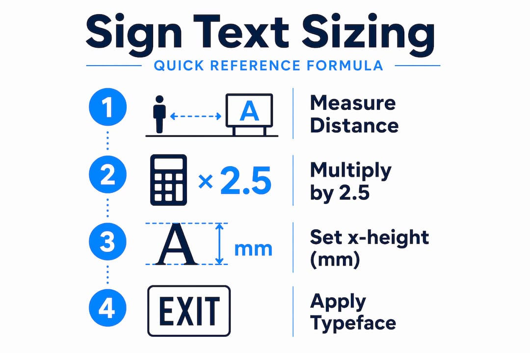
The formula for minimum text size is straightforward: x-height in millimeters equals viewing distance in meters multiplied by 2.5. A sign read from 10 meters needs letters with an x-height of at least 25mm. Sans-serif fonts like Helvetica, Frutiger, or similar typefaces outperform decorative fonts at distance because their letterforms stay clear without fine details to blur.
Limit each sign to one or two typeface weights. Use bold for destination names and regular weight for supplemental text like floor numbers or distances. Mixing too many styles slows reading speed exactly when visitors need to make quick decisions.
Color contrast and symbols
High contrast between text and background is non-negotiable. White text on dark backgrounds or black text on light backgrounds both perform well. Avoid putting text on patterned or photographic backgrounds. Signs that look stunning in a design mockup often fail in real lighting conditions.
Symbols and pictograms reduce language barriers and speed up recognition. Use universally recognized icons for restrooms, accessibility routes, and exits. Directional signs using arrows, overhead signs, and route markers collectively build visitor confidence by creating a predictable visual language throughout the space.
Arrow conventions and sign types
Arrow placement follows standardized conventions: a left-pointing arrow belongs on the left side of the destination text, a right-pointing arrow on the right. Arrows pointing ahead sit above the destination name. Avoid downward-pointing arrows on wall-mounted signs because they confuse visitors who can’t determine what “down” refers to in context.
Here’s a quick comparison of sign types and their best uses:
| Sign type | Best placement | Key benefit |
|---|---|---|
| Overhead hanging sign | Large open areas, atriums | Visible from multiple directions and distances |
| Wall-mounted sign | Corridors, hallways | Cost-effective, easy to read at close range |
| Freestanding sign | Lobbies, temporary events | Repositionable without mounting hardware |
| Floor sign | Emergency exits, accessibility paths | Guides in low visibility conditions |
Brand integration done right
Your brand colors and logo can absolutely appear on directional signs. The rule is that brand identity should support clarity, never override it. Signage aligned with architectural features and brand creates a recognizable wayfinding experience without adding cognitive load to the visitor.
Pro Tip: If you are unsure whether a design choice helps clarity or hurts it, test the sign in the actual space at the intended viewing distance before going to final production. Lighting conditions in your building rarely match what you see on screen.
Step-by-step sign placement for maximum clarity
You have your space map and your design system. Now comes placement, and this is where most DIY signage projects fall apart. Getting this step right is the core of how to create wayfinding signs that actually work.
-
Start at every entry point. The first sign a visitor encounters sets the tone. It should orient them immediately, listing the top three to five destinations with directional arrows. Do not list every possible destination on one panel.
-
Place signs before decision points, not at them. Signs must be readable from at least 5 meters before the turn or intersection. A sign positioned exactly at the fork gives no time to slow down, process, and choose. Mount it far enough ahead that action is comfortable.
-
Follow consistent mounting heights. Consistent heights and locations for each sign type create a predictable system that visitors learn quickly. ADA guidelines recommend that wall-mounted signs with raised characters sit between 48 and 60 inches above the finished floor. Overhead signs should clear at least 80 inches for pedestrian paths.
-
Add reassurance signs on long routes. After a turn, place a confirmation sign within 10 to 15 meters confirming the visitor is heading the right way. Long corridors without reassurance signs cause doubt and backtracking.
-
Group destinations logically. If restrooms, an elevator, and a stairwell are all to the left, group them under a single left-pointing arrow rather than three separate panels. Fewer messages per sign means faster reading.
-
Check perpendicular alignment. Signs should face directly toward the visitor’s line of approach. A sign angled away from foot traffic is easy to miss.
Common placement mistakes to avoid:
- Placing signs behind doors that may be propped open, blocking the sign entirely.
- Mounting signs too high above eye level where natural gaze does not land.
- Clustering too many destinations on one sign, creating a decision overload.
- Skipping reassurance signs on routes longer than 30 meters.
Pro Tip: Walk every route after mock-up installation using a staff member who has never been in the space. Their confusion points are your revision list.
Material choices, installation, and maintenance
Understanding what materials for directional signs suit your specific environment is as important as the design itself. The wrong material in the wrong setting fails faster than you would expect.
Here are the most common material options and where each performs best:
- Aluminum composite panels: Rigid, lightweight, and weather-resistant. The go-to material for outdoor trail signage, parking lots, and building exteriors. The Lynch Creek Trail wayfinding project completed installation within 8 months using durable exterior panels supported by local partnerships, showing what a focused timeline looks like in practice.
- PVC foam board: Budget-friendly and suitable for indoor temporary or semi-permanent signs. Not ideal for outdoor use in humid or high-UV climates.
- Acrylic panels: Clean, professional aesthetic for interior corporate or retail environments. Available in backlit versions for high-visibility applications.
- Vinyl graphics on rigid substrates: Cost-effective for changeable content. Graphics can be peeled and replaced when destinations or branding change.
- Magnetic inserts: Magnetic inserts allow for easy content updates in environments like museums and event spaces where layouts shift frequently. The frame stays in place; only the insert changes.
For installation, plan your timeline backward from your opening or event date. A typical professional installation for a medium-sized facility runs two to four weeks from final design approval to completed installation. Factor in any permits required for exterior or overhead mounting. Many municipalities require a permit for permanently affixed outdoor signs above a certain size.
Maintenance planning is often forgotten until a sign is peeling, faded, or listing a department that no longer exists. Schedule a quarterly audit of all directional signs. Check for physical damage, legibility, and accuracy of destination information. Budget for periodic reprints and replacements as part of your annual facilities or event planning spend.
What I’ve learned from real wayfinding projects
I’ve worked on signage projects ranging from small retail stores to multi-building campuses, and the single most common mistake I see is trusting the floor plan over the actual space. Architects draw spaces as they intend them to be experienced. People experience them differently.
The second issue I encounter constantly is brands over-designing their directional signs. A sign covered in brand colors, custom iconography, and logo lockups may win a design award and still fail the visitor who just wants to find the parking garage exit. My rule: once the sign works perfectly in plain black and white, then add brand identity on top. Never start with the brand and retrofit function.
Spaces evolve, too. I’ve seen companies install a fixed sign system and then relocate their main office entrance two years later, making half the signs actively misleading. The clients who avoided this pain were the ones who invested in modular signage systems from the start. Those systems pay for themselves the first time you reconfigure a space without a full reprinting budget.
One more thing: good signage builds trust. When visitors find what they need without asking for help, they feel competent and comfortable. That feeling transfers directly to how they perceive your business. Signage is not decoration. It is a direct expression of how much you respect your visitors’ time.
— Yossi
Get professional directional signage that works
If this process feels like more than you want to manage alone, that is exactly where Customsignstoday comes in. The team at Customsignstoday handles the full range of custom directional signs for businesses, events, and properties of all sizes, from single lobby panels to full multi-building wayfinding systems.
Whether you need weather-resistant exterior signs, sleek interior panels, or flexible modular systems for a space that changes frequently, Customsignstoday produces every sign with materials matched to your environment. The team also works with event planners who need event directional signage installed and removed on a tight schedule. For facilities needing illuminated exterior options, the exterior lightbox signs service delivers 24-hour visibility for high-traffic locations. Request a free quote and get a solution sized to your actual space.
FAQ
What is the first step in planning directional signs?
Walk the space physically and map every point where a visitor must choose a direction. That hands-on assessment reveals placement needs that no floor plan can show you.
How far in advance should signs be placed before a turn or decision point?
Signs should be visible at least 5 meters before the decision point to give visitors enough time to read, process, and act without stopping.
What is the best material for outdoor directional signs?
Aluminum composite panels are the most reliable option for outdoor directional signs because they resist weather, UV exposure, and physical impact better than PVC or foam board alternatives.
How do I calculate the right text size for a directional sign?
Use the formula: x-height in millimeters equals viewing distance in meters multiplied by 2.5. A sign read from 8 meters needs an x-height of at least 20mm.
How often should directional signs be updated or replaced?
Conduct a quarterly audit to check for physical damage, faded graphics, and outdated destination information. Replace or reprint any sign that no longer accurately reflects your space or brand standards.