

TL;DR:
- Getting sign sizing wrong is one of the most costly branding mistakes, causing unreadable signs and lost visibility. Businesses should prioritize letter height based on viewing distance, environmental factors, and message goals, using formulas and real-world testing to ensure effectiveness. Adhering to regulatory standards and sizing for specific environments enhances signage impact, while working with professionals ensures durability and optimal readability.
Getting sign sizing wrong is one of the most expensive branding mistakes a business can make. You invest in design, materials, and installation, and then customers walk right past your sign because the letters are too small to read from the road. Knowing how to select sign sizes correctly means understanding the relationship between letter height, viewing distance, environment, and your message goals. This guide covers the formulas, standards, and real-world applications that help you make confident, informed decisions about selecting signage dimensions for any setting.
Table of Contents
- Key takeaways
- How to select sign sizes: the foundational formula
- Regulatory standards and when compliance matters
- Sign sizing for different environments and applications
- Common mistakes that undermine sign effectiveness
- Tools and techniques for confirming sign dimensions
- My take on what the formulas miss
- Get the right size from professionals who know signage
- FAQ
Key takeaways
| Point | Details |
|---|---|
| Use the 1-inch rule | One inch of letter height gives roughly 10 feet of readable viewing distance. |
| Match size to environment | Outdoor, roadside, and indoor signs each require different size benchmarks based on viewer speed and distance. |
| Comply with MUTCD when relevant | Regulatory and roadside signs must meet federal size minimums to pass inspection and protect public safety. |
| Prioritize legibility over aesthetics | Choosing size based on how a sign looks rather than how far it reads is the leading cause of ineffective signage. |
| Test before you print | Mock-ups and field testing at actual viewing distances prevent costly production errors. |
How to select sign sizes: the foundational formula
Before you think about fonts, colors, or materials, you need to understand one principle: letter height drives everything. The industry standard is that one inch of letter height corresponds to roughly 10 feet of readable viewing distance. A 4-inch letter reads clearly from 40 feet. A 10-inch letter reads from 100 feet. Simple, but most businesses get it wrong because they start with the size of the sign panel rather than the size of the letters.
Here is where the confusion compounds: letter height and total sign size are not the same thing. A sign with 4-inch letters also needs margins, a logo, possibly a phone number, and breathing room between lines. In practice, that 4-inch letter height may require a sign panel that is 18 to 24 inches tall just to hold the content properly. Always calculate your letter height first, then build the panel dimensions around it.
A few practical examples make this concrete:
- Storefront at 30 feet: Minimum 3-inch letters, ideally 4 to 5 inches for comfortable reading
- Parking lot sign at 75 feet: Letters need to be at least 7 to 8 inches tall
- Roadside monument sign at 150 feet: Letters should be no smaller than 15 inches
- Highway billboard at 500 feet: Standard letter heights range from 18 to 36 inches depending on speed
Pro Tip: When determining sign size for a storefront, measure the actual distance from the curb or the center of the nearest travel lane to your sign location. That number, divided by 10, gives you your minimum letter height in inches.
Good letter sizing gets you readable text. Good word spacing makes it fast to read. MUTCD recommends word spacing of 0.3 times the letter height for signs where quick comprehension matters. Apply that logic to your commercial signage and you will immediately improve how fast customers absorb your message.
Regulatory standards and when compliance matters
Most business owners assume that sign size regulations only apply to government road signs. That assumption creates expensive problems. If your business has any roadside signage, construction site signs, or directional signs visible from a public road, MUTCD standards are worth understanding even if they are not strictly required for your application.
The numbers are specific. The MUTCD 11th Edition requires STOP signs at a minimum of 24×24 inches on single-lane roads and at least 36×36 inches on multi-lane roads. Oversized STOP signs at 36×36 inches or larger measurably improve visibility at high-speed or multi-lane intersections. That is not an aesthetic choice. It is a visibility threshold backed by federal research.
Here is a reference table showing standard MUTCD regulatory sign sizes:
| Sign type | Single-lane minimum | Multi-lane minimum | High-speed/oversized |
|---|---|---|---|
| STOP | 24×24 inches | 36×36 inches | 48×48 inches |
| YIELD | 30 inches (triangle) | 36 inches | 48 inches |
| Speed Limit | 12×18 inches | 18×24 inches | 24×30 inches |
| Warning (diamond) | 24×24 inches | 30×30 inches | 36×36 inches |
“Regulatory sign standards improve safety and also set best practices that translate directly into commercial signage legibility. If the federal government requires a certain size for a driver moving at 55 mph to read it safely, that data tells you a lot about what your customers actually need to read your business sign from the road.”
Speed matters more than most marketers realize. At 55 mph on a four-lane road, recommended letter height is 15 inches to achieve 440 feet of visibility. If your business sits along a 55-mph corridor and your sign uses 4-inch letters, drivers literally do not have enough time to read your name before they pass you. That is a real scenario affecting real businesses every day.
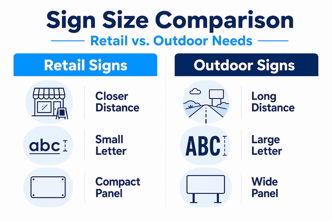
Sign sizing for different environments and applications
The formula changes depending on where your sign lives and who is reading it. Selecting signage dimensions for a tradeshow booth requires a completely different approach than sizing a banner for a storefront or an outdoor yard sign for a construction site. Here is how to think through the most common scenarios.
Indoor signs and digital displays
Indoor environments typically work at shorter viewing distances, which means smaller letter heights can be effective. However, digital signage adds a new variable. Sans-serif fonts like Arial and Roboto strongly outperform script and lightweight fonts on digital displays, and font choice impacts readability far more than size alone. For indoor digital screens, the distance-to-font-size relationship scales predictably. At 10 to 20 feet, headlines should be at least 60pt with body text no smaller than 36pt.

Digital signage also demands fewer words. Viewers are moving or distracted, which means you have less time than you think. Most people read only three to four words at a glance. Design your message around that constraint, then size accordingly.
Outdoor banners and event signage
Banners are often undersized because they are temporary. That logic backfires. For a banner visible from 50 feet, letters need to be at least 5 inches tall. For a banner spanning the front of a building visible from 100 feet, go 10 inches or taller on the primary text. You can find detailed guidance on yard sign sizing that applies directly to banner and event signage principles as well.
For event signage specifically, consider pedestrian flow speed. Someone walking at a normal pace gives you more time than a driver, but they are also looking at their phone. Event signage sizing should account for the fact that viewers are distracted and often moving in groups that block sightlines.
Pro Tip: For high-traffic outdoor banners, use a 2:1 ratio for headline to body text height. If your headline letters are 8 inches, keep your supporting text at 4 inches minimum. Going smaller makes the secondary content invisible from the target distance.
Here is a quick comparison for common business sign applications:
| Application | Viewing distance | Minimum letter height | Recommended panel size |
|---|---|---|---|
| Retail storefront | 30 to 50 feet | 3 to 5 inches | 24×48 inches or larger |
| Roadside monument | 100 to 200 feet | 10 to 20 inches | 48×96 inches or larger |
| Outdoor banner | 50 to 100 feet | 5 to 10 inches | 3×6 feet to 4×8 feet |
| Tradeshow display | 10 to 20 feet | 1.5 to 2 inches | Varies by booth size |
| Construction yard sign | 50 to 75 feet | 5 to 8 inches | 18×24 to 24×36 inches |
Common mistakes that undermine sign effectiveness
Most sign sizing mistakes come from good intentions applied in the wrong direction. Business owners want their sign to look proportional, clean, and professional. So they design for the space rather than designing for the reader. The result is a sign that photographs beautifully and performs poorly in real-world conditions.
Here are the most common errors and how to correct them:
- Sizing for aesthetics, not legibility. A sign that looks balanced on a design screen may have letters too small to read from the street. Always start with the minimum letter height required for your target viewing distance, then design the panel around it.
- Ignoring environmental factors. Glare, shadows, competing visual noise, and weather all reduce effective visibility. Signs in low-contrast environments (light letters on a pale background, for example) need to be larger than the base formula suggests.
- Using fonts that shrink legibility. Thin, decorative, or script fonts reduce effective readability even at appropriate sizes. Stick to medium-weight sans-serif fonts for any sign where fast comprehension matters.
- Overcrowding the sign panel. More information does not help if none of it is readable. Focus on one primary message, your business name or offer, and let everything else be secondary or removed entirely.
- Skipping real-world testing. Designing entirely on screen without standing at the actual viewing distance is guesswork. Print a mock-up, tape it up, and walk to your target distance before committing to production.
Pro Tip: Take a photo of your mock-up sign from the intended viewing distance, then zoom out on your phone until the image is the size of a thumbnail. If you can still read the main message, you are probably in good shape. If you cannot, scale up.
Tools and techniques for confirming sign dimensions
Getting to a final sign size should involve more than formula math. The best outcomes come from combining calculation with real-world verification. Here is a practical process for confirming that your chosen dimensions will actually perform.
Start with a letter height calculator. Several free online tools let you input your viewing distance and get a recommended letter height instantly. Online calculators and mockups help you catch sizing errors before committing to production costs.
Measure actual sightlines. Walk the viewing path your customer will take. Note where they first have a clear line of sight to your sign location, and measure that distance. That is your true viewing distance, which is often different from what you estimate looking at a map.
Run a field test with a printed mock-up. Print your design at full scale on regular paper or use a plotter print, then mount it at the intended location temporarily. Stand at the measured viewing distance and evaluate it honestly.
Before approving final production, check these items:
- Letter height meets the 1-inch-per-10-feet minimum for your viewing distance
- Primary message reads in under three seconds from target distance
- Font is a legible weight (avoid thin or decorative fonts for primary text)
- Color contrast between letters and background is strong (dark on light or light on dark)
- Sign proportions leave adequate margins, at least 10 to 15 percent of total panel width on each side
- Regulatory or municipal sign size requirements are confirmed if applicable
Working with a professional sign maker at this stage is worth the investment. They can catch issues that are invisible at the design phase and recommend material choices that maintain legibility across different lighting conditions. Good signage design tips always include early consultation with your sign provider, not just at final approval.
My take on what the formulas miss
I have worked with enough businesses to know that sign sizing advice usually stops at the formula. One inch per 10 feet, check your compliance, done. But the formula is a floor, not a target.
What I have seen repeatedly is that businesses size their signs to the minimum and then wonder why competitors with larger, bolder signs capture more attention from the same street. The formula tells you what is technically readable. It does not tell you what is memorable or compelling. A sign that someone can read at 50 feet is not the same as a sign that makes them slow down, take notice, and turn in.
I have also watched clients spend weeks debating font choices and color palettes on a sign that was fundamentally too small for its location. No amount of design refinement fixes an undersized sign. Get the size right first. Then refine everything else.
The other thing I would push back on is the idea that digital signage gets a pass because the content changes. Dynamic content does not compensate for poor sizing. If anything, moving or cycling content demands even larger text because viewers have less time with any single frame. The standards for property signage and physical installations apply equally to digital displays placed in real environments.
My advice is to treat the sizing formula as your starting point, then add 20 percent more than you think you need. You will rarely regret making a sign larger. You will almost always regret making it smaller.
— Yossi
Get the right size from professionals who know signage
Choosing the right sign size is one decision. Executing it with materials and production quality that hold up in real conditions is another. That is where working with a dedicated sign provider pays off.

At Customsignstoday, we produce custom signage across a full range of sizes, formats, and environments, from roadside monuments and construction banners to storefront displays and event graphics. Whether you need adaptable face change signs that flex with your branding or permanent site signs built for exterior visibility, we size every product to perform at the distances that matter. Our team walks through viewing distances, environmental factors, and regulatory requirements with you before anything goes to production. Request a free quote and get sizing guidance specific to your location and goals.
FAQ
What is the standard rule for sign letter height?
The standard formula is one inch of letter height per 10 feet of viewing distance. A sign read from 50 feet needs letters at least 5 inches tall for comfortable legibility.
What size should a roadside business sign be?
For roadside visibility at 100 to 200 feet, letter heights should range from 10 to 20 inches, with total panel size typically starting at 48×96 inches. Speed of passing traffic also increases size requirements significantly.
Do MUTCD sign size standards apply to businesses?
MUTCD standards are required for regulatory and traffic control signs on public roads. However, the size principles behind those standards, particularly for driver legibility at speed, are directly applicable when sizing any roadside commercial signage.
How do I size signs for digital displays?
For digital screens viewed at 10 to 20 feet, headlines should be at least 60pt and body text no smaller than 36pt. Use sans-serif fonts and limit your message to three to five words for maximum readability.
How do I avoid making my sign too small?
Start by measuring the actual distance from where viewers will read your sign, calculate letter height using the 1-inch-per-10-feet rule, and always create a full-scale mock-up before final production. When in doubt, go larger than the minimum.