
TL;DR:
- Sign artwork issues often originate in the file preparation stage, affecting the final print quality and brand perception. Proper tools, resolution, color settings, font outlines, and layout principles are crucial for professional results that match your design intentions. Careful review and adherence to technical guidelines prevent costly mistakes and ensure your signage effectively promotes your brand.
You spent money on a custom sign, it arrived, and the fonts look wrong. Or the border vanished. Or the colors shifted in a way that makes your brand look cheap. These are not printer errors. In almost every case, the problem started in your artwork file, long before the job reached production. Getting sign artwork right is not optional for business owners, event planners, or real estate agents who rely on signage to generate leads and reinforce brand credibility. This guide walks you through every step of the process, from software selection to final file review, so your signs print exactly the way you designed them.
Table of Contents
- Gathering the right tools and materials
- Setting up your sign artwork file for success
- Designing for clarity and brand impact
- Avoiding common sign artwork mistakes
- Final checks: Reviewing and submitting sign artwork
- Why perfection in artwork prep pays off
- Take your sign artwork to the next level with custom solutions
- Frequently asked questions
Key Takeaways
| Point | Details |
|---|---|
| Fonts must be outlined | Converting fonts to outlines prevents unwanted substitutions during printing. |
| Use proper sign dimensions | Set artwork resolution to at least 300 DPI and include required bleed for best results. |
| Prioritize readability | Bold fonts, large sizes, and high-contrast layouts ensure your sign grabs attention even from a distance. |
| Avoid thin borders | Borders thinner than 2 inches tend to disappear or look uneven after cutting. |
| Review before submitting | Always run through a checklist to catch common errors before sending artwork for production. |
Gathering the right tools and materials
Start by ensuring you have the right tools in place, which will make the following prep process much smoother.
The software you choose matters more than most people realize. Adobe Illustrator is the gold standard for sign artwork because it is vector based, meaning your graphics scale to any size without losing sharpness. Adobe Photoshop works well for photo heavy designs but is not ideal for text or logos. CorelDRAW is a strong alternative popular with print shops and works seamlessly with most sign production workflows. Whichever tool you use, make sure you can export to vector file formats.
Before you open your design software, gather the following materials:
- Your original logo file in vector format (AI or EPS preferred)
- Brand color codes in both CMYK and HEX values
- High-resolution product or property photos (minimum 300 DPI)
- Approved taglines, contact information, and web addresses
- Any brand style guide that specifies fonts, colors, and spacing rules
Accepted file formats for professional sign printing are typically AI, EPS, and PDF. JPEG and PNG files can work for photo elements, but they should not carry text or logos because they cannot scale cleanly.
One of the most important technical steps you can take early is to convert all fonts to outlines before sending your file. When fonts are left as live text, the printer’s system may substitute a different font if your typeface is not installed on their machine. Converting to outlines turns your letters into shapes, locking the appearance permanently. This single step prevents a surprising number of sign failures.
When you prepare signage files for production, always save two versions of your document. One is the outlined version for the printer. The other is your working file with live text still active, so you can go back and edit later.
Pro Tip: Never send your only copy of the live text file to a printer. Keep it in a separate folder labeled “editable master” so you always have the ability to update copy without rebuilding the whole layout from scratch.
| File format | Best use | Editable? |
|---|---|---|
| AI | Logos, vector artwork | Yes (in Illustrator) |
| EPS | Scalable graphics, logos | Yes (in compatible apps) |
| Print-ready submission | No (after outlining) | |
| PNG | Raster photo elements | No |
| JPEG | Photographic backgrounds | No |
Setting up your sign artwork file for success
Now that you have the right tools, it’s time to set up your artwork file to avoid technical mishaps.
Resolution is the first thing to get right. For most signs, set your resolution to a minimum of 300 DPI (dots per inch) at actual print size. Large format signs printed for viewing at a distance can sometimes use 72 to 150 DPI, but for standard business and real estate signs, 300 DPI is the safe baseline. Low resolution files produce blurry, pixelated prints that look unprofessional and undermine your brand immediately.
Here is a step-by-step setup process to follow for every new sign artwork file:
- Open your design software and create a new document set to the exact final sign dimensions.
- Set the color mode to CMYK, not RGB. Computer screens display RGB colors, but printers use CMYK inks. What looks vivid on screen in RGB often prints duller in CMYK unless you design in CMYK from the start.
- Add a bleed area of 0.125 to 0.25 inches around the edges of your artwork. Bleed extends your background color or image slightly beyond the trim line so that when the sign is cut, there are no white slivers at the edges.
- Keep all critical content (text, logos, contact info) at least 0.25 inches inside the bleed boundary, in what designers call the “safe zone.”
- Avoid borders thinner than 2 inches, and do not include crop marks in your artwork file. Thin borders look uneven after cutting because even small shifts in the cutting machine can make one side slightly wider than another. Crop marks are added by the printer’s production software and having them in your file creates duplication errors.
When reviewing business sign design tips, you will notice that experienced designers always confirm substrate requirements before finalizing file settings. Different materials, such as corrugated plastic, aluminum, vinyl, or foam board, absorb ink differently and may require specific color adjustments.
For real estate professionals, following a reliable property signage step-by-step process reduces the back-and-forth with print vendors and speeds up your turnaround considerably.
Substrates vary batch-to-batch. Adjust artwork accordingly.
Pro Tip: Before finalizing your file, call or email your sign provider to confirm the exact substrate for your order. Ask whether they recommend any color profile adjustments for that specific material.
Comparison: RGB vs. CMYK for sign printing
| Setting | Screen display | Print result |
|---|---|---|
| RGB | Vibrant, backlit colors | Inaccurate color shift at press |
| CMYK | Slightly muted on screen | Accurate, consistent print output |
Designing for clarity and brand impact
After setting up your file, the next priority is visual design that gets noticed and communicates your brand clearly.
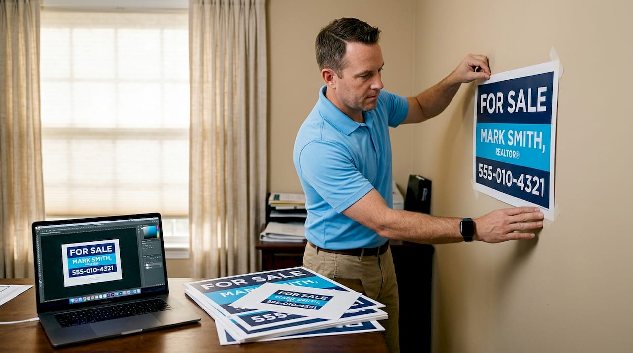
Font selection is where many business owners make their first visual mistake. Decorative or script fonts may look elegant on screen, but they become unreadable at a distance. For any sign intended to be read quickly, especially real estate yard signs or event banners, bold sans-serif fonts like Helvetica, Arial, or Futura are the professional standard. Their clean strokes remain legible at small sizes and across long distances.
For sizing, bold sans-serif fonts at 108-144 pt for contact information on real estate signs ensures readability for passing traffic. That translates to roughly 1.5 to 2 inches of physical letter height, which is the minimum for legibility from a moving vehicle. For headline text meant to be read from even farther away, go larger.
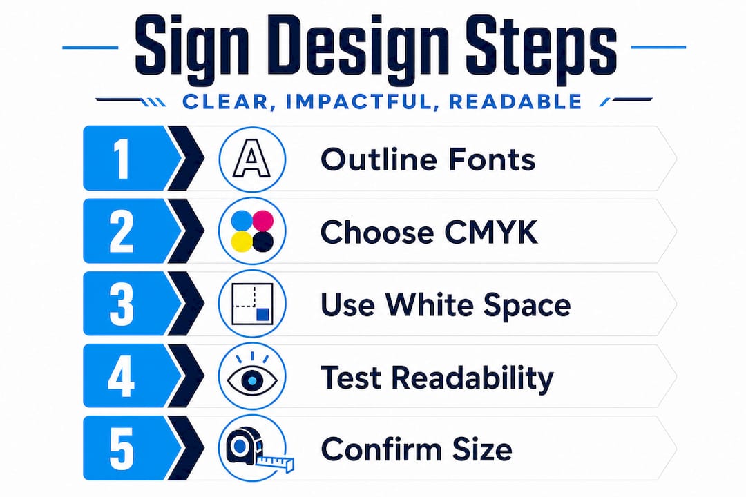
White space is one of the most underused tools in sign design. Aim for 30 to 40 percent white space in your layout. White space does not mean the background must be white. It means leaving intentional breathing room around text, logos, and images so each element stands out clearly. A sign that tries to include everything ends up communicating nothing.
Color contrast between text and background is equally important. Dark text on a light background or light text on a dark background provides the strongest legibility. Avoid placing red text on orange, or yellow text on white. These low-contrast combinations force the viewer to strain, and most people simply won’t bother.
Here are some common layout pitfalls to watch out for in your own designs:
- Too much text crammed into the available space
- Weak contrast between font color and background
- Inconsistent fonts that suggest multiple brands rather than one
- Logos placed too close to the edge of the sign
- Phone numbers or web addresses in fonts too small to read from a car
Check out impactful real estate signs for real-world examples of how layout and contrast choices translate directly into marketing results. For broader brand applications, these small business sign tips break down design principles that apply to any sign type.
Pro Tip: Print a small test version of your sign on a standard printer and tape it to a wall. Walk back 10 to 15 feet and ask yourself: what is the first thing I read? If it isn’t your name or key message, your hierarchy needs adjusting.
Avoiding common sign artwork mistakes
Design is only half the battle. Next, you need to dodge the mistakes that commonly sabotage sign artwork.
The most frequent artwork problems that derail production include low-resolution images, fonts that were not converted to outlines, files submitted in RGB color mode, missing bleed, borders that are too thin, and overall cluttered design. Every one of these is fixable if you catch it before submission.
Here are the top six mistakes to check for, and how to fix each one:
- Low-resolution images: Open your image in Photoshop and check “Image Size.” If it reads below 300 DPI at actual print dimensions, source a higher resolution version or consult your designer.
- Fonts not converted to outlines: In Illustrator, go to “Select All,” then “Type” and “Create Outlines.” In CorelDRAW, select all text and choose “Convert to Curves.”
- RGB color mode: In Illustrator, go to “File” then “Document Color Mode” and switch to CMYK. In Photoshop, use “Image” then “Mode” then “CMYK Color.”
- Missing bleed: Go back to your document setup and add 0.125 to 0.25 inches of bleed. Extend any background colors or images to fill that bleed zone.
- Thin borders: If your design uses a border frame, make sure it sits at least 2 inches from the trim edge on all sides.
- Cluttered layout: Remove any text element that does not serve the sign’s single primary purpose. If your sign is about a house listing, every element should support that goal.
Preventive techniques to run through before every file submission:
- Zoom to 100% and review each element individually
- Check that all linked images are embedded, not just linked
- Confirm the total file size is reasonable (unusually small files often signal missing elements)
- Verify your document dimensions match the spec sheet from your print provider
- Run a preflight check if your software offers one
For real estate professionals, reviewing a solid property signage design guide can flag additional industry-specific issues unique to yard signs, riders, and directional panels.
Pro Tip: Set your design software to display the file at 100% zoom and walk through it section by section as if you were a customer seeing it for the first time. Fresh eyes catch errors that familiarity hides.
Final checks: Reviewing and submitting sign artwork
Before you send your files for production, reviewing your artwork ensures it achieves the professional results you expect.
Treat your final review as a formal process, not a quick glance. Prioritize brand consistency, minimal text, and distance-based sizing in your review checklist to maximize promotional effectiveness. These three factors alone determine whether your sign earns attention or gets ignored.
| Review checkpoint | What to check | Pass or fix? |
|---|---|---|
| File format | AI, EPS, or print-ready PDF | Must be one of these |
| Resolution | 300 DPI at print size | Fix if below 300 |
| Font handling | All text converted to outlines | Convert before saving |
| Color mode | CMYK, not RGB | Switch if in RGB |
| Bleed | 0.125 to 0.25 inch added | Add if missing |
| Border thickness | Minimum 2 inches from edge | Redesign if thinner |
| Crop marks | None present in file | Remove if present |
| Safe zone | All critical content 0.25 inch from bleed | Move elements if needed |
Once your checklist is clear, follow these steps for file submission:
- Save your final file as a PDF with high-quality print settings and embedded fonts or outlined text.
- Compress any linked images at maximum quality, not minimum file size.
- Label your file clearly with the project name, dimensions, and date (for example: MainStreetRealty_18x24_2026.pdf).
- Include a brief written note to your print provider confirming the final size, substrate, and any special finishing instructions such as grommets or laminate.
- Send the file and request a digital proof before full production begins.
For more detailed guidance on the submission process, check out signage tips for real estate that walk through vendor communication best practices.
Why perfection in artwork prep pays off
Here is the honest truth that most sign guides skip over: the visible difference between a sign that builds brand confidence and one that undermines it often comes down to steps that take less than 20 minutes to complete. Converting fonts, switching to CMYK, and building proper white space are not glamorous tasks, but they are the ones that determine your final result.
There is a contrarian view worth considering. Many business owners spend hours debating gradient styles, drop shadows, and decorative effects, then submit a file with live text and RGB colors because they ran out of patience for the “technical stuff.” That is backwards. The technical foundation is what makes the visual design actually print the way you intended. Effects mean nothing if the font substitutes or the colors shift.
We have seen signs come back from production with full-line font substitutions that turned professional headings into generic system text. We have seen real estate yard signs with borders that disappeared entirely after cutting because the file was prepared without bleed. In every case, the client was frustrated, the reprints cost money, and the delay hurt their timeline.
Investing careful attention in artwork prep advice before hitting submit is where your real return on investment lives. A technically flawless file that looks simple will outperform a flashy design that prints wrong every single time.
Take your sign artwork to the next level with custom solutions
Artwork preparation is a learnable skill, but working with a professional signage partner means you spend less time troubleshooting file specs and more time focusing on your business.
At Custom Signs Today, we support business owners, event planners, and real estate agents through every stage of the sign production process, from reviewing artwork files to recommending the right materials for your environment. Whether you need help with a step-by-step custom signage project, outdoor-grade site signs for a construction or real estate listing, or professionally lit exterior lightbox signs for maximum visibility at night, our team is ready to deliver. Request a free quote and get expert eyes on your artwork before it ever goes to print.
Frequently asked questions
Why does my printed sign look different from my design?
Differences usually come from unconverted fonts or wrong color mode, both of which cause the printer’s system to interpret your file differently than you intended. Switching to CMYK and outlining all fonts resolves the most common color and text discrepancies.
Should I use borders or crop marks in sign artwork?
Avoid thin borders and crop marks in your submitted file because both create cutting and production errors. Keep any border frame at least 2 inches from the trim edge and let your print provider add crop marks on their end.
What font and size is best for real estate signs?
Bold sans-serif fonts like Helvetica and Arial with contact information set at 108 to 144 pt deliver the strongest readability for passing traffic. These fonts maintain legibility at distance without requiring the viewer to slow down.
How much white space should my sign have?
Aim for 30 to 40 percent white space in your layout to give each element room to breathe and ensure your primary message stands out. Signs that fill every inch of space are harder to process quickly, especially for viewers in motion.