
Meet the legal minimum first: 29 CFR 1910.145 sets the federal floor for accident-prevention signs and tags in general industry, and every U.S. workplace must satisfy it. Beyond that floor, the ANSI Z535 series gives you a design system that inspectors recognize, workers understand faster, and attorneys can point to as evidence of good-faith compliance. Safety signs in the workplace are not decoration — they are a documented layer of your hazard-control program.
Compliance checklist to act on now:
- Use the correct signal word and color for each hazard level: DANGER (red) for immediate death/serious injury risk, WARNING (orange) for serious but not immediate threats, CAUTION (yellow) for minor injury risk, NOTICE (blue/white) for policy and instruction.
- Post permanent signs wherever ongoing hazards exist: electrical panels, chemical storage, machinery lockout points, and egress routes.
- Use tags (not permanent signs) only for temporary, out-of-the-ordinary hazards; remove them the moment the hazard is resolved.
- Schedule three inspection actions now: (1) walk every sign location for legibility and physical damage, (2) verify signal words match current hazard severity, and (3) replace any faded, torn, or obstructed sign before your next OSHA inspection cycle.
- Consult 29 CFR 1910.145 for the legal minimum and ANSI Z535 for best-practice design.
Key Takeaways
Compliant workplace safety signs require meeting OSHA 29 CFR 1910.145 minimums, adopting ANSI Z535 layouts for clearer hazard communication, and maintaining signs through scheduled inspections and timely replacement.
| Point | Details |
|---|---|
| OSHA 1910.145 is the legal floor | Every general-industry workplace must meet its sign classifications, color rules, and tag criteria. |
| ANSI Z535 adds design precision | Adopt Z535 layouts and pictograms to improve recognition speed and support a good-faith compliance defense. |
| Placement determines effectiveness | Mount signs in the worker’s line of sight before the hazard zone; signs behind doors or equipment fail regardless of design quality. |
| Material must match environment | Specify aluminum or polycarbonate for outdoor/chemical exposure; photoluminescent substrates for egress paths. |
| Customsignstoday builds to spec | Custom signs produced to OSHA/ANSI specs with digital proofs, small-batch runs, and site-photo-based quoting. |
Table of Contents
- What types of safety signs does your workplace actually need?
- What OSHA actually requires for safety signs in the workplace
- How ANSI Z535 goes further than OSHA’s minimum
- Why pictogram-based signage outperforms text-heavy signs
- Design rules that make signs legible and effective
- Choosing the right materials and placement for lasting compliance
- Tags vs. permanent signs: when each one applies
- What to specify when ordering custom safety signs
- What good signage actually looks like in practice
- Customsignstoday produces compliant signs built to your exact specs
- What most safety managers get wrong about workplace signage
- Sources
What types of safety signs does your workplace actually need?
U.S. workplaces use seven primary sign categories, each tied to a specific hazard severity or communication purpose. Knowing which category applies to which situation keeps you compliant and prevents the most common field mistake: using a CAUTION sign where DANGER is required.
| Signal Word | Standard Color | Hazard Level | Typical Use Case |
|---|---|---|---|
| DANGER | Red background, white letters, black border | Immediate threat of death or serious injury | Energized electrical panels, confined space entry, chemical splash zones |
| WARNING | Orange background, black letters | Serious hazard; injury or death possible but not certain | Moving machinery, fall hazards above 4 feet, pressurized systems |
| CAUTION | Yellow background, black letters | Minor or moderate injury risk | Slippery floors, low overhead clearance, pinch-point equipment |
| NOTICE | Blue background, white letters | Policy, instruction, no direct injury link | PPE requirements, visitor check-in, no-smoking areas |
| SAFETY INSTRUCTION | White background, green panel | Safe condition or first-aid information | First-aid stations, eyewash locations, emergency exits |
| FIRE EQUIPMENT | Red background, white letters/symbols | Fire-fighting equipment location | Fire extinguisher cabinets, hose reels, pull stations |
| BIOLOGICAL HAZARD | Fluorescent orange or orange-red | Biohazardous materials or infectious agents | Lab specimen areas, medical waste containers |
A few scenarios where the category choice matters most: hazardous chemical storage areas typically need both a DANGER sign at the room entrance and individual CAUTION or WARNING labels on containers. Locked-out machinery during maintenance requires a tag (not a permanent sign) plus a DANGER or CAUTION designation depending on the energy source. Electrical panels rated 50 volts or above warrant DANGER signs with an arc-flash pictogram. Exit routes use SAFETY INSTRUCTION or safe-condition signs, which must remain visible even during a power failure — which is where photoluminescent materials come in.
What OSHA actually requires for safety signs in the workplace
29 CFR 1910.145 is the controlling federal regulation for accident-prevention signs and tags in general industry. It does not prescribe every design detail, but it sets the legal baseline that OSHA compliance officers measure against during inspections.
What the standard requires or defines:
- Sign classifications: Danger, Caution, and Safety Instruction are the three OSHA-defined sign classes. Biological hazard signs are also addressed.
- Color guidance: Danger signs use red, white, and black. Caution signs use yellow background with black lettering. Safety Instruction signs use white background with a green panel and white letters.
- Wording and readability: Signs must be legible, with wording that is concise, direct, and easy to understand. Wording must accurately reflect the hazard.
- Tag requirements: Tags must carry a signal word (DANGER, CAUTION, or BIOLOGICAL HAZARD), a major message explaining the hazard or required action, and must be legible at a minimum distance of five feet — or at a greater distance if the hazard warrants it.
- When tags are required: Tags are used when a hazard exists that is not yet controlled by a permanent sign or engineering control, and they must be removed as soon as the hazard is eliminated.
The CFR text states the purpose plainly:
One important scope note: 1910.145 applies to general industry, while construction sites have their own construction site safety tips for Alberta managers. Construction sites fall under 29 CFR 1926.200, which carries its own signage requirements. Maritime and other industry-specific OSHA standards add further obligations, so always check the subpart that governs your specific operations.
What inspectors look for: Compliance officers focus on three things during a walk-through. First, are signs present where hazards exist? Second, are the signal words accurate — is a CAUTION sign standing in front of what is clearly a DANGER-level hazard? Third, are signs physically legible? A faded, torn, or obstructed sign is a citation waiting to happen, even if the original design was fully compliant.
How ANSI Z535 goes further than OSHA’s minimum
ANSI Z535 is voluntary, but calling it optional undersells how widely it has been adopted. Safety practitioners treat it as the de facto design system for workplace signage, and OSHA compliance officers recognize it as evidence of a good-faith hazard-communication effort.
The ANSI Z535 series covers six sub-standards, each addressing a distinct piece of the safety communication system:
- Z535.1 — Safety colors: defines the exact color specifications (Pantone, CMYK, and RGB values) for each signal word category.
- Z535.2 — Environmental and facility safety signs: governs the layout, signal panel, pictogram placement, and message format for posted signs in facilities.
- Z535.3 — Criteria for safety symbols: sets the design and evaluation process for pictograms used on signs and labels.
- Z535.4 — Product safety signs and labels: applies to signs affixed to equipment and products rather than walls or structures.
- Z535.5 — Safety tags and barricade tapes: covers temporary warning devices, including the tag criteria that align with OSHA’s tag rules.
- Z535.6 — Product safety information in manuals and instructions: extends the system to written documentation accompanying equipment.
The ANSI blog explains that this family of standards standardizes pictograms and layouts across environments, which matters when your workforce moves between facilities, works with global equipment manufacturers, or includes workers whose first language is not English.
Pro Tip: When deciding between a bare OSHA-minimum layout and a full ANSI Z535 design, default to ANSI. The added cost is minimal, the pictogram panel improves comprehension across your entire workforce, and the documented use of a recognized standard strengthens your position if a sign’s adequacy is ever challenged in litigation or during an inspection.
Why pictogram-based signage outperforms text-heavy signs
The case for ANSI-style pictograms is not just aesthetic. Industry guidance from ANSI consistently points to pictograms as a tool for faster hazard recognition and reduced misinterpretation, particularly in workplaces with diverse or multilingual workforces.
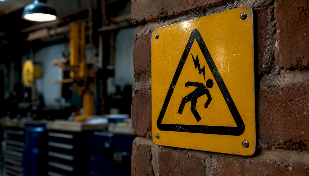
Text-only signs require a worker to stop, read, and process language before responding. A well-designed pictogram communicates the hazard type and required action almost instantly, even across language barriers. That gap in recognition time matters most in high-traffic areas, near fast-moving equipment, or anywhere a worker is already managing cognitive load from the task at hand.
The practical payoff shows up in training outcomes too. Workers who are trained with pictogram-forward signage tend to associate the visual symbol with the hazard more reliably than those trained with text-only signs. When you pair symbols with standard safety sign layouts, you get a system that reinforces itself: the sign on the wall matches the symbol in the training material, which matches the label on the equipment.
One more angle worth considering: ANSI Z535 pictograms are designed to align with ISO 11684 and ISO 7010, the international symbol standards. If your facility works with equipment from European or Asian manufacturers, or if you have workers who trained in other countries, ANSI-compliant pictograms give you a shared visual vocabulary that text alone cannot provide.
Design rules that make signs legible and effective
A compliant sign that no one can read at the point of hazard is not doing its job. Legibility is not a style preference — it is a compliance requirement under 1910.145 and a practical necessity for the sign to function.
Answer first: the four non-negotiable legibility factors are high contrast between foreground and background, a signal panel that matches the hazard level, a pictogram that reinforces the message, and letter height scaled to the expected viewing distance.
Actionable design checks:
- Color contrast: Use the ANSI Z535.1 color specifications exactly. Substituting a similar-looking orange for the specified WARNING orange, or a pale yellow for CAUTION yellow, degrades recognition speed.
- Letter height: As a general rule, letters should be at least 1 inch tall for every 25–30 feet of viewing distance. A sign read from 50 feet needs 2-inch letters at minimum.
- Case: Use mixed case (upper and lower) for body message text; reserve all-caps for the signal word only. All-caps body text slows reading speed.
- Signal word prominence: The signal word must be the most visually dominant element on the sign. If the message text is competing with the signal word for attention, the layout needs revision.
- Pictogram pairing: Place the pictogram in the signal panel or immediately adjacent to it. A pictogram buried at the bottom of a text-heavy sign loses most of its recognition advantage.
- Wording: Keep the major message to one line if possible. Two lines maximum. If you need three lines to explain the hazard, the sign is doing the job of a procedure — post the procedure separately and use the sign to direct workers to it.
Pro Tip: For outdoor signs, long sightlines, or low-light environments, specify a reflective or photoluminescent substrate. Photoluminescent signs are required by NFPA 101 for egress path marking in many occupancies and remain visible during power outages without any electrical connection. They are also a smart choice for any sign that needs to be readable in smoke-filled or dimly lit conditions.
For a deeper look at how to create safety signage that maximizes compliance, the design principles above translate directly into a spec sheet you can hand to any sign vendor.
Choosing the right materials and placement for lasting compliance
A sign that fades, peels, or corrodes within two years is a recurring cost and a recurring compliance gap. Material selection should be part of the initial procurement decision, not an afterthought.
Match material to environment:
- Aluminum: The standard choice for outdoor and industrial environments. Resists UV, moisture, and most chemical splash. Typically 0.040-inch or 0.063-inch thickness for facility signs.
- Rigid plastic (PVC or HDPE): Lighter than aluminum, suitable for indoor use and moderate outdoor exposure. Not ideal for high-UV or high-chemical environments without a UV-resistant laminate.
- Vinyl adhesive: Best for flat, indoor surfaces where a permanent mount is not practical. Specify a laminate overcoat for any vinyl sign in a wash-down or high-humidity area.
- Photoluminescent film or rigid substrate: Required or strongly recommended for egress signs, stairwell markings, and any sign that must remain visible during a power failure. Performance grades vary; specify the grade required by your local fire code.
| Material | Indoor Suitability | Outdoor/UV Resistance | Chemical Resistance | Typical Use |
|---|---|---|---|---|
| Aluminum (painted/printed) | Excellent | Excellent | Good | Facility walls, machinery, outdoor posts |
| Rigid PVC | Excellent | Moderate | Moderate | Indoor equipment, clean rooms |
| Vinyl adhesive | Good | Poor without laminate | Poor without laminate | Flat indoor surfaces, equipment labels |
| Photoluminescent film | Good | Moderate | Moderate | Egress paths, stairwells, emergency exits |
| Polycarbonate | Excellent | Good | Excellent | High-impact areas, chemical plants |
ANSI Z535.2 guidance on environmental durability is direct: physical degradation from UV fade, chemical abrasion, or dirt makes a sign legally insufficient even if its original layout was fully compliant. Specify UV inhibitors for any outdoor sign, and chemical-resistant laminates for industrial wash areas.
Placement rules that actually matter:
Signs must be visible before a worker reaches the hazard, not at the point of contact. Mount at normal line of sight (roughly 5–6 feet from the floor for standing workers) and avoid placing signs behind doors, around corners, or behind equipment that workers routinely stand in front of. For long corridors or large areas, repeat the sign at multiple entry points. For outdoor signage installation in high-UV environments, anchor hardware and substrate choice both affect how long the sign stays legible and secure.
Inspect every sign location at least quarterly: check for legibility, physical damage, and whether the sign is still accurately describing the current hazard. A sign left in place after a process change that eliminated the original hazard is a compliance problem in the other direction.
Tags vs. permanent signs: when each one applies
Tags and permanent signs serve different purposes under OSHA, and using one where the other is required is a common citation trigger.
The direct answer: permanent signs are for ongoing, fixed hazards that exist as a normal condition of the work environment. Tags are for temporary, out-of-the-ordinary hazards that arise during specific tasks or maintenance activities and will be resolved within a defined timeframe.
OSHA tag rules under 1910.145:
- Tags must display a signal word: DANGER, CAUTION, or BIOLOGICAL HAZARD.
- The major message must explain the specific hazard or required action (e.g., “Do Not Operate — Equipment Under Repair”).
- Tags must be legible at a minimum distance of five feet.
- Tags must be attached securely enough that they cannot be accidentally removed or displaced.
- Tags must be removed immediately when the hazard no longer exists.
Common legitimate uses for tags: lockout/tagout during maintenance (where OSHA 1910.147 also applies), wet-floor warnings during cleaning operations, temporary barricades around spill areas, and equipment taken out of service pending repair. For temporary event or site hazard signage, tags and temporary barriers often work together as a layered warning system.
Misuse to avoid: leaving a lockout tag on equipment after maintenance is complete, using a tag as a substitute for a permanent sign at a recurring hazard location, and attaching tags to surfaces where they are not clearly visible to workers approaching the hazard. A tag that has been in place for weeks at a fixed hazard point is almost certainly the wrong tool — that location needs a permanent sign.
What to specify when ordering custom safety signs
Getting a compliant sign on the first order requires a complete brief. Vague requests produce generic results; a specific spec sheet eliminates back-and-forth and gets you production-ready artwork faster.
Ordering checklist:
- Applicable standard: State whether the sign must meet OSHA 1910.145 minimums, ANSI Z535.2 (facility signs), ANSI Z535.4 (product/equipment labels), or both.
- Signal word: Specify DANGER, WARNING, CAUTION, NOTICE, or SAFETY INSTRUCTION — do not leave this to the vendor’s judgment.
- Exact wording: Write out the complete major message as you want it to appear. Include any supplemental message text.
- Pictogram: Specify the ANSI Z535.3-compliant symbol number if known, or describe the hazard so the vendor can propose the correct symbol. Attach a reference image when possible.
- Letter height and viewing distance: State the maximum distance from which the sign must be readable and confirm the letter height meets the 1-inch-per-25-to-30-feet guideline.
- Material and finish: Specify substrate (aluminum, rigid PVC, vinyl, photoluminescent), thickness, and any laminate or UV coating required.
- Mounting method: Indicate whether the sign will be wall-mounted (screw holes, adhesive, or magnetic), post-mounted, or hung. Include hardware requirements.
- Quantity and location map: List the number of signs needed per design and attach a site map or photos showing each installation point.
- Durability and warranty expectations: Note the environment (indoor, outdoor, chemical exposure, wash-down) and ask for the vendor’s stated durability rating for the specified material in that environment.
- Proof/mockup requirement: Always request a digital proof showing the exact layout, colors, and proportions before production begins. A proof catches signal-word errors, color mismatches, and layout problems before they are printed at scale.
Document each installation point with a photo after mounting. That photo log becomes part of your compliance record and makes future audits faster. Include an inspection cadence note in the work order so the first scheduled review is already calendared when the signs go up.
What good signage actually looks like in practice
The gap between a technically compliant sign and one that genuinely protects workers is usually execution, not intent. After years of producing workplace signage, the patterns that separate effective programs from costly ones are consistent.
The most common field mistake is not the wrong signal word — it is placement. Signs mounted behind equipment doors, above normal sightlines, or facing the wrong direction from the approach path fail the worker even when the design is perfect. A DANGER sign for an electrical panel that is only visible after you have already opened the panel door is not doing its job. Correct placement means the sign is readable before the worker is in the hazard zone, every time.
The second pattern: maintenance programs that treat sign replacement as reactive rather than scheduled. Facilities that budget for annual sign audits and replace degraded signs on a fixed cycle spend less over time than those who replace signs only after an inspection finding or an incident. A faded CAUTION sign that costs $15 to replace proactively costs considerably more when it is the centerpiece of an OSHA citation or a workers’ compensation claim.
Compliance wins tend to cluster around a few consistent practices: clear signal panels that match the actual hazard severity, correct tag use during maintenance windows (with tags removed the same day work is completed), and a documented audit trail showing that signs were inspected and maintained. That audit trail is what turns a good signage program into a defensible one.
For safety sign compliance guidance specific to site and facility contexts, the same principles apply: accurate signal words, correct placement, and a documented inspection record are the three things that matter most when an inspector walks through.
Customsignstoday produces compliant signs built to your exact specs
Getting from a compliance checklist to physical signs on the wall is where most procurement processes stall. Customsignstoday produces custom safety signs built to OSHA 1910.145 and ANSI Z535 specifications, with material options covering aluminum, rigid PVC, vinyl, and photoluminescent substrates for both indoor and outdoor environments.

The ordering process is built around the spec sheet approach described above: submit your signal word, wording, pictogram requirement, viewing distance, and material preference, and Customsignstoday returns a digital proof before anything goes to production. Small-batch runs are available for testing placement before committing to full-facility quantities. Site-photo-based quoting means you get accurate pricing without a site visit, and the team can advise on material selection for specific exposure conditions — chemical wash areas, high-UV exteriors, egress paths requiring photoluminescent grades.
Request a free quote and include your location map or site photos to get production-ready artwork and pricing in one round.
What most safety managers get wrong about workplace signage
The conventional wisdom treats sign compliance as a one-time installation project. Put up the right signs, check the box, move on. That framing is where most programs quietly fail.
Signs degrade. Hazards change. Processes get modified, equipment gets relocated, and the sign that was accurate in 2022 may be pointing workers toward a hazard that no longer exists — or worse, failing to warn them about one that does. A sign program without a maintenance cycle is not a compliant program; it is a compliant program on its first day.
The second thing safety managers underestimate is the litigation value of ANSI Z535 adoption. Because the standard is voluntary, some facilities skip it to save design time or cost. But in a post-incident investigation or a workers’ compensation dispute, the question is not just “was there a sign?” It is “was the sign adequate?” A documented decision to adopt ANSI Z535 layouts, with a paper trail showing that pictograms were selected from Z535.3-compliant symbol sets, is a meaningful defense. A generic yellow sign with the word CAUTION in black letters is not.
The third underestimated factor is workforce diversity. Text-only signs in that environment are not just less effective — they are a foreseeable failure point. ANSI’s guidance on pictogram effectiveness exists precisely because the research shows symbol-based signs outperform text-only signs on recognition speed across language groups. That is not a design preference. It is a documented safety outcome.
Build your sign program as a living system: initial installation to spec, scheduled quarterly inspections, a replacement budget, and a review trigger any time a process or layout change affects a hazard point. That is what separates a sign program that protects workers from one that just looks like it does.
Sources
Use these primary references when preparing for audits, updating your sign program, or verifying that your current signs meet current regulatory language.
- 1910.145 | Occupational Safety and Health Administration
- 1910.145 – Specifications for accident prevention signs and tags. | govinfo
- The Significance of Product Safety Signs and Labels in ANSI Z535 – The ANSI Blog
- eCFR — 29 CFR 1910.145
The practical workflow: start with 1910.145 to confirm you meet the legal minimum, then layer in ANSI Z535.2 for facility sign design and Z535.5 for tag specifications. For construction sites, check 1926.200 in addition to the general-industry standard. When your facility works with equipment from international manufacturers, Z535.3 and Z535.4 help align your posted signs with the symbols already on the machinery.