
{
“@type”: “Article”,
“image”: {
“url”: “https://csuxjmfbwmkxiegfpljm.supabase.co/storage/v1/object/public/blog-images/organization-6408/1774485778664_Manager-reviewing-wall-mounted-safety-signage.jpeg”,
“@type”: “ImageObject”,
“caption”: “Manager reviewing wall-mounted safety signage”
},
“author”: {
“url”: “https://customsignstoday.us”,
“name”: “Customsignstoday”,
“@type”: “Organization”
},
“@context”: “https://schema.org”,
“headline”: “What are safety signs and symbols: a business guide”,
“publisher”: {
“url”: “https://customsignstoday.us”,
“name”: “Customsignstoday”,
“@type”: “Organization”
},
“inLanguage”: “en-US”,
“articleBody”: “Learn what safety signs and symbols mean for your business. Understand OSHA and ISO standards, design principles, and practical tips to improve workplace safety and compliance.”,
“description”: “Learn what safety signs and symbols mean for your business. Understand OSHA and ISO standards, design principles, and practical tips to improve workplace safety and compliance.”,
“datePublished”: “2026-03-26T00:43:01.805Z”
}
Many business owners struggle to differentiate between the dozens of safety signs and symbols posted throughout their facilities. Understanding these visual tools is essential for preventing workplace accidents and maintaining compliance with OSHA and ISO regulations. This guide breaks down the types, standards, design principles, and practical applications of safety signs to help you create a safer, more compliant workplace. You’ll learn how to select, design, and position signs that communicate hazards effectively to diverse workforces while meeting legal requirements.
Table of Contents
- Key takeaways
- What are safety signs and symbols? Understanding the basics
- Key standards guiding safety sign design and usage
- Design principles and practical installation tips for effective safety signs
- Addressing multicultural workforces and enhancing sign comprehension
- Enhance your workplace safety with custom signs
- Frequently asked questions
Key Takeaways
| Point | Details |
|---|---|
| Standardized signs improve recognition | Standardized signs help workers quickly identify hazards and required actions across locations and languages. |
| Standards guide design | ISO 7010 and ISO 3864 define symbols, colors, and layout principles to ensure consistency worldwide. |
| Design and placement matter | Proper sign design and placement improve hazard recognition and compliance. |
| Training boosts safety effectiveness | Training employees on these symbols increases understanding and reduces risk in diverse workforces. |
What are safety signs and symbols? Understanding the basics
Safety signs and symbols are standardized visual communication tools using specific shapes, colors, and pictograms to indicate hazards, prohibitions, mandatory actions, emergency information, and fire safety for accident prevention and compliance. These visual markers serve as your first line of defense against workplace injuries, providing instant recognition of potential dangers without requiring lengthy text explanations.
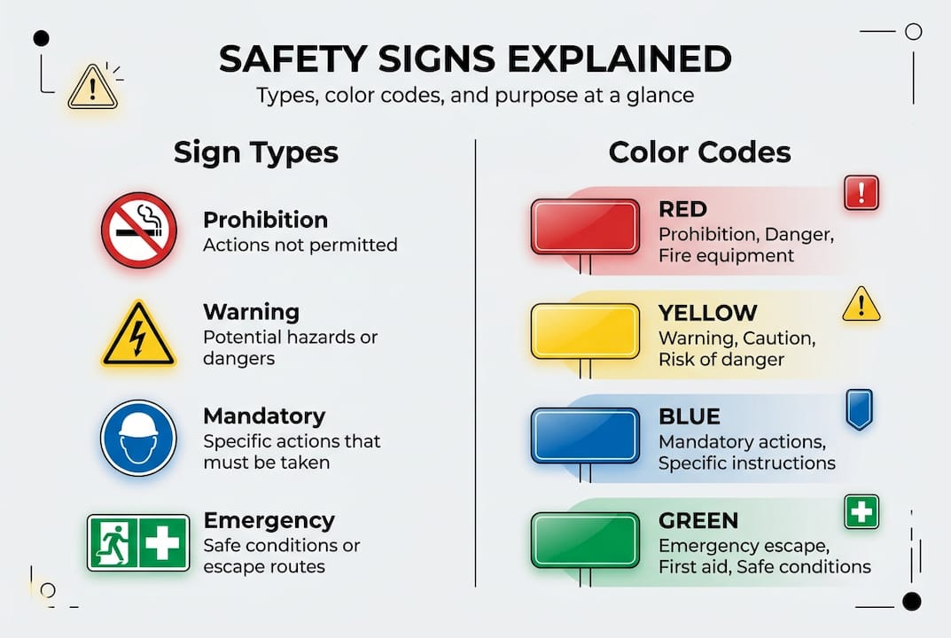
Five main categories organize safety signs based on their purpose and visual design. Prohibition signs use circular shapes with red borders and diagonal slashes to indicate forbidden actions like “No Smoking” or “No Entry.” Warning signs feature yellow triangles with black borders alerting workers to hazards such as electrical risks, slippery surfaces, or toxic materials. Mandatory signs appear as blue circles commanding specific actions like wearing hard hats, safety glasses, or hearing protection. Emergency signs display green rectangles or squares showing escape routes, first aid stations, and assembly points. Fire safety signs combine red rectangles with white pictograms marking extinguisher locations, hoses, and alarm points.
Standardization matters because it creates universal recognition across industries and geographic regions. When a worker sees a yellow triangle, they immediately understand a hazard exists regardless of their native language or prior workplace experience. This visual consistency reduces cognitive load during emergencies when quick decisions save lives. Safety signs compliance realtors rely on this same principle to protect property visitors.
Common workplace examples include:
- Prohibition: No unauthorized entry, No mobile phones, No food or drink
- Warning: Forklift operating area, Overhead load, Chemical storage
- Mandatory: Eye protection required, Wash hands, Keep door closed
- Emergency: Emergency exit, Eye wash station, Emergency phone
- Fire: Fire extinguisher, Fire hose reel, Fire alarm call point
Both symbols and colors work together for quick hazard recognition. The shape provides the category, the color reinforces the message type, and the pictogram specifies the exact hazard or action. This triple redundancy ensures comprehension even in poor lighting, at distance, or during stressful situations.
Key standards guiding safety sign design and usage
Regulatory frameworks establish precise criteria for safety sign design to ensure consistency and legal compliance across workplaces. Understanding these standards helps you select appropriate signage that protects employees while satisfying inspection requirements.
ISO 7010 and ISO 3864 focus on symbol design and color codes for global workplaces, creating a universal visual language that transcends linguistic barriers. ISO 7010 provides a registry of over 400 standardized safety symbols covering everything from biological hazards to confined spaces. ISO 3864 defines the color specifications, shape meanings, and layout principles that make these symbols instantly recognizable. These international standards prioritize pictograms over text, making them ideal for multinational operations or workplaces with diverse language backgrounds.
OSHA 1910.145 and ANSI Z535 standards emphasize text and signal words in U.S. settings, reflecting American preferences for explicit written warnings. OSHA regulations require specific signal words paired with color codes to indicate hazard severity. ANSI Z535 expands on these requirements with detailed specifications for header panels, message panels, and symbol sizes. This text-heavy approach provides clarity for English-speaking workers but can create comprehension challenges in multilingual environments.
| Standard | Primary Focus | Best For | Key Feature |
|---|---|---|---|
| ISO 7010/3864 | Symbol-based design | Global/multicultural workplaces | Universal pictograms |
| OSHA 1910.145 | Signal words and text | U.S. compliance | Explicit written warnings |
| ANSI Z535 | Comprehensive layout | Detailed hazard communication | Structured message panels |
OSHA signal words communicate three distinct hazard levels through color and text combinations. Danger signs use red headers with white lettering to indicate immediate threats that will result in death or serious injury if not avoided. Warning signs feature orange headers signaling hazards that could result in death or serious injury. Caution signs display yellow headers for hazards that may result in minor or moderate injury. This color-coded hierarchy helps workers instantly assess risk levels and respond appropriately.
Pro Tip: For U.S. businesses, prioritize OSHA compliance but consider adding ISO symbols for multicultural clarity, especially in industries with high immigrant workforce percentages like manufacturing, construction, or food service.
The symbol-only ISO approach versus text-heavy ANSI creates different comprehension dynamics. ISO symbols enable faster recognition across language barriers, with studies showing comprehension improves by 43% when using standardized pictograms. ANSI text provides explicit detail that reduces ambiguity for English readers. Many forward-thinking businesses now use hybrid signs combining both approaches, placing ISO symbols prominently with minimal ANSI-compliant text for maximum effectiveness. Business signage installation process guide and safety signs compliance realtors can help implement this dual approach.
Design principles and practical installation tips for effective safety signs
Creating visible, comprehensible safety signs requires attention to specific design mechanics and strategic placement. These practical considerations determine whether your signs actually prevent accidents or simply fulfill paperwork requirements.

Size requirements scale with typical viewing distances to ensure readability. ISO 3864-1 specifications recommend a minimum 40mm symbol height for signs viewed from 4 meters, 80mm for 8 meters, and 120mm for 12 meters. This proportional scaling maintains visual clarity as distance increases. Smaller signs work for close-range applications like equipment labels, while larger formats suit warehouse aisles or outdoor facilities. Calculate your maximum viewing distance first, then select sign dimensions accordingly.
Placement best practices center on eye level positioning and adequate lighting. Mount signs at 150-170cm height to align with average adult sight lines, ensuring workers encounter warnings naturally without searching. Lighting levels above 300 lux provide sufficient illumination for color recognition and symbol detail. In areas with variable lighting, position signs where ambient or emergency lighting maintains visibility during power failures or nighttime operations.
| Design Element | Specification | Purpose |
|---|---|---|
| Viewing distance | 40mm symbol per 4m | Ensures readability at range |
| Mounting height | 150-170cm | Aligns with natural sight lines |
| Lighting level | Minimum 300 lux | Enables color and detail recognition |
| Color contrast | 70% minimum difference | Improves visual separation |
| Pictogram area | 50% of sign face | Maximizes symbol prominence |
Color contrast and pictogram area percentages drive visual clarity in busy environments. Maintain at least 70% contrast between background and foreground colors to ensure separation under various lighting conditions. Allocate 50% or more of the sign face to the pictogram itself, minimizing decorative elements or excessive text that dilutes the core message. High-contrast combinations like black on yellow or white on red provide maximum visibility even with peripheral vision or quick glances.
Durable material criteria protect your investment and maintain effectiveness over time. Select materials with UV resistance rated for 5+ years of outdoor exposure to prevent fading. Chemical resistance matters in manufacturing or laboratory settings where cleaning agents or process chemicals contact sign surfaces. Impact resistance prevents damage from equipment strikes or vandalism. Photoluminescent materials store ambient light and glow in darkness, providing visibility during power failures.
Pro Tip: Use photoluminescent signs for low-light areas to increase visibility by 87%, particularly for exit routes, stairwells, and emergency equipment locations where power failures create dangerous conditions.
Regular sign audits and maintenance preserve effectiveness as facilities evolve. Inspect signs quarterly for fading, damage, or obstruction by equipment or inventory. How to design property signage and business sign design tips essential impact offer frameworks for systematic evaluation. Replace signs showing more than 25% color degradation or physical damage. Update signage when processes change, new hazards emerge, or regulations evolve. Document inspection dates and replacements to demonstrate due diligence during safety audits.
A laboratory sign design study revealed that optimal placement combined with proper sizing reduced hazard recognition time by 34%, translating to faster emergency response and fewer accidents. Apply these evidence-based principles rather than treating signs as mere compliance checkboxes.
Addressing multicultural workforces and enhancing sign comprehension
Diverse workforces present unique challenges for safety communication that require thoughtful signage strategies. Language barriers, cultural differences, and varying educational backgrounds all influence how effectively your signs protect employees.
Non-English speakers face significant obstacles with text-heavy signs that rely on reading comprehension. Workers with limited English proficiency may misinterpret warning levels, miss critical instructions, or simply ignore signs they cannot understand. This communication gap creates liability exposure and genuine safety risks, particularly in high-hazard industries like construction, warehousing, or chemical processing. Even bilingual workers processing information quickly during emergencies default to their native language, making English-only signs less effective under stress.
ISO symbol use delivers measurable benefits for faster recognition in multicultural settings. Studies show symbols improve comprehension by 43% compared to text-based warnings when workers speak multiple primary languages. Pictograms bypass language processing entirely, triggering direct visual recognition that works across cultural boundaries. A flame symbol communicates fire hazard identically to Spanish, Mandarin, or Arabic speakers without translation delays. This universal approach reduces cognitive load and accelerates response times when seconds matter.
Enhancing safety signage comprehension for diverse workforces:
- Conduct workforce language assessments to identify primary languages and literacy levels among employees
- Implement hybrid signs combining ISO symbols with minimal text in the two most common languages
- Create visual job aids pairing signs with photographs of actual workplace hazards they represent
- Schedule multilingual safety orientations explaining symbol meanings before workers enter hazard areas
- Post symbol reference guides in break rooms and common areas for ongoing reinforcement
- Test comprehension through practical exercises where workers identify hazards from signs alone
- Gather feedback from non-English speakers about which signs create confusion or uncertainty
Distance and context effects alter sign effectiveness in real-world conditions. Workers recognize familiar signs faster than novel symbols, making consistent design across your facility essential. Environmental factors like glare, shadows, or visual clutter reduce comprehension rates by up to 28%. Position signs against contrasting backgrounds, avoid placing them near bright windows, and ensure clear sight lines from typical approach angles. Signage impacts event safety demonstrates these principles in temporary settings.
Ongoing employee training serves as the critical component connecting signs to behavioral change. Training boosts effectiveness by 38% by building mental associations between symbols and appropriate responses. Conduct initial training during onboarding, then reinforce quarterly through toolbox talks or safety meetings. Use actual workplace signs during training rather than generic examples to build location-specific recognition. Quiz workers on symbol meanings and observe whether they notice and respond to signs during routine tasks.
Common pitfalls undermining multicultural signage programs:
- Ignoring language diversity by assuming all workers read English proficiently
- Poor placement in areas with inadequate lighting or visual obstructions
- Mixing incompatible symbol systems that create confusion rather than clarity
- Failing to update signs when workforce demographics shift
- Neglecting maintenance allowing fading or damage to degrade comprehension
- Treating signs as one-time installations rather than components of ongoing safety culture
Successful programs treat signs as conversation starters rather than complete solutions. Pair visual warnings with supervisor coaching, peer mentoring, and hands-on demonstrations that reinforce safe practices. Encourage workers to report signs they find confusing or ineffective, then iterate based on frontline feedback. This participatory approach builds ownership and ensures your signage actually serves the people it’s meant to protect.
Enhance your workplace safety with custom signs
Implementing comprehensive safety signage requires expertise in regulatory compliance, visual design, and durable manufacturing. Professional solutions ensure your signs meet legal requirements while effectively communicating with your specific workforce.
Custom Signs Today specializes in tailored safety sign solutions that address the unique challenges business owners and facility managers face. We design signs meeting both U.S. OSHA and ISO 7010 standards, giving you flexibility to serve diverse workforces while maintaining compliance. Our materials deliver the UV resistance, chemical durability, and impact protection necessary for demanding industrial environments.

Whether you need site signs for construction zones, face change signs for variable messaging, or completely custom designs, we provide solutions scaled to your facility requirements. Our team helps you navigate the complex decisions around symbol selection, text inclusion, and placement strategies that maximize safety effectiveness. Request custom sign quotes to explore options tailored to your specific compliance needs and workforce composition. Investing in professional signage protects your employees while demonstrating the commitment to safety that defines responsible business operations.
Frequently asked questions
What are common types of safety signs?
Prohibition, warning, mandatory, emergency, and fire safety signs are the main types classified by shapes and colors. Prohibition signs use red circles with diagonal slashes, warning signs display yellow triangles, mandatory signs show blue circles, emergency signs appear as green rectangles, and fire signs use red rectangles. Each type serves a specific communication purpose helping prevent accidents through instant visual recognition.
How do OSHA and ISO standards differ in safety signs?
OSHA emphasizes text and signal words like Danger, Warning, and Caution in U.S. workplaces, while ISO uses standardized symbols worldwide for universal comprehension. OSHA requires explicit written warnings with color-coded headers, whereas ISO prioritizes pictograms that transcend language barriers. Combining both approaches improves comprehension in multicultural environments by providing visual symbols with minimal supporting text.
What factors affect safety sign visibility?
Viewing distance, lighting levels, sign size, placement height, and color contrast are critical factors determining whether workers notice and comprehend safety signs. Signs must scale proportionally with distance, maintain 300+ lux lighting, mount at 150-170cm eye level, and provide 70% minimum color contrast. Using photoluminescent materials can boost low-light visibility significantly, particularly for emergency exits and equipment during power failures.
Why is employee training on safety signs important?
Training improves understanding by approximately 38%, ensuring better hazard recognition and appropriate responses during both routine operations and emergencies. Workers who receive formal instruction on symbol meanings develop faster recognition speeds and stronger associations between signs and required actions. Regular reinforcement through toolbox talks and practical exercises maintains comprehension over time, supporting compliance and reducing workplace accidents through informed behavioral choices.