

{
“@type”: “Article”,
“image”: {
“url”: “https://csuxjmfbwmkxiegfpljm.supabase.co/storage/v1/object/public/blog-images/organization-6408/1775435850340_Store-owner-reviews-new-building-signage.jpeg”,
“@type”: “ImageObject”,
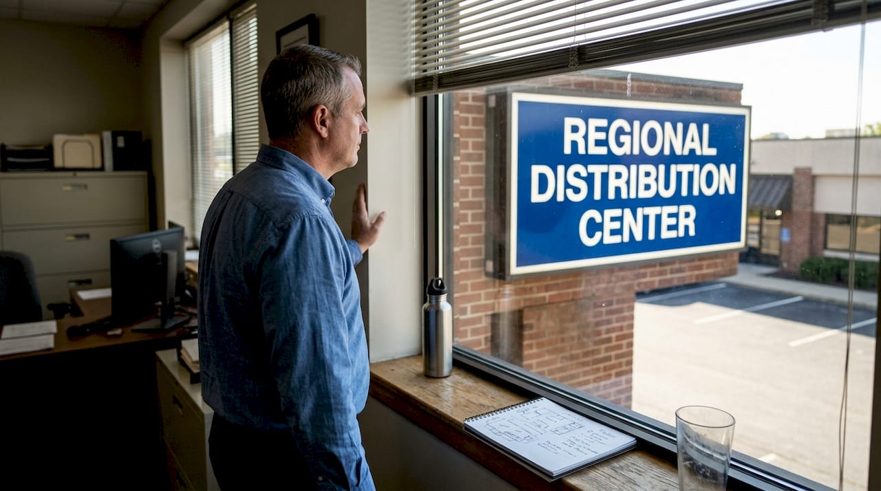
“caption”: “Store owner reviews new building signage”
},
“author”: {
“url”: “https://customsignstoday.us”,
“name”: “Customsignstoday”,
“@type”: “Organization”
},
“@context”: “https://schema.org”,
“headline”: “Expert tips for effective building signage that gets noticed”,
“publisher”: {
“url”: “https://customsignstoday.us”,
“name”: “Customsignstoday”,
“@type”: “Organization”
},
“inLanguage”: “en-US”,
“articleBody”: “Learn expert tips for effective building signage: design, compliance, lighting, and maintenance strategies that boost visibility and branding for your business.”,
“description”: “Learn expert tips for effective building signage: design, compliance, lighting, and maintenance strategies that boost visibility and branding for your business.”,
“datePublished”: “2026-04-06T00:37:34.588Z”
}
TL;DR:
- Effective signage depends on clear goals, compliance, and strategic design choices.
- High-contrast colors and readable fonts at appropriate sizes improve visibility and communication.
- Regular maintenance and proper installation ensure signage longevity and optimal business impact.
Your building’s exterior is working 24 hours a day, either pulling people in or letting them walk past. In crowded commercial areas, businesses with clear, well-designed signage can see foot traffic increases that outpace competitors by a significant margin. But getting signage right means navigating design choices, local codes, material decisions, and maintenance schedules all at once. This guide walks you through every major decision point, from clarifying your goals and meeting compliance requirements to choosing colors, materials, and lighting that actually hold up over time. Whether you’re planning a new installation or refreshing an existing sign, these proven strategies will help you make choices that stick.
Table of Contents
- Define your signage goals and understand requirements
- Choose high-impact colors, fonts, and layouts
- Lighting, material, and installation strategies
- Test, maintain, and refresh your signage regularly
- Our perspective: Why expert signage strategy beats DIY fixes
- Enhance your business or event with custom signage solutions
- Frequently asked questions
Key Takeaways
| Point | Details |
|---|---|
| Clarify sign goals first | A clear purpose and understanding of regulations make every design and install decision easier. |
| Use high-contrast visuals | Bold colors and readable fonts maximize both visibility and compliance. |
| Choose lighting and materials wisely | Proper choices here boost sign durability and ensure effectiveness in every setting. |
| Schedule regular sign reviews | Ongoing testing and maintenance keep signage fresh, visible, and on brand. |
| Professional strategy delivers best ROI | Getting expert input for design, compliance, and installation avoids costly mistakes and boosts brand value. |
Define your signage goals and understand requirements
Before you pick a font or a color, you need to know exactly what you want your sign to do. That sounds obvious, but most signage mistakes start here. Businesses rush into design without first asking: Is this sign meant to attract new customers from the street? Guide existing visitors to the right entrance? Satisfy a legal requirement? Or reinforce brand identity for people who already know you?
Each goal leads to a different set of decisions. A wayfinding sign inside a parking garage needs to be readable at a glance under artificial light. A street-facing brand sign needs to be visible from 200 feet away in full daylight. Mixing these goals without a clear priority creates cluttered, ineffective signage.
Once you’ve nailed down your primary goal, the next step is understanding the rules that govern what you can actually build. Local zoning codes control sign size, placement, lighting type, and sometimes even color. Permits are required in most municipalities before installation begins. Skipping this step is one of the most common and expensive mistakes business owners make.
Here’s what to document before you move forward:
- Primary sign purpose: Branding, wayfinding, compliance, or promotional
- Zoning district: Commercial, mixed-use, historic district, or other
- Permit requirements: Application process, fees, and approval timeline
- ADA compliance needs: Tactile characters, Braille, mounting height, and contrast rules
- Viewing distance and context: Street speed, pedestrian traffic, or interior corridor
When you design property signage, ADA requirements are non-negotiable for public-facing signs. The ADA signage requirements cover everything from character height to mounting position. Reviewing sign design principles early helps you build compliance into the design from the start, not bolt it on later.
“Overlooking permitting is a top cause of signage project delays and budget overruns. Checking sign code best practices through ISA resources early in the process saves time and money.”
Pro Tip: Schedule your permit review before finalizing any design elements. Codes can restrict dimensions or lighting types that you’ve already planned around, and redesigning after the fact costs more than doing it right the first time.
Choose high-impact colors, fonts, and layouts
Once your goals and rules are clear, focus shifts to visual elements that drive attention. The choices you make here determine whether your sign communicates in two seconds or gets ignored entirely.
Color contrast is the single most important visual decision you’ll make. The 65% contrast ratio is the ADA standard for visual characters, but it’s also just good design practice. High contrast means the text or graphic reads cleanly against the background, even in bright sunlight or low-light conditions. Dark text on a light background, or light text on a dark background, consistently outperforms mid-tone combinations.
Fonts are the second major lever. Script fonts look elegant on a spa menu but fail completely on a building sign viewed from a moving vehicle. For maximum readability at distance, stick to clean sans-serif typefaces like Arial, Helvetica, or similar. Bold weights read better than thin weights at scale.
Letter size matters more than most people realize. A general rule: every inch of letter height gives you roughly 10 feet of readable distance. A 6-inch letter is readable from 60 feet. A 12-inch letter from 120 feet. Plan your letter size around the farthest point from which you need your sign to be read.
Here’s a quick reference for common signage scenarios:
| Scenario | Recommended font | Contrast level | Min. letter height |
|---|---|---|---|
| Street-facing retail | Sans-serif, bold | 70%+ | 8 to 12 inches |
| Building entrance | Sans-serif, medium | 65%+ | 4 to 6 inches |
| Interior wayfinding | Sans-serif, regular | 65%+ | 2 to 4 inches |
| ADA-required room signs | Sans-serif, uppercase | 65%+ | 5/8 inch minimum |
Layout is where many signs fall apart. Crowding too much information onto one sign forces viewers to work harder, and most won’t bother. Use the “3-second rule”: if a passing driver or pedestrian can’t absorb your core message in three seconds, simplify it. One primary message, one secondary detail, and your logo is usually the ceiling.
Review signage design tips for practical guidance on layout hierarchy. For businesses focused on brand consistency across a location, office signage branding resources can help align interior and exterior messaging.
Pro Tip: Before finalizing your design, print a scaled version and view it from the actual installation distance. What looks balanced on a computer screen often reads differently at 50 or 100 feet.
Lighting, material, and installation strategies
After establishing design, the next step is choosing functional materials and lighting. These decisions directly affect how long your sign lasts, how visible it stays, and whether it meets local code requirements for illuminated signs.
Lighting falls into three main categories. Direct illumination shines light onto the sign face from an external source. Indirect or backlit illumination glows from behind translucent panels. Electronic message centers (EMCs) display changing content digitally. Each has different installation requirements, energy costs, and maintenance needs.
For EMCs, brightness regulation is critical. ISA guidelines for EMC brightness specify maximum luminance levels for day versus night use to prevent glare and light pollution complaints. Ignoring these standards can result in fines or forced dimming after installation.
Here’s how common sign materials compare:
| Material | Durability | Maintenance | Best use case |
|---|---|---|---|
| Aluminum composite | High | Low | Outdoor flat signs, long-term installs |
| Acrylic | Medium | Low to medium | Backlit panels, interior signs |
| PVC foam board | Low to medium | Medium | Temporary or indoor signs |
| HDU (high-density urethane) | High | Low | Carved dimensional signs |
| Vinyl | Medium | Low | Banners, wraps, short-term outdoor |
Installation planning is just as important as material selection. Consider these factors:
- Wind load: Signs in open areas need reinforced mounting to handle sustained wind pressure.
- Substrate compatibility: The mounting surface (brick, metal, wood, glass) determines fastener type and anchor depth.
- Electrical access: Illuminated signs need conduit routing and a licensed electrician in most jurisdictions.
- Vandal resistance: Ground-level signs benefit from anti-graffiti coatings and tamper-resistant hardware.
For a full breakdown of what to expect during setup, the outdoor signage installation guide covers site prep, mounting methods, and safety considerations. If you’re starting from scratch, exterior signage basics provides a solid foundation. Once installed, knowing how to maintain outdoor signs keeps your investment performing year after year.
“Illuminated signs that aren’t installed by experienced professionals often have wiring or mounting issues that shorten their lifespan significantly and create safety risks.”
Pro Tip: For any sign that requires electrical work or weighs more than 50 pounds, partner with a certified installer. The liability and safety risks of a DIY approach on complex installs are simply not worth the short-term savings.
Test, maintain, and refresh your signage regularly
Great signage is only truly effective when it’s kept visible and current. A sign that looked sharp on installation day can fade, dim, or become outdated within a year if you don’t have a maintenance plan in place.
Start with a visibility test immediately after installation. Walk, drive, or approach from every angle a customer might use. Check it at multiple times of day, including early morning, midday, and after dark. Illuminated signs often look fine in daylight but reveal wiring or brightness issues at night.
Illumination and material quality directly affect how often maintenance is needed and how well a sign holds up over its full lifespan. Higher-quality materials and proper lighting setup reduce the frequency of repairs and replacements.
Here’s a routine sign checkup process you can follow:
- Monthly visual check: Look for burned-out bulbs, loose fasteners, peeling vinyl, or fading color.
- Quarterly cleaning: Wash sign faces with appropriate cleaners for the material. Dirt and oxidation reduce contrast and readability.
- Biannual structural inspection: Check mounting hardware, brackets, and electrical connections for corrosion or wear.
- Annual design review: Assess whether the message, branding, or contact information is still current and relevant.
Beyond physical maintenance, keep an eye on whether your sign is actually doing its job. If customers frequently ask where to find your entrance, your wayfinding sign isn’t working. If new visitors can’t identify your business from the street, your brand sign needs a refresh.
- Track customer questions that relate to location or identification
- Monitor whether seasonal promotions are reflected in changeable sign elements
- Note any nearby construction or new landscaping that may be blocking sightlines
For interior locations, the interior signage guide covers how to keep indoor signs aligned with your brand as your space evolves. For exterior upkeep specifics, maintaining outdoor signs gives you a practical checklist.
Pro Tip: Set a recurring calendar reminder every 90 days for a quick sign walkthrough. It takes 15 minutes and catches small problems before they become expensive repairs or brand embarrassments.
Our perspective: Why expert signage strategy beats DIY fixes
With the practical steps laid out, consider this hard-earned perspective from the field. We’ve seen hundreds of businesses invest in signage and the pattern is consistent: the ones who treat signage as a strategic asset get results, and the ones who treat it as a quick fix waste money.
DIY sign projects almost always underestimate three things: local code complexity, the technical demands of proper lighting, and the ongoing commitment of maintenance. A sign that gets installed without a permit gets torn down. A sign with the wrong brightness setting gets a complaint from the city. A sign with cheap materials looks faded within 18 months.
The real cost of cutting corners isn’t the original purchase price. It’s the removal, redesign, and reinstallation after the first approach fails. We’ve seen businesses spend three times their original budget fixing signage that wasn’t planned correctly from the start.
The businesses that get the best return from their signage follow a clear pattern: they start with goals, check compliance through resources like signage installation safety guides, choose materials and lighting that match their environment, and commit to regular upkeep. That combination of strategy, compliance, and execution is what separates signage that builds a brand from signage that just fills a space.
Enhance your business or event with custom signage solutions
For those ready to upgrade their signage strategy, here’s how experts can help. At Custom Signs Today, we design and produce business-ready signage tailored to your specific location, goals, and brand standards. Every project is built with code compliance in mind from day one.

Need to update an existing sign cabinet? Our face change signs service refreshes your look without a full replacement. For construction projects, grand openings, or temporary promotions, site signs give you professional visibility fast. From initial concept through final installation, our team guides you through every step so your signage works as hard as your business does. Request a free quote today and see what the right sign can do.
Frequently asked questions
What are the most important ADA rules for building signage?
ADA rules require at least a 65% contrast ratio between text and background, along with clear, non-decorative fonts for all public-facing visual signage. Tactile characters and Braille are also required on certain interior signs.
How often should building signage be inspected or replaced?
Inspect all signs at least quarterly for lighting issues, fading, and physical damage. Update messaging or design whenever your branding, promotions, or sign effectiveness changes significantly.
Why does permitting matter for building signage?
Permitting confirms your sign meets local zoning laws, preventing fines, forced removal, or project delays. Reviewing sign code best practices before you start protects your investment from the beginning.
Does sign lighting need to meet specific brightness standards?
Yes. Electronic message centers must follow ISA brightness guidelines that set maximum luminance levels for both daytime and nighttime operation to prevent glare and comply with local light ordinances.