
{
“@type”: “Article”,
“image”: {
“url”: “https://csuxjmfbwmkxiegfpljm.supabase.co/storage/v1/object/public/blog-images/organization-6408/1777198046966_Manager-checking-wayfinding-sign-in-bright-hallway.jpeg”,
“@type”: “ImageObject”,
“caption”: “Manager checking wayfinding sign in bright hallway”
},
“author”: {
“url”: “https://customsignstoday.us”,
“name”: “Customsignstoday”,
“@type”: “Organization”
},
“@context”: “https://schema.org”,
“headline”: “Top Wayfinding Sign Examples to Improve Navigation”,
“publisher”: {
“url”: “https://customsignstoday.us”,
“name”: “Customsignstoday”,
“@type”: “Organization”
},
“inLanguage”: “en-US”,
“articleBody”: “Discover top wayfinding sign examples that boost navigation and reinforce your brand. Learn to choose effective signage for better visitor experience!”,
“description”: “Discover top wayfinding sign examples that boost navigation and reinforce your brand. Learn to choose effective signage for better visitor experience!”,
“datePublished”: “2026-04-26T10:07:32.951Z”
}
TL;DR:
- Properly placed and designed wayfinding signs improve navigation and reinforce brand identity.
- Hanging signs are most effective in high-traffic areas for fast, clear guidance.
- A layered signage system combining wall, hanging, and ground signs maximizes flow and clarity.
Choosing signage that both guides visitors efficiently and reinforces your brand identity is harder than it looks. Put up the wrong type of sign in the wrong location, and you create confusion, slow down foot traffic, and miss a powerful branding opportunity. The right wayfinding sign, placed strategically, does the opposite: it moves people confidently through your space, reduces the need for staff assistance, and communicates your brand values before a single word is spoken. This article walks you through the most effective wayfinding sign examples, the criteria that separate great signs from mediocre ones, and how to make smart decisions for your specific facility.
Table of Contents
- Understanding wayfinding signage and selection criteria
- Hanging signs: Maximizing speed and visibility
- Wall and column signs: Balancing function and aesthetics
- Floor and ground signs: Niche uses and creative solutions
- Our expert perspective: Making wayfinding signage work for you
- Find and customize your wayfinding signage solutions
- Frequently asked questions
Key Takeaways
| Point | Details |
|---|---|
| Hanging sign advantage | Hanging signage delivers the fastest and most efficient visitor guidance thanks to high visibility. |
| Sign placement matters | Strategic placement can improve evacuation speed and create safer, easier-to-navigate spaces. |
| Branding integration | Wayfinding signs can double as brand assets, boosting recognition and professionalism. |
| Tailored solutions | Different sign types suit different environments, so custom selection maximizes both function and aesthetics. |
Understanding wayfinding signage and selection criteria
Wayfinding signage refers to any visual system designed to help people navigate a physical space. That covers everything from directional arrows and room number plaques to emergency evacuation signs and large facility maps. The goal is always the same: reduce confusion, improve flow, and get people where they need to be with minimal friction.
But wayfinding signs carry a second job that many facility managers overlook. Every sign in your building is a branded touchpoint. The fonts, colors, materials, and overall design speak volumes about your organization, whether you intend them to or not. A hospital with clean, well-spaced signage feels more trustworthy. A hotel with thoughtfully designed directional signs feels more upscale. That dual role, navigation and brand communication, is what makes designing effective wayfinding signs a strategic decision, not just a practical one.
What makes a wayfinding sign effective? Here are the core criteria you should evaluate before selecting any sign type or design:
- Visibility: Can visitors read the sign from a meaningful distance and angle? Font size, contrast, and lighting all play a role.
- Placement: Is the sign positioned where visitors naturally look when they need guidance? The height and location of a sign dramatically affect its usefulness.
- Durability: Will the sign hold up to foot traffic, cleaning products, weather, or direct sunlight? Material choice must match the environment.
- Branding potential: Does the sign support your color palette, logo, and overall aesthetic, or does it clash with your environment?
- Compliance: Does the sign meet ADA requirements, fire code regulations, and any applicable local standards?
- Clarity: Is the message or direction immediately obvious, with no ambiguity?
Research on evacuation behavior reveals just how much placement affects performance. Overhead signs guide people at a rate 5.46% faster than wall or column signs and 17.62% faster than ground-level signs. That’s not a small margin. In emergencies, that gap is the difference between an orderly evacuation and a dangerous bottleneck.
Pro Tip: Before purchasing any sign, walk through your facility as a first-time visitor. Note where you feel lost or uncertain. Those friction points are exactly where wayfinding signs need to work hardest.
Good property signage design starts with a facility audit, not a product catalog. Understand your space’s traffic patterns, your audience’s expectations, and your brand guidelines before you commit to any sign type.
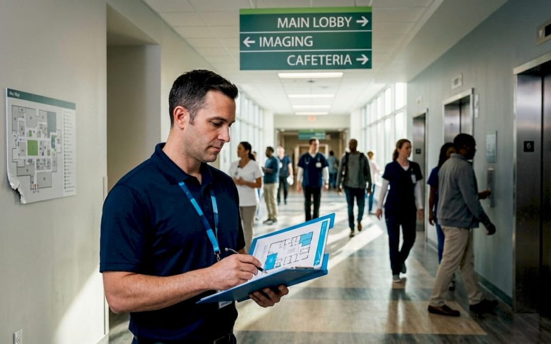
Hanging signs: Maximizing speed and visibility
If you manage a large, high-traffic facility, hanging signs are almost always your most powerful wayfinding tool. They’re suspended from ceilings or overhead structures, which means they’re visible across long distances without being blocked by people, carts, or equipment. That unobstructed sightline is exactly why they perform so well.
Consider how airports use hanging signs. Every terminal gate, baggage claim zone, and concourse junction is marked with large, illuminated overhead panels. Passengers often move in dense crowds at a fast pace, sometimes under stress. Hanging signs cut through that chaos because they’re positioned above eye level and visible even when the floor is packed. Convention centers use the same logic: overhead banners and suspended directional panels help attendees navigate massive exhibition halls without stopping to ask for help.
Retail environments benefit enormously from hanging signs too. Department stores use them to mark product categories, clearance zones, fitting rooms, and restroom corridors. Done well, these signs keep shoppers oriented and moving, which directly supports sales. Done poorly, or not at all, shoppers abandon their search and leave.
The research backs this up clearly. Overhead signs outperform both wall-mounted and ground-level signs in guiding speed, with a 17.62% advantage over ground signs specifically. In practical terms, that means fewer bottlenecks, faster throughput, and a more comfortable experience for everyone in the building.
Performance snapshot: Hanging signs guide visitors to exits 17.62% faster than ground signs and 5.46% faster than wall signs. In high-occupancy buildings, that difference has real safety implications.
What makes hanging signs work in different settings:
- Airports and transportation hubs: High ceilings and long sightlines make overhead signs essential for gate, zone, and service markers.
- Warehouses and distribution centers: Aisle labels and zone identifiers suspended from racking help workers navigate efficiently under time pressure.
- Shopping centers and malls: Hanging signs above anchor stores and wing entrances reduce shopper disorientation in complex layouts.
- Event venues: Temporary hanging banners mark registration desks, breakout rooms, and sponsor areas without requiring floor space.
From a branding standpoint, hanging signs offer a lot of creative flexibility. You can customize the shape, size, color, finish, and print design to match your facility’s identity. Double-sided signs are especially effective since they’re readable from multiple directions.
Pro Tip: When creating directional signs for a multi-level facility, prioritize hanging signs at transition points like elevator lobbies and stairwells. These are the moments when visitors are most disoriented and most in need of clear, immediate guidance.
For areas where ceiling mounting isn’t practical, directional door signs can serve as a complementary system to keep navigation consistent throughout the facility.
Wall and column signs: Balancing function and aesthetics
Wall and column signs are the backbone of most commercial wayfinding systems. They’re versatile, easy to install, and available in a huge range of materials and finishes. While they don’t match the navigation speed of hanging signs in emergencies, they excel in settings where the environment requires a more integrated, design-forward approach.
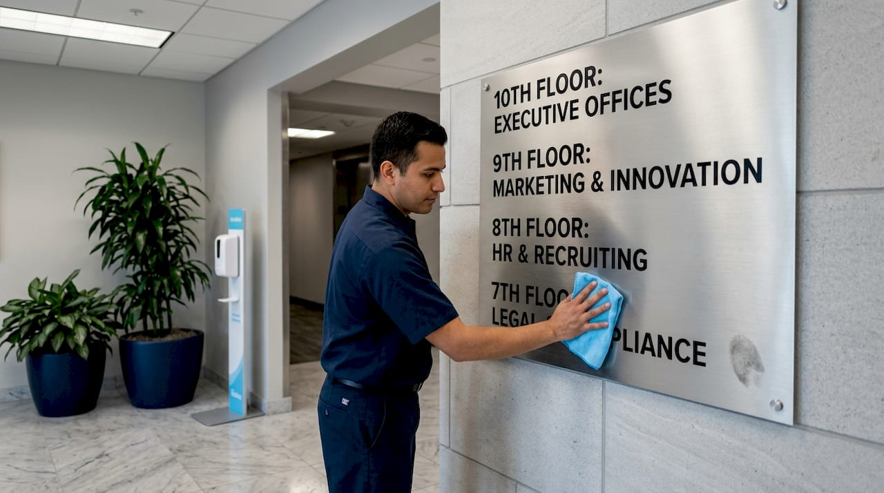
Office buildings are a prime example. Room number plaques, departmental nameplates, and directional arrows on corridor walls keep employees and visitors moving efficiently without overwhelming the space visually. A well-designed office sign system uses consistent typography, spacing, and materials to create a coherent visual language throughout the building. That consistency is also a branding opportunity, since every touchpoint in your workplace communicates organizational culture.
Hotels lean heavily on wall and column signage for exactly this reason. Guest corridor signs, elevator lobby directories, and restaurant entrance plaques are designed to match the property’s interior design. A boutique hotel might use brushed brass plaques with custom letterforms. A modern business hotel might prefer backlit acrylic panels with a clean sans-serif font. In both cases, the sign does double duty: it navigates and it reinforces the brand experience.
Schools and universities use wall signs to differentiate departments, mark classrooms, and provide directional guidance across campuses. Here, durability is especially important since signs in educational settings face heavy use and occasional vandalism. Custom signage for branding in these environments often incorporates school colors and logos, making the signage system part of the institution’s visual identity.
Advantages of wall and column signs:
- Design integration: Can be matched to interior finishes, materials, and color schemes more easily than hanging signs.
- Lower installation complexity: Most wall signs require minimal infrastructure compared to ceiling-mounted systems.
- Flexibility: Works in spaces with low ceilings or architectural restrictions that prevent overhead mounting.
- Branding depth: Surface area allows for richer design details, textures, and branded graphic elements.
The tradeoff is performance in crowded or emergency scenarios. As noted, wall signs guide evacuation about 5.46% slower than overhead signs. In a routine office environment, that’s negligible. In a stadium or transit hub at capacity, it matters.
“The best signage systems aren’t built around one sign type. They use wall signs for contextual detail and hanging signs for long-distance navigation, working together as a layered system.”
A strong office signage design program combines wall-mounted directional arrows and room identification signs with overhead markers at major decision points. This layered approach captures the branding richness of wall signs while maintaining the navigation speed benefits of hanging signs.
Floor and ground signs: Niche uses and creative solutions
Floor and ground signs occupy a specific and important niche in wayfinding. They’re not the right choice for general navigation in most facilities, but in the right context, they’re extraordinarily effective and sometimes the only viable option.
Hospitals use floor signs extensively to mark colored pathways through complex building layouts. Colored tape lines or printed floor graphics guide patients to radiology, cardiology, the cafeteria, or the emergency exit without requiring them to scan walls or ceilings for information. This system works well in environments where patients may be distracted, anxious, or moving slowly with assistive devices.
Stadiums and large event venues use floor graphics to direct crowd flow during entry and exit. Painted arrows, numbered sections, and color-coded zones on the floor help manage tens of thousands of people simultaneously. Construction zones rely on ground-level signs and painted markings to communicate temporary routing, hazard warnings, and pedestrian pathways when normal signage infrastructure is disrupted.
Creative brands have also discovered the marketing potential of floor graphics. Retail stores use floor decals near product displays to draw attention and prompt action. Trade show exhibitors use custom floor graphics to define their booth boundary and reinforce brand presence from a distance. These applications prove that floor signs can be both functional and visually compelling.
Key use cases for floor and ground signs:
- Hospital wayfinding: Color-coded floor paths for patients navigating large medical campuses.
- Stadium crowd management: Directional floor arrows and section markers for high-density events.
- Construction site routing: Temporary ground markers that redirect pedestrian traffic safely.
- Retail product promotions: Floor decals at point-of-purchase locations to guide shopper attention.
- Trade show booths: Branded floor graphics that define space and reinforce identity.
Where ground signs fall short is in general, everyday navigation across a facility. The research is clear: ground signs guide people 17.62% slower than hanging signs. In a crowded space, looking down at floor signs while navigating is awkward and slow. They work best as supplements to overhead or wall systems, not as standalone solutions.
For outdoor environments, material choice is critical. Proper outdoor signage installation requires slip-resistant surfaces, UV-stable inks, and adhesives rated for temperature variation. Consulting resources on how to weatherproof outdoor signs ensures your ground-level investment holds up through seasons and heavy foot traffic.
For complex facilities requiring coordinated sign placement, referencing shop drawing production services can help you plan sign positioning with architectural precision before installation begins.
Comparison: Wayfinding sign type performance
| Sign type | Evacuation speed | Best environment | Branding potential |
|---|---|---|---|
| Hanging/overhead | Fastest | Airports, malls, warehouses | High |
| Wall/column | Moderate | Offices, hotels, schools | Very high |
| Floor/ground | Slowest | Hospitals, stadiums, events | Moderate |
Our expert perspective: Making wayfinding signage work for you
After working with businesses across retail, hospitality, healthcare, and property management, the most consistent mistake we see is treating wayfinding signage as an afterthought. Signs get ordered at the end of a renovation project, squeezed into a leftover budget, and installed without a coherent system or strategy. The result is a mismatched patchwork that confuses visitors and undermines the brand.
The truth is, sign type matters less than sign strategy. A well-planned system of modest wall signs will outperform an expensive hanging sign installed in the wrong location every time. Placement, consistency, and clarity are the variables that actually drive performance. Brand alignment is what transforms a navigation tool into a genuine asset.
We’ve also seen businesses over-rotate toward digital signs as a default “upgrade.” Digital displays have real advantages in dynamic environments, but they introduce maintenance complexity, require power infrastructure, and can fail at the worst moment. Physical signs, properly installed, are reliable by nature. For most facilities, a layered physical system with hanging signs at decision points, wall signs for room identification, and floor signs for specialized routing covers every real need without unnecessary complexity.
When planning signage campaigns, treat the process like interior design: think about the full visitor journey from arrival to destination, map every decision point, and design signs that answer the question in the visitor’s head before they even have to ask it.
Find and customize your wayfinding signage solutions
Your facility’s signage system says something about your brand every single day, whether you’ve designed it intentionally or not. Getting it right means choosing sign types that match your environment, placement that supports real navigation behavior, and designs that reinforce your identity at every turn.

At Custom Signs Today, we specialize in custom wayfinding solutions built for real facilities and real visitor needs. Whether you need a full-facility sign system or a single high-impact overhead panel, we can help you design and produce it. Explore our range of face change signs for flexible, updateable installations, or browse our full catalog of custom sign services to find the right solution for your space. Request a free quote and let’s build a wayfinding system that works as hard as your brand does.
Frequently asked questions
Why are hanging signs considered the most effective for wayfinding?
Hanging signs are proven to guide visitors faster and more efficiently because their overhead placement provides unobstructed sightlines across crowded spaces. Research confirms they outperform wall and ground signs by 5.46% and 17.62% respectively in evacuation speed.
What should I consider when choosing wayfinding signage for my property?
Key factors include placement at natural decision points, durability suited to your environment, clear visibility from a distance, branding alignment, and compliance with ADA and fire safety standards.
Can floor signs be effective in high-traffic areas?
Floor signs work well for marking temporary routes, color-coded hospital pathways, or safety zones, but they are less effective for general navigation because ground signs guide people 17.62% slower than overhead signs in high-density environments.
How can wayfinding signage enhance brand identity?
Custom colors, materials, fonts, and finishes allow businesses to embed their brand DNA directly into their sign system, turning every directional marker into a consistent, recognizable brand touchpoint throughout the facility.
Are digital wayfinding signs better than traditional options?
Digital signs offer real-time flexibility and dynamic content updates, but physical signs excel in reliability, low maintenance, and clarity, making them the stronger choice for most standard commercial and institutional environments.